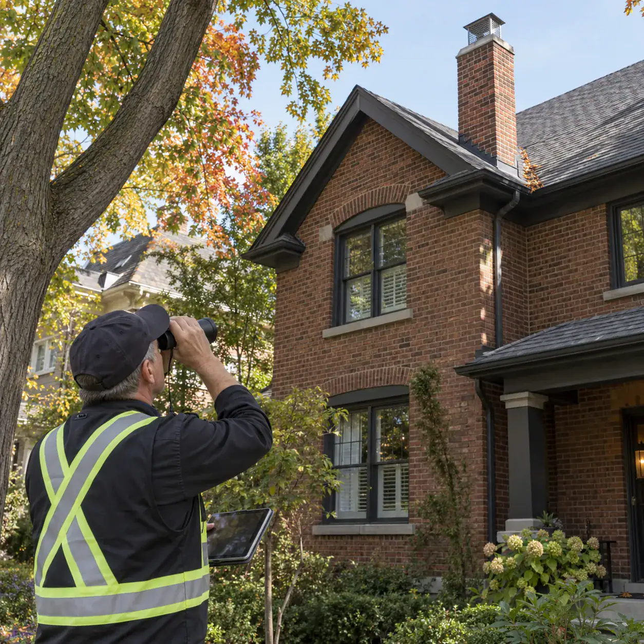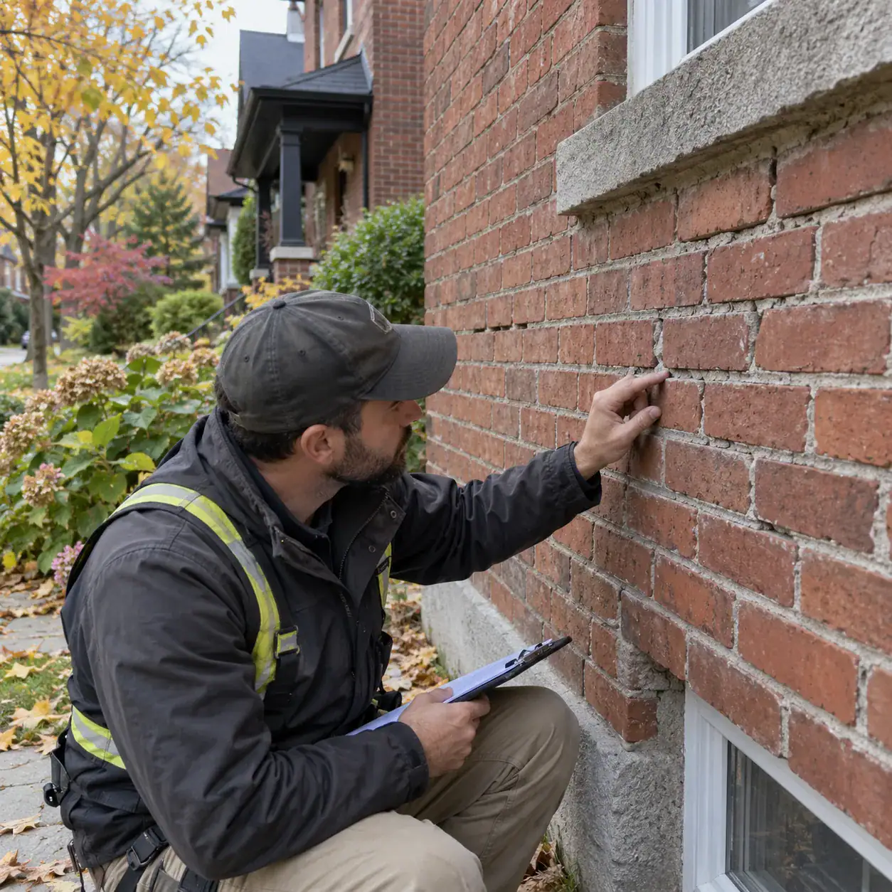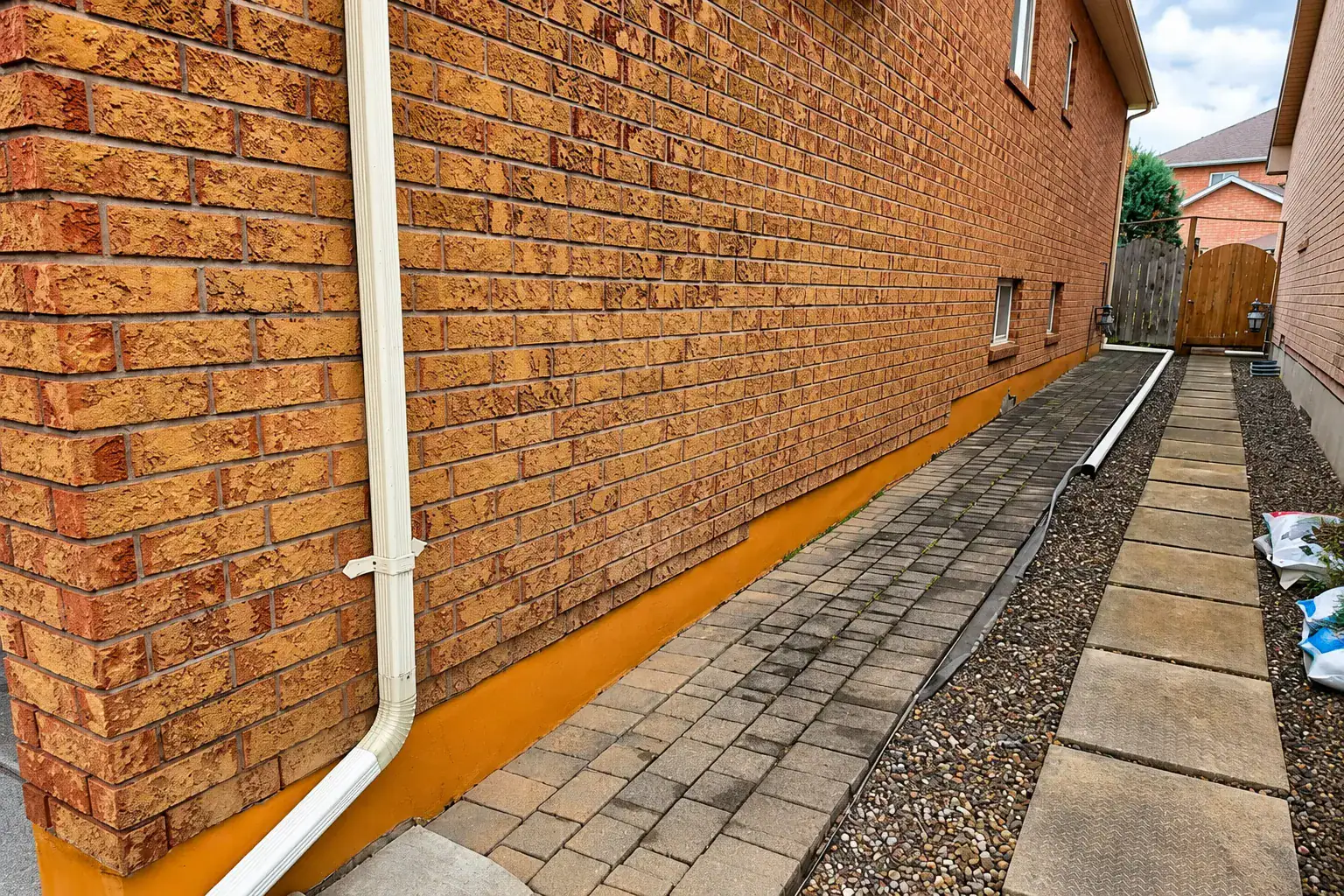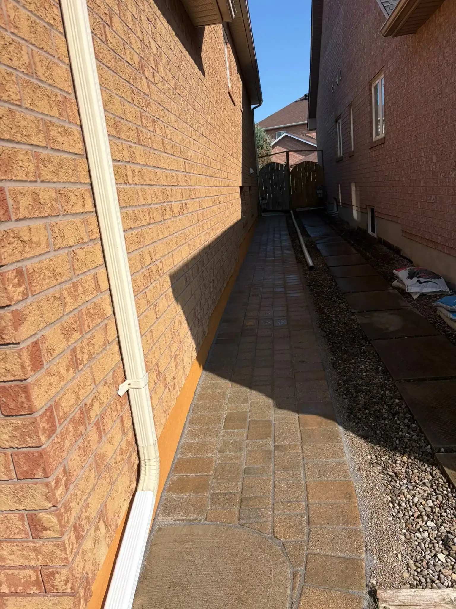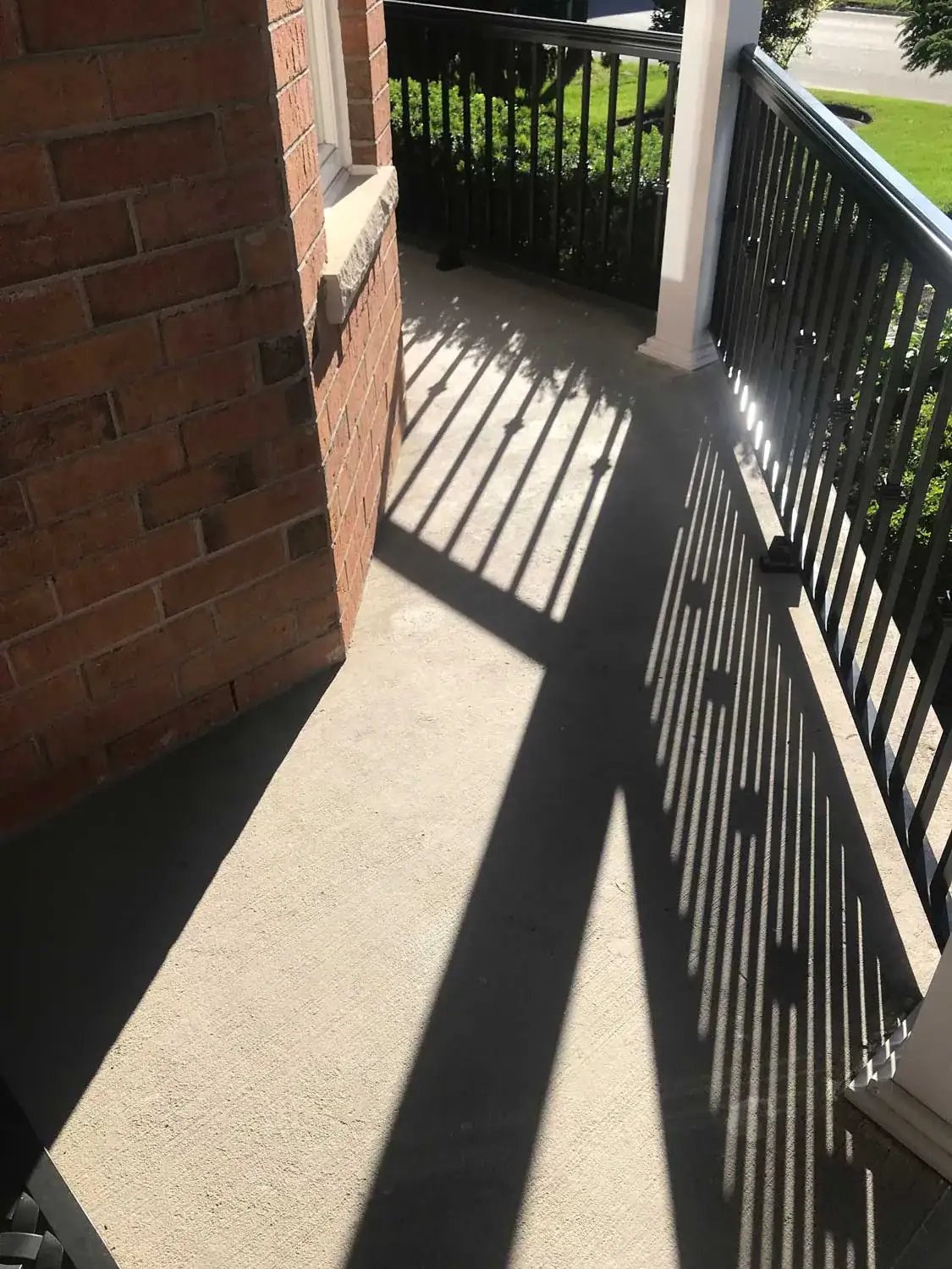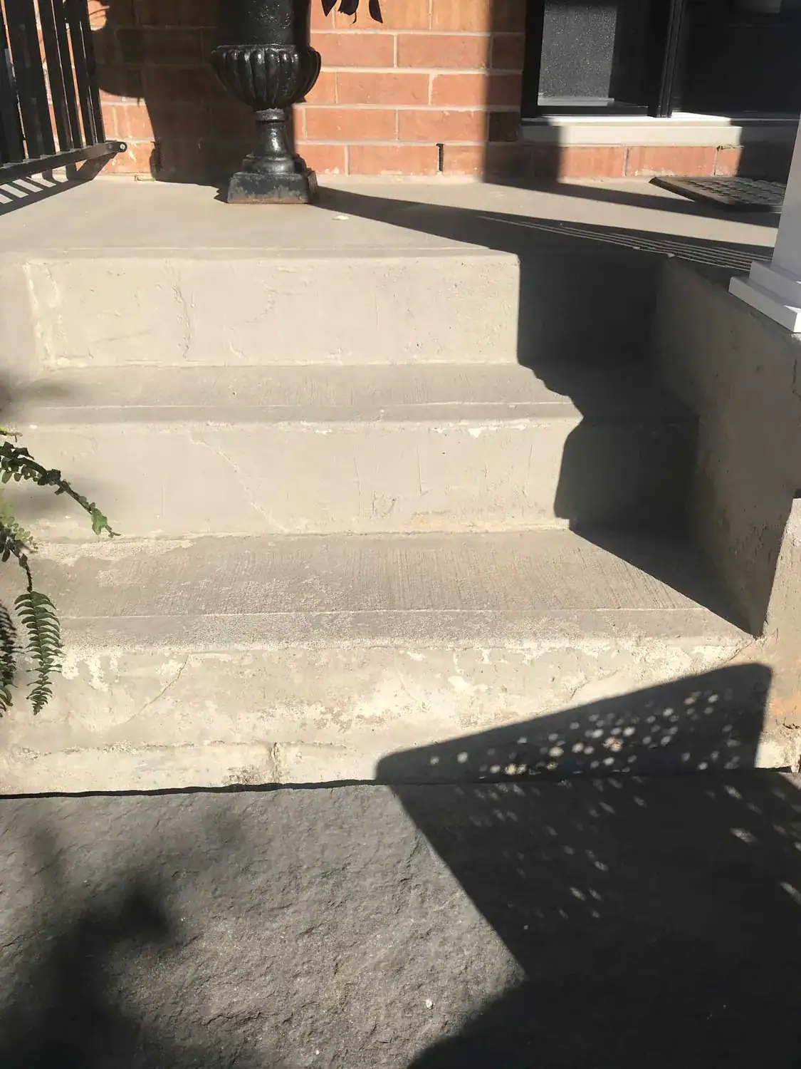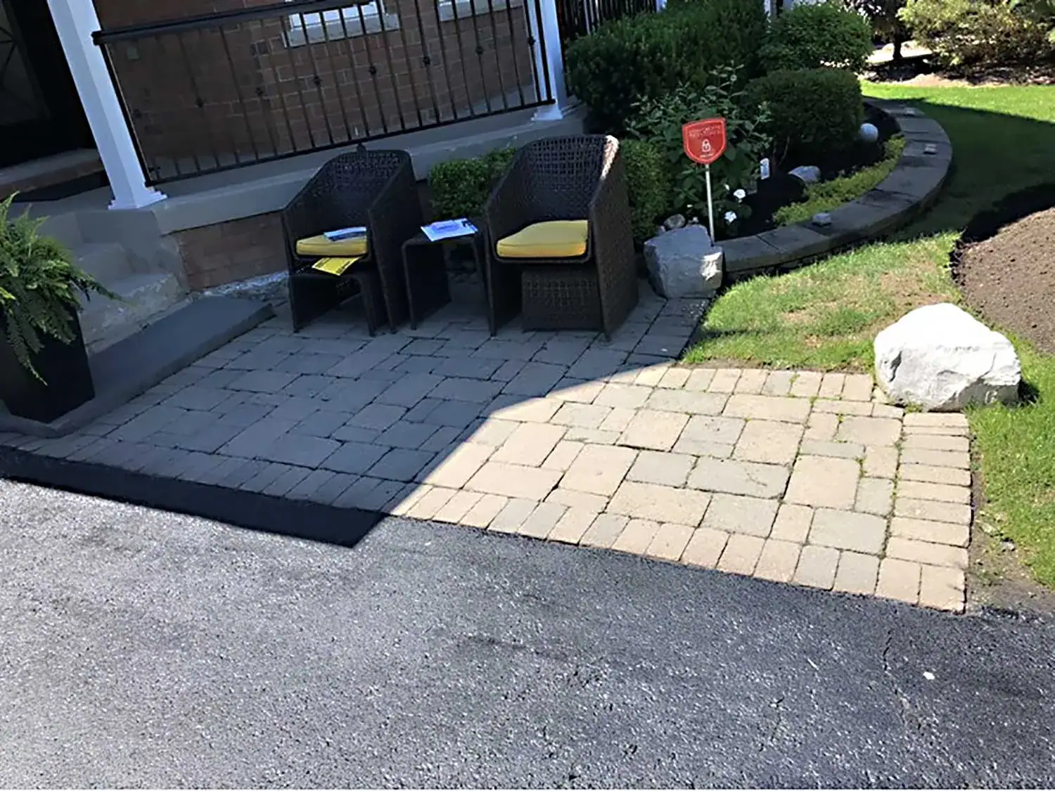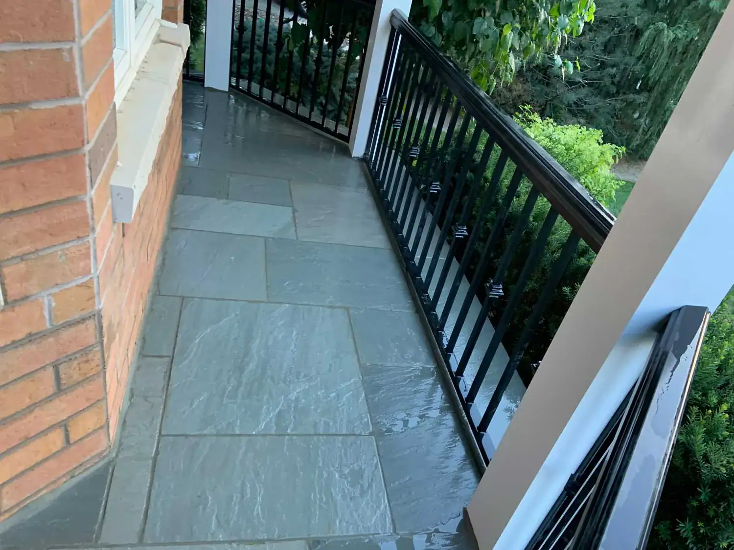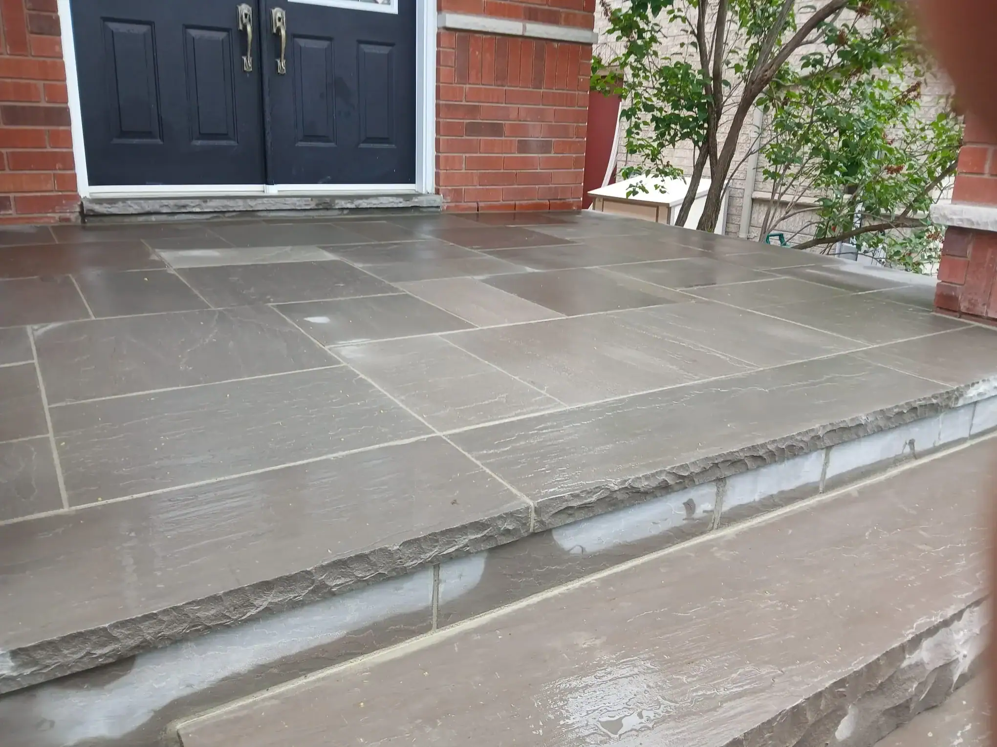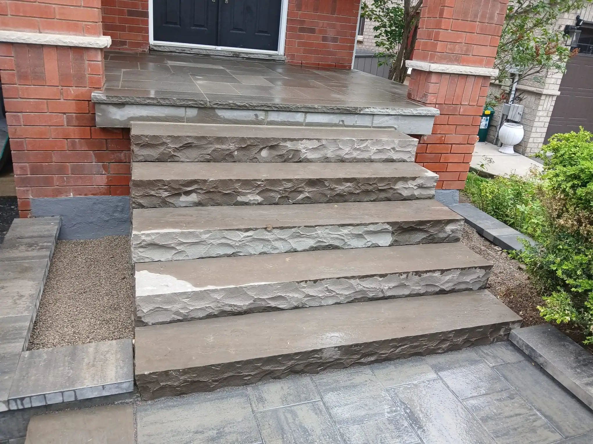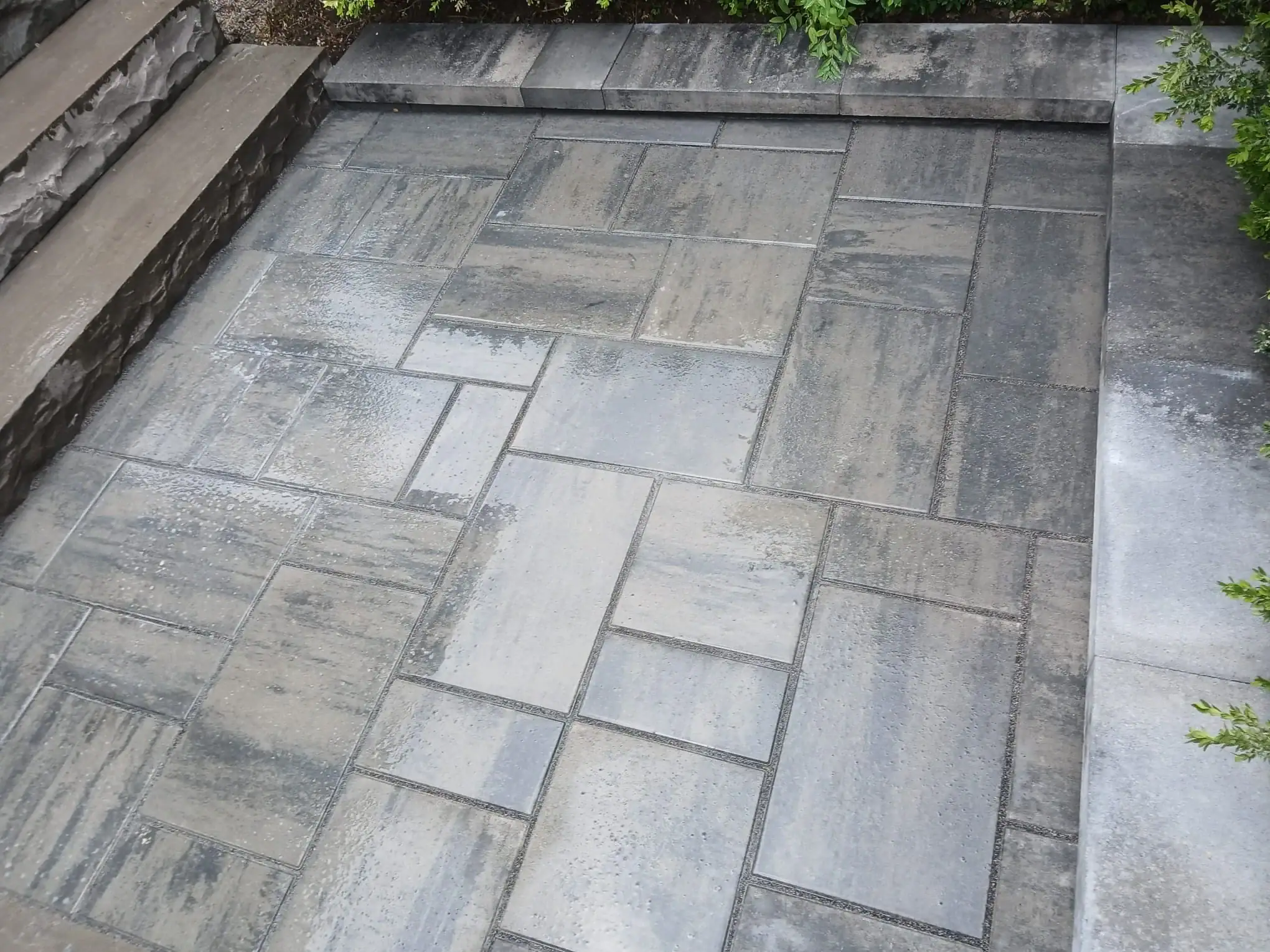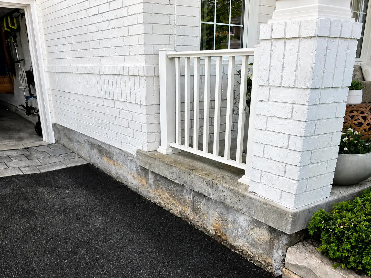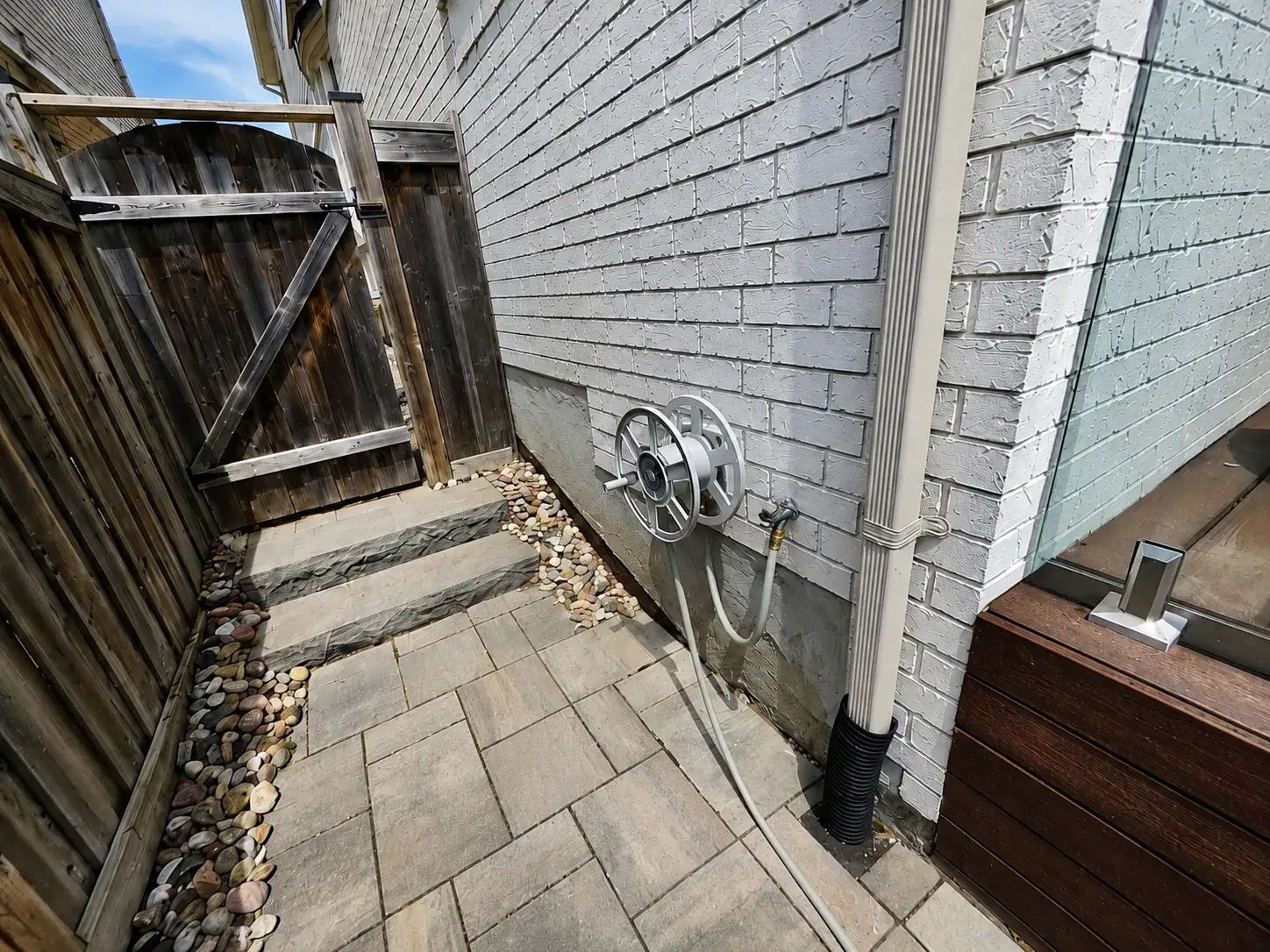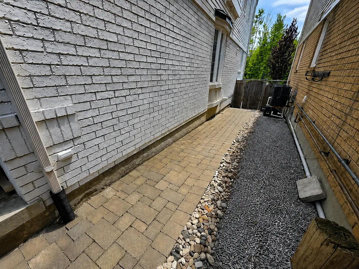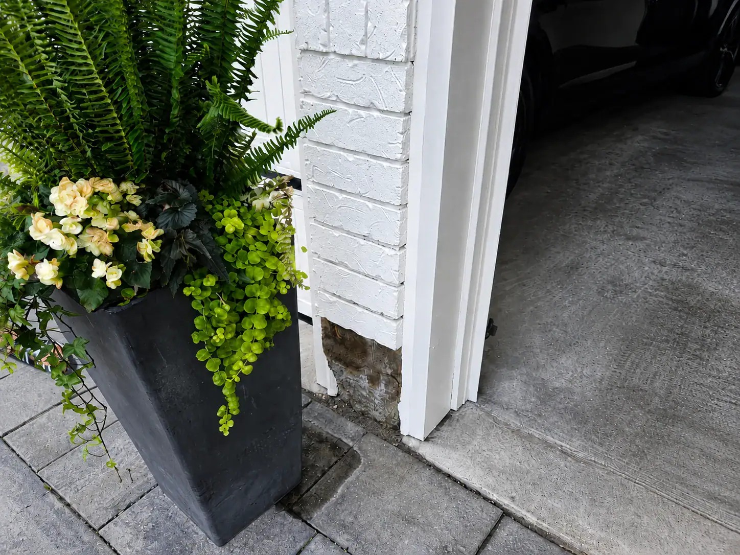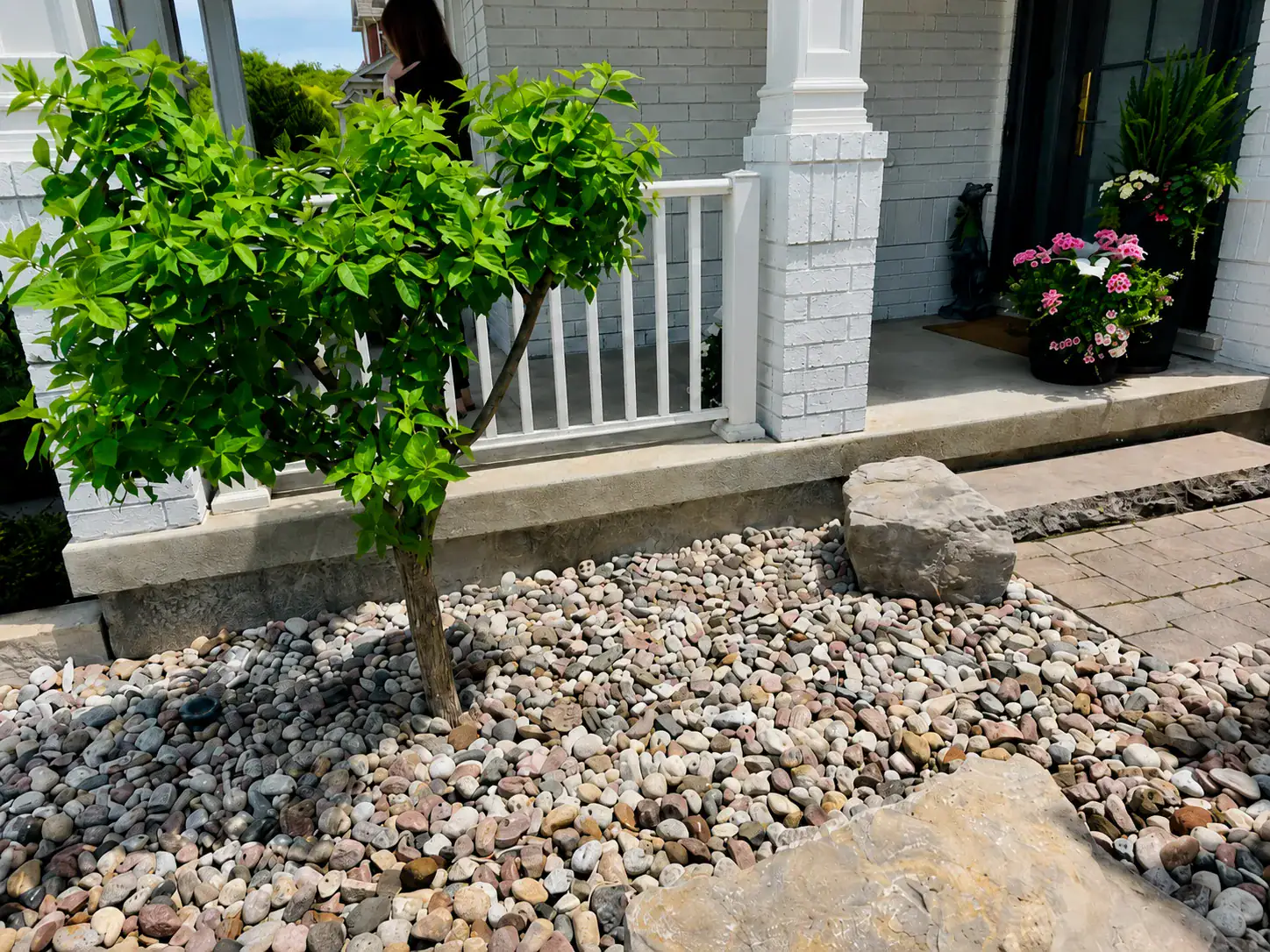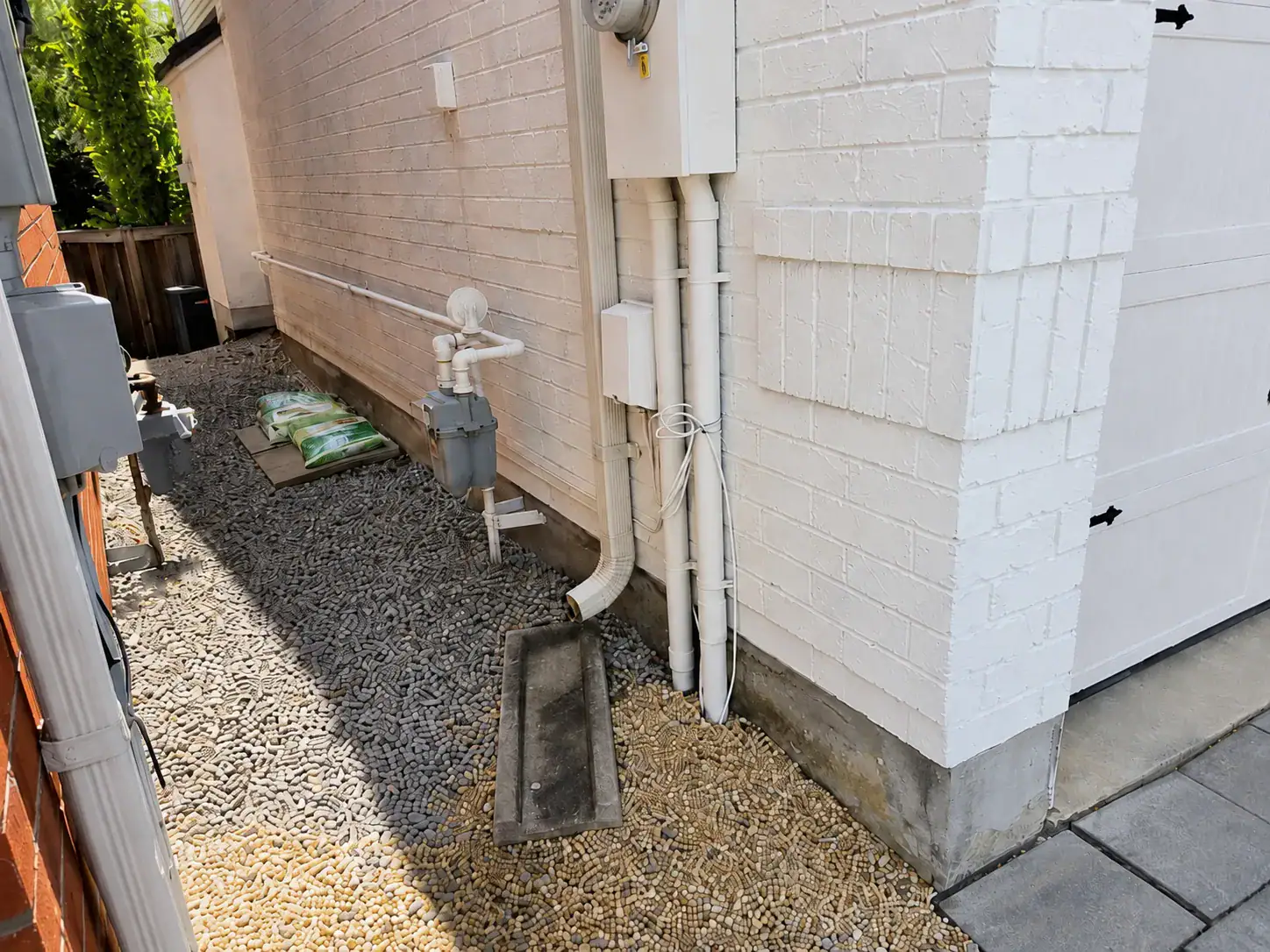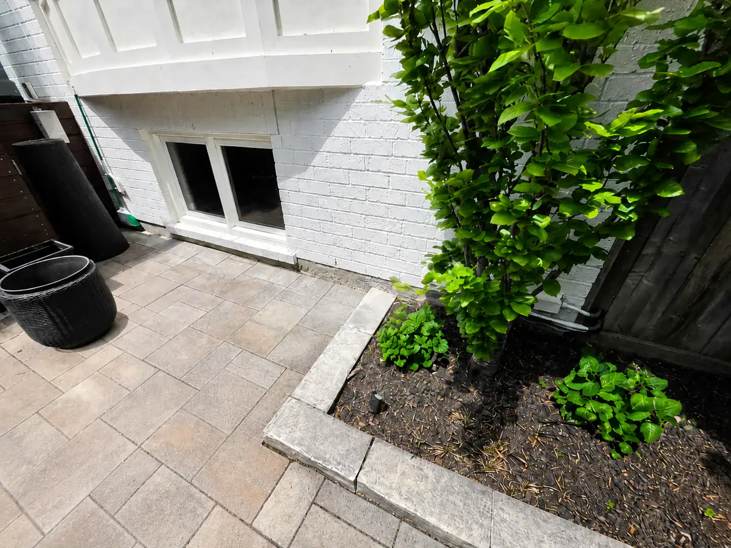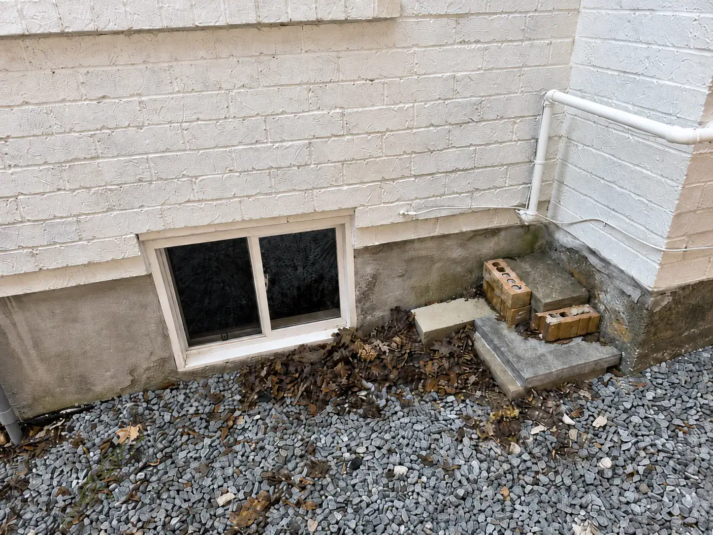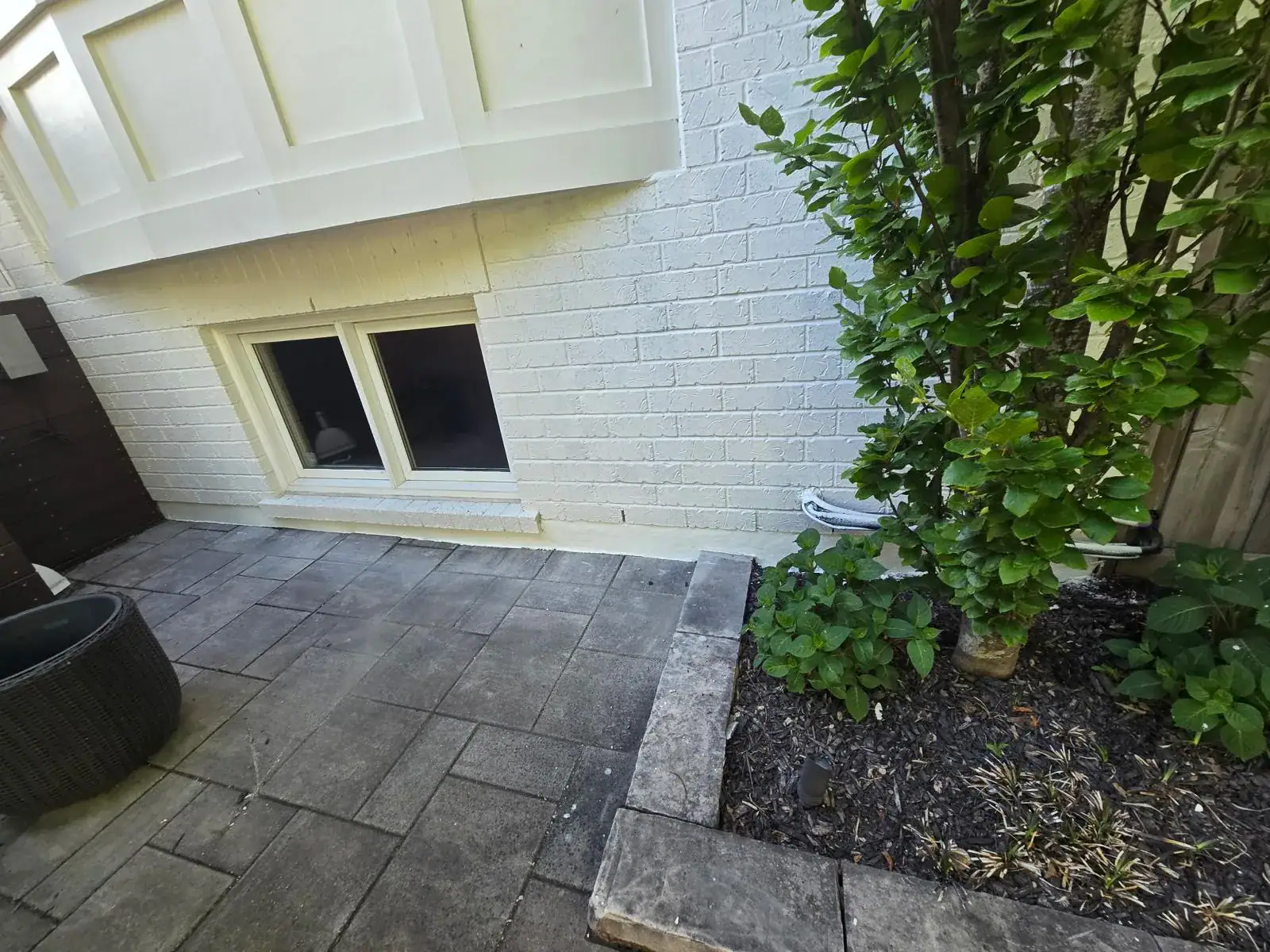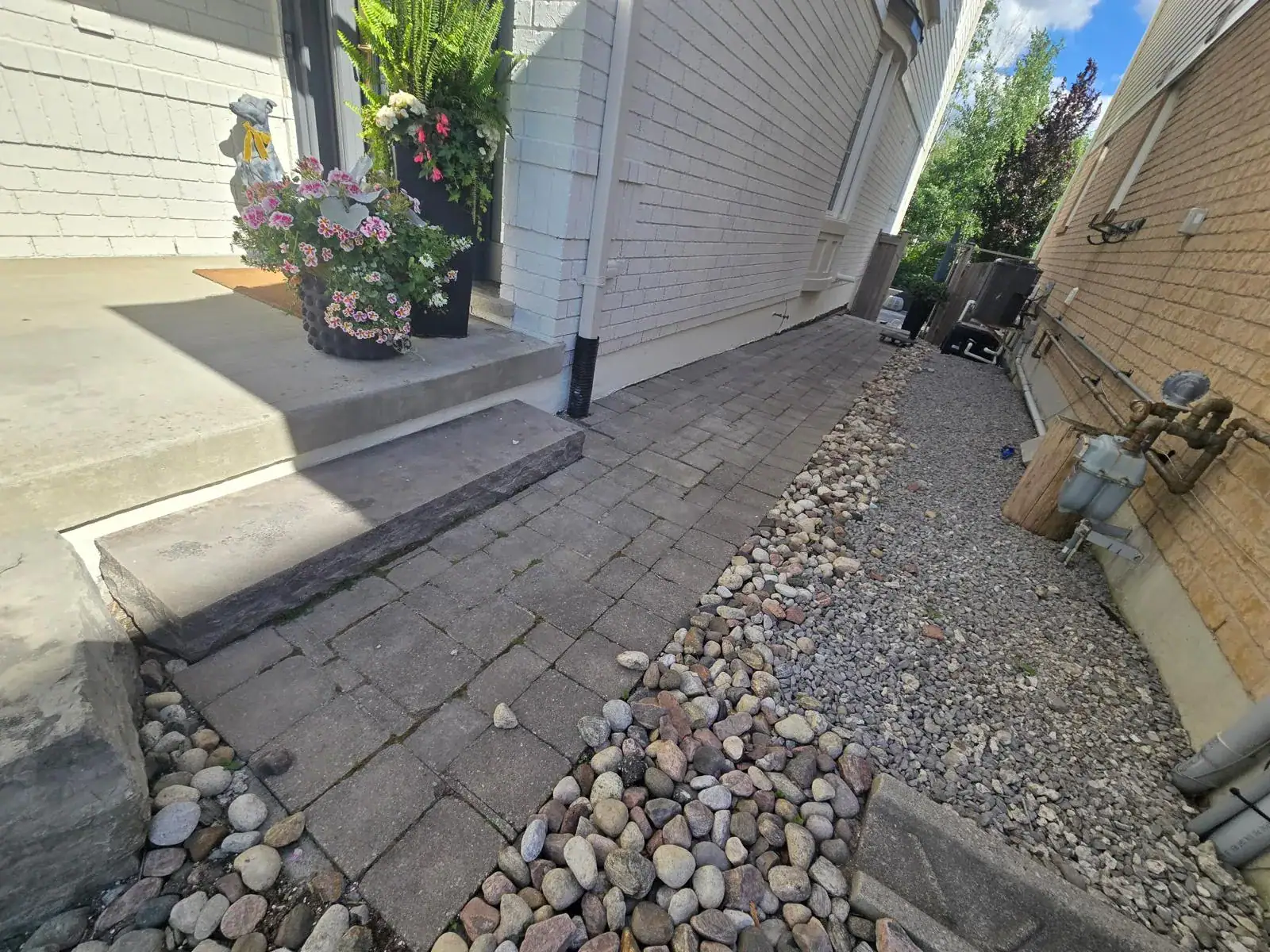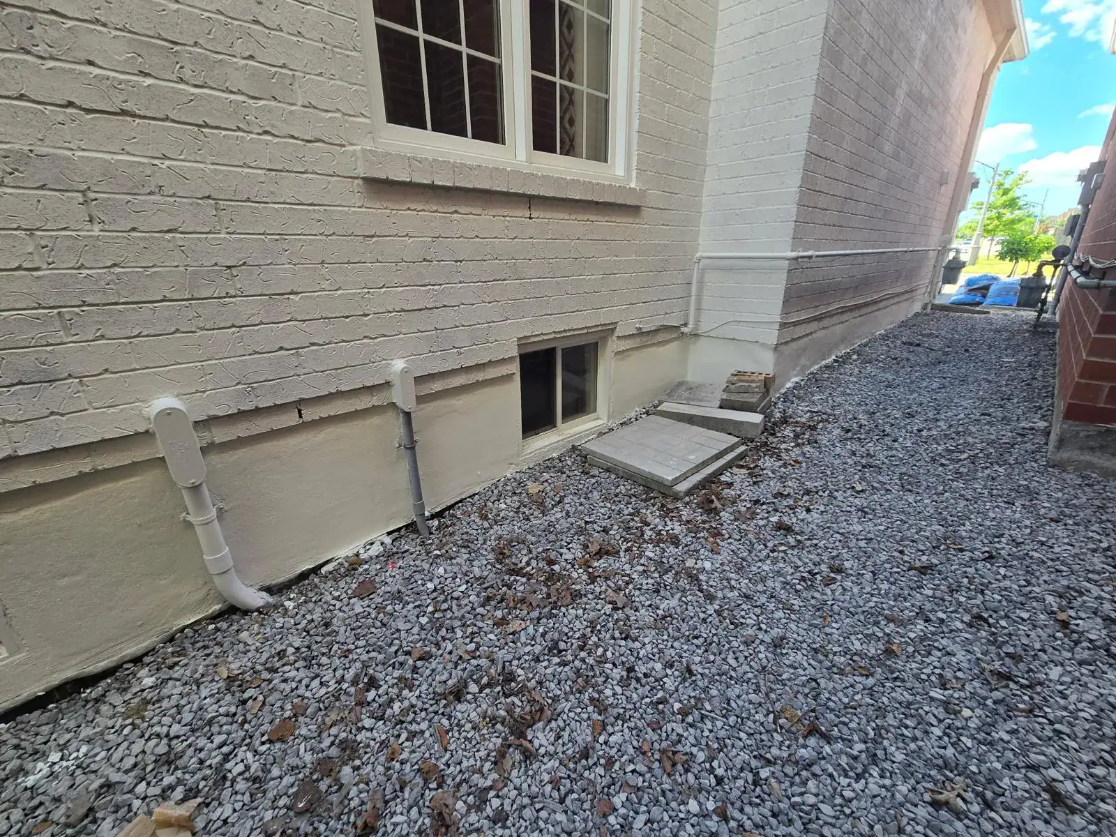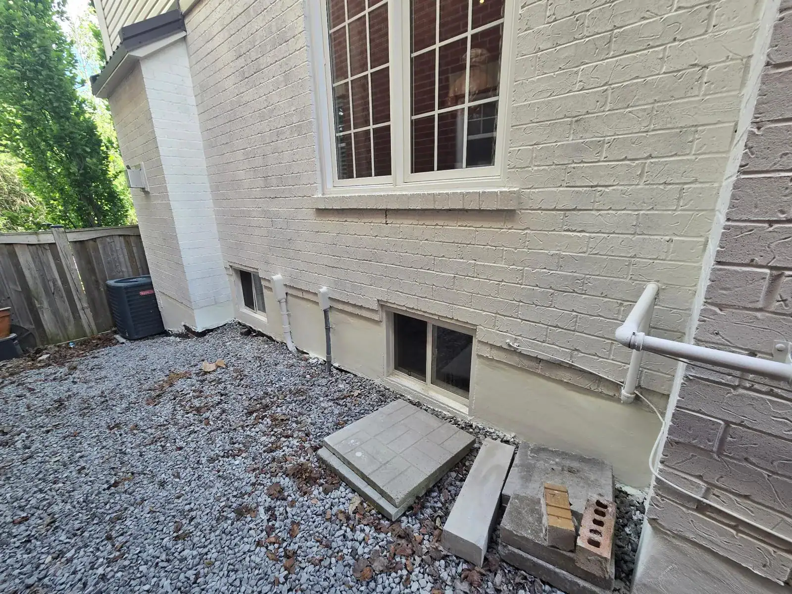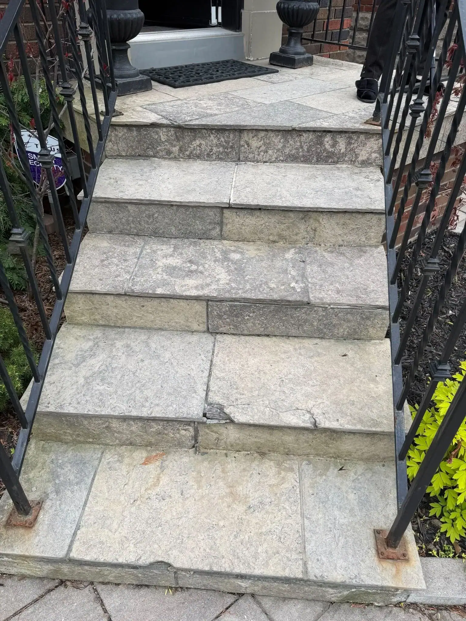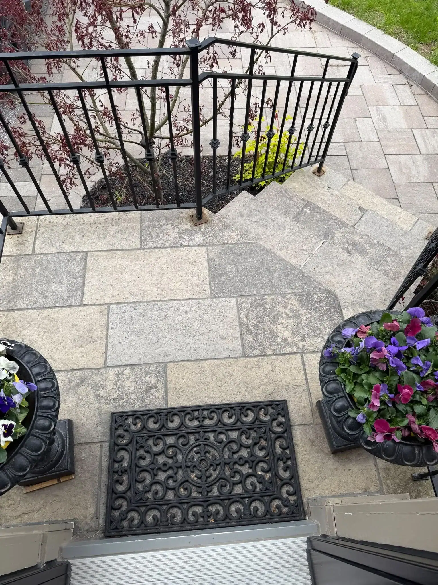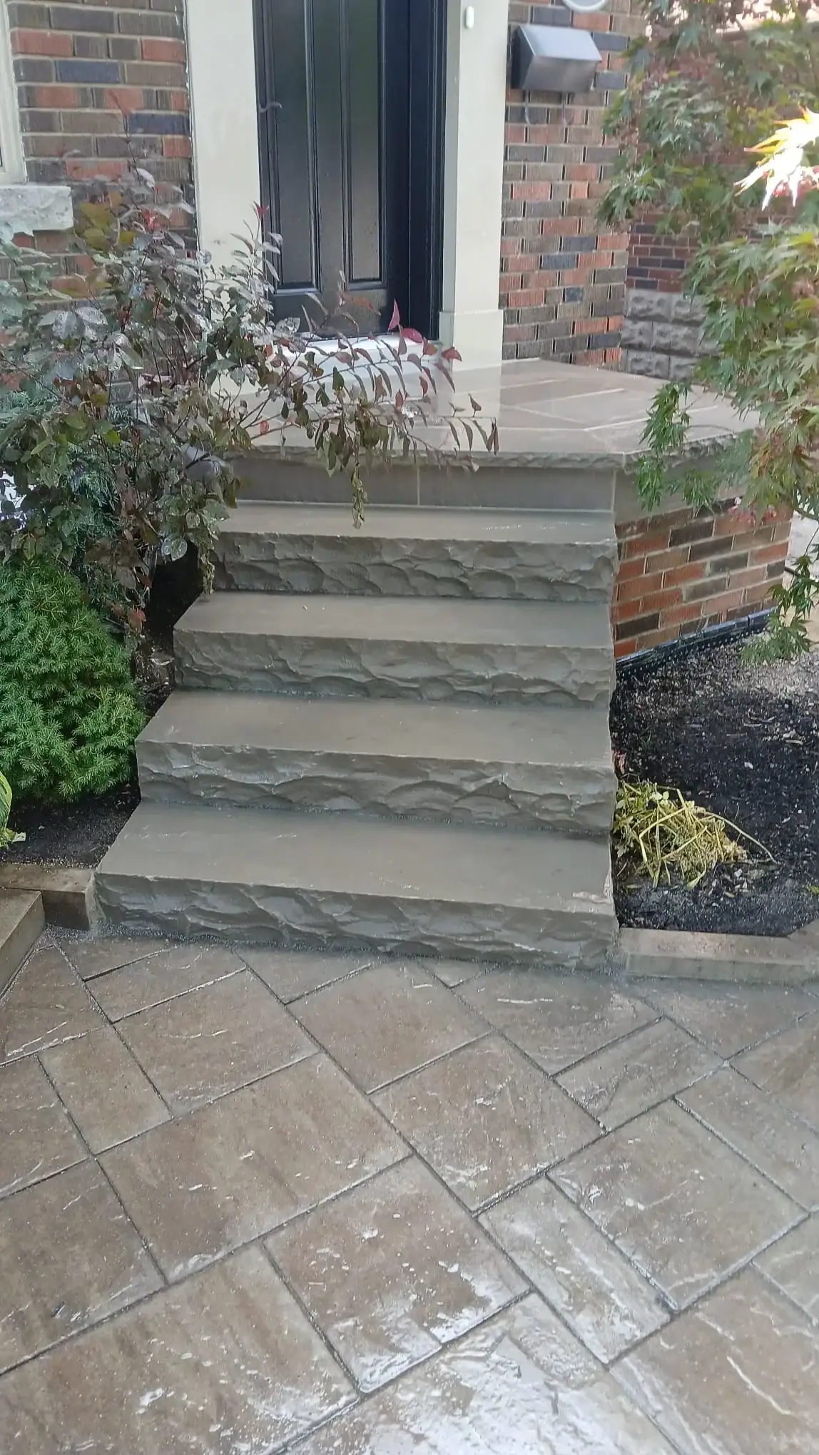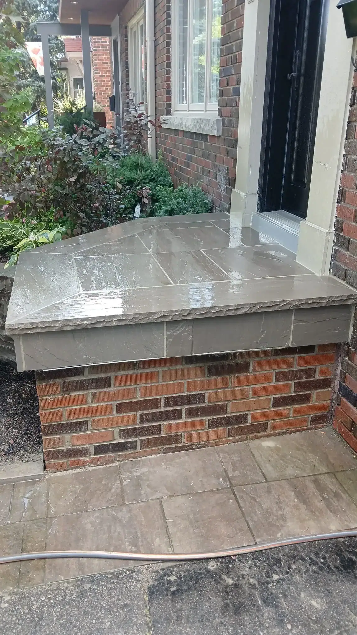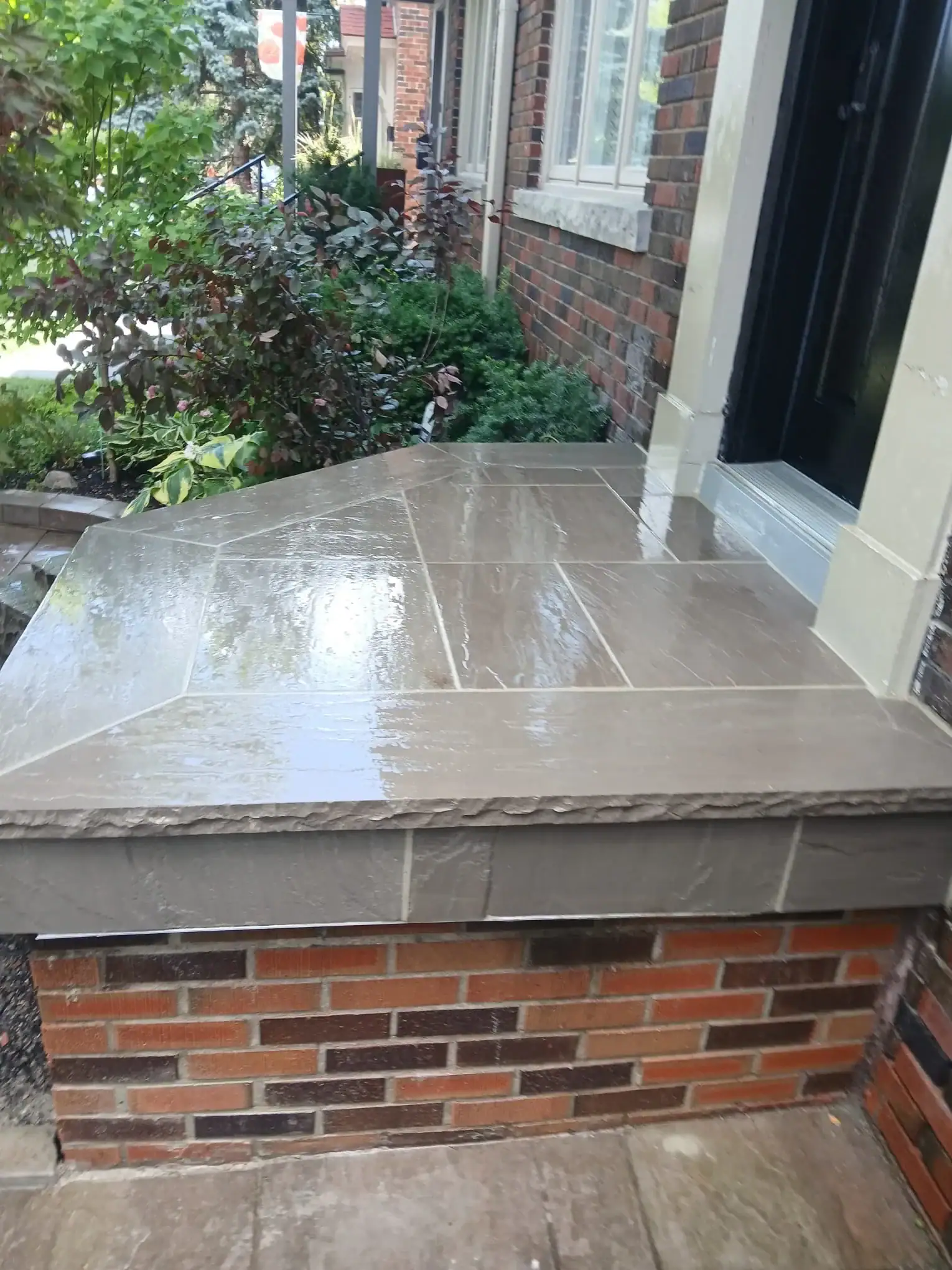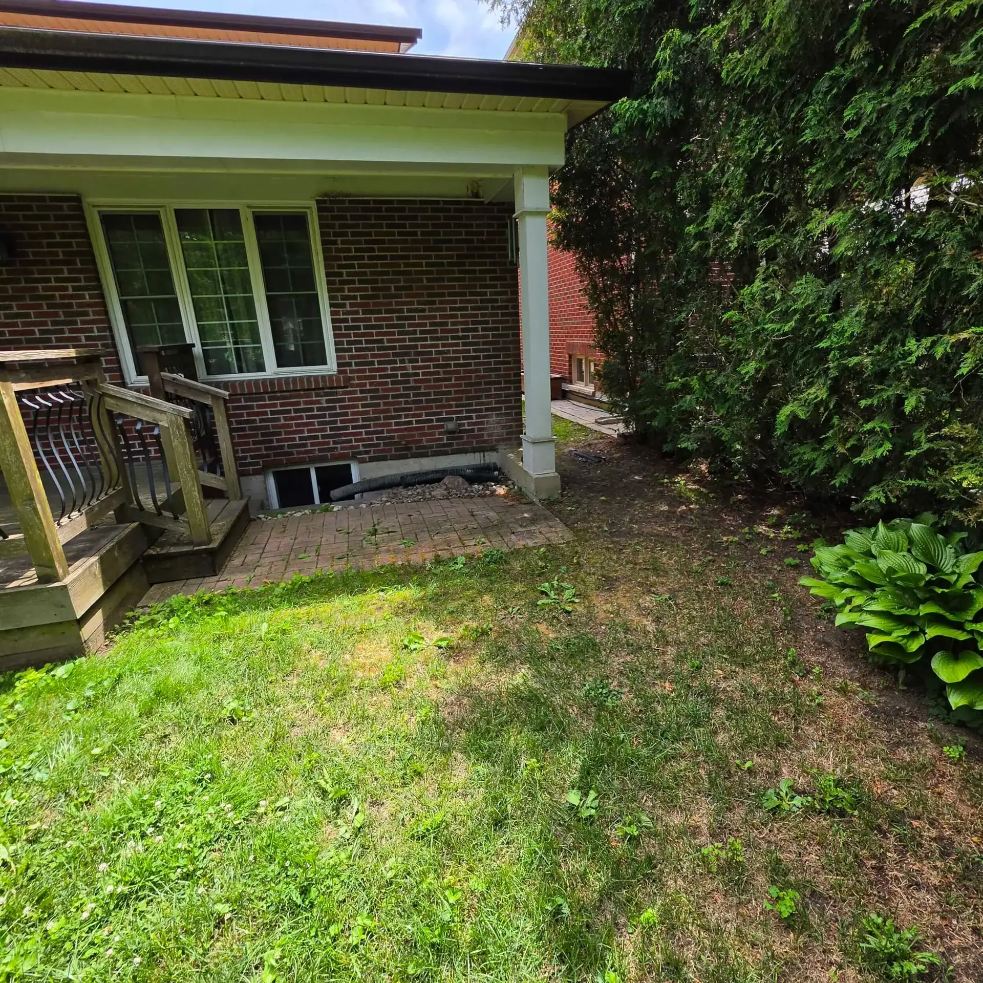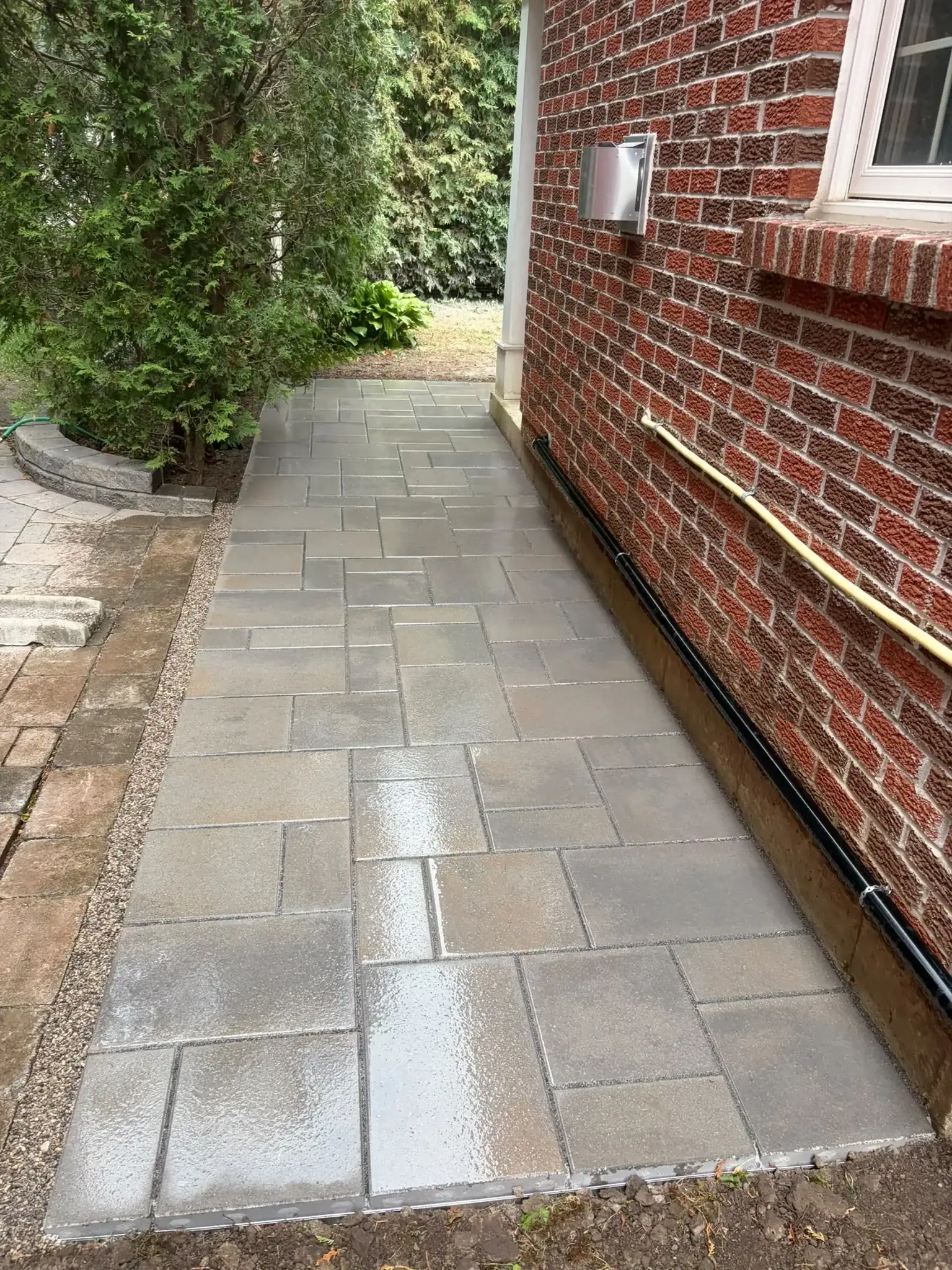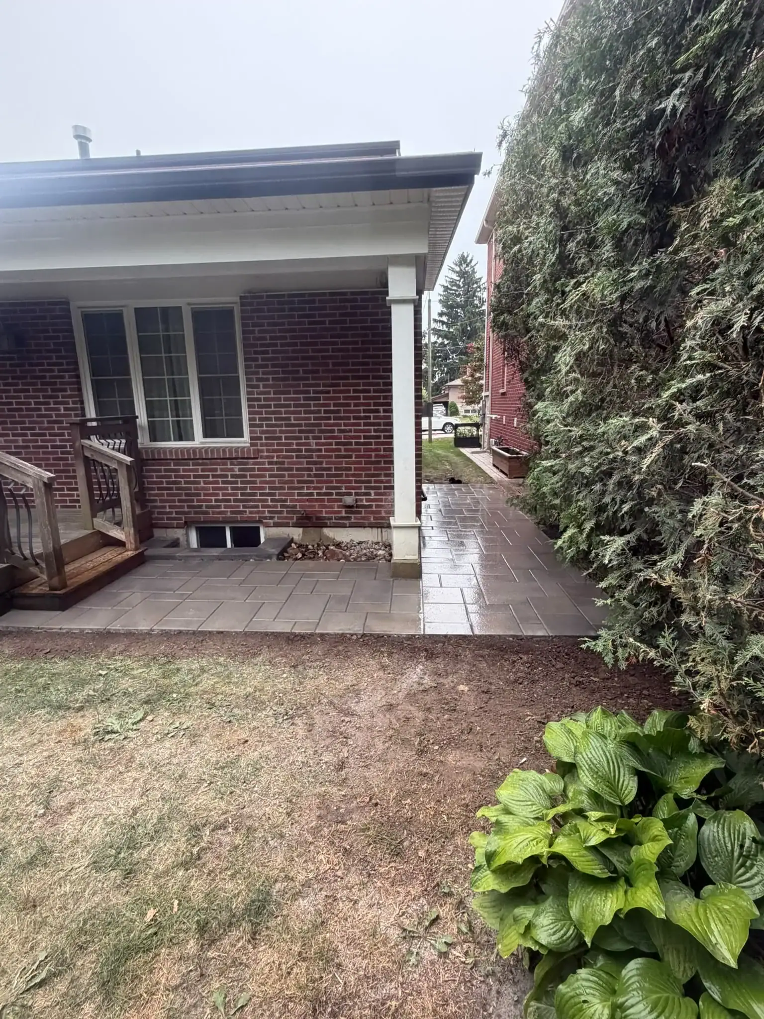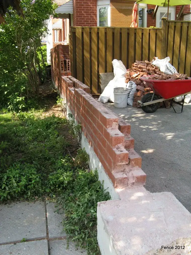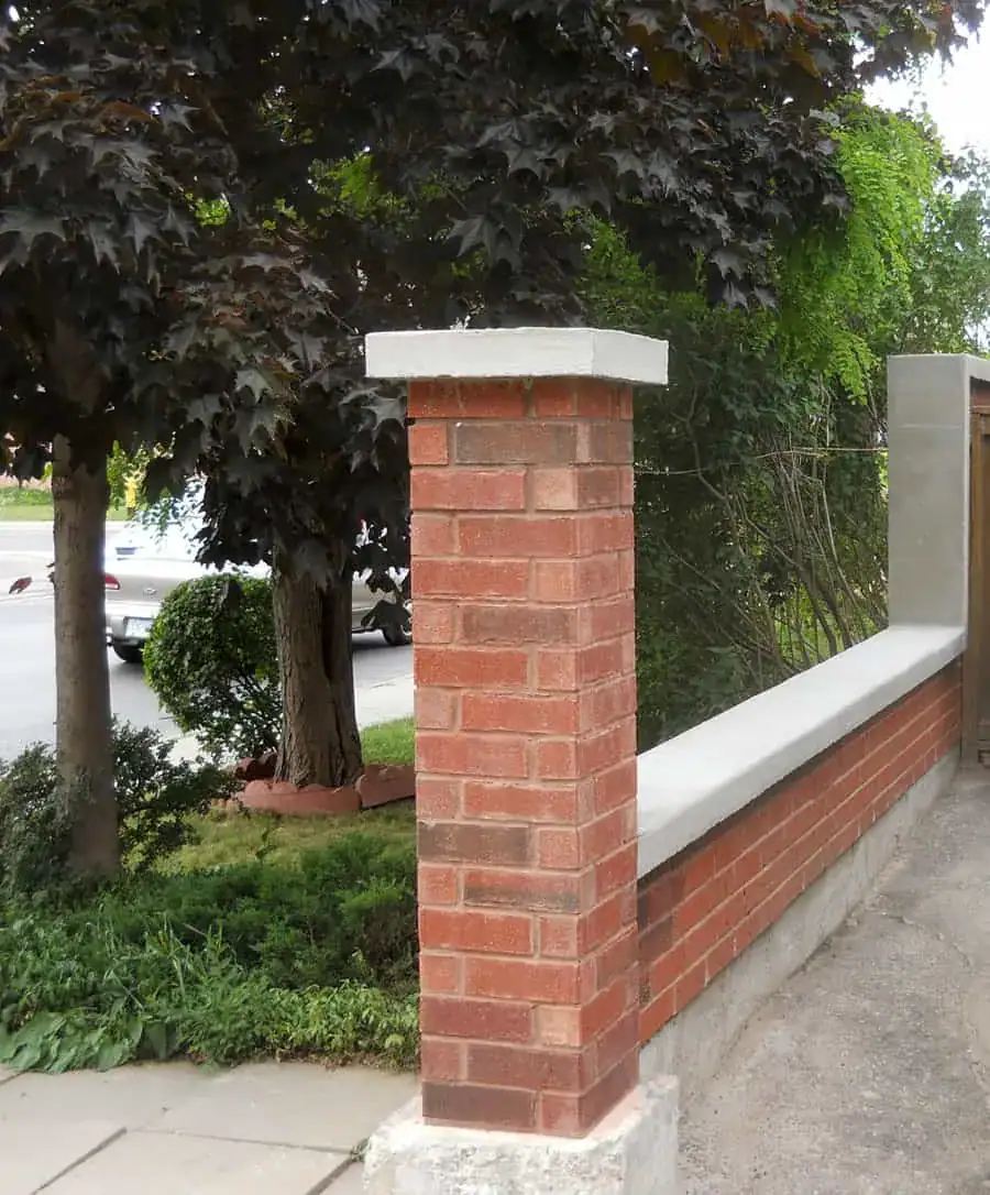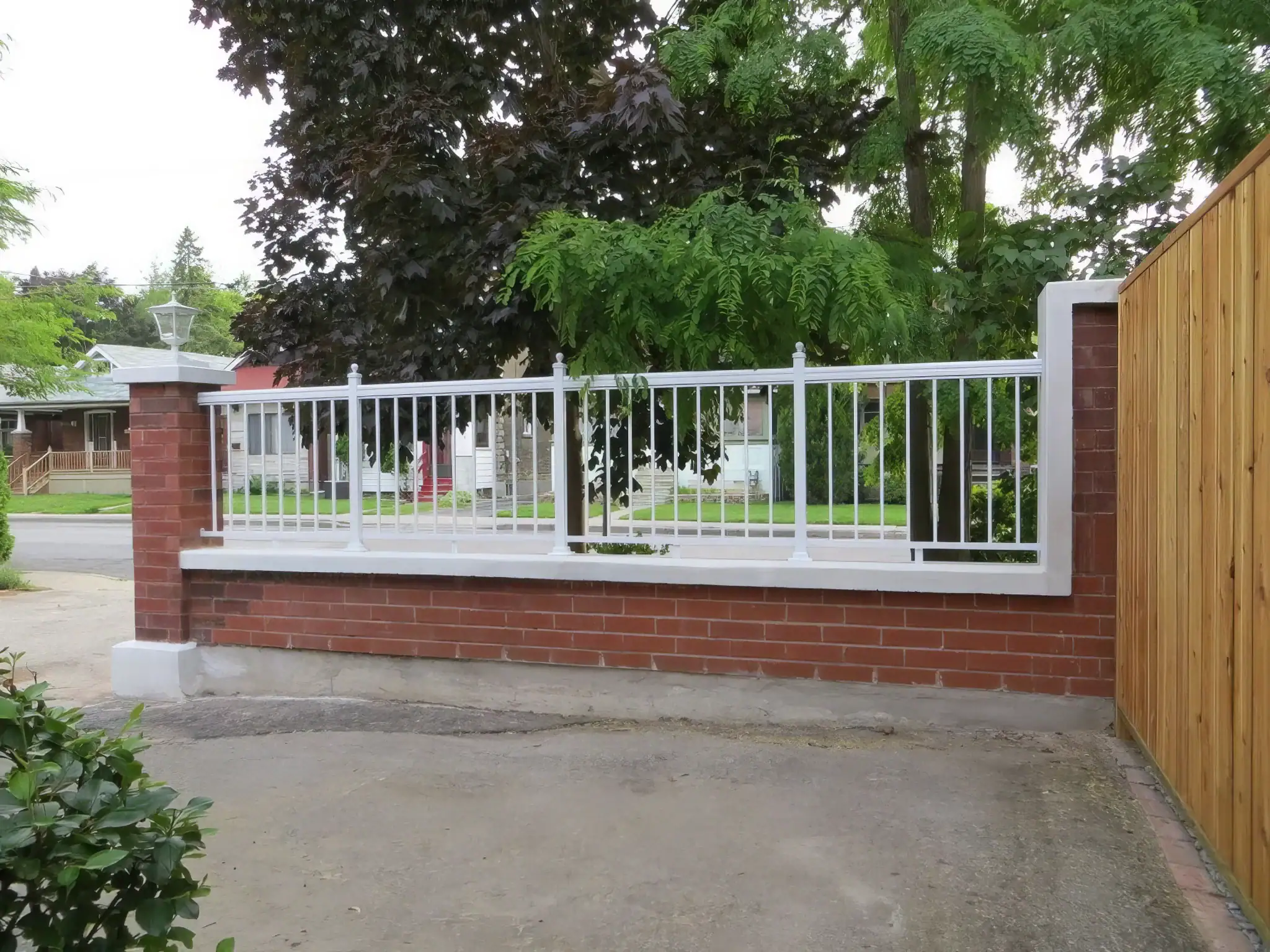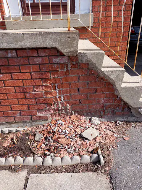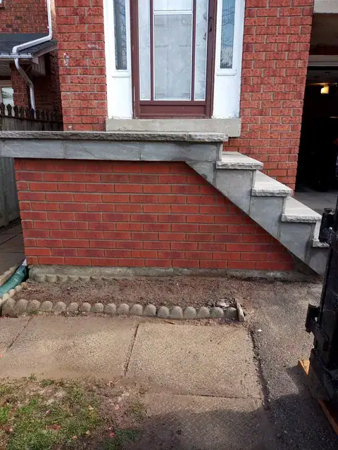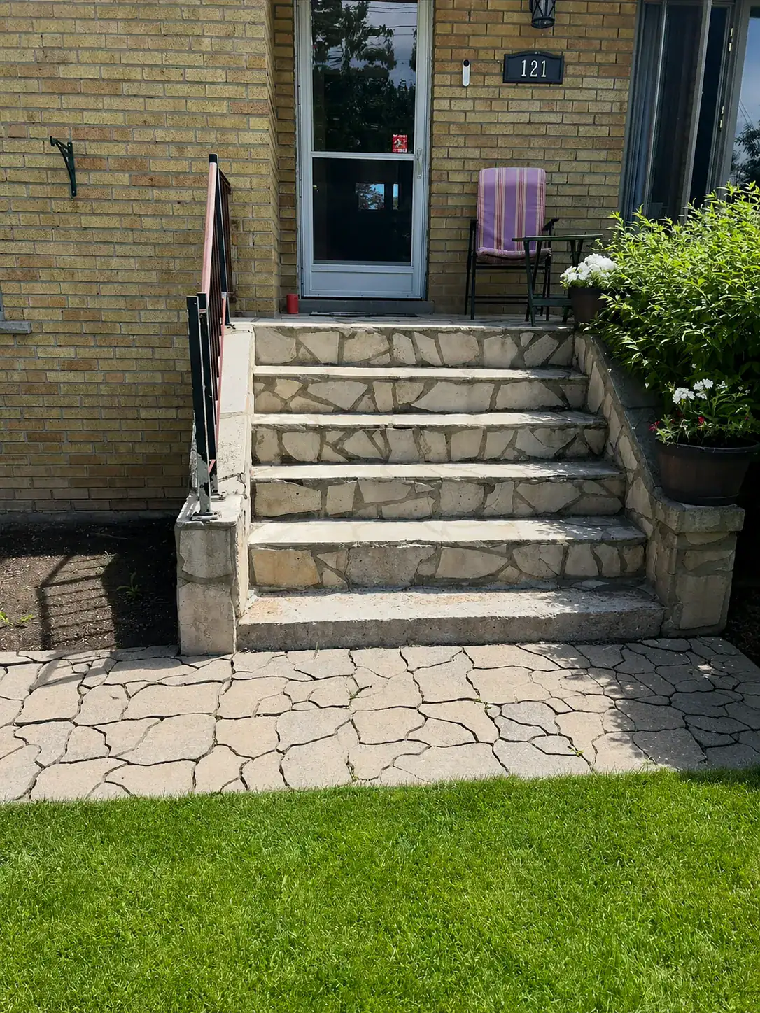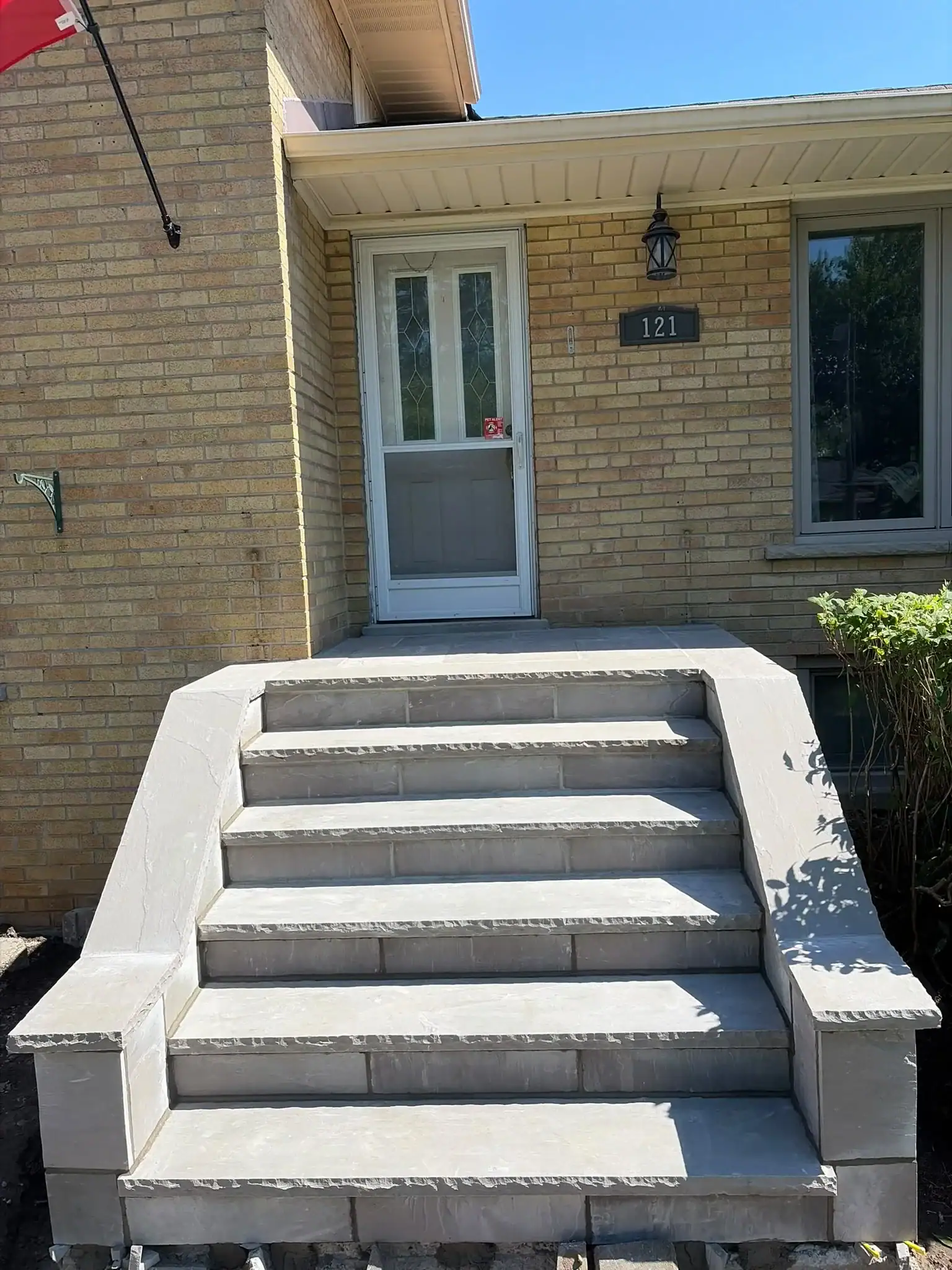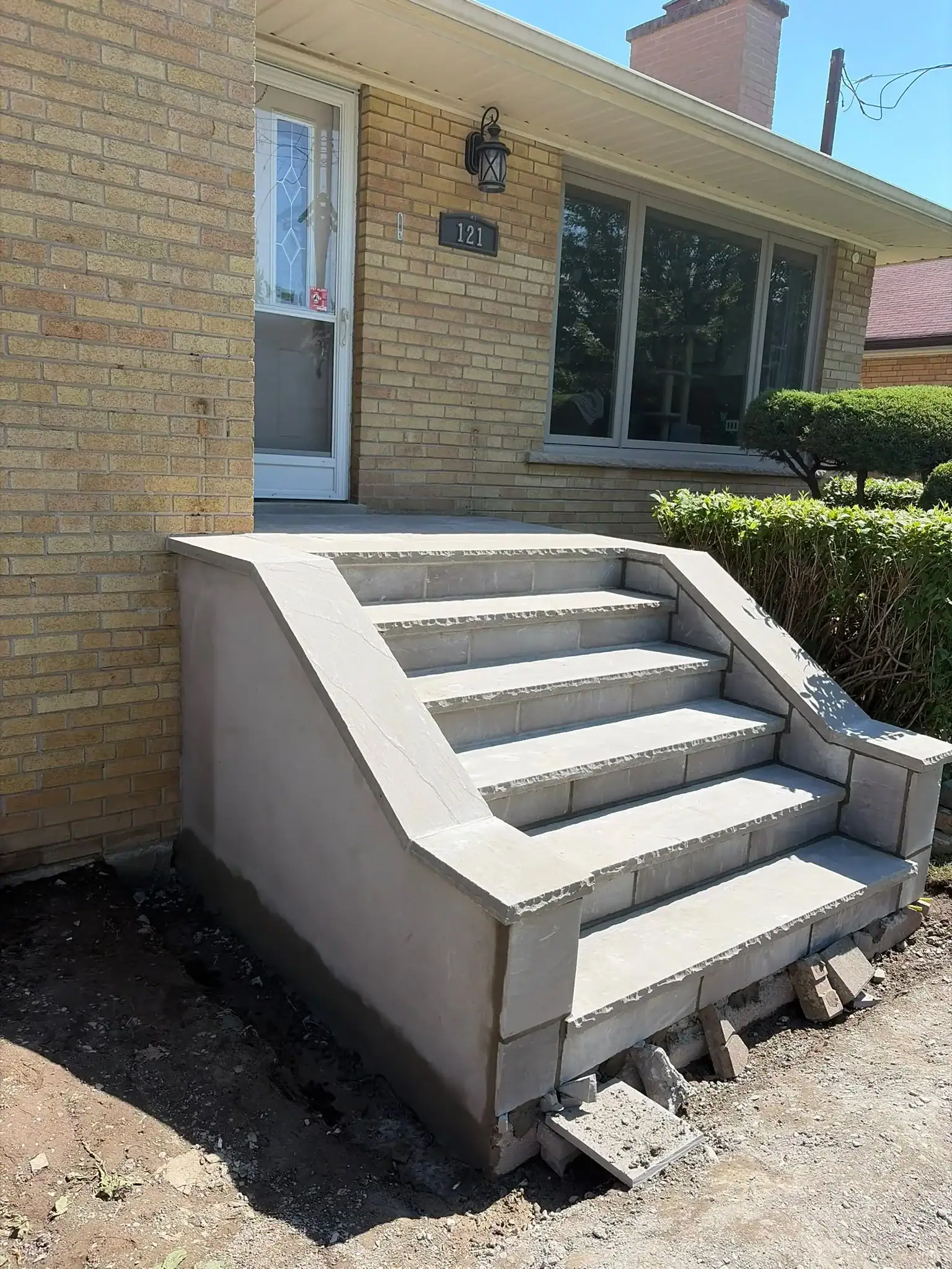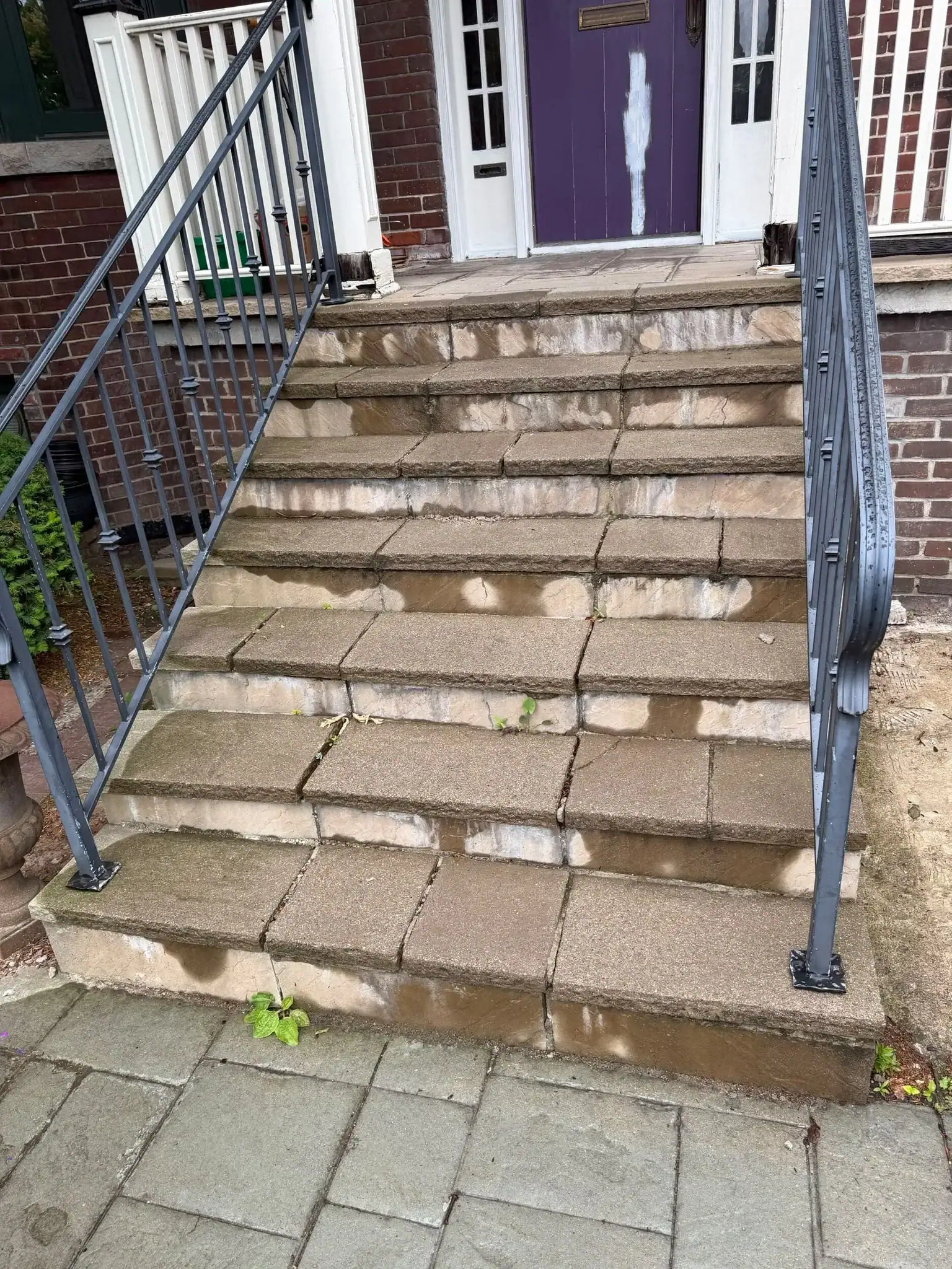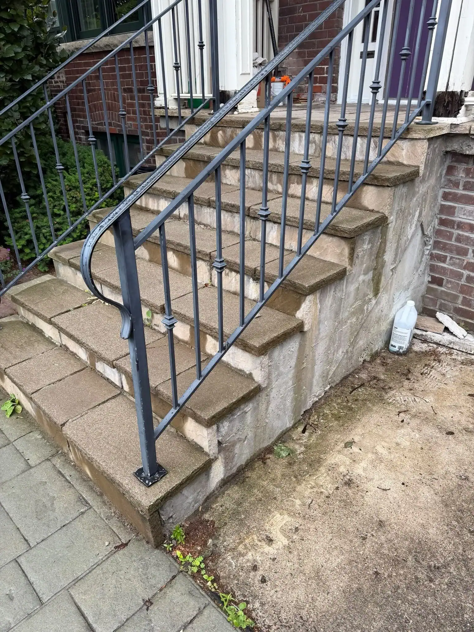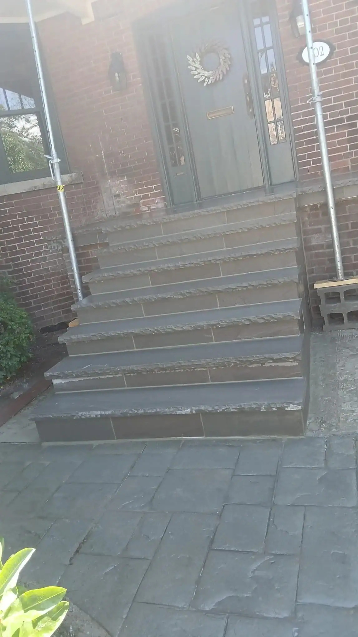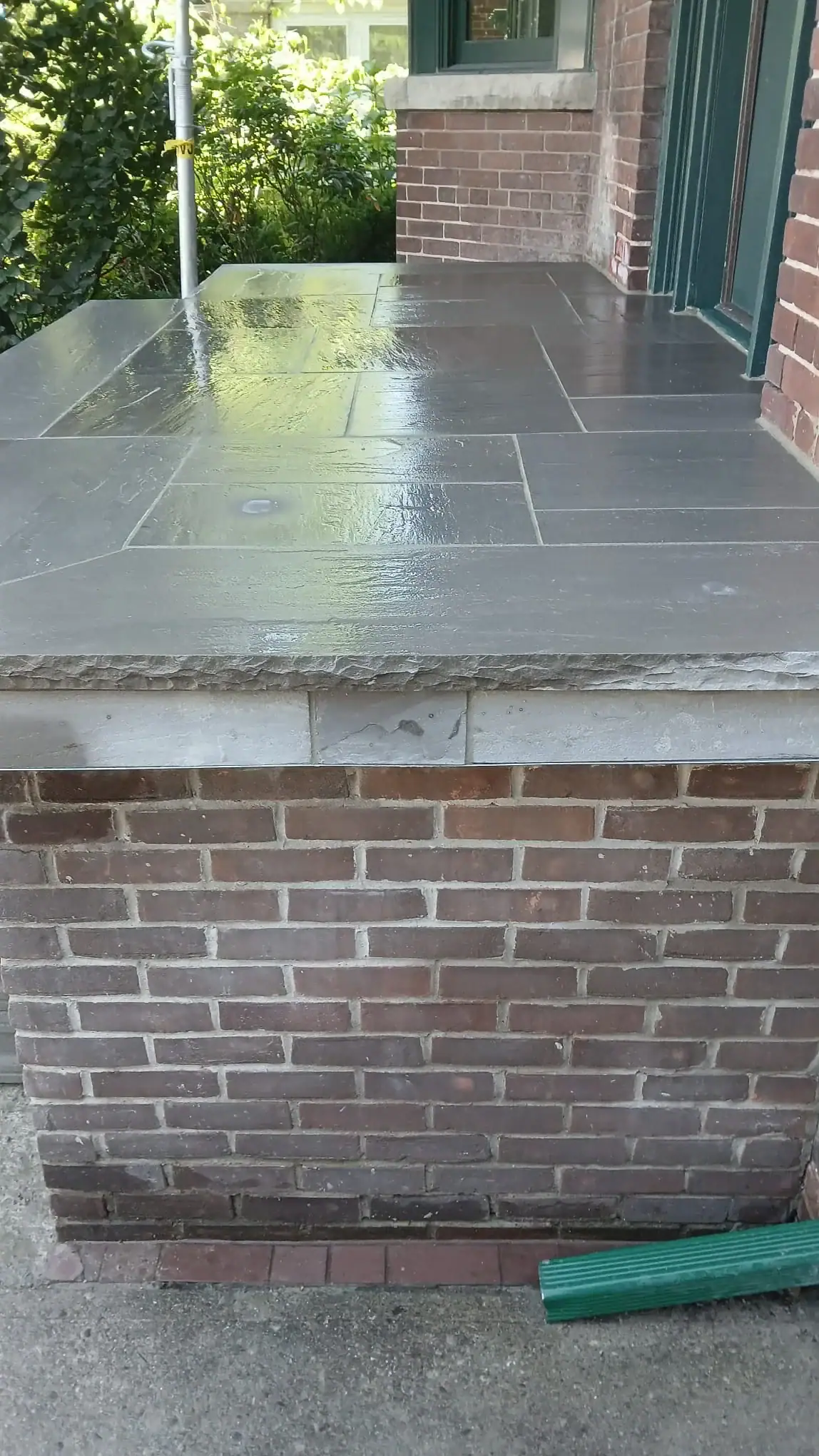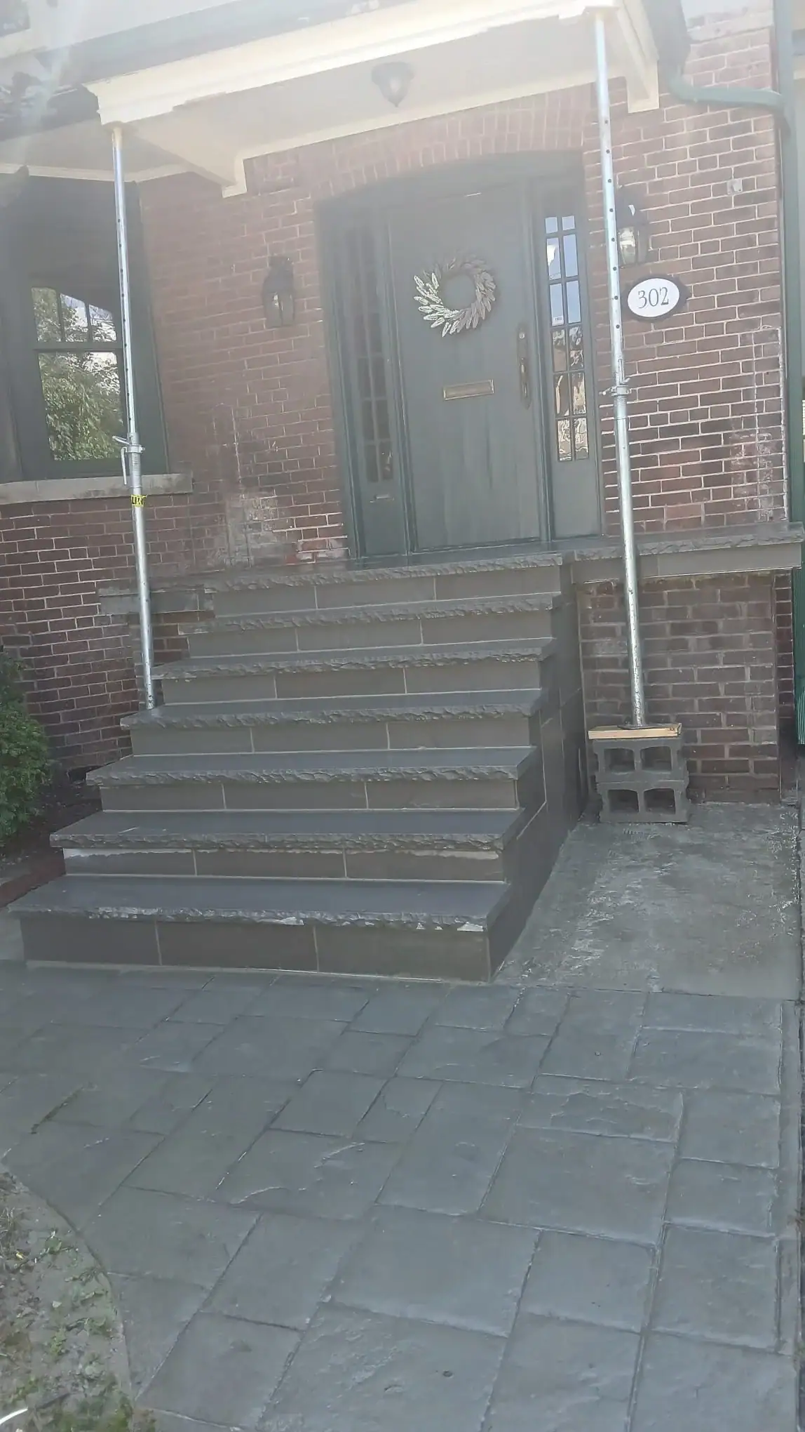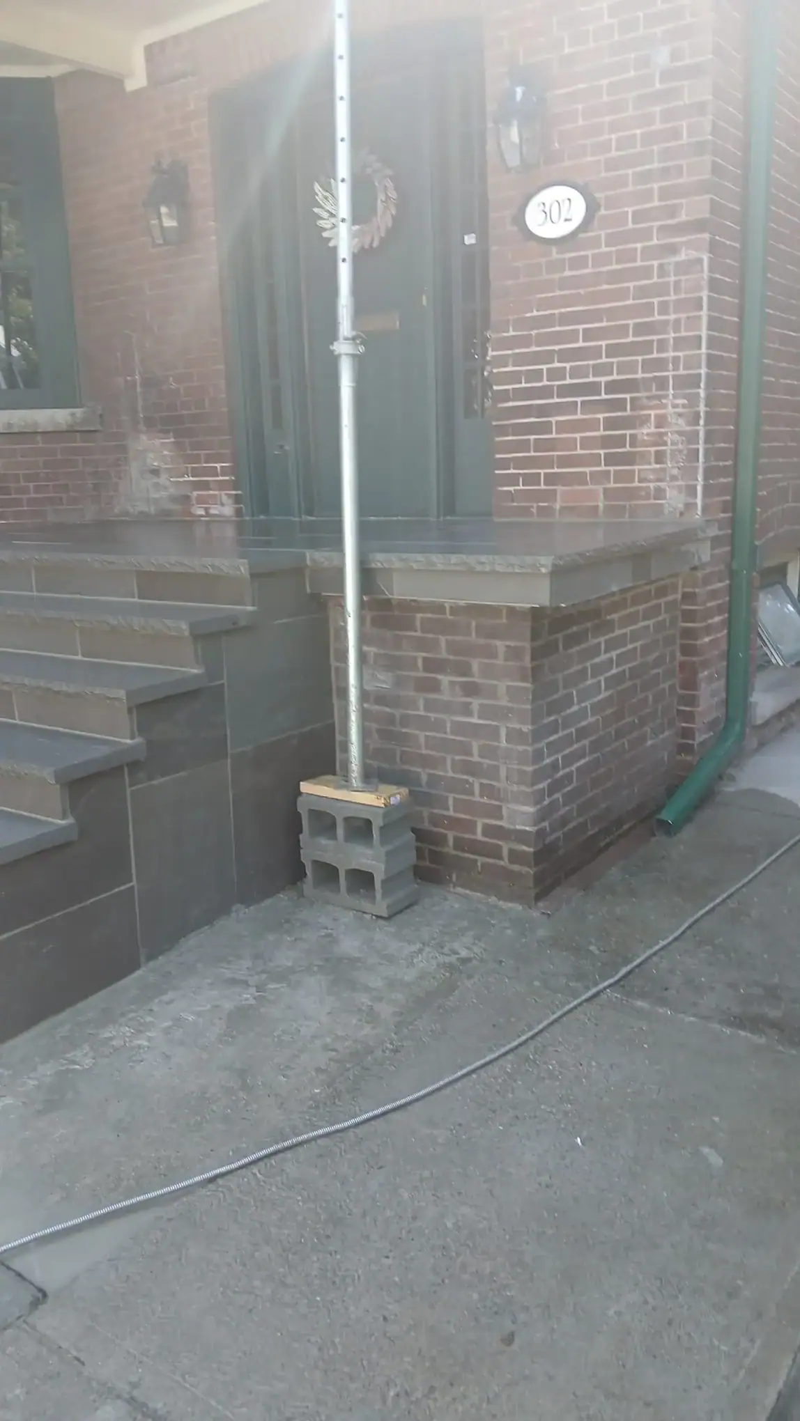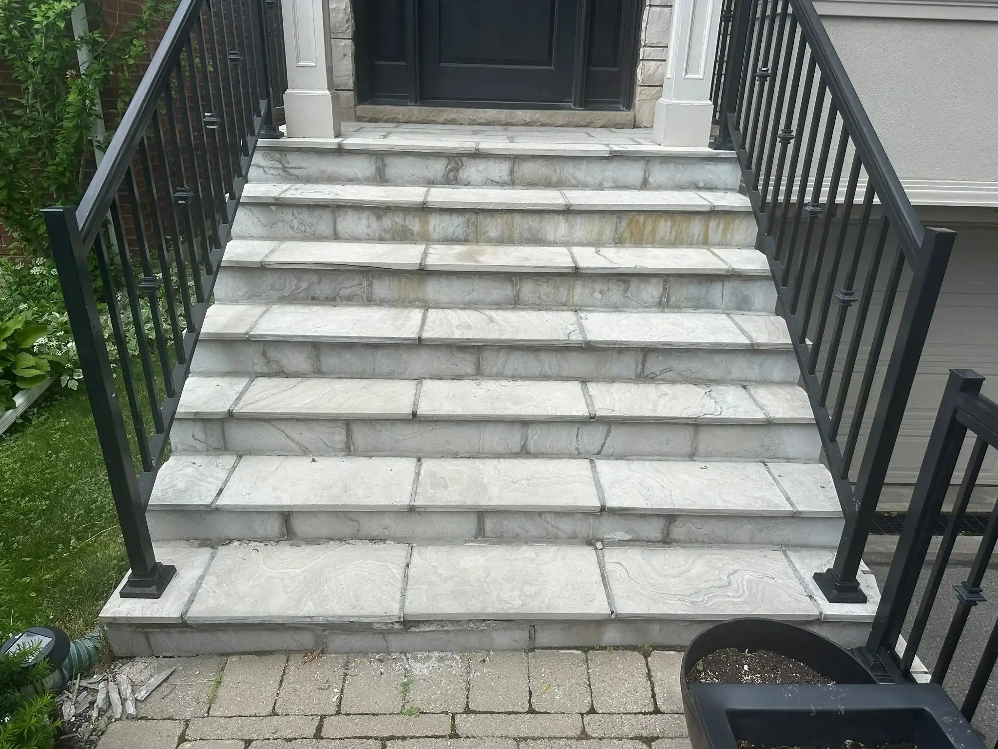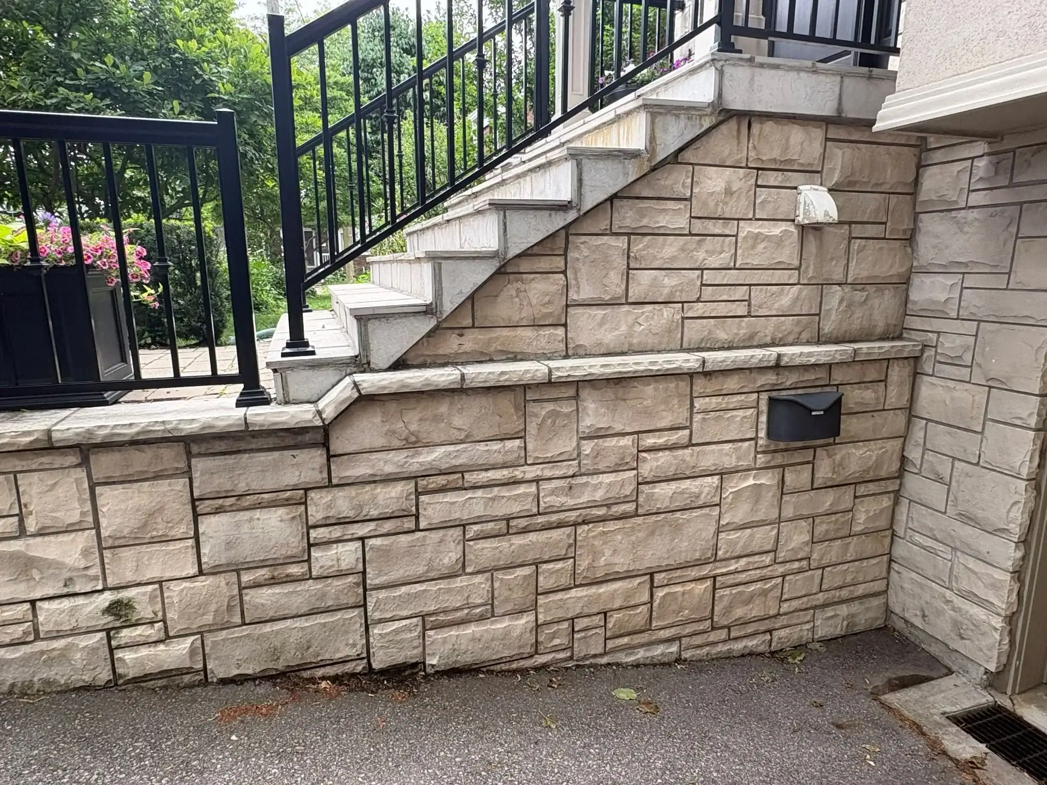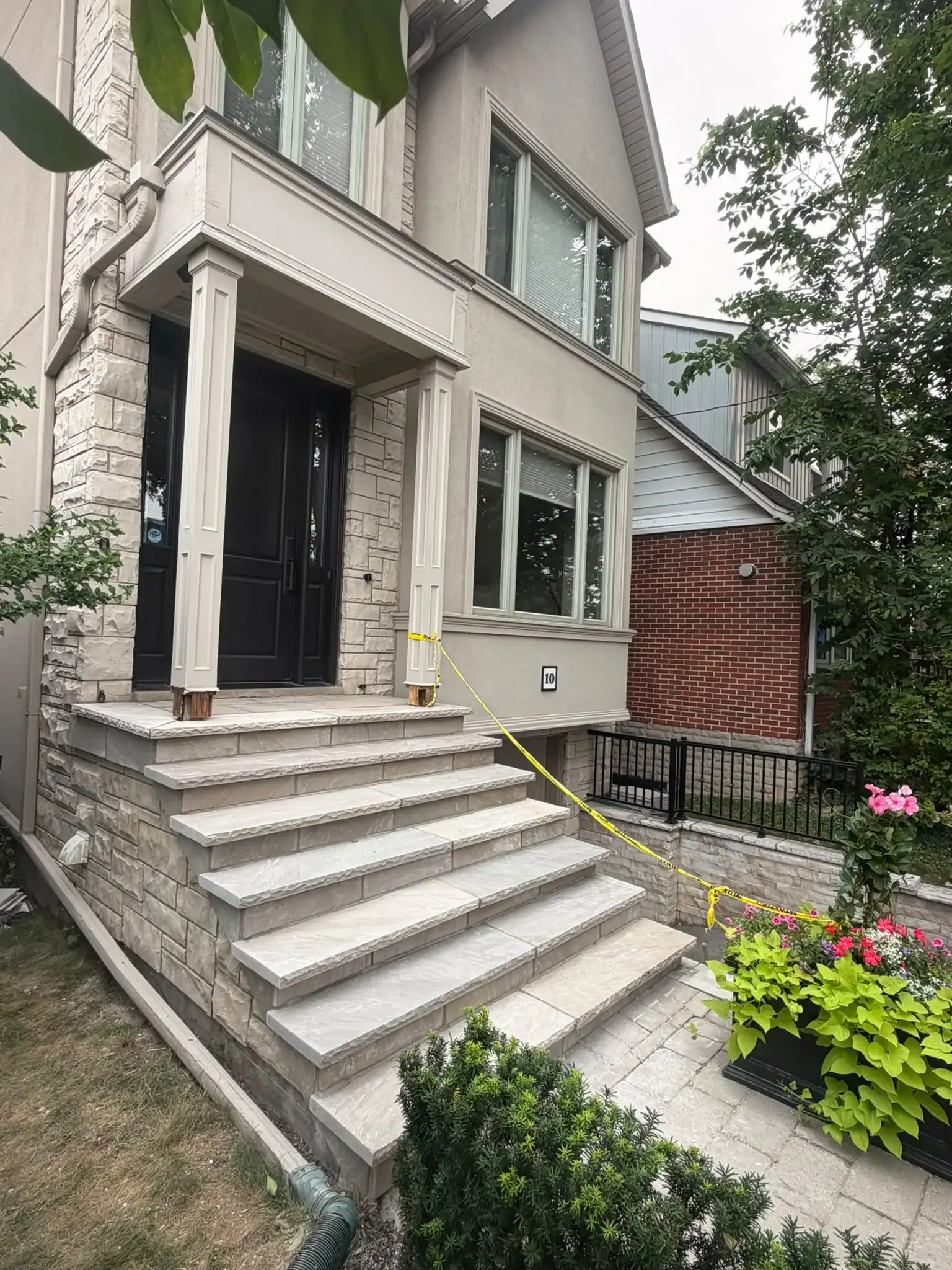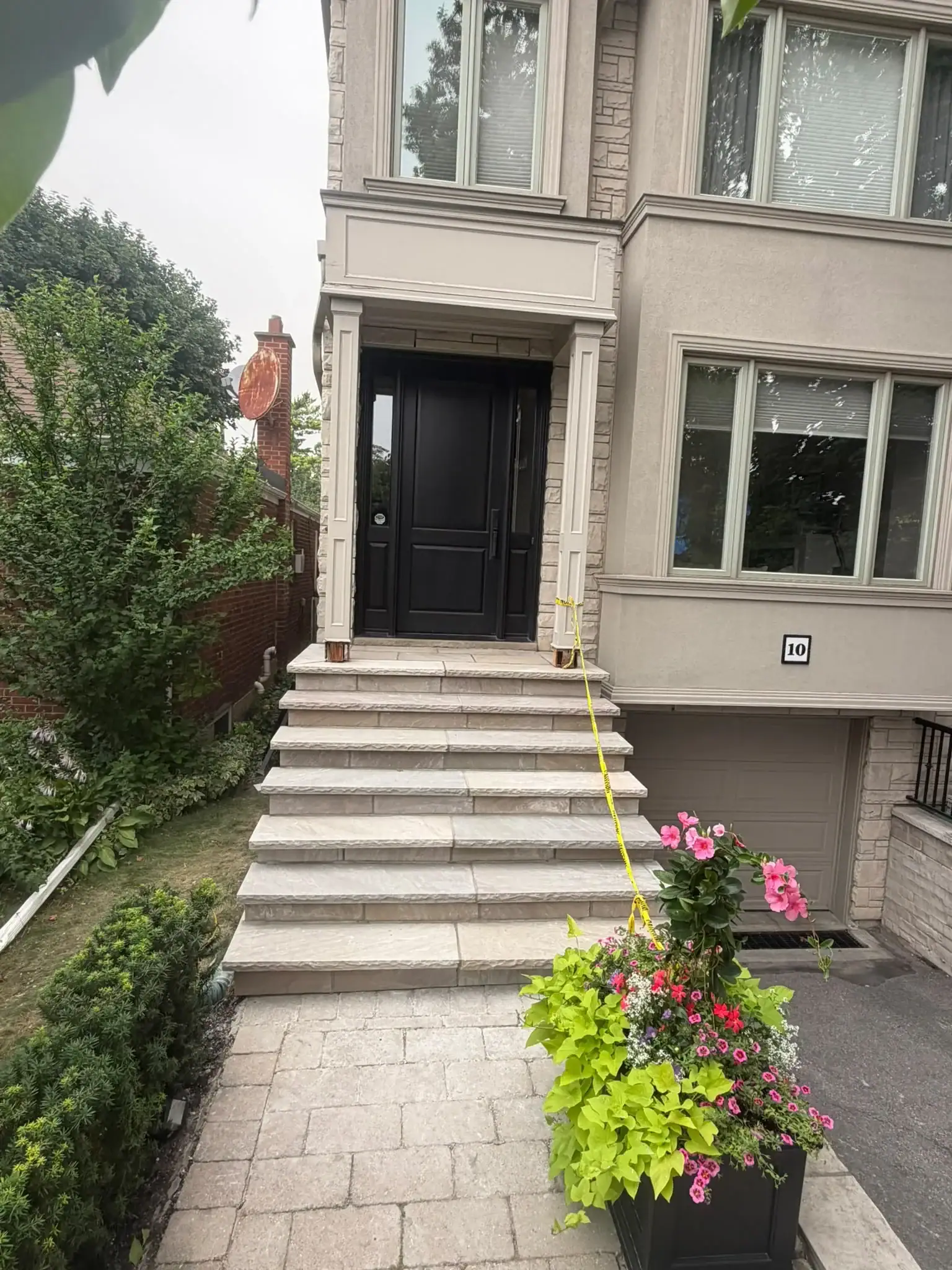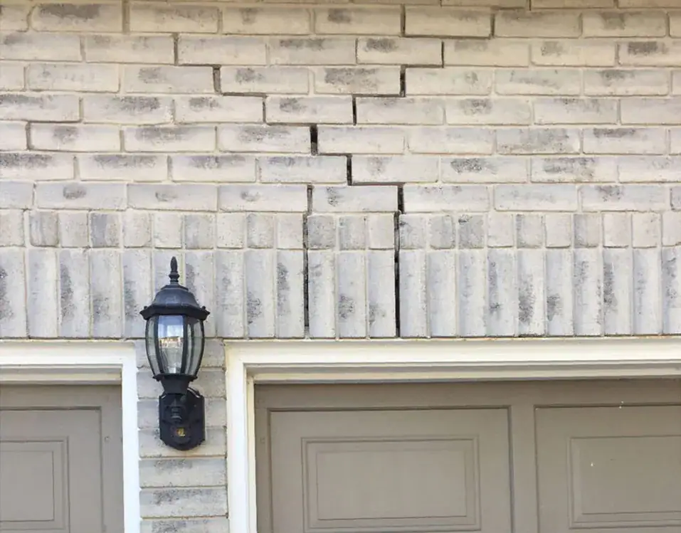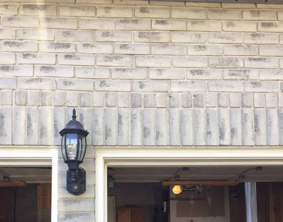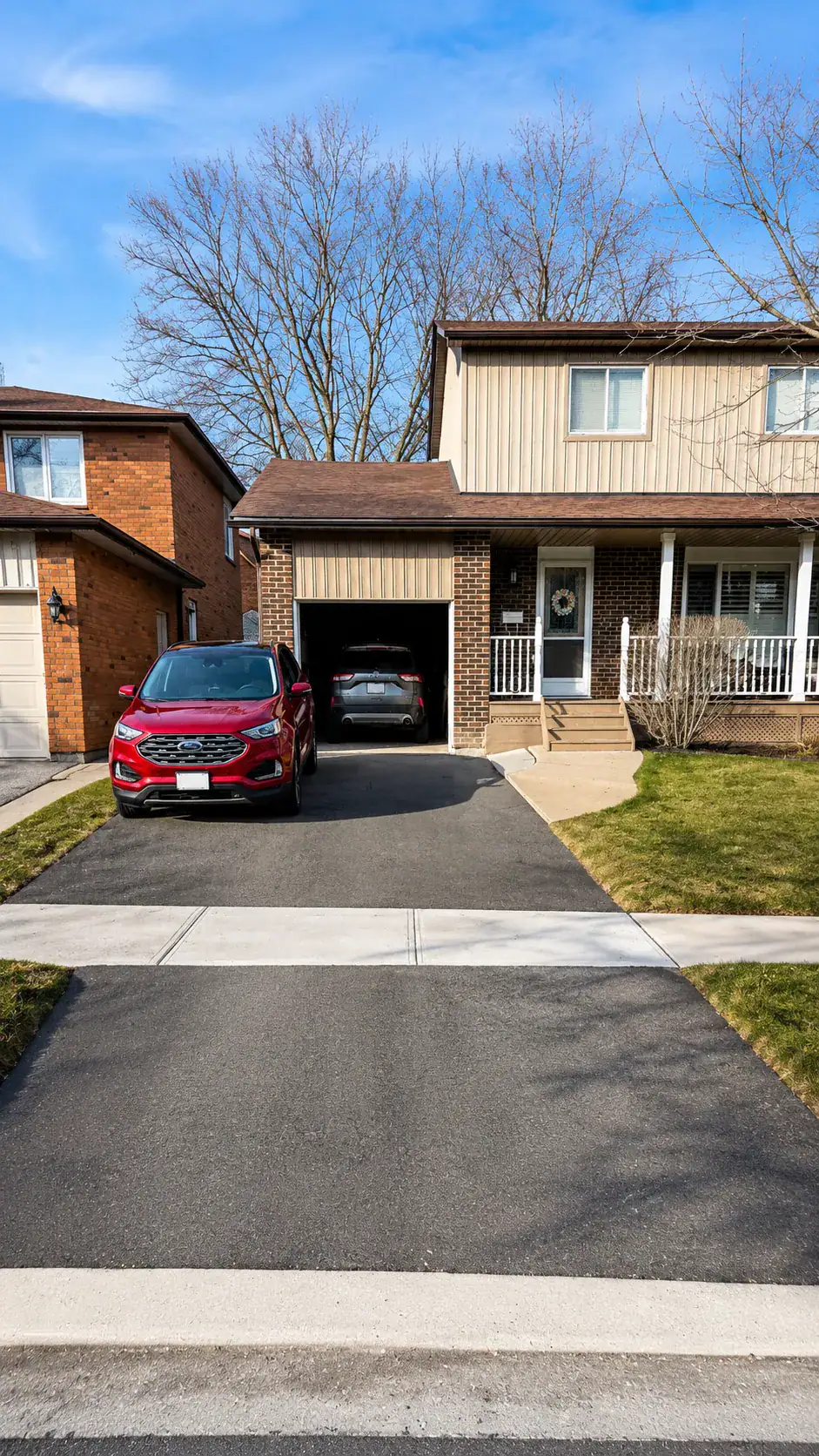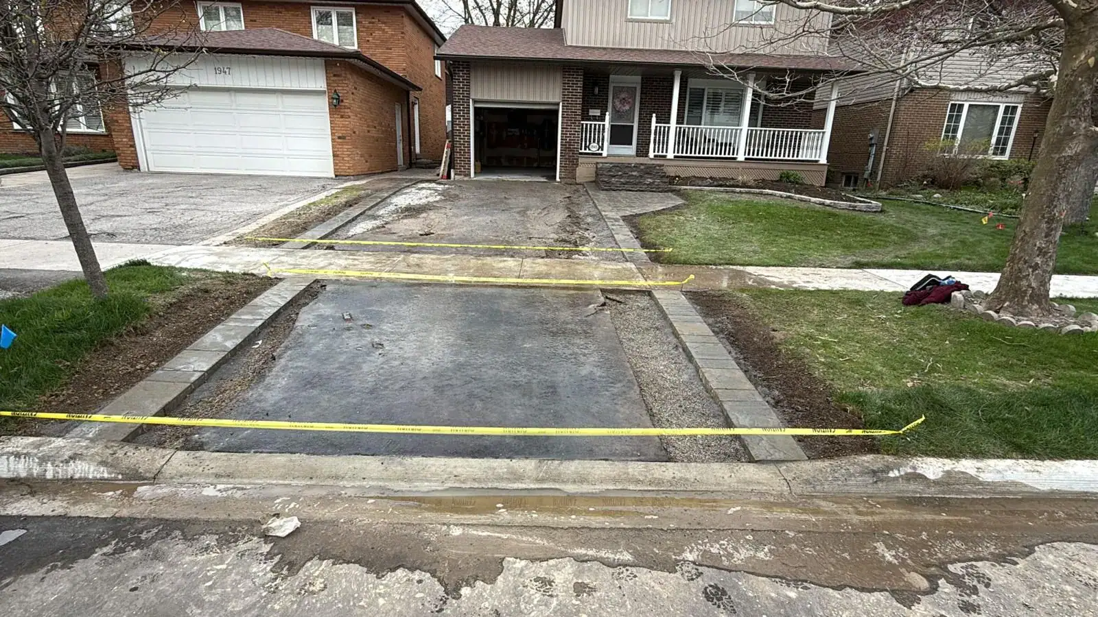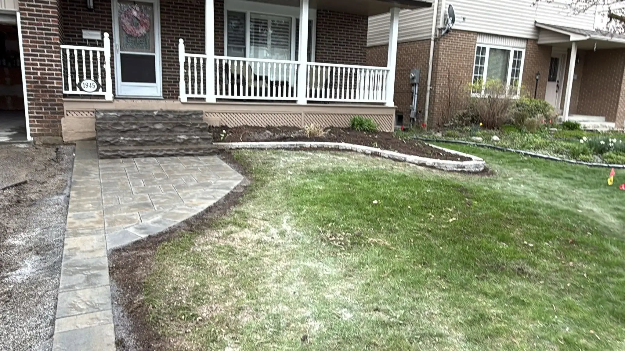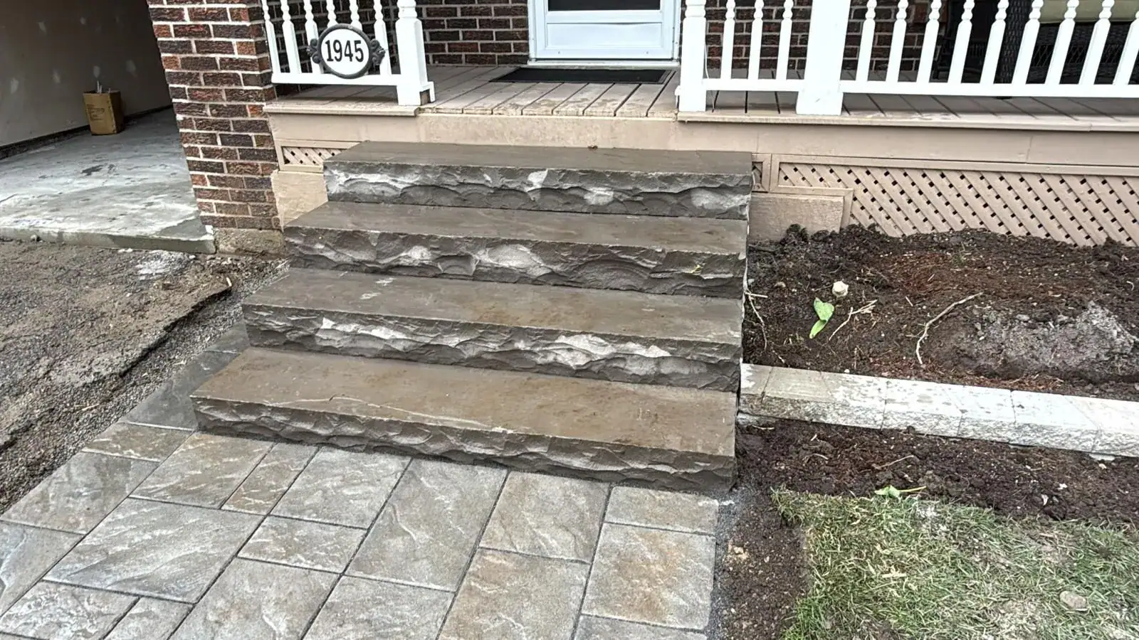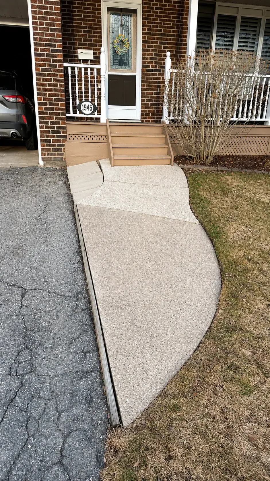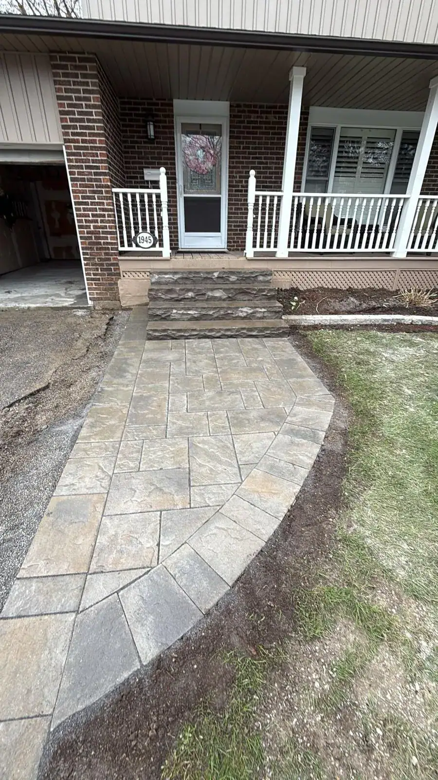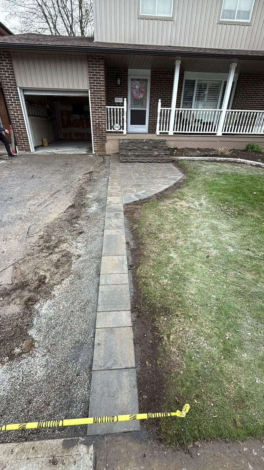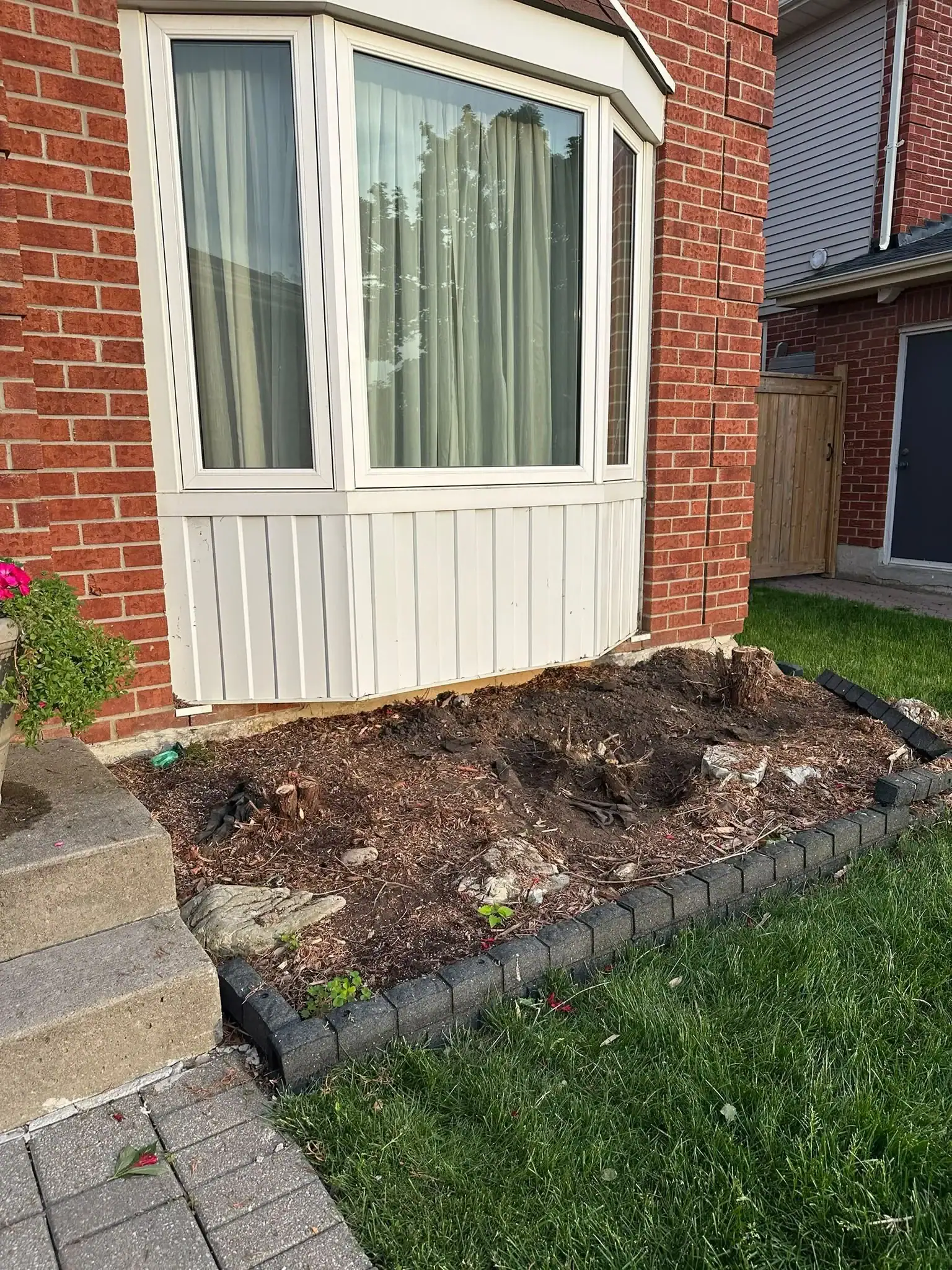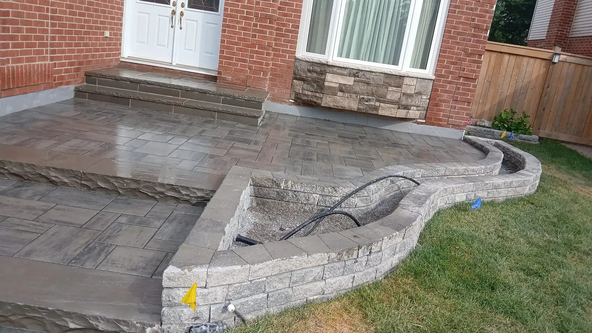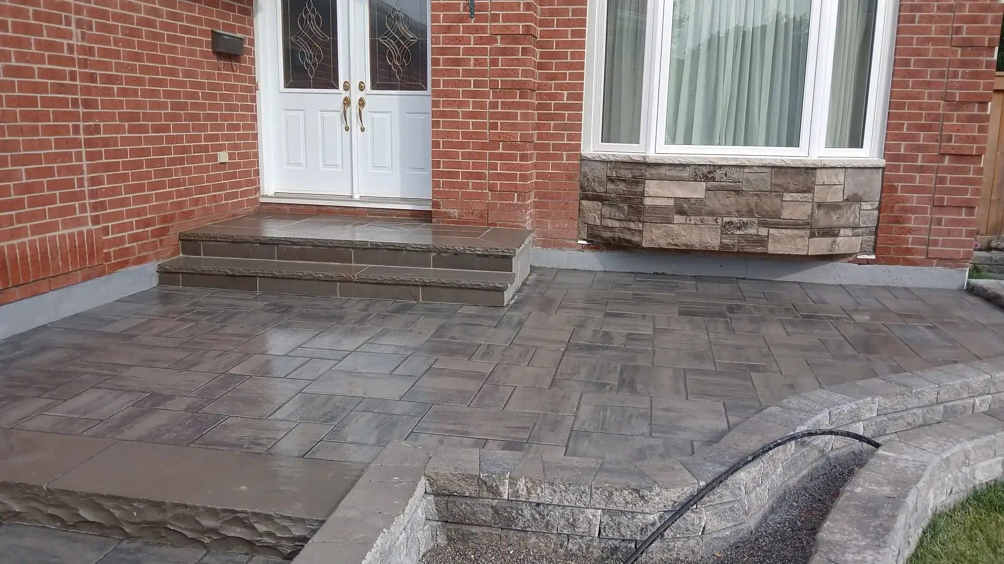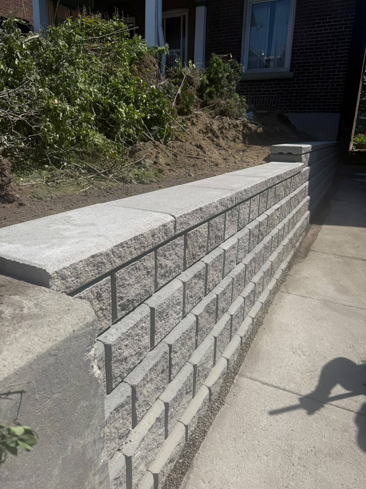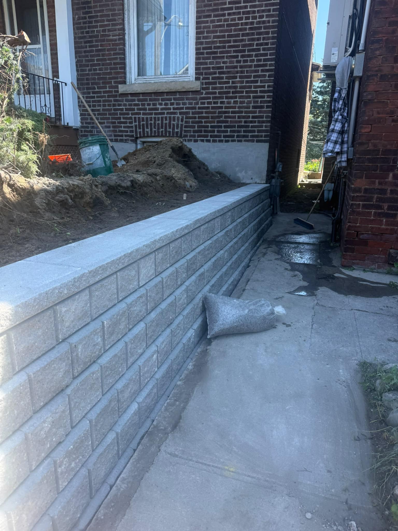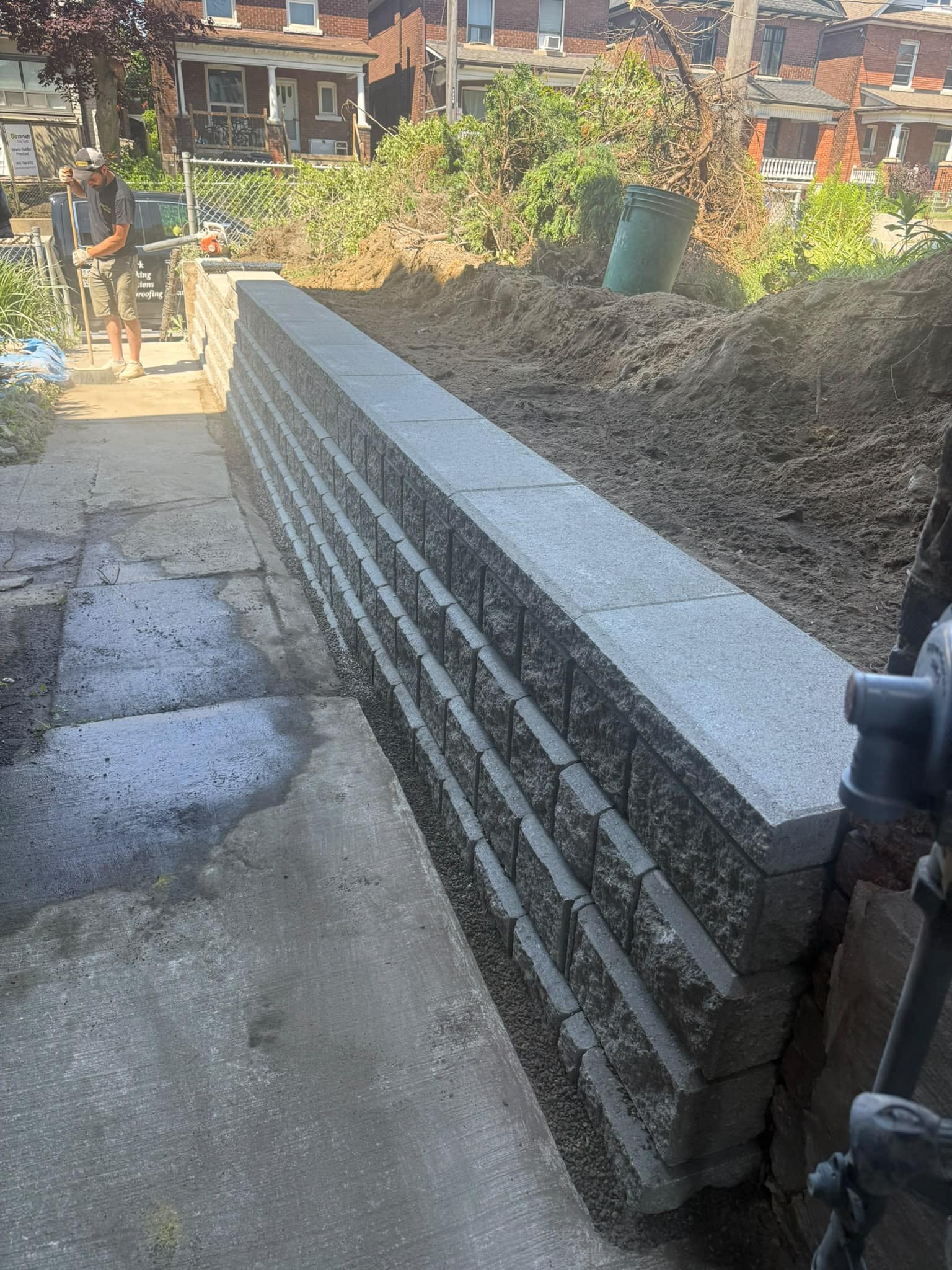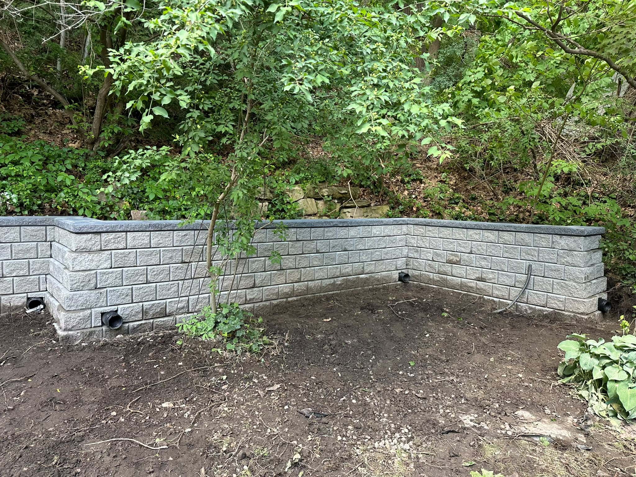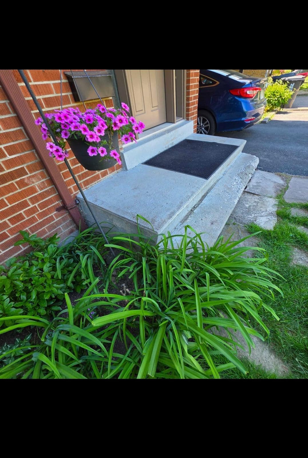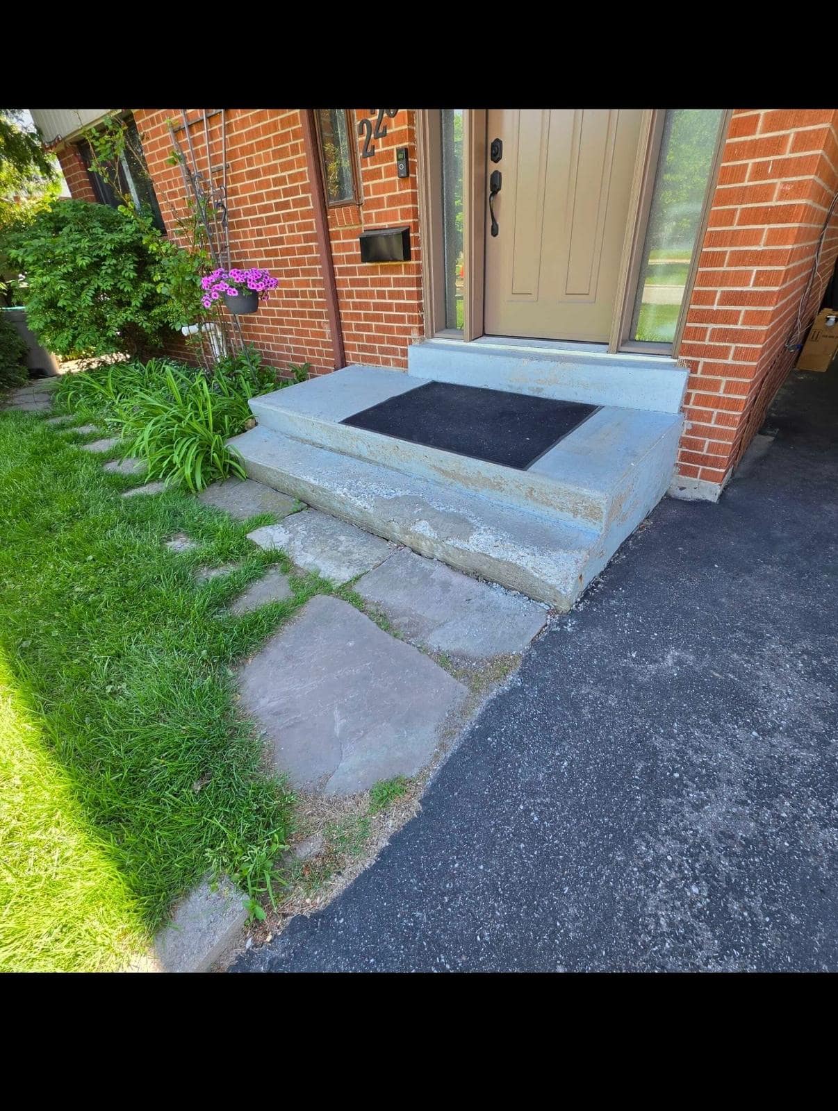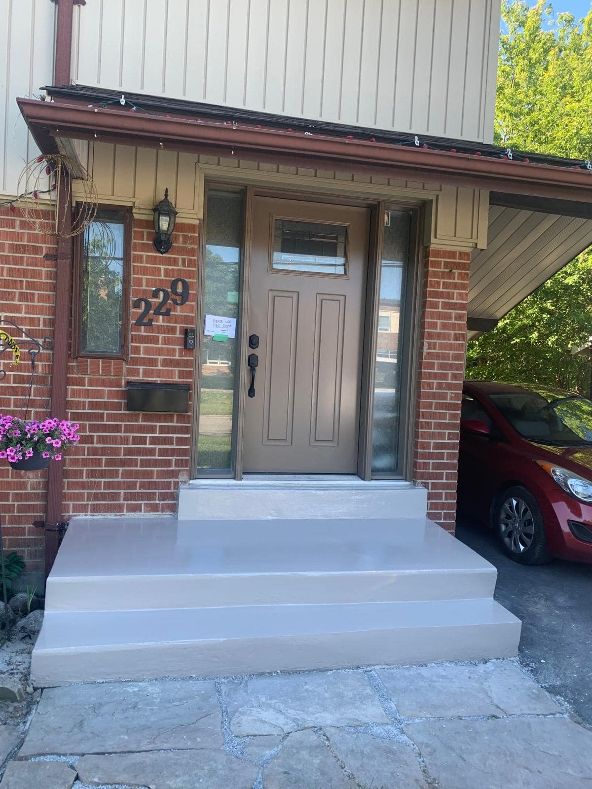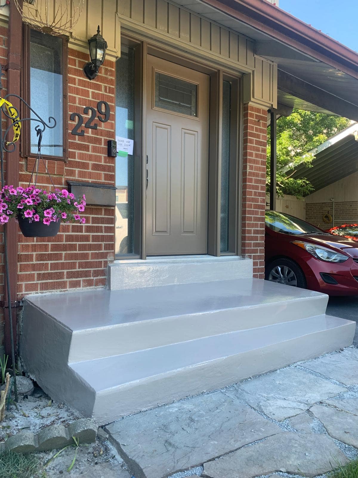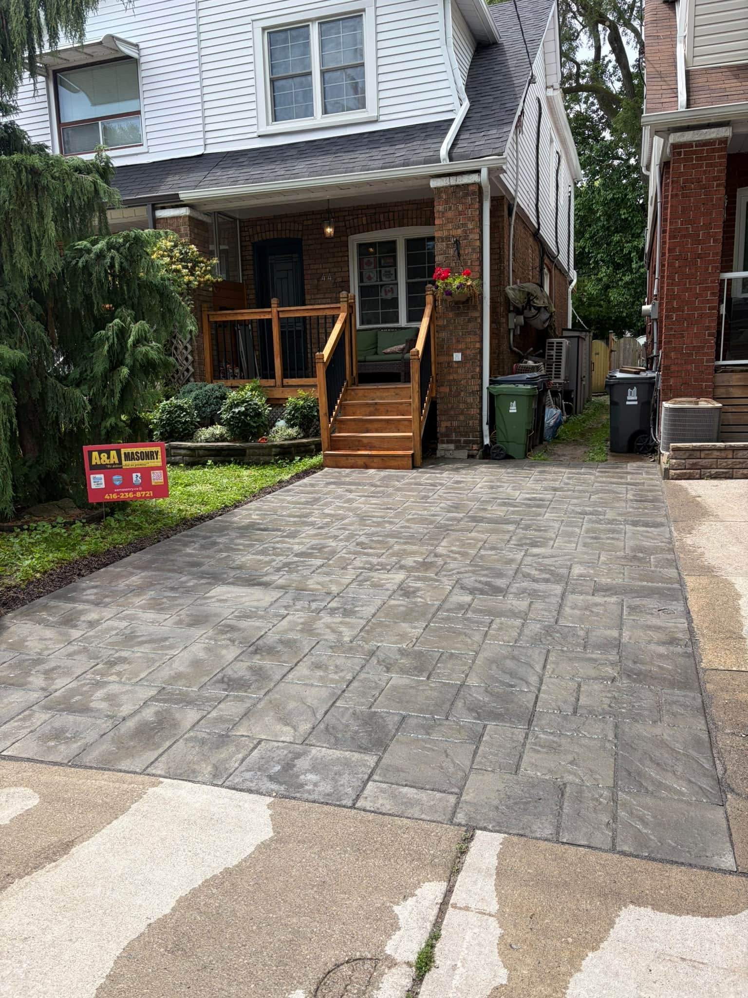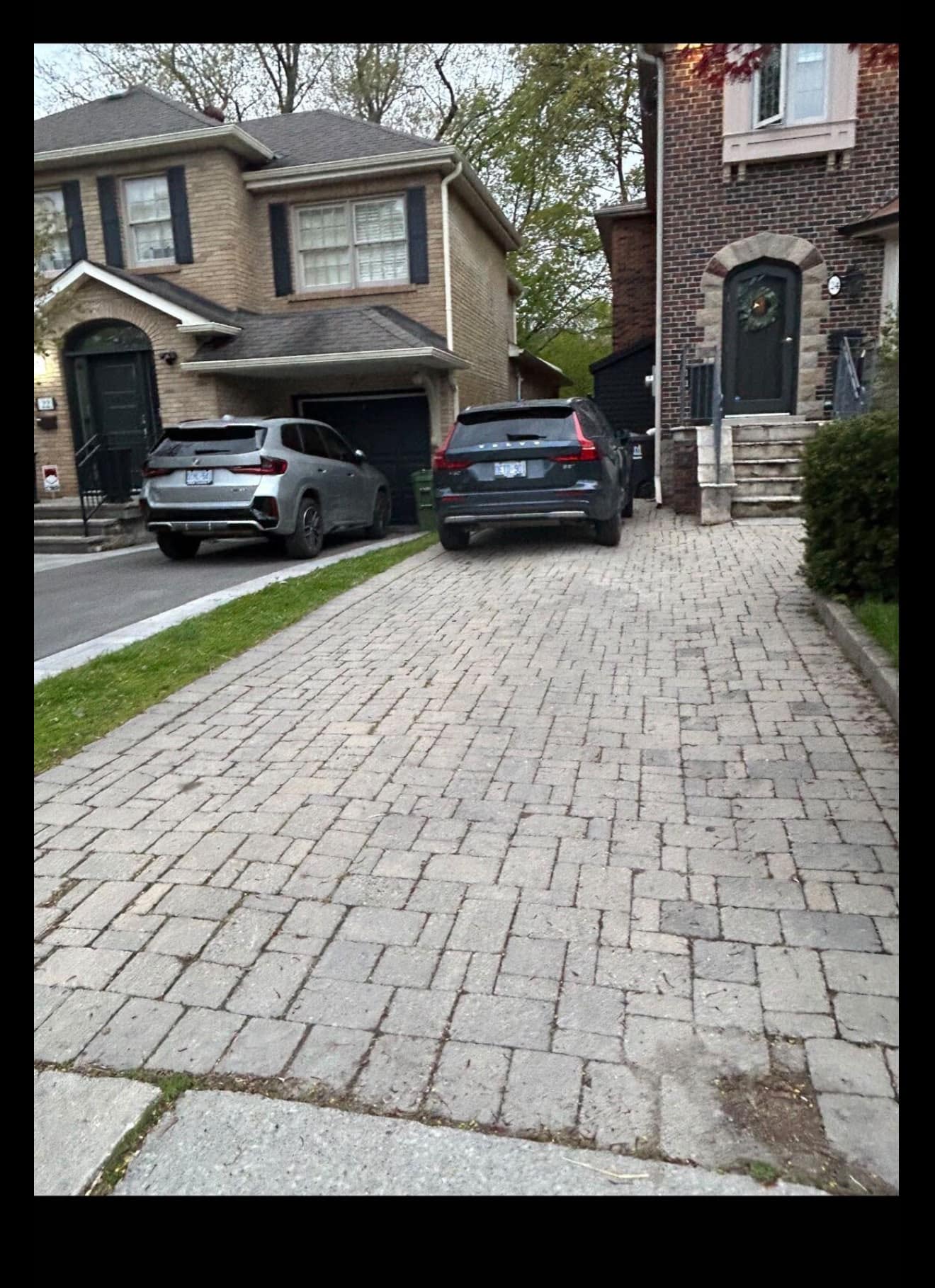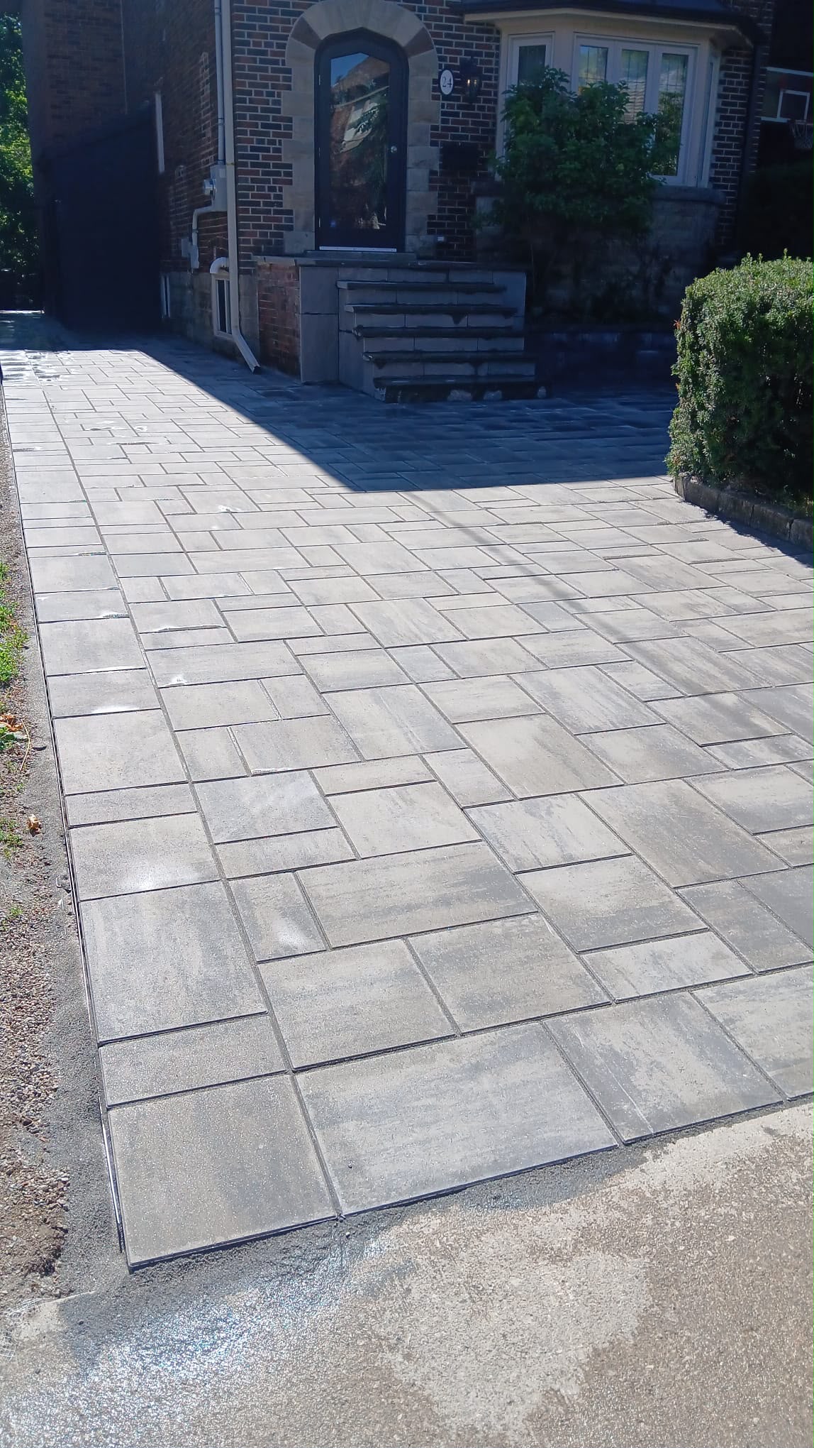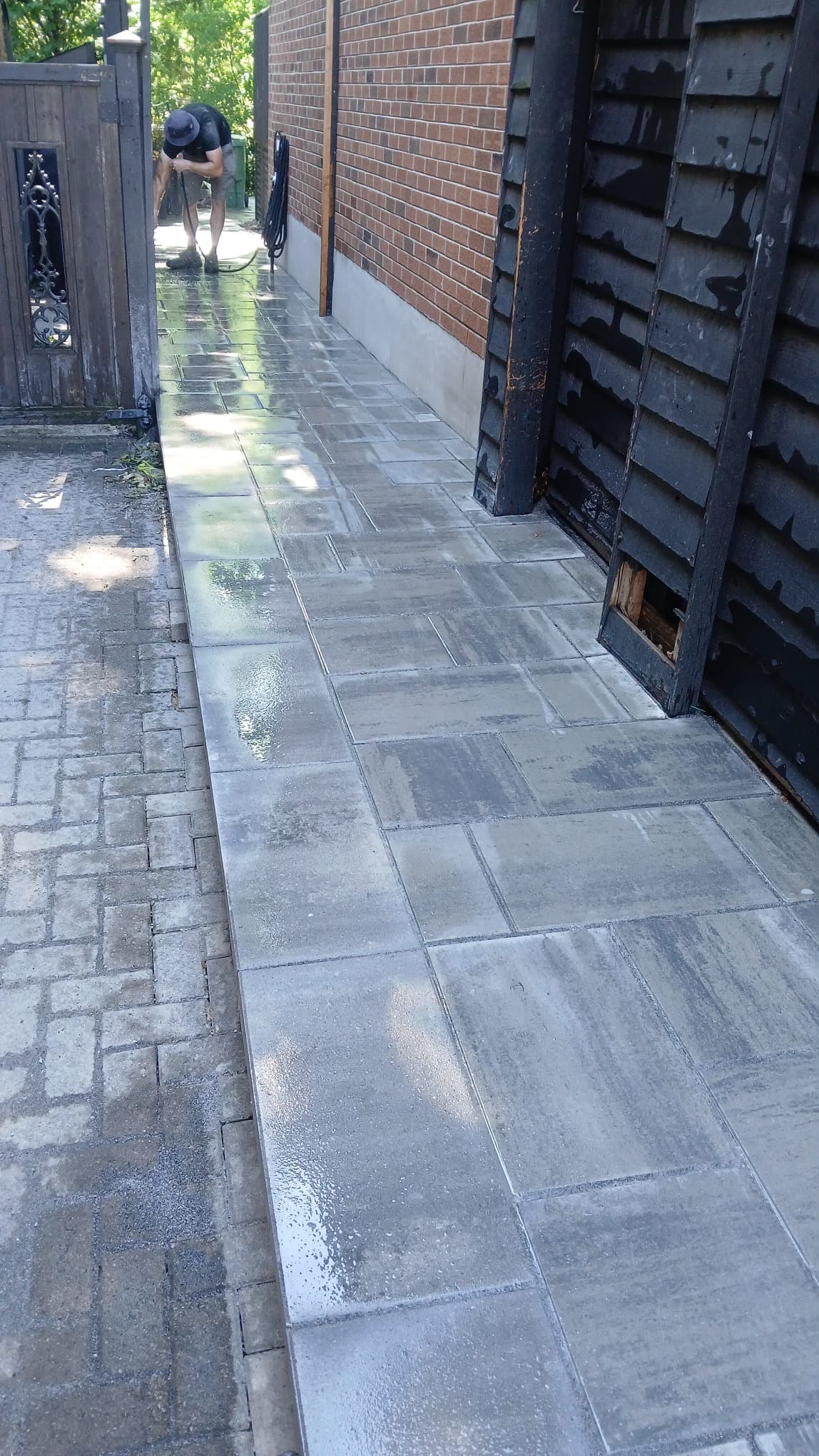

Brick and stone colours that complement Toronto homes usually work best when they respect the property’s age, style, roof colour, trim, landscaping, and surrounding neighbourhood character. The right colour does not need to be trendy or loud. It should make the home feel balanced, durable, and natural in its setting.
Toronto has a wide mix of home styles, from older red-brick houses and semi-detached homes to newer infill properties, stone-front houses, townhomes, and updated facades. That variety gives homeowners many design options, but it also makes colour selection easy to get wrong. A brick or stone colour that looks beautiful on a sample board can feel too harsh, too flat, too modern, or too mismatched once it is placed across a full wall, step, patio, chimney, or exterior feature.
The safest way to choose masonry colours is to start with the home itself. Look at what is already permanent: the roof, windows, doors, soffits, existing brick, stone, walkway, driveway, porch, and landscaping. Good masonry colour choices support those fixed elements instead of competing with them.
Why Masonry Colour Matters for Toronto Homes
Masonry colour matters because brick and stone are not easy to change once installed. Paint colours can be adjusted more easily. Landscaping can be refreshed. But exterior brickwork, stone veneer, steps, chimneys, retaining walls, and interlocking surfaces are long-term choices. A poor colour match can affect curb appeal for years.
In Toronto, masonry colour also affects how well a home fits its street. Many neighbourhoods have strong visual patterns, especially where older brick homes, heritage properties, and established streetscapes are common. Red brick, buff brick, limestone tones, grey stone, brown brick, and mixed natural stone all appear across the city in different settings.
Some areas also have heritage considerations. The City of Toronto’s Heritage Grant Program notes that eligible heritage conservation work can include repairs to defining heritage attributes such as masonry, windows, doors, wood detailing, and slate roofs. Homeowners with designated heritage properties should be careful before changing visible masonry colours, finishes, or materials. You can review the City’s Heritage Grant Program information for context.
Even when a home is not heritage-designated, colour still affects long-term value. Masonry should feel like it belongs to the house, not like an update added without thought.
Start With the Existing Brick or Stone
The existing masonry should guide the colour decision because it is usually the largest visual element on the exterior. If your home already has brick walls, a stone foundation band, a masonry chimney, or an older front porch, start there before choosing new materials.
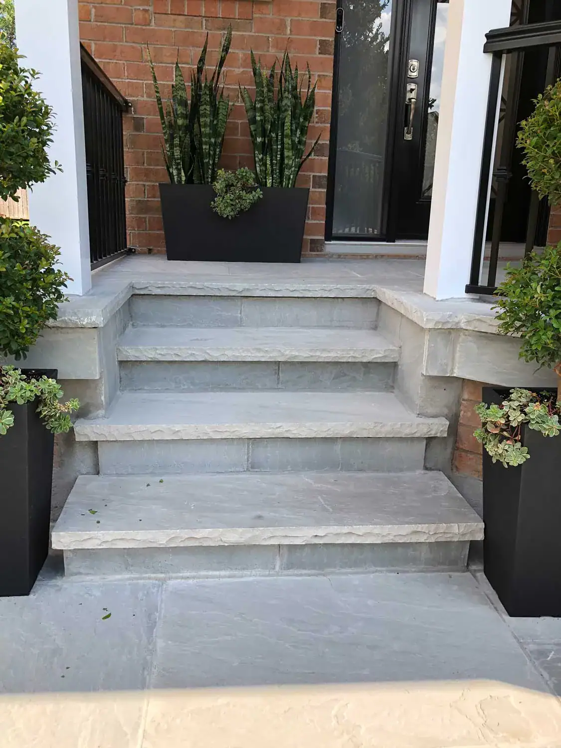
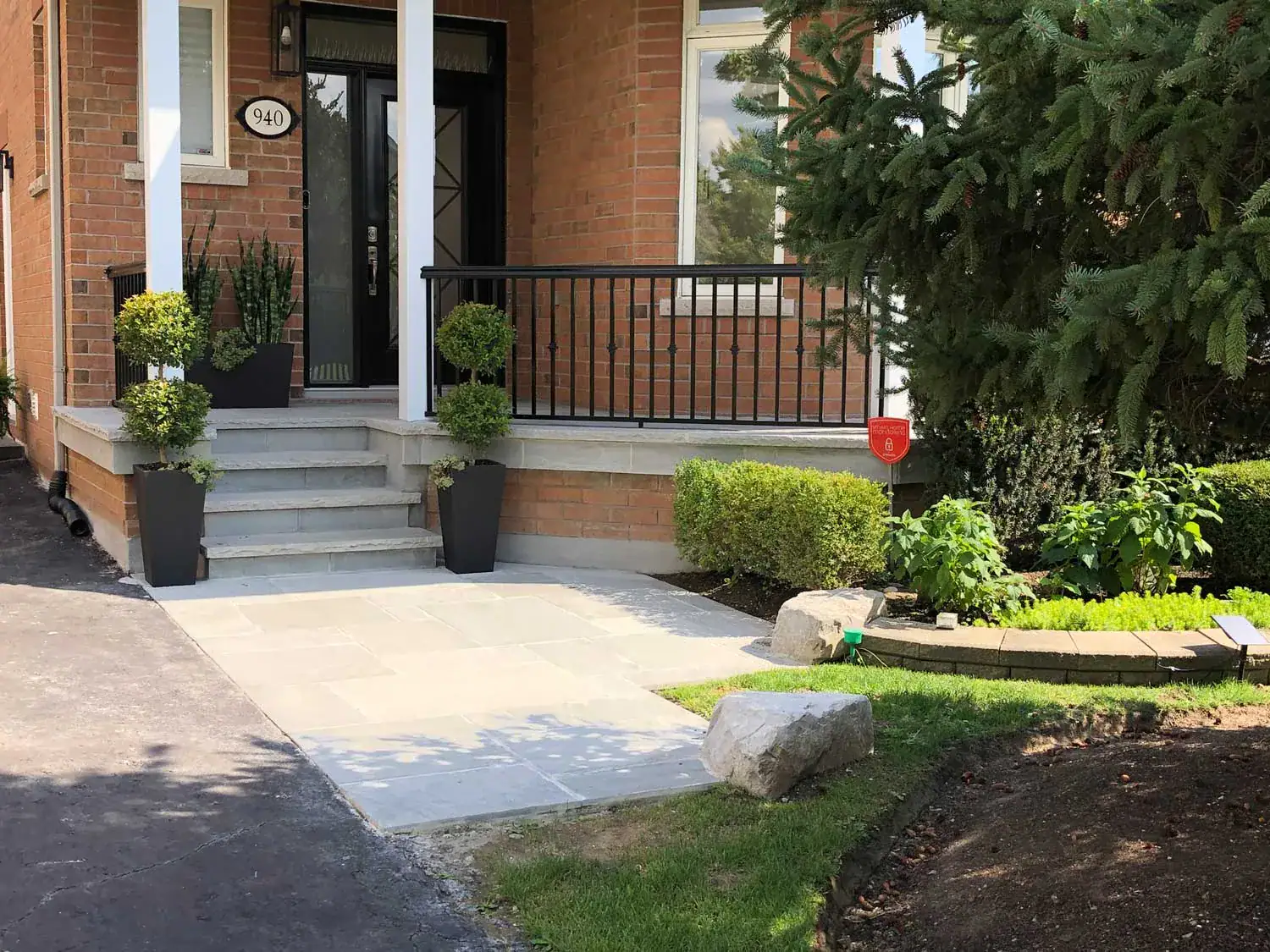
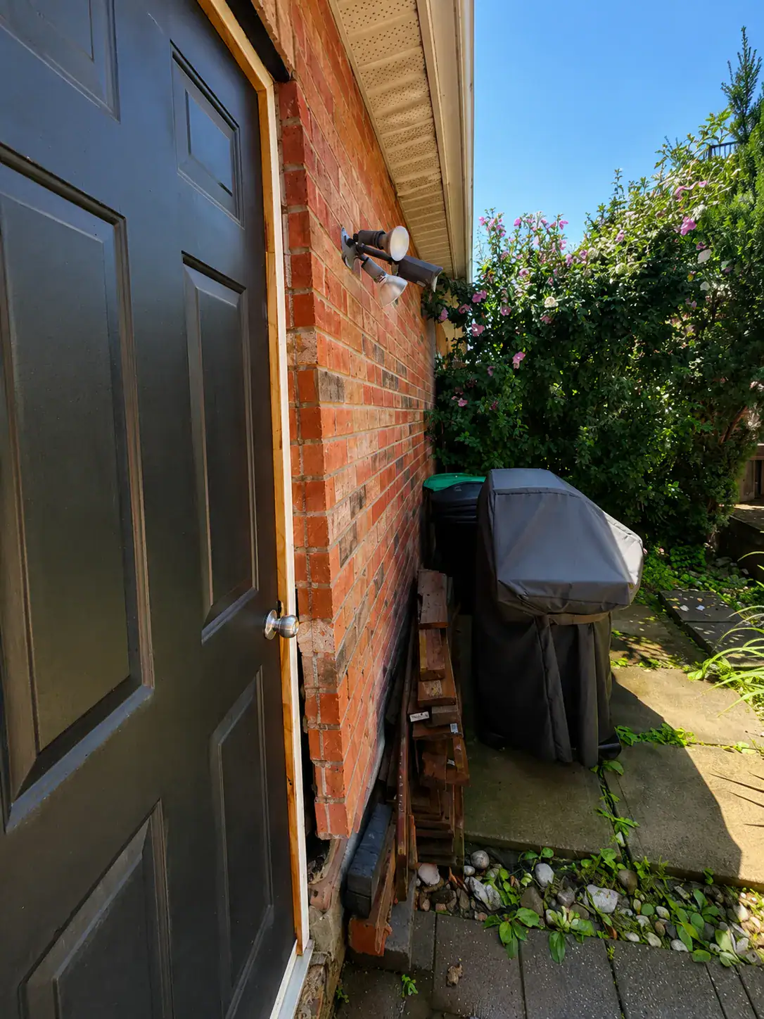
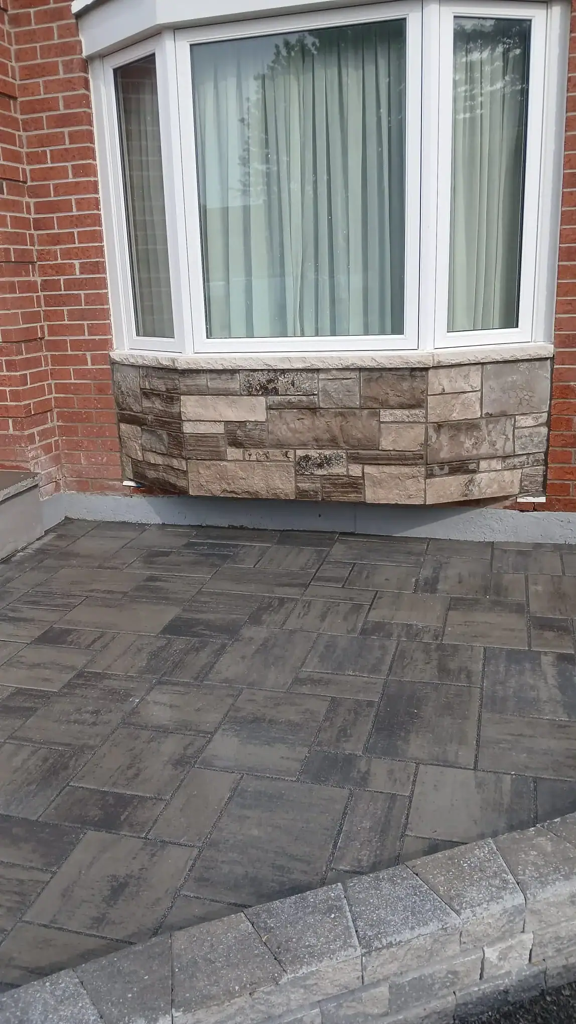
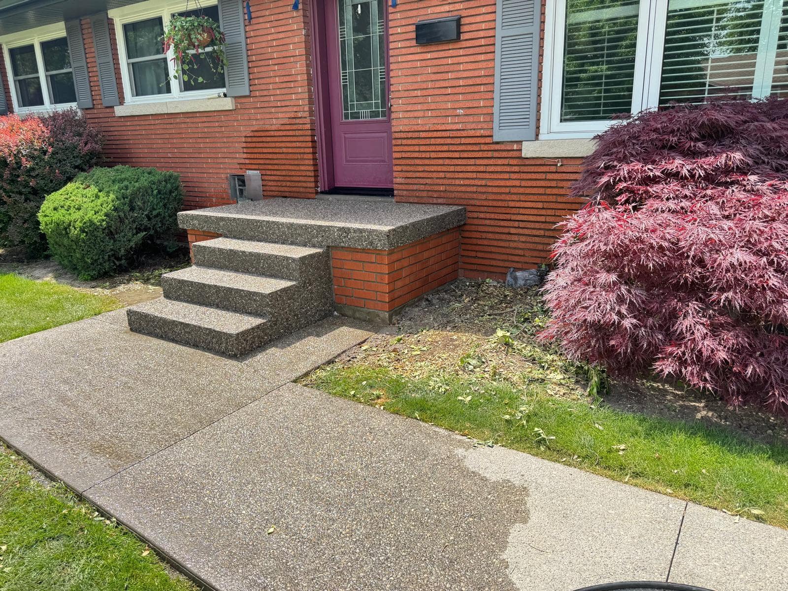
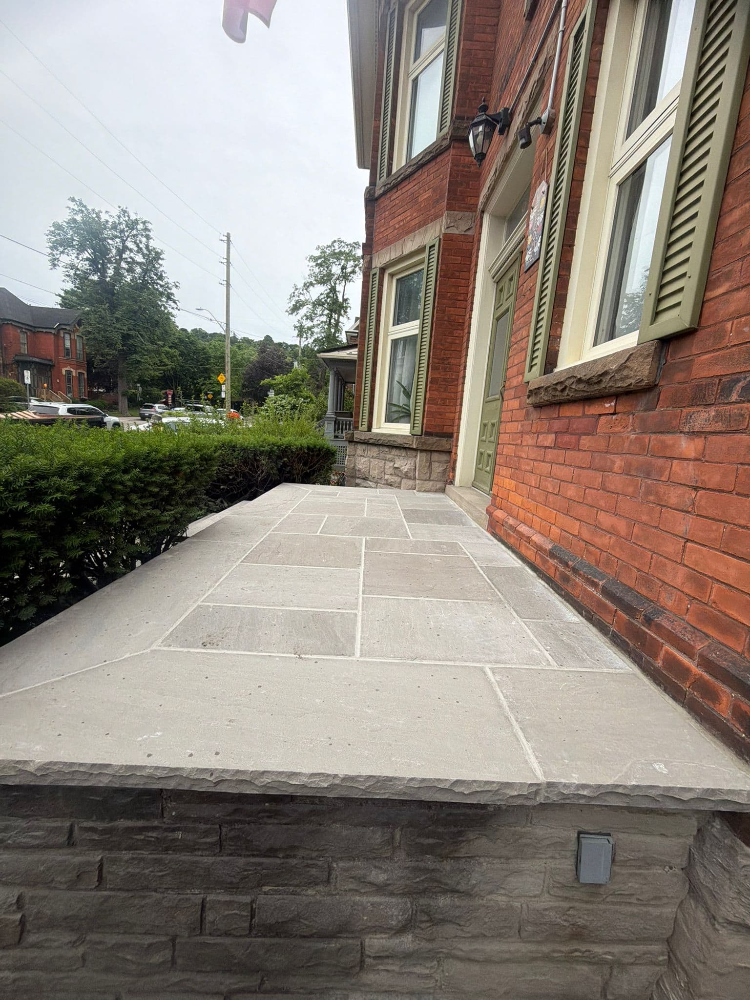
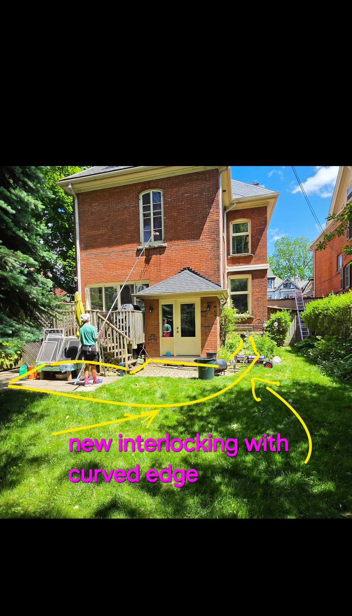
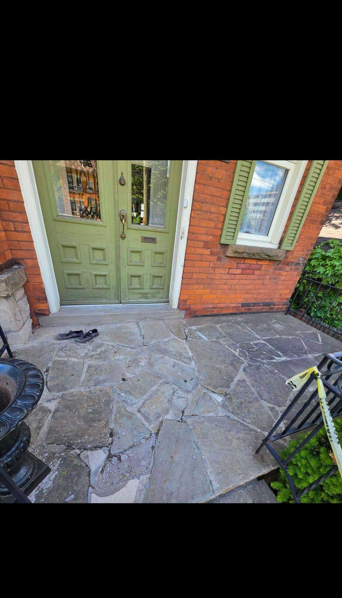
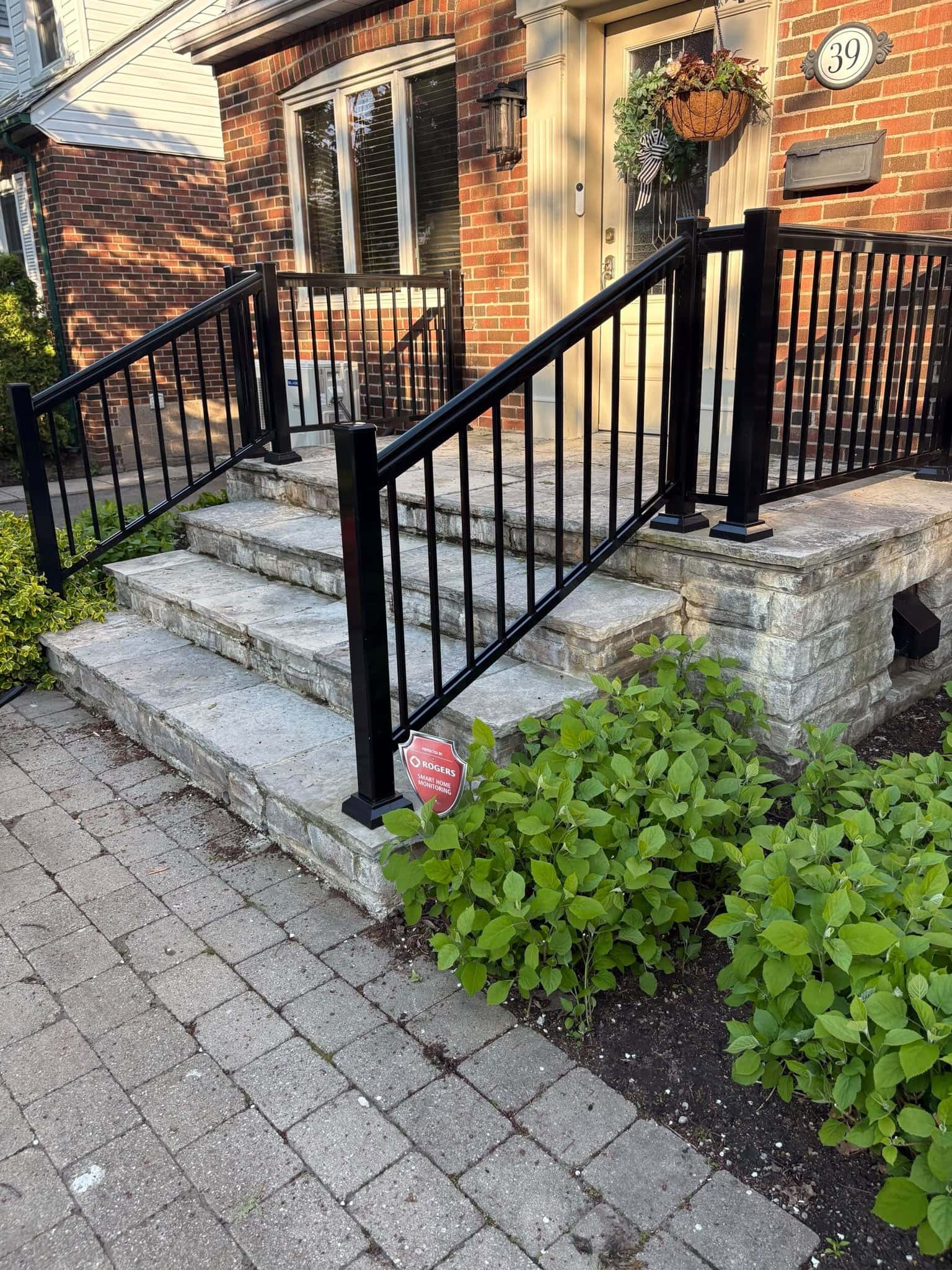
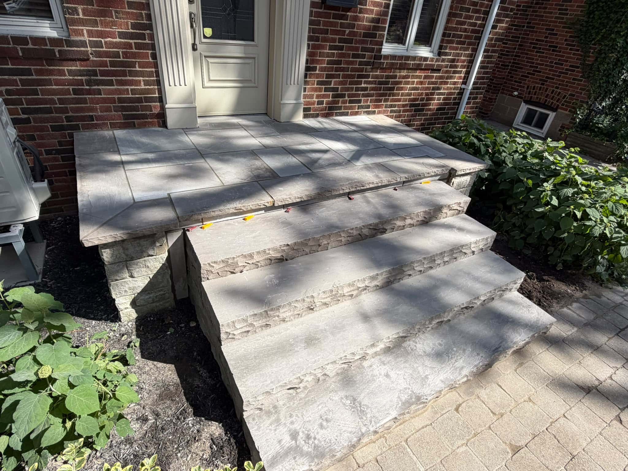
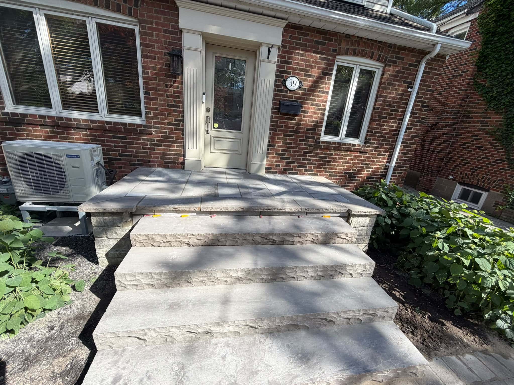
For example, an older Toronto red-brick house may look best with warm stone steps, natural grey accents, or buff-toned pavers. A brown-brick home may pair better with taupe, beige, charcoal, or muted grey stone. A house with lighter buff brick may work well with limestone-style colours, soft greys, or subtle earth tones.
The mistake is choosing a new colour in isolation. A stone sample that looks great in a showroom may clash with the existing brick once placed outside. Natural light, shade, roof colour, and nearby landscaping can all change how the colour appears.
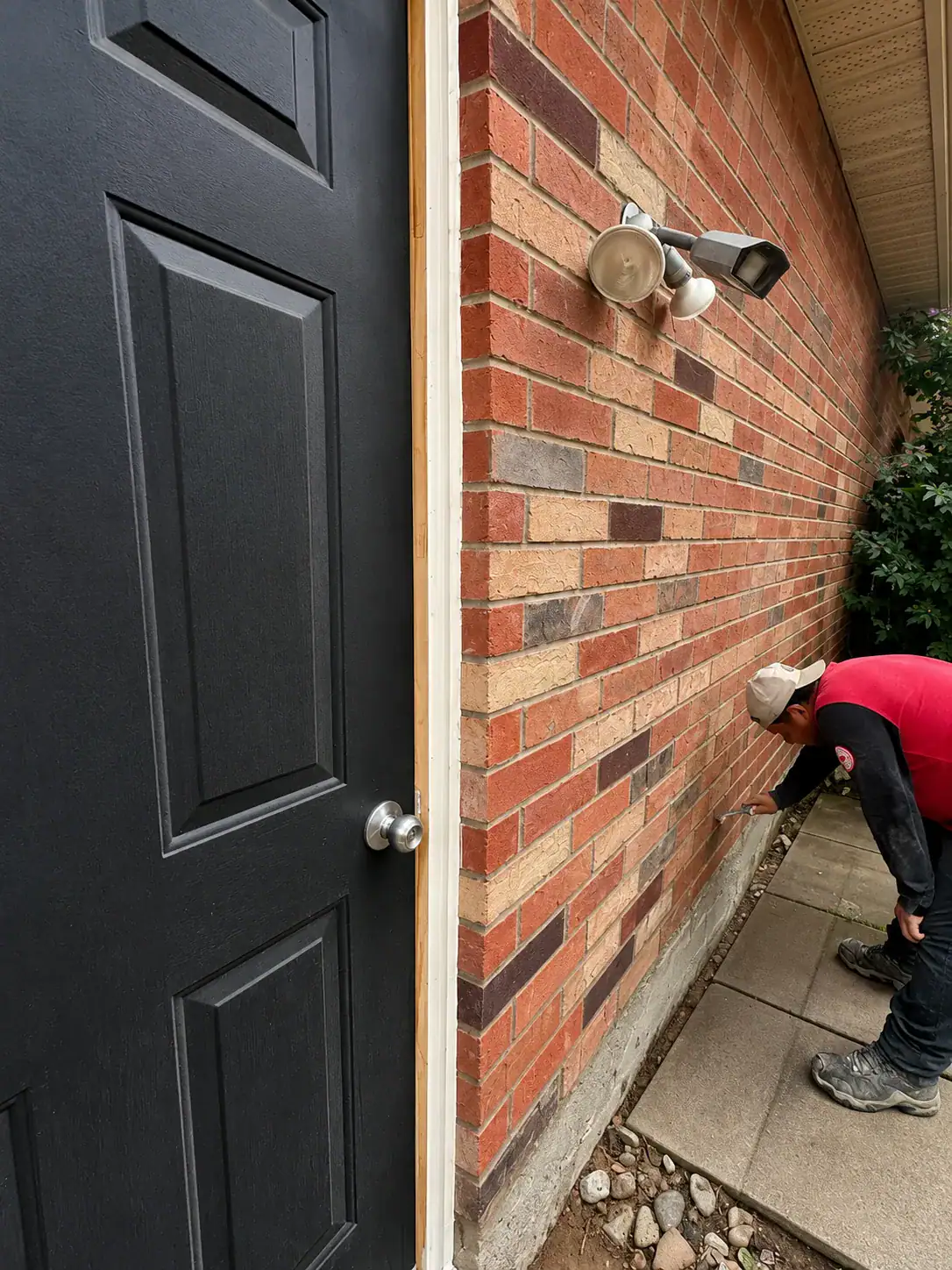
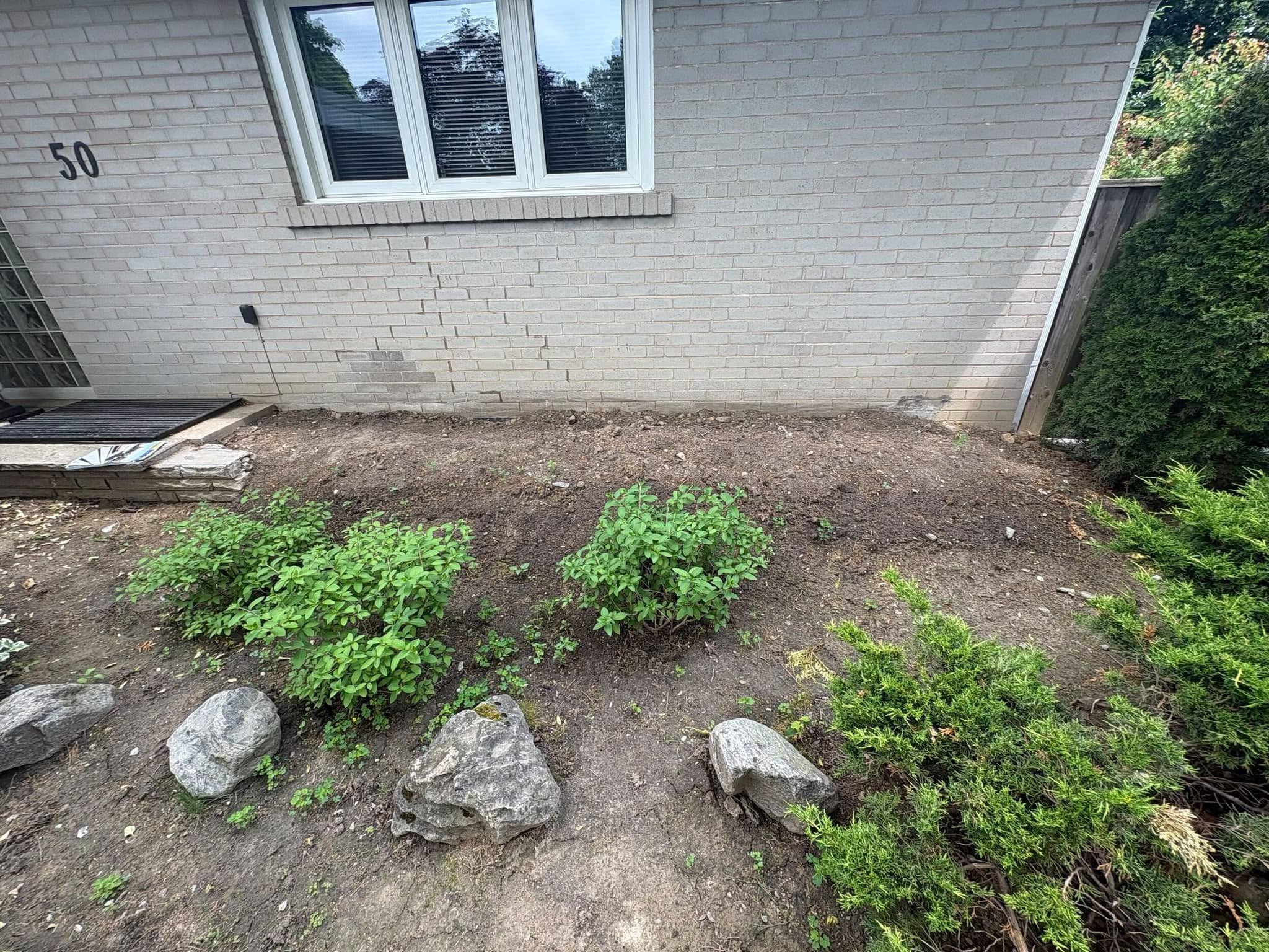
If the existing brick has damage, staining, or old mortar problems, repairs may also affect the final look. Homeowners dealing with worn or damaged brickwork can review brick repair in Toronto before making colour decisions around replacement bricks, mortar tone, or surrounding stonework.
Red Brick Homes: Colours That Usually Work Well
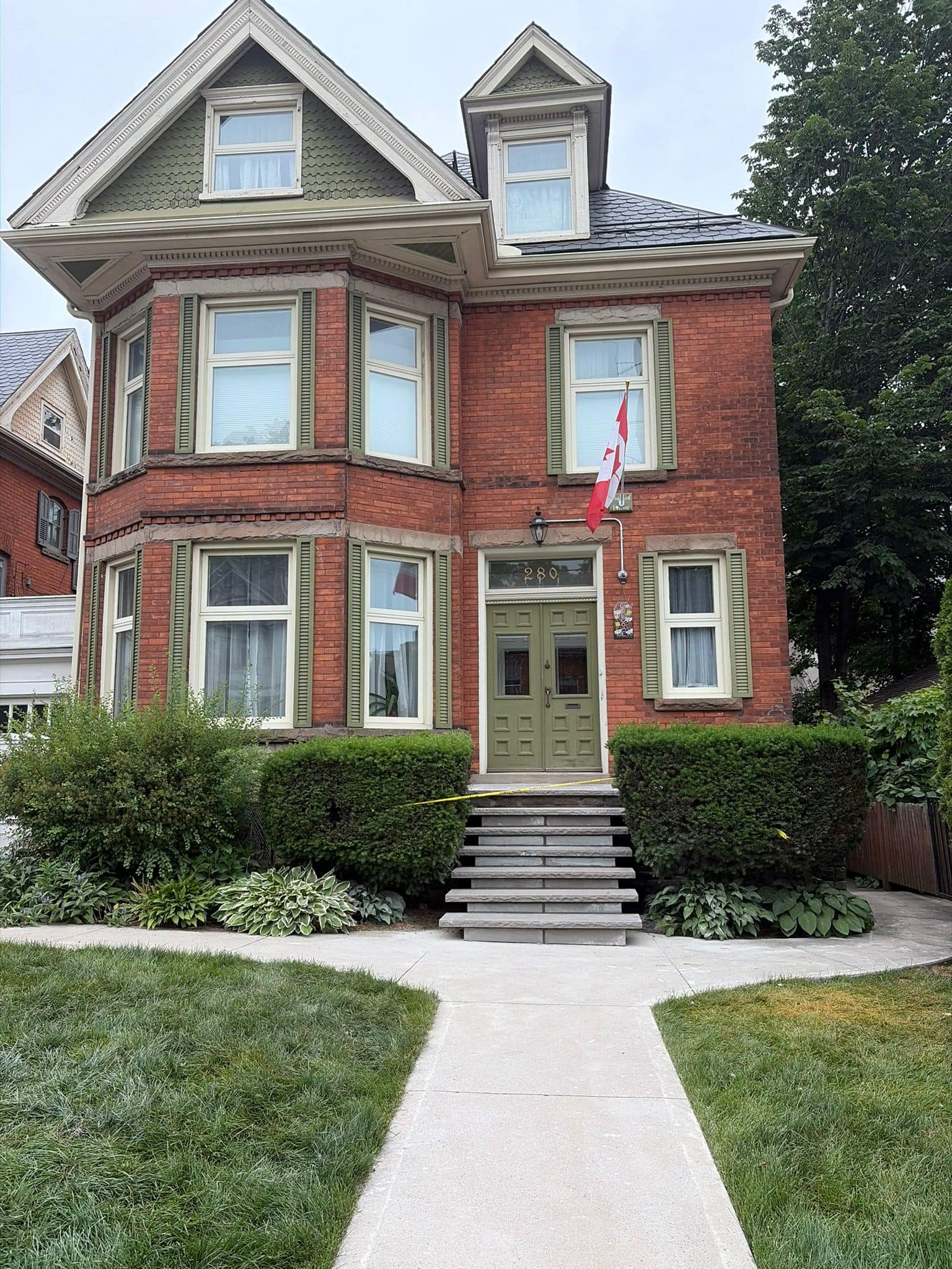
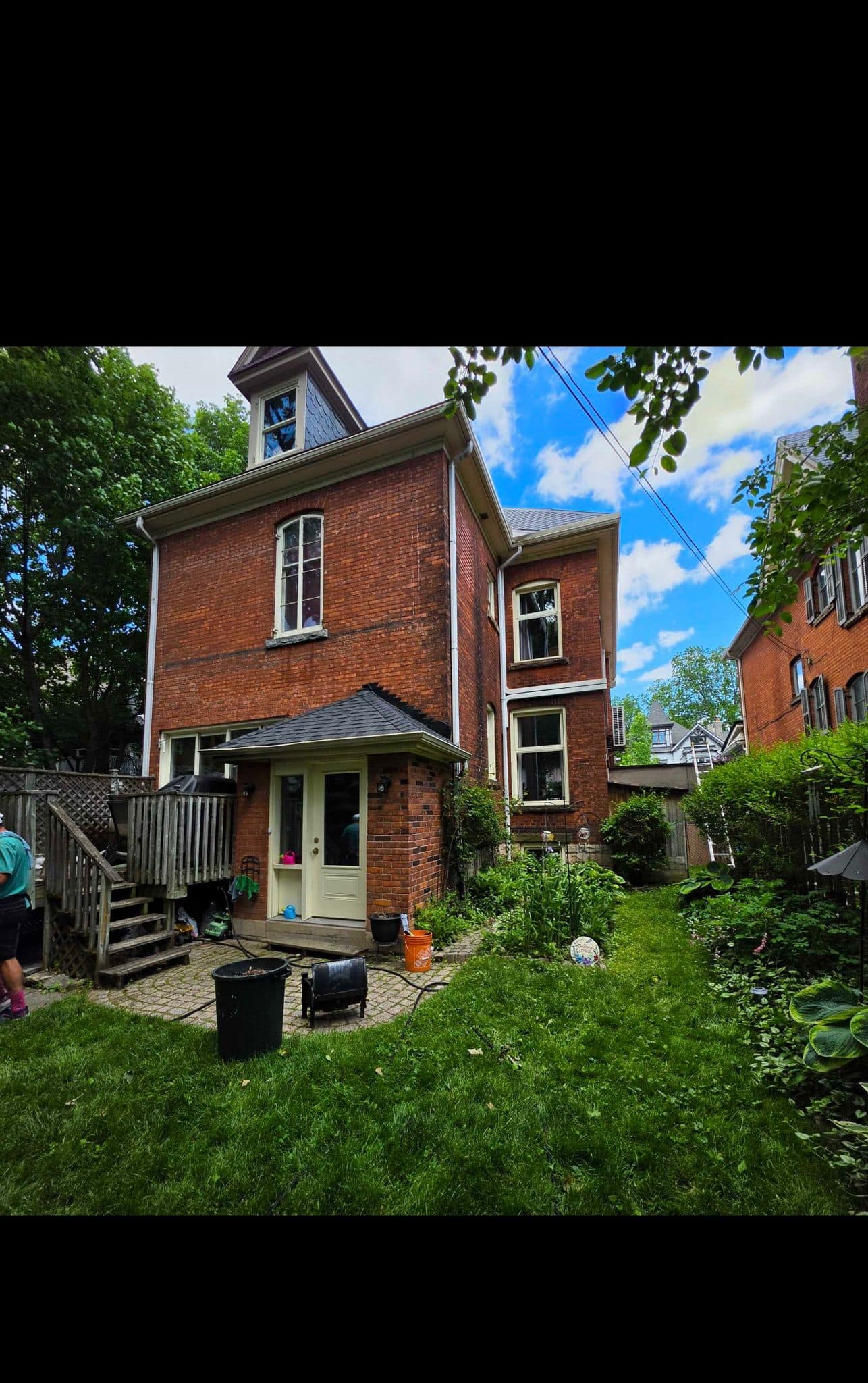
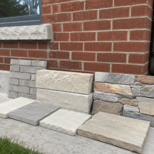
Red brick homes often work best with warm, grounded, and slightly muted colour choices. Toronto has many red-brick houses, including older detached homes, semis, row houses, and neighbourhood properties where red masonry is part of the street character.
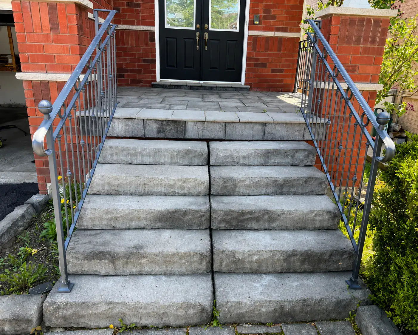
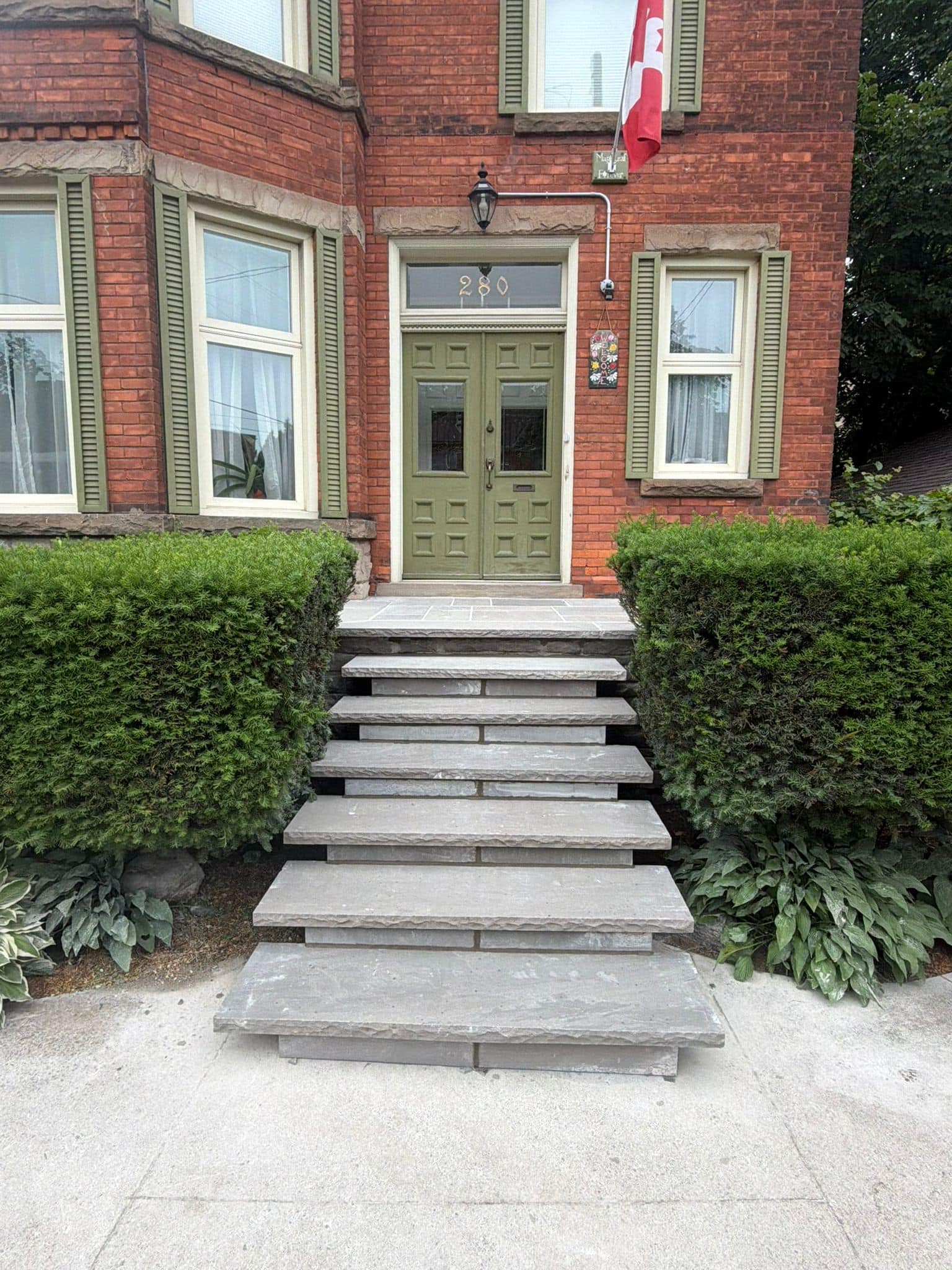
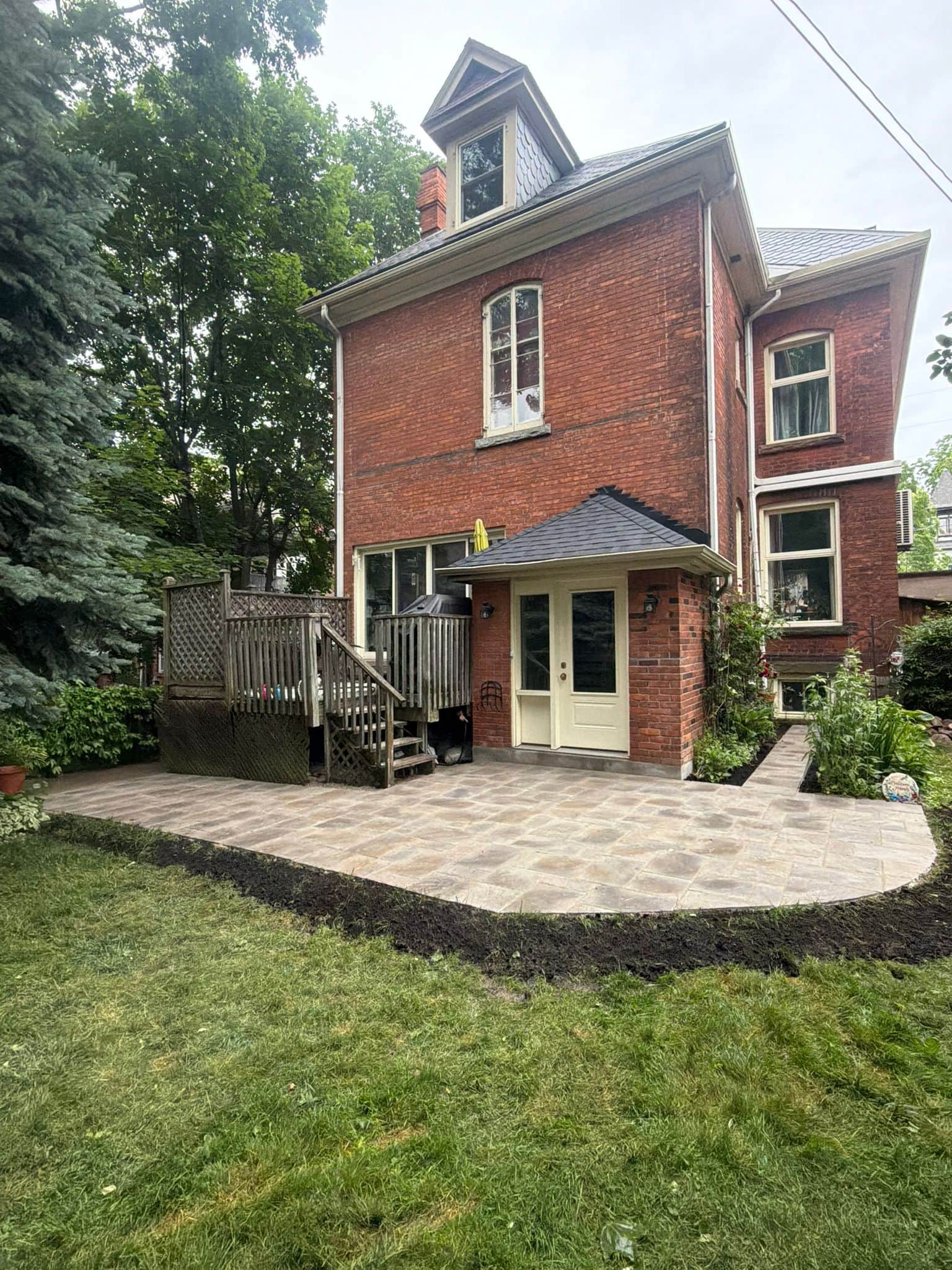
For these homes, good complementary colours often include natural limestone tones, soft grey, buff, taupe, warm beige, brown-grey, and muted charcoal used carefully. These colours can help steps, walkways, garden walls, or stone accents feel connected without overpowering the brick.
Bright white stone can sometimes look too sharp beside older red brick, especially when the brick has weathered variation. Very blue-grey materials can also feel cold if the home has warm red, orange, or brown undertones. A better option is often a grey with a warm undertone or a natural stone blend that includes several related colours.
Mortar colour matters too. A high-contrast white mortar joint can make red brick look busy. A softer buff, grey, or lime-toned mortar may feel more natural depending on the age and style of the wall. For older masonry, the goal is not only colour matching. Mortar compatibility also matters for durability.
Buff, Beige, and Yellow Brick Homes
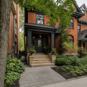
Buff, beige, and yellow brick homes usually pair well with soft, natural, and low-contrast masonry colours. These homes can look elegant when the surrounding stone or hardscape does not compete with the brick.
Good options often include warm grey, limestone, cream, tan, taupe, light brown, and soft charcoal accents. The goal is to avoid colours that make the home look washed out or overly yellow. A little contrast can help, but too much contrast can make the exterior feel split into separate parts.
For example, a buff-brick Toronto home with black windows may handle a stronger charcoal accent on steps or pavers. But if the trim and roof are softer, a lighter limestone-style stone may be better. The same brick can call for different masonry colours depending on the rest of the exterior.
Buff brick can also benefit from natural stone with gentle variation. A stone blend with beige, cream, light grey, and soft tan can add depth without making the facade feel busy.
Brown and Earth-Toned Brick Homes
Brown and earth-toned brick homes usually need masonry colours that feel rich but not heavy. These homes often look best with taupe, warm grey, tan, soft charcoal, brown-grey, and natural stone mixes.
The main risk with brown brick is choosing materials that make the home look too dark. A dark walkway, dark stone steps, dark roof, and dark brick can remove contrast and make the exterior feel heavy. On the other hand, a very pale stone may look out of place if the home has deep brown tones.
A balanced approach is to choose mid-tone materials. For example, warm grey stone steps can lighten the entry while still connecting to brown brick. Mixed stone with tan, grey, and brown tones can also help bridge different exterior elements.
Landscaping matters here. Green plants, mulch colour, garden edging, and lighting can change how earth-toned masonry reads from the street. A colour that looks dull in winter may look much better when paired with summer planting, so it helps to think about all seasons.
Grey Stone and Modern Toronto Exteriors
Grey stone can work well on modern Toronto homes, but it should be chosen with care. Grey is popular because it feels clean and current, but not all greys are the same. Some are warm and natural. Others are cool, blue, or industrial.
For newer homes, grey stone may pair well with black-framed windows, white stucco, wood accents, or dark metal details. For older homes, grey stone can still work, but it should usually be softer and less stark. A natural grey with beige or brown variation often blends better than a flat, uniform grey.
One common mistake is using too many modern finishes at once. Black windows, charcoal stone, dark pavers, dark soffits, and pale cladding can create a strong look, but it may feel cold without warmth from brick, wood, planting, or natural textures.
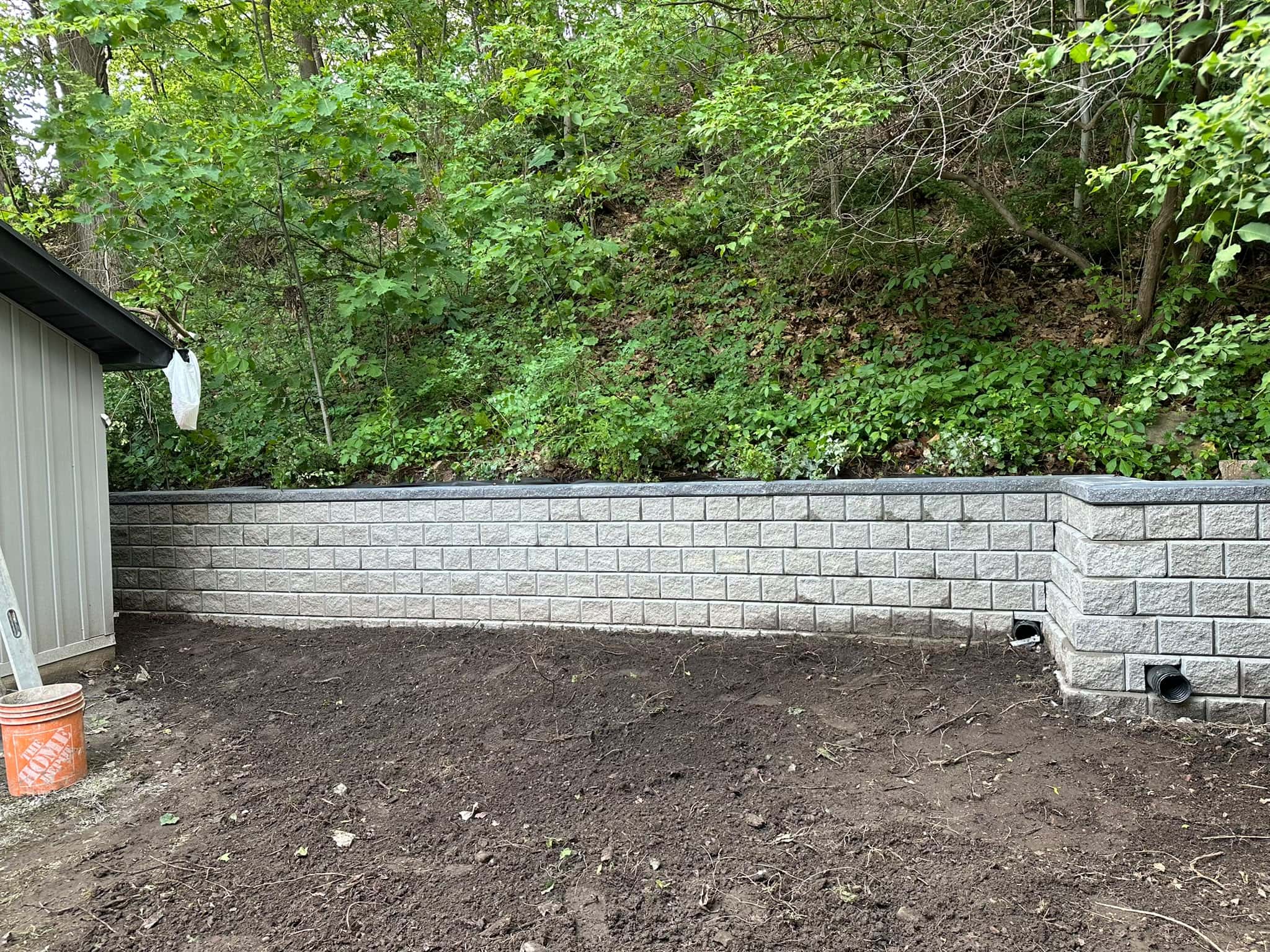
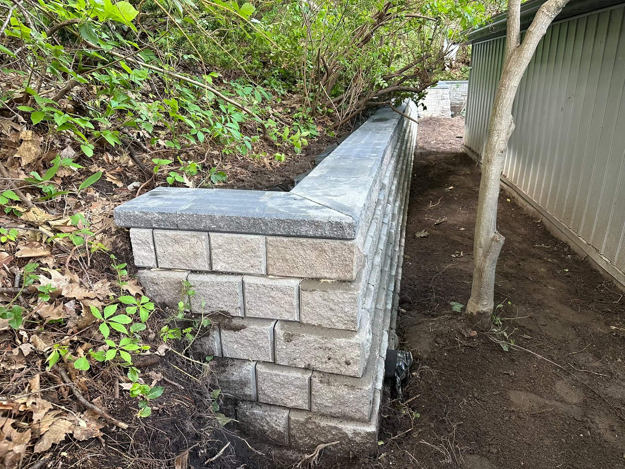
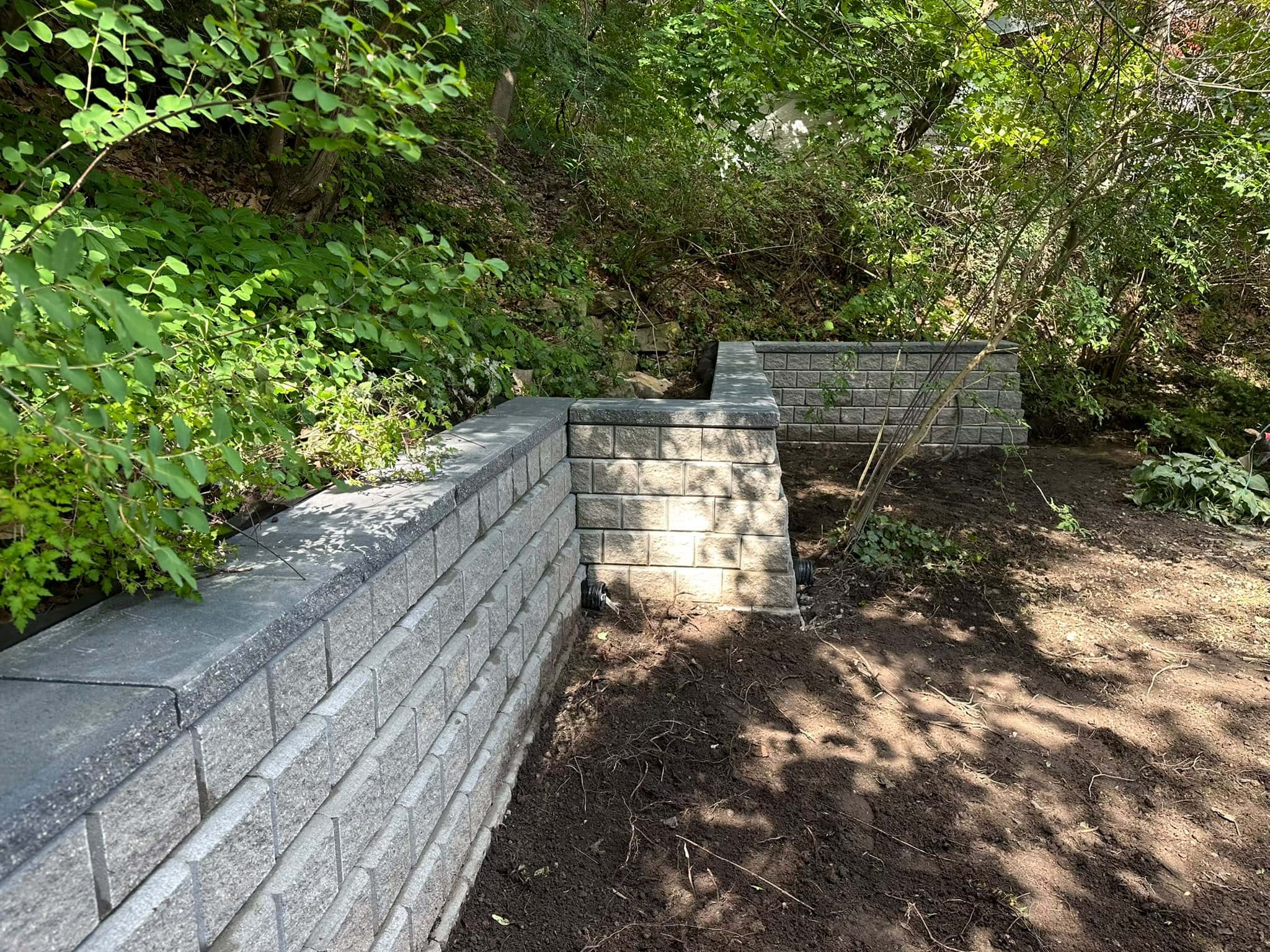
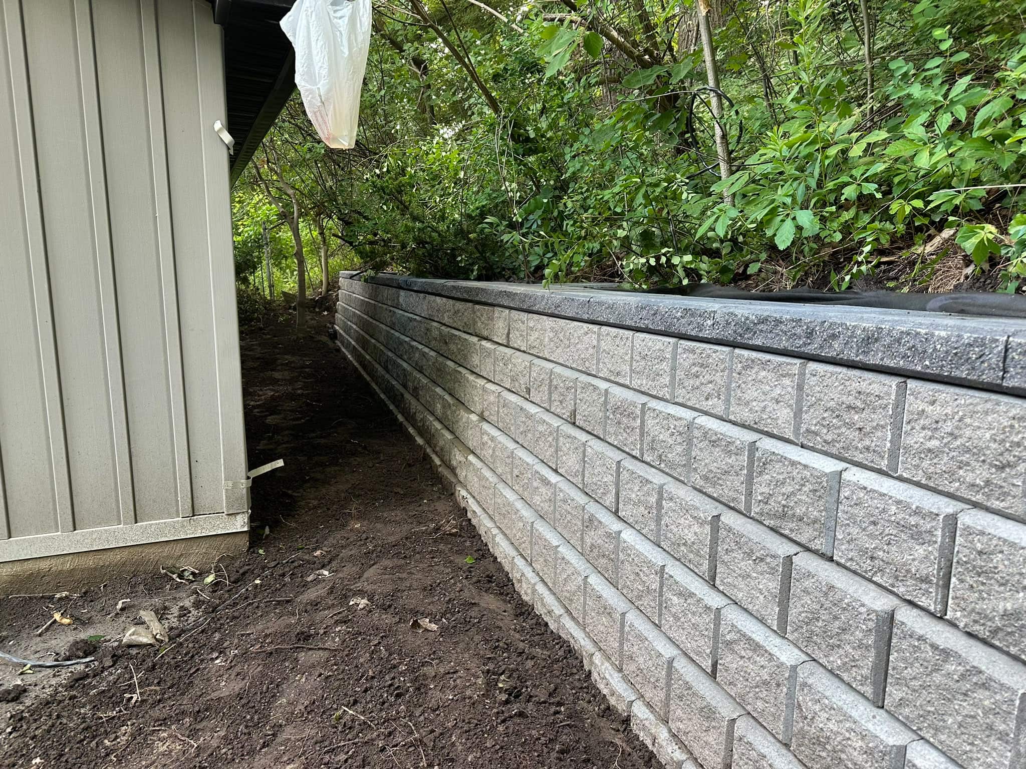
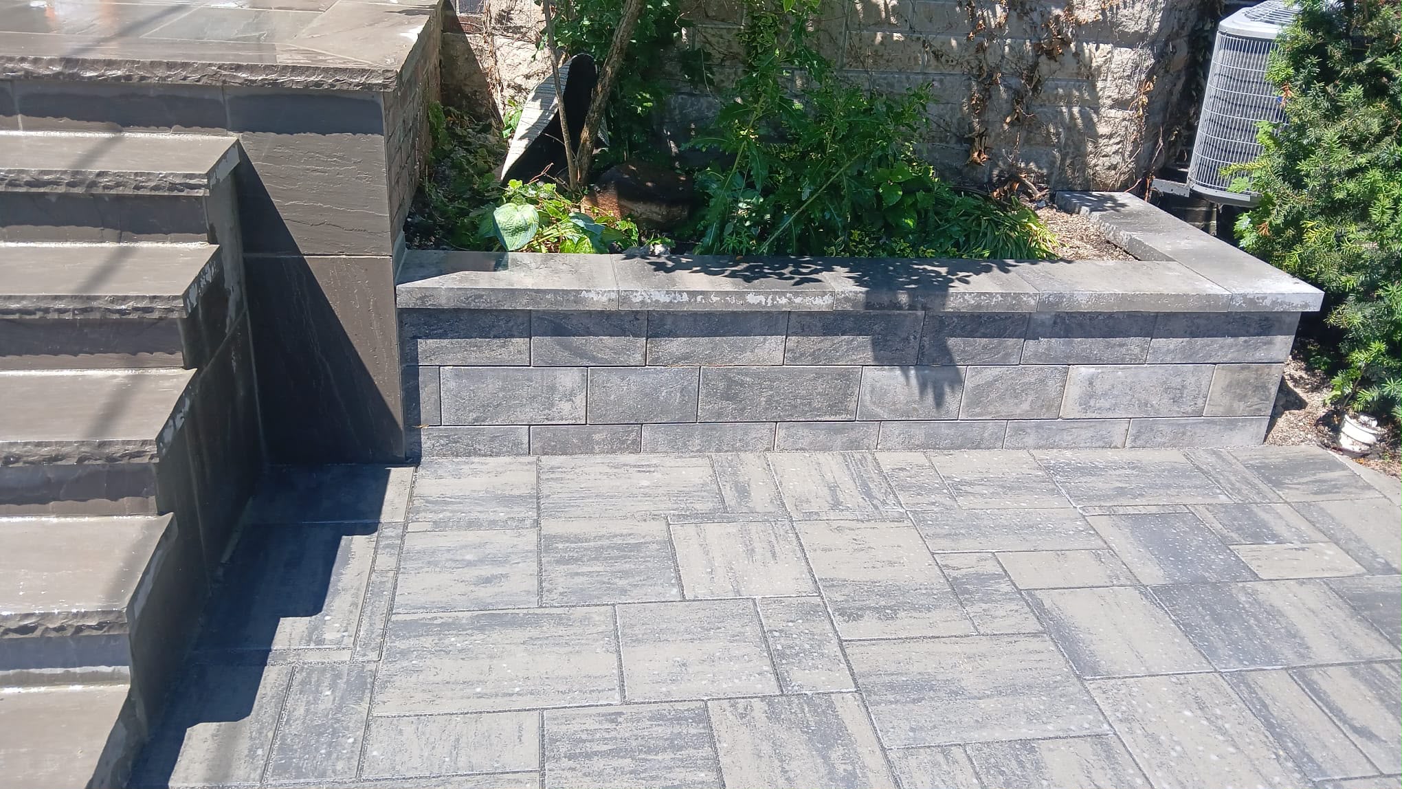
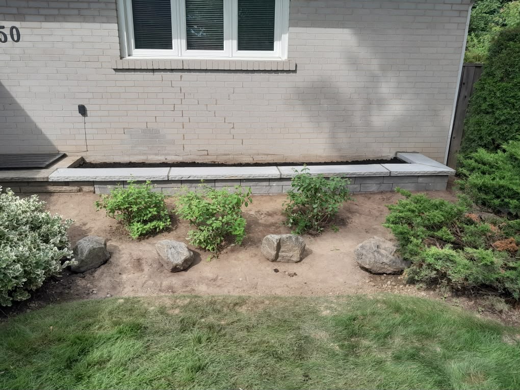
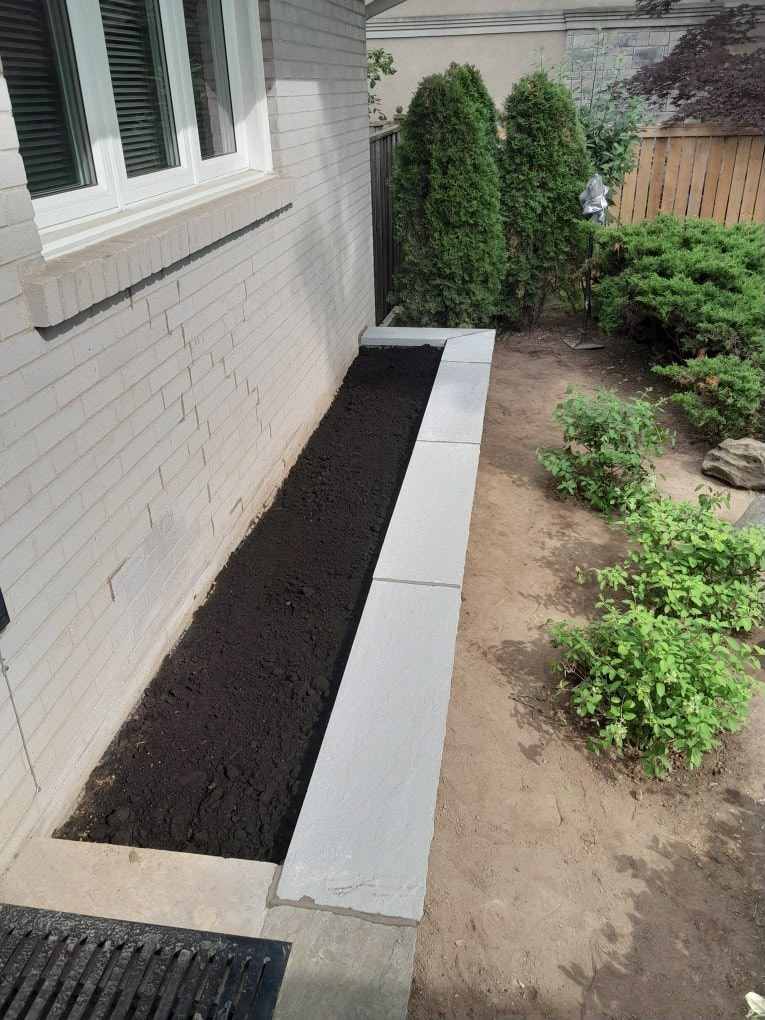
Stone should add depth, not make the home feel like a flat colour block. Homeowners considering stone features, steps, walls, or exterior accents can review stone masonry in Toronto for ideas on how natural stone can support both traditional and modern homes.

How Roof, Trim, and Windows Affect Masonry Colour
Roof, trim, and window colours affect masonry colour because they frame the entire exterior. Masonry may be the largest material, but it is not the only visual anchor.
A black or charcoal roof can support stronger stone accents, but it can also make the house feel darker if the brick is already deep red or brown. A brown roof often works better with warm stone, tan pavers, and earth-toned brick. White trim can sharpen contrast, while cream trim can soften it. Black-framed windows often make lighter stone and brick look more modern.
Before choosing brick or stone colours, look at the home from the street and take note of the fixed colours. These include the roof, window frames, door, garage door, soffits, fascia, existing porch, foundation, driveway, and nearby fences. A good masonry colour should connect at least two or three of these elements.
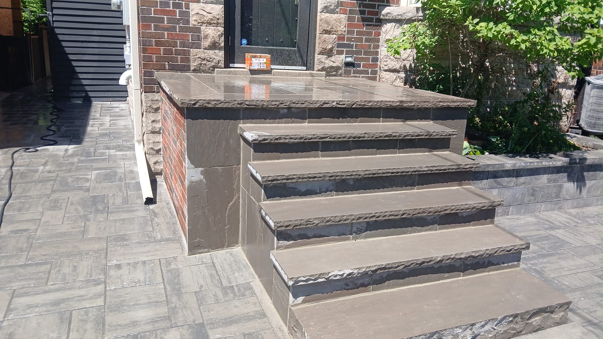
For example, if a home has warm red brick, a charcoal roof, and black windows, a stone step with warm grey and charcoal variation may tie the exterior together. If the home has buff brick, cream trim, and a brown roof, limestone or tan stone may feel more natural.
Think About Mortar Colour, Not Just Brick Colour
Mortar colour can change the entire look of a brick or stone wall. Many homeowners focus on the unit colour and overlook the joints, but mortar can make masonry look softer, sharper, older, newer, busier, or calmer.
Matching mortar is especially important when repairing older Toronto brickwork. If replacement mortar is too bright, too dark, too hard, or too smooth, the repair can stand out. The visual mismatch may be obvious, and the technical mismatch can also cause problems on older walls.
Some Toronto heritage guidance is clear about compatibility. For example, the St. Lawrence Neighbourhood Heritage Conservation District Plan states that brick masonry should be repointed using an appropriate and compatible mortar mixture and traditional pointing methods. That type of guidance is most directly relevant to heritage properties, but the principle is useful for many older homes as well.
Homeowners planning repointing, brick replacement, or masonry colour updates should avoid treating mortar as a minor detail. For many homes, the right mortar tone is what makes the repair disappear into the wall.
Light vs Dark Masonry Colours in Toronto’s Climate
Light and dark masonry colours behave differently in sun, shade, and winter conditions. Darker brick, stone, and pavers usually absorb more heat, while lighter surfaces tend to reflect more sunlight. This can affect comfort around patios, walkways, driveways, and south-facing walls.
Health Canada has noted that increasing the reflectivity of surfaces can involve using light-coloured construction materials on paved surfaces such as roads, sidewalks, parking lots, play spaces, and driveways. You can review Health Canada’s climate change and health adaptation bulletin for a broader context on urban heat.
For homeowners, this does not mean every surface should be pale. Dark accents can look beautiful and practical in the right places. The issue is scale and exposure. A dark stone border may work well. A large dark patio in full sun may feel hotter than expected. A light walkway may stay more comfortable, but it may also show dirt or winter staining more easily.
Toronto homeowners should also think about winter. Very light masonry can show salt stains and dirt. Very dark masonry can make surface damage or faded areas more noticeable over time. Mid-tone natural colours are often the most forgiving.
Colour Choices for Stone Steps, Walkways, and Patios
Stone steps, walkways, and patios should complement the home while staying practical for daily use. These surfaces are viewed up close, walked on regularly, and exposed to rain, snow, ice, salt, and foot traffic.
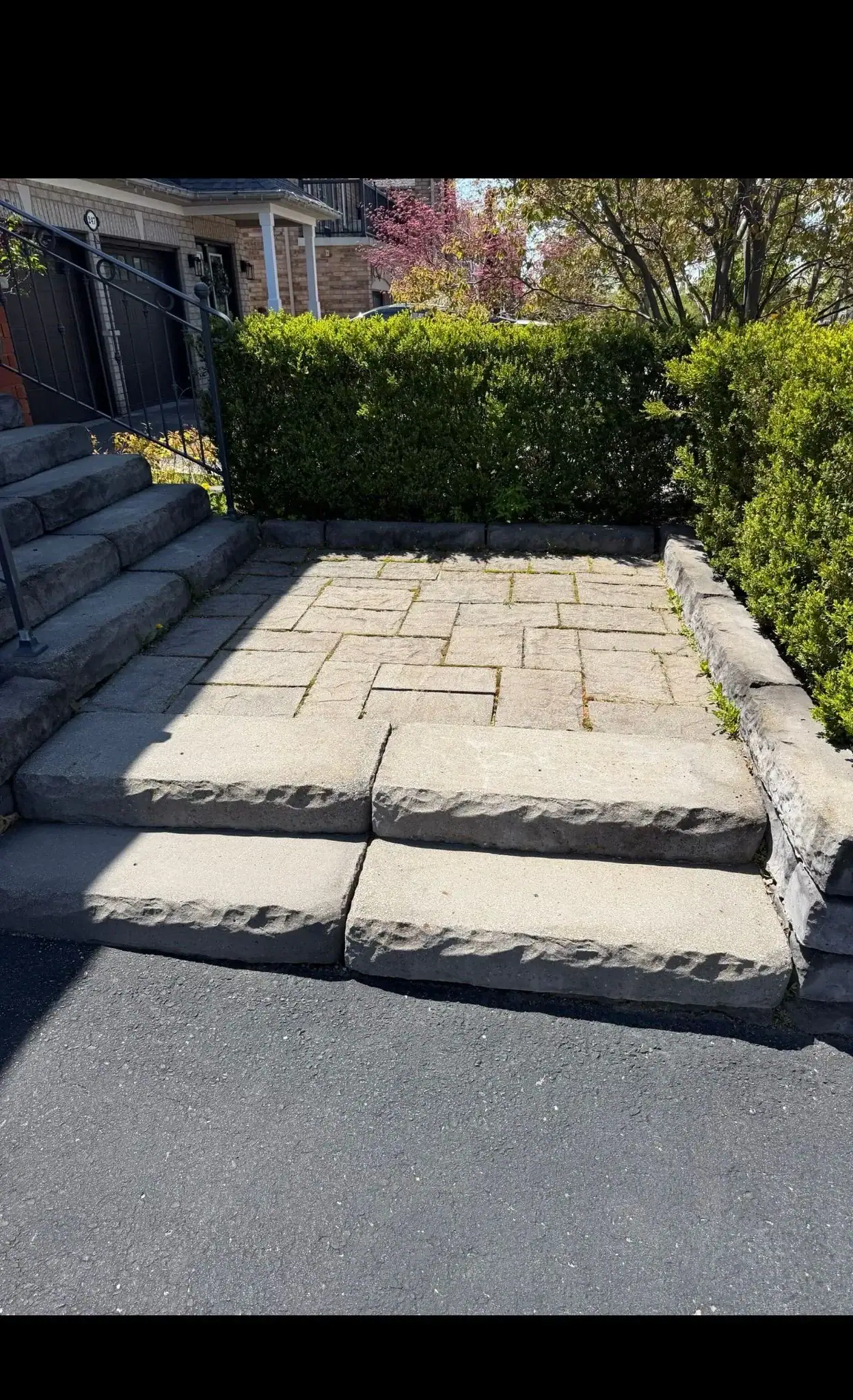
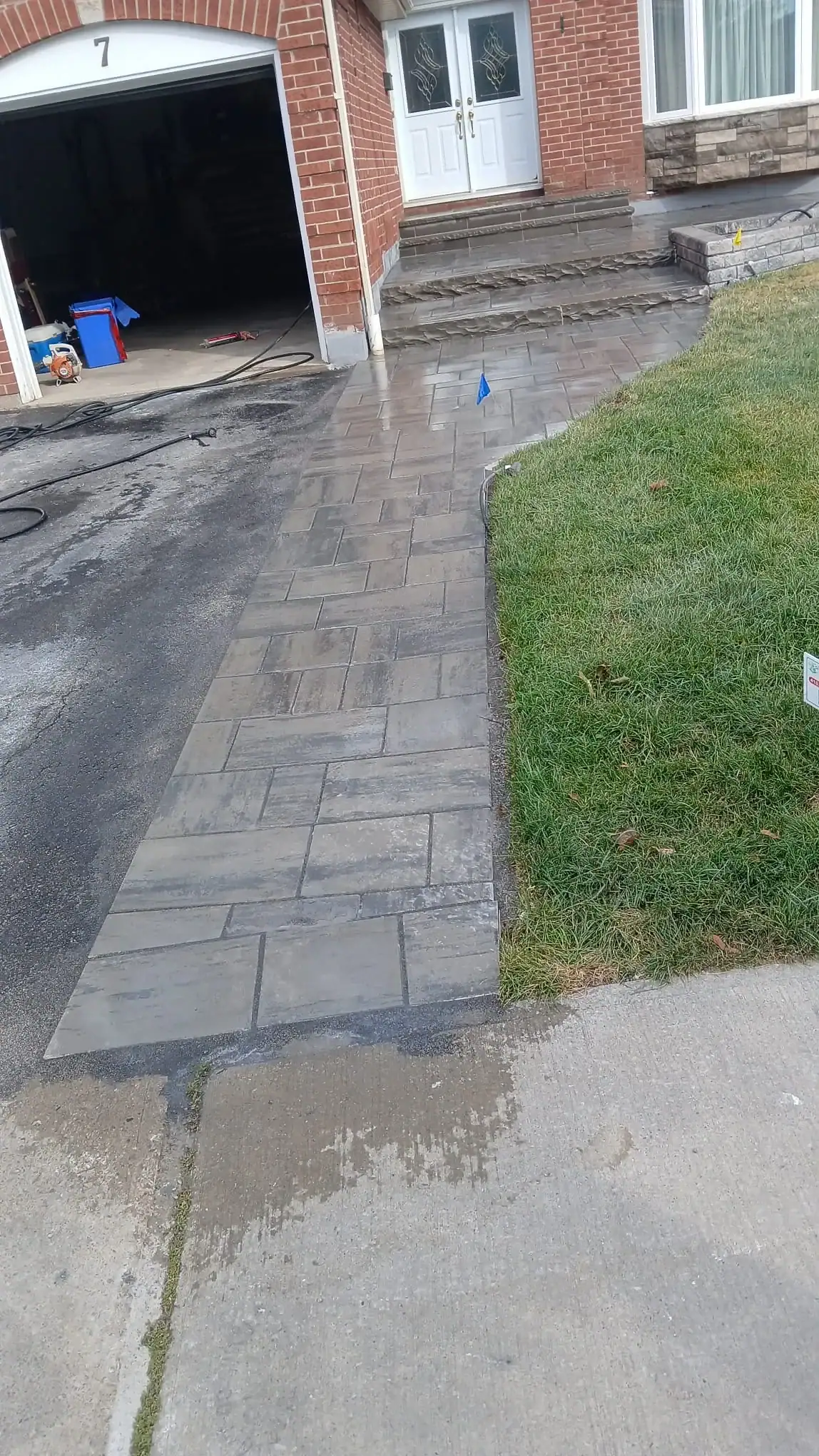
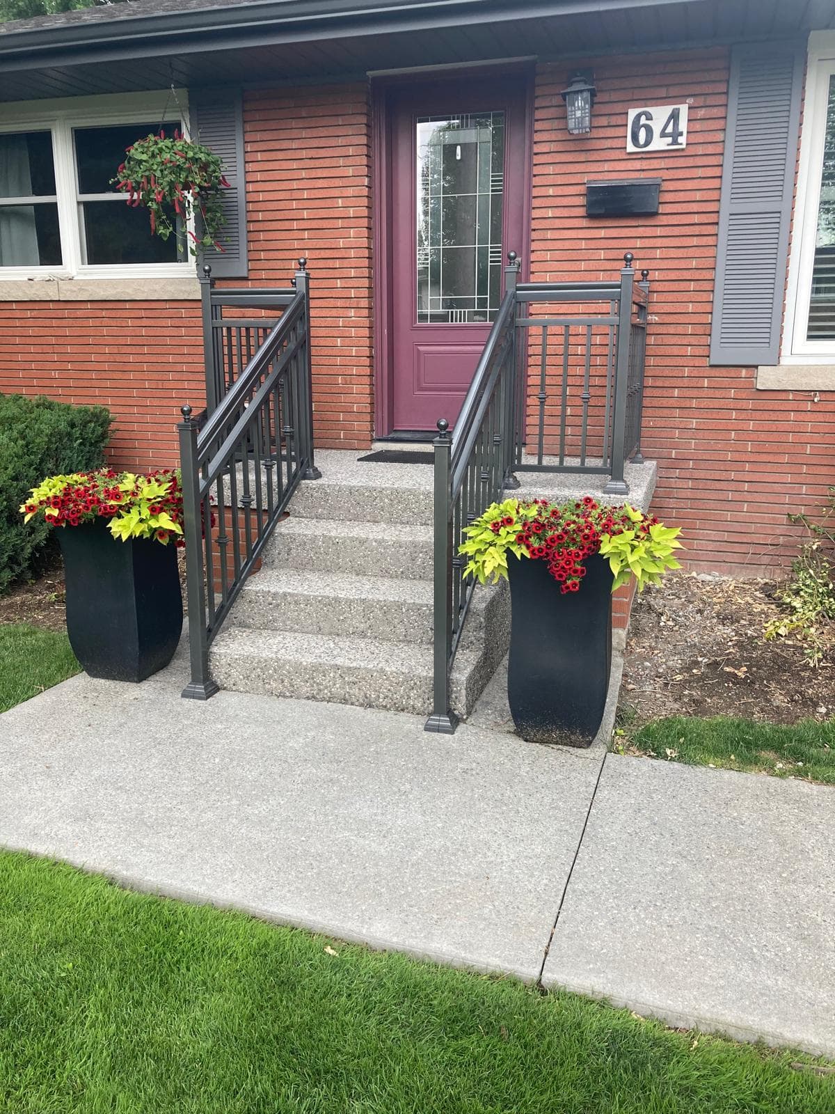
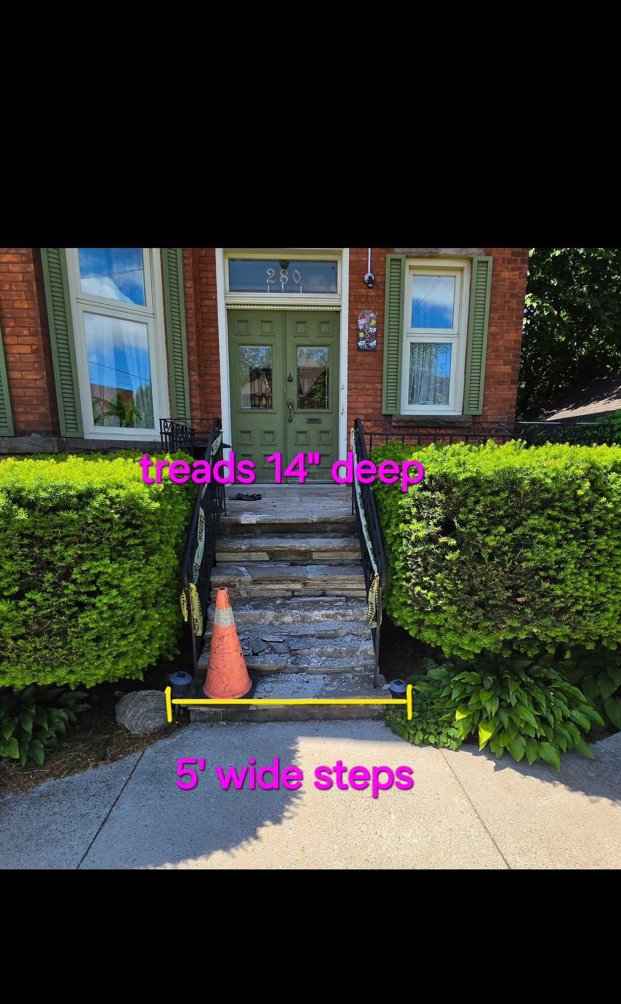
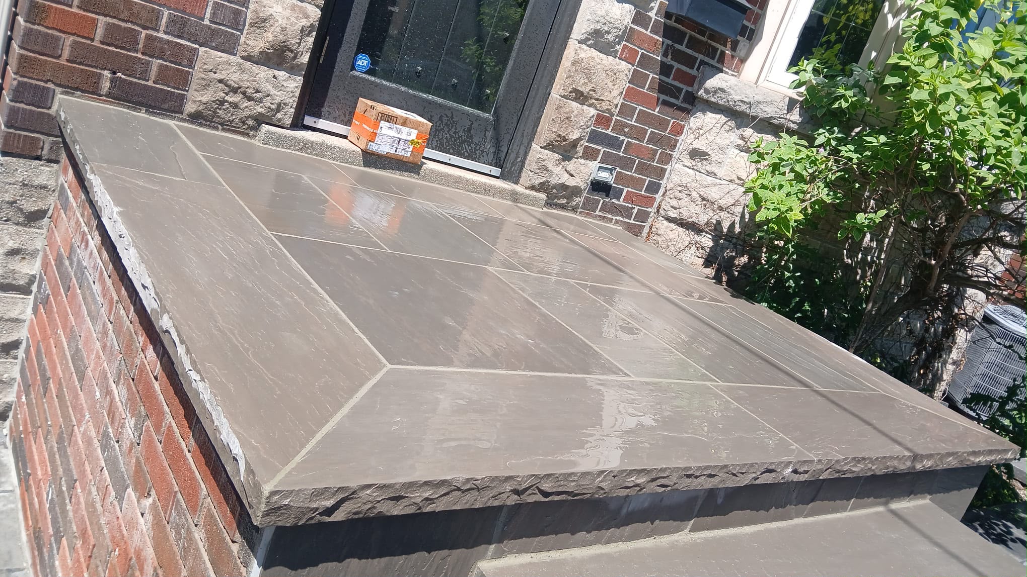
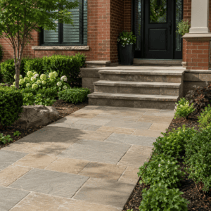
For front steps, choose a colour that connects the entry to the rest of the home. Natural grey, limestone, buff, and warm stone tones are common because they can work with many brick colours. A very trendy colour may feel dated more quickly, especially in a front entry that visitors see first.
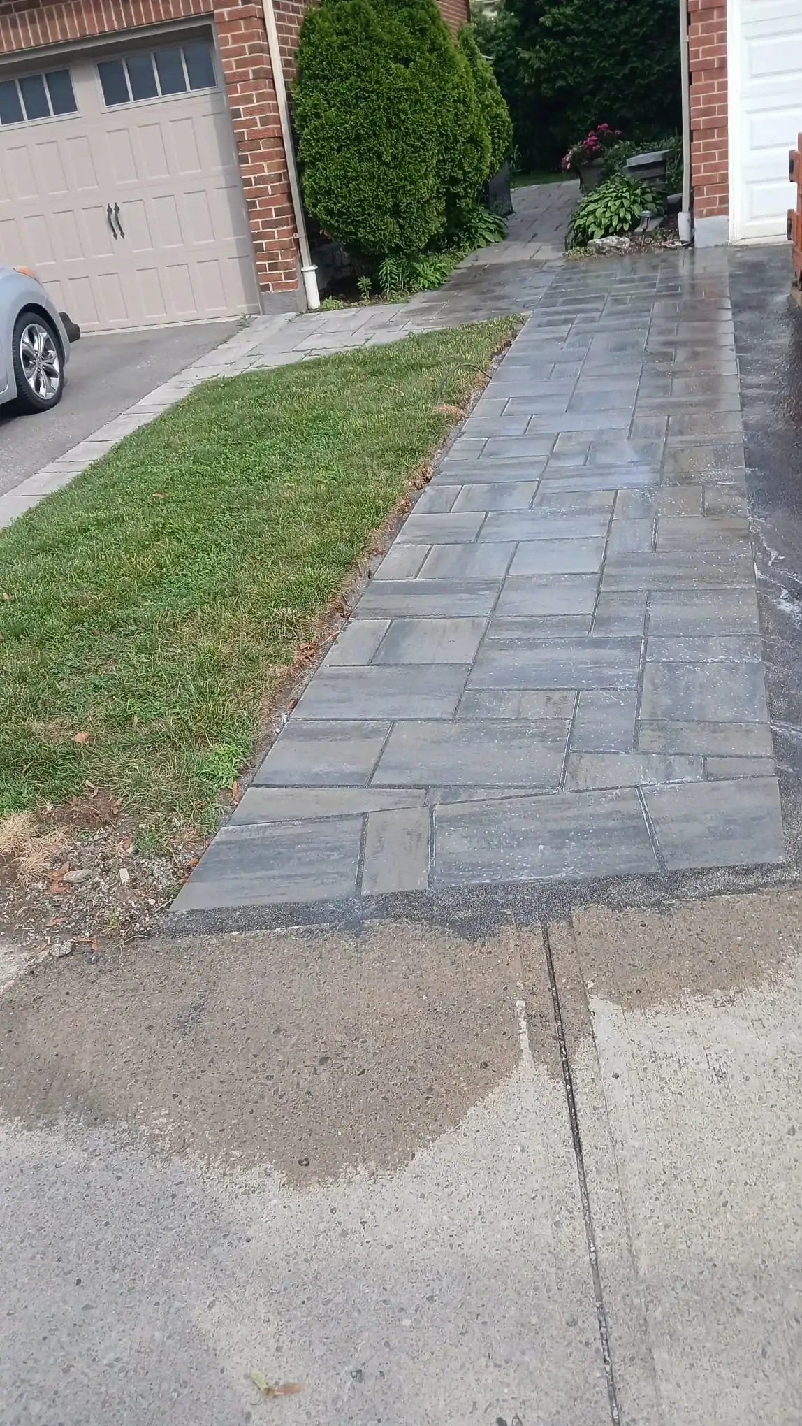
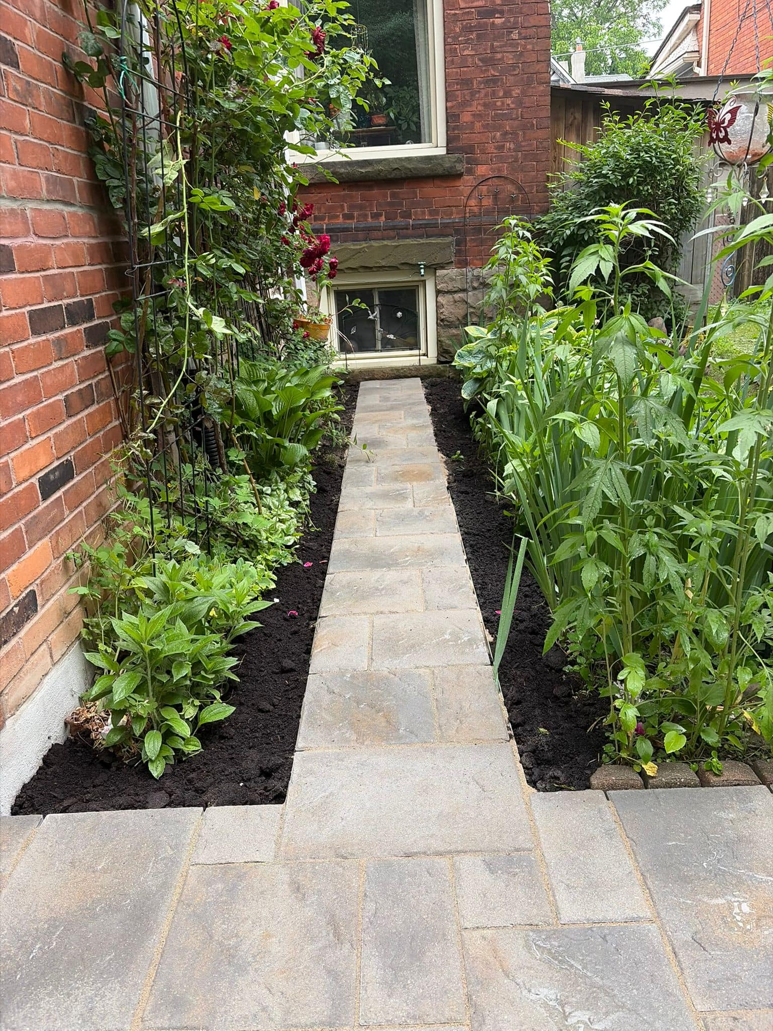
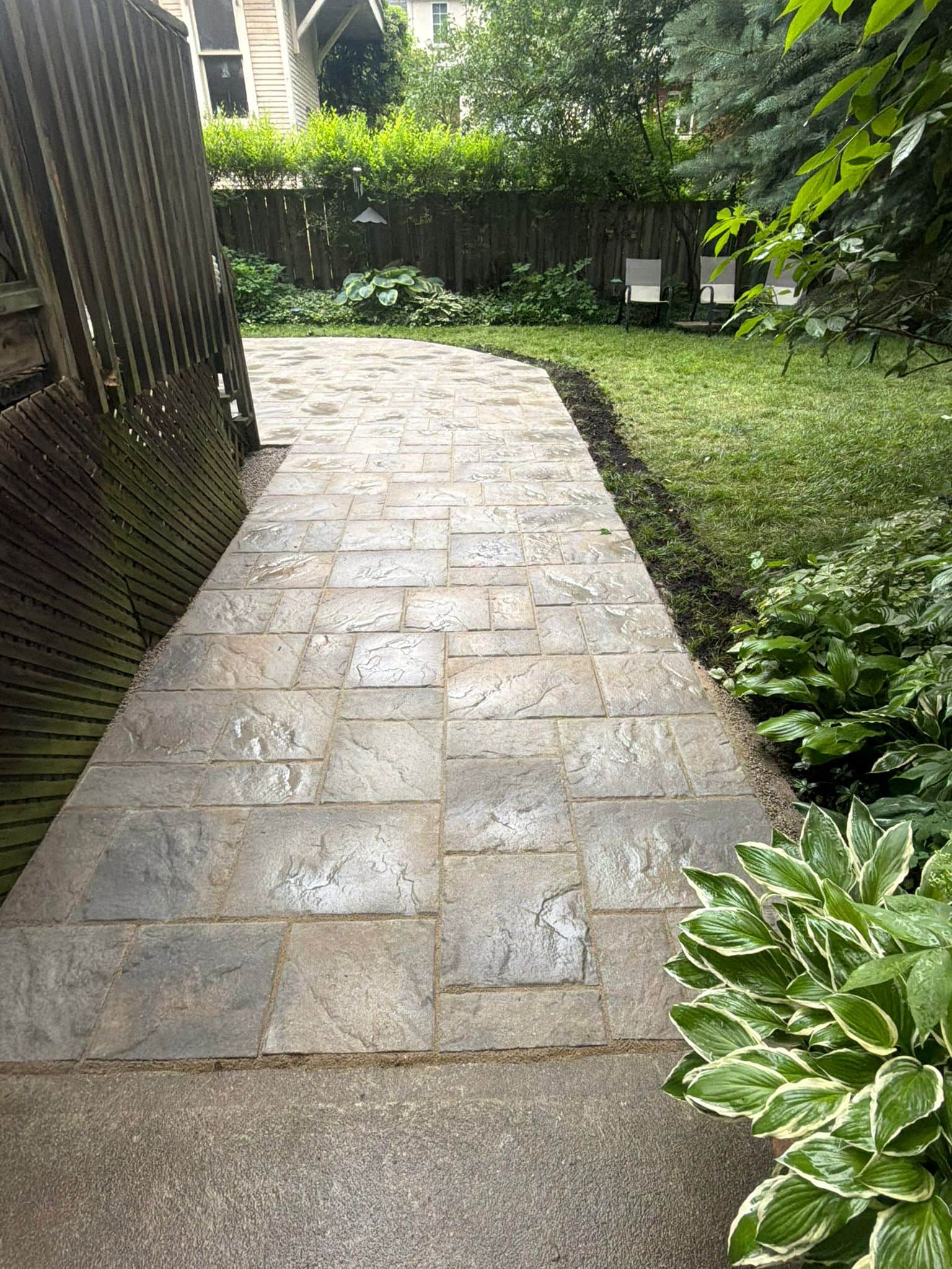
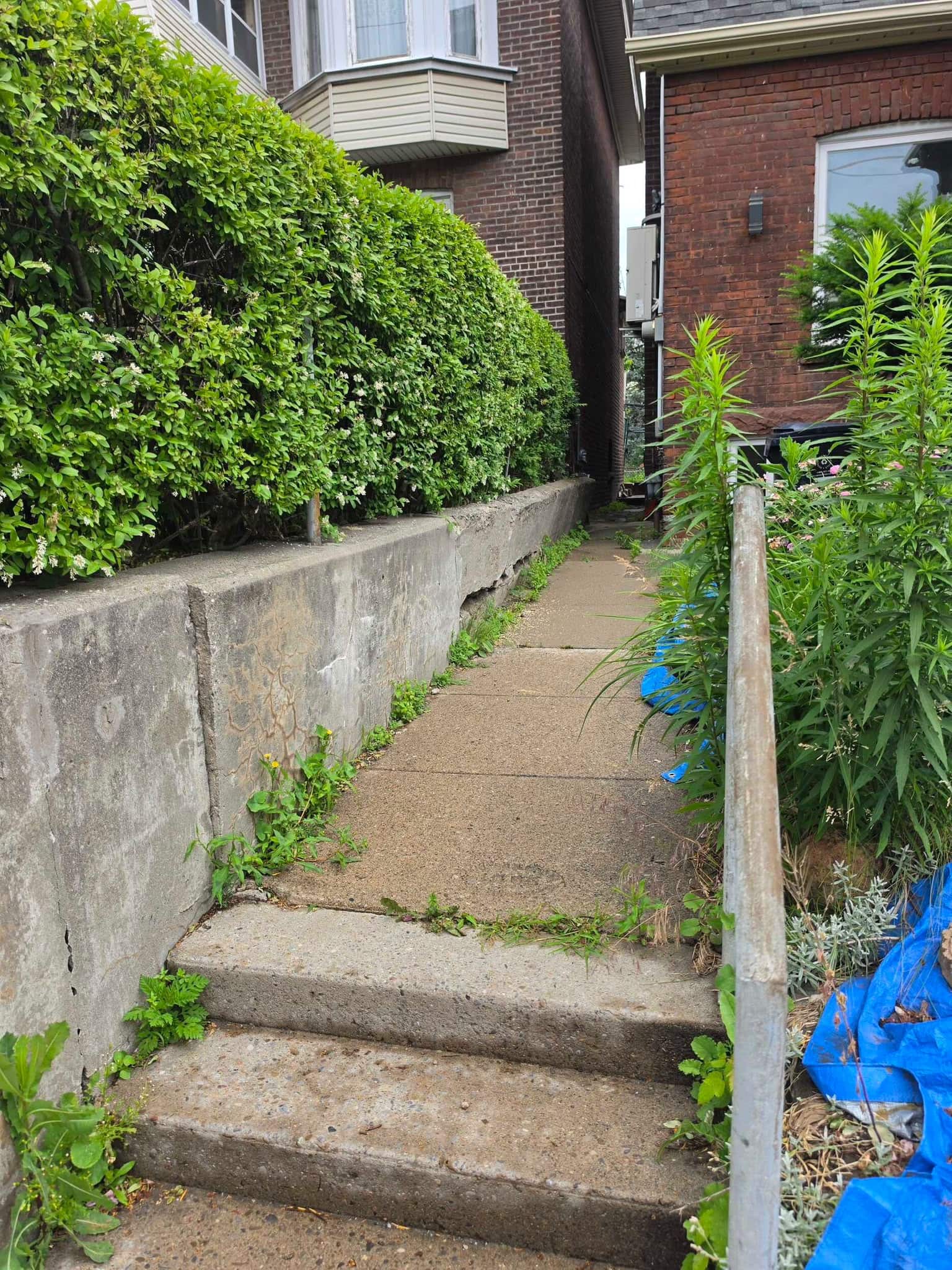
For walkways, the colour should guide the eye without overpowering the house. If the home already has a strong brick colour, a calmer walkway often works better. If the home is very neutral, a stone walkway with gentle variation can add interest.
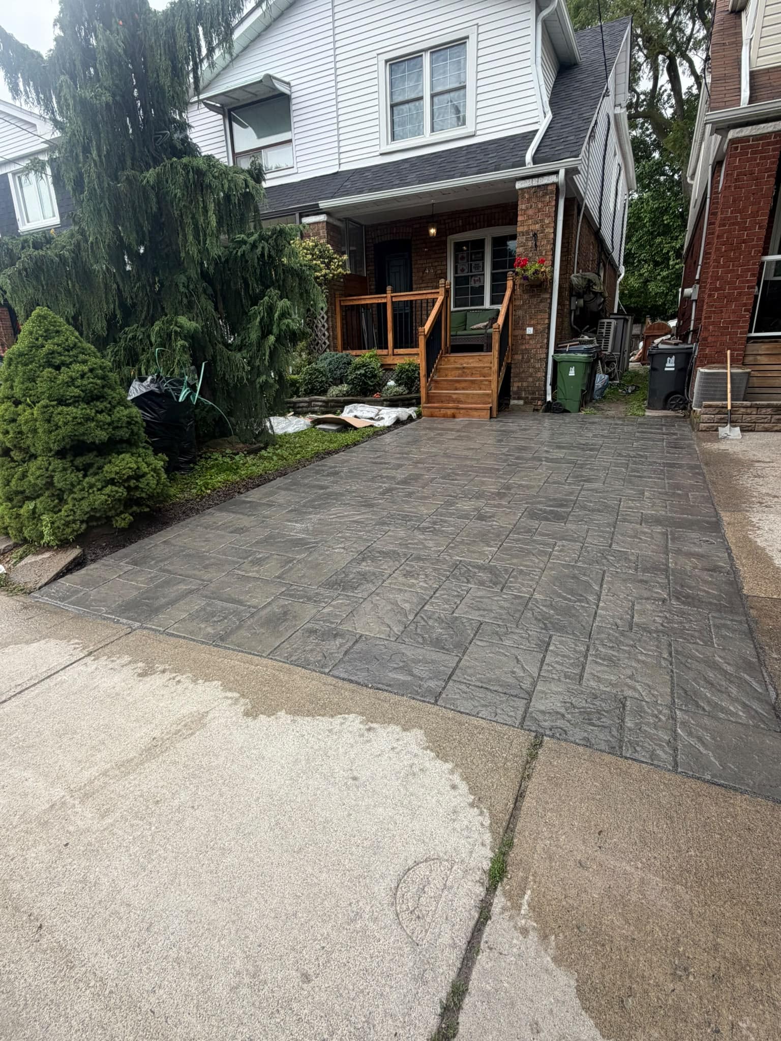
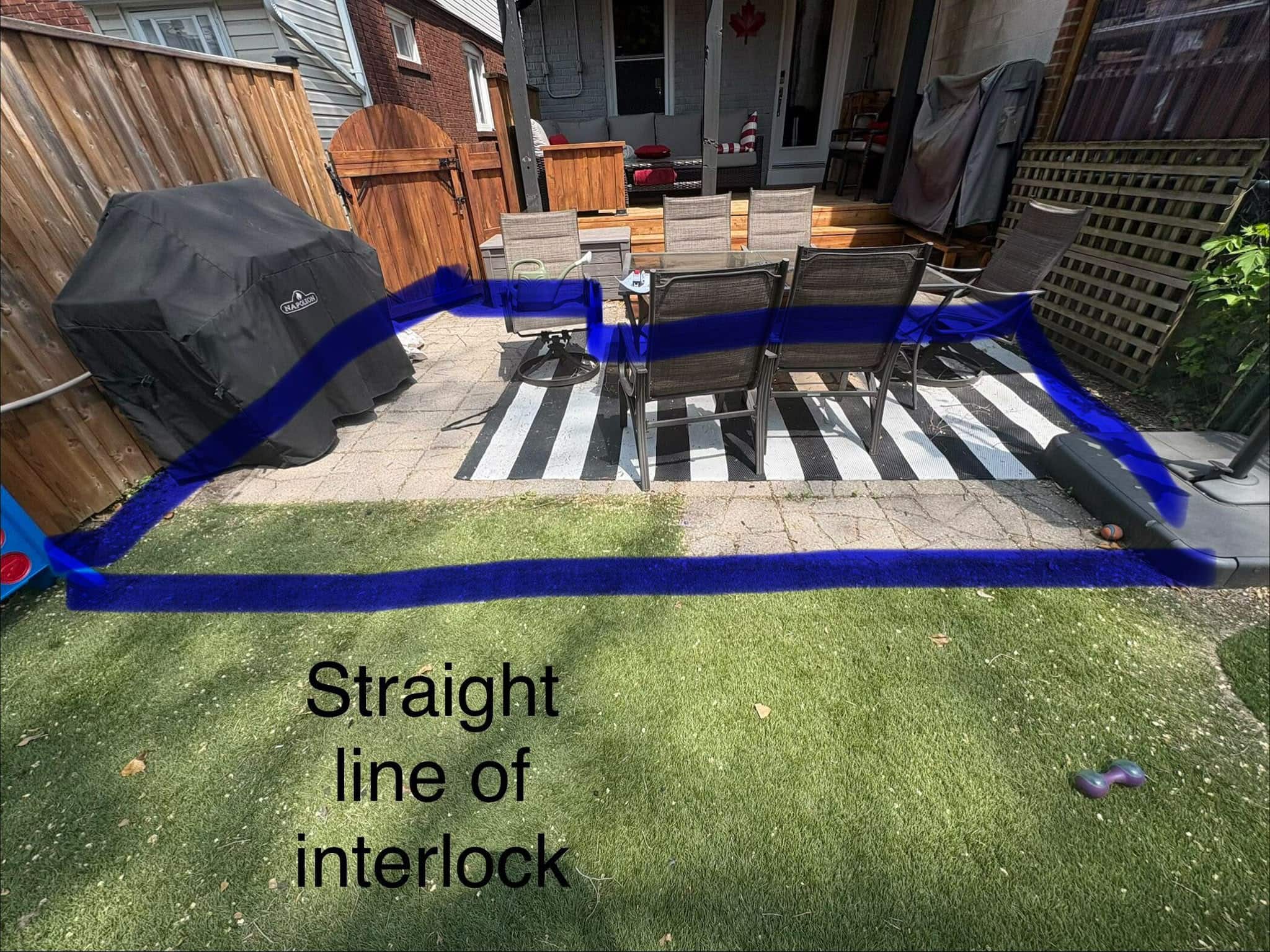
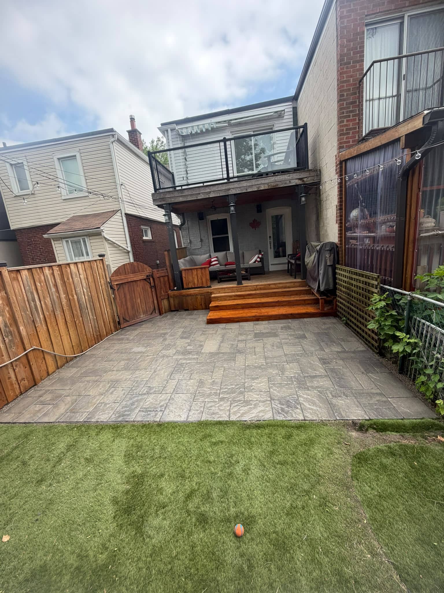
For patios, comfort matters more than curb appeal alone. Consider surface heat, shade, furniture colour, garden beds, and how the patio looks from inside the home. Homeowners planning outdoor living areas can also review interlocking installation in Toronto when comparing paver colours, patterns, and drainage needs.
When Colour Matching Repairs Become Difficult
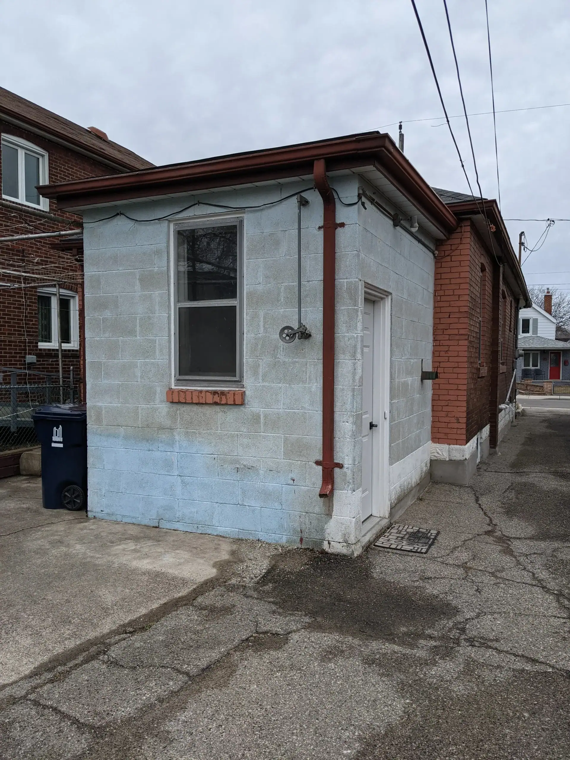
Colour-matching repairs become difficult when older brick or stone has weathered, faded, absorbed minerals, or changed over decades of exposure. A new brick may technically be the closest available match, but it may still look too clean or too uniform beside older masonry.
This is common in Toronto homes where original brick may no longer be produced. Replacement materials may need to be selected based on size, texture, colour range, and how they will weather over time. Sometimes a slightly varied blend looks more natural than a single “perfect” colour.
Cleaning also affects colour. Dirty brick may look darker than it really is. Efflorescence may make surfaces look pale or chalky. Old coatings can change the appearance of masonry. Before deciding that the colour is wrong, it may be worth checking whether the issue is staining, moisture, or surface buildup.
However, aggressive cleaning can damage masonry if done poorly. Older brick, soft mortar, and historic surfaces need careful treatment. The goal is to improve appearance without altering the character or damaging the material’s face.
What Homeowners Can Do Before Choosing a Colour
Homeowners can make better colour decisions by testing masonry materials in real site conditions. A small sample inside a store or online image is not enough.
- View samples outside. Look at them in morning light, afternoon sun, shade, and cloudy weather.
- Compare against existing brick. Place samples directly beside the wall, porch, steps, or chimney.
- Check the roof and trim. A colour that matches the brick may still clash with the roof or windows.
- Look from the street. Masonry colour should work from a distance, not only up close.
- Think about all seasons. Toronto homes look different in summer greenery, fall leaves, winter snow, and spring rain.
- Avoid overmatching. A slight complementary contrast often looks more natural than trying to match everything exactly.
- Be careful with trends. Strong colour trends can date exterior masonry faster than classic natural tones.
If the home is part of a heritage district or has heritage status, homeowners should also check the applicable rules before making any visible changes to the masonry. The Ontario government explains that exterior alterations to heritage places often focus on sensitivity to historic appearance, materials, and character. Its guidance on effectively conserving and managing heritage places is written for places of worship, but the conservation principles are still useful when considering the appearance of historic masonry.
Quick Guide: Colours That Often Work Well
The best colour depends on the home, but these general combinations can help homeowners narrow the options before looking at samples.
- Red brick homes: warm grey, buff, limestone, taupe, muted charcoal, natural stone blends.
- Buff or yellow brick homes: cream, tan, limestone, light grey, warm grey, soft brown accents.
- Brown brick homes: taupe, warm grey, tan, brown-grey, soft charcoal, mixed natural stone.
- Modern white or light exteriors: grey stone, limestone, black accents, natural wood tones, soft beige stone.
- Older Toronto homes: colours that respect existing brick, mortar tone, roof colour, and neighbourhood character.
- Large patios or driveways: mid-tone or lighter colours if surface heat and summer comfort are a concern.
This guide should not replace seeing real samples on site. It simply helps avoid the most common mismatch: choosing a masonry colour that looks good on its own but does not work with the rest of the house.
When Professional Masonry Help Makes More Sense
Professional masonry help makes more sense when the colour choice is tied to repair, replacement, structural work, or older masonry. Choosing a decorative patio colour is one thing. Matching replacement brick on a visible wall is another.
A masonry professional can help assess whether the issue is colour, staining, weathering, mortar mismatch, moisture, or damaged material. In many cases, the best result comes from solving the underlying problem first. For example, a wall may look discoloured because of water exposure, not because the brick colour is wrong. A chimney may look mismatched because repairs were made using the wrong mortar. A stone step may look dull because it needs cleaning or repointing, not replacement.
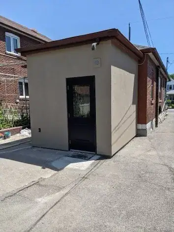
Homeowners should be especially careful before painting or coating masonry simply to change the colour. Some coatings can trap moisture if the wrong product is used or the wall is not properly prepared. Colour changes should never come at the cost of masonry performance.
Final Thoughts on Brick and Stone Colours that Complement Toronto Homes
Brick and stone colours that complement Toronto homes are usually the ones that look natural, age well, and respect the house’s existing materials. The best choice is rarely based on a single sample or trend. It comes from looking at the full exterior, including brick tone, stone texture, mortar colour, roof, trim, windows, landscaping, and neighbourhood setting.
For many Toronto and GTA homes, classic masonry colours work best because they hold up visually through changing seasons and changing design trends. Warm greys, limestone tones, buff, taupe, natural stone blends, soft charcoal accents, and well-matched mortar can all help create a balanced exterior.
The smarter question is not “What colour is popular right now?” A better question is “Which colour will still look right on this home ten years from now?” When homeowners choose masonry colours with that mindset, the result is usually more timeless, more practical, and better suited to Toronto’s streetscapes.