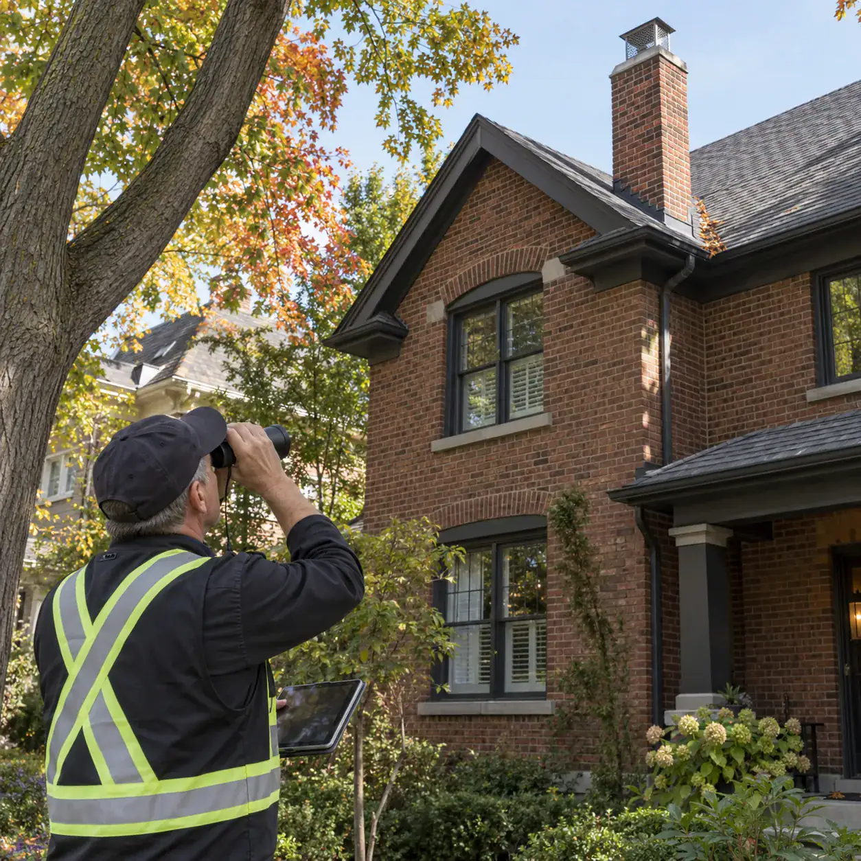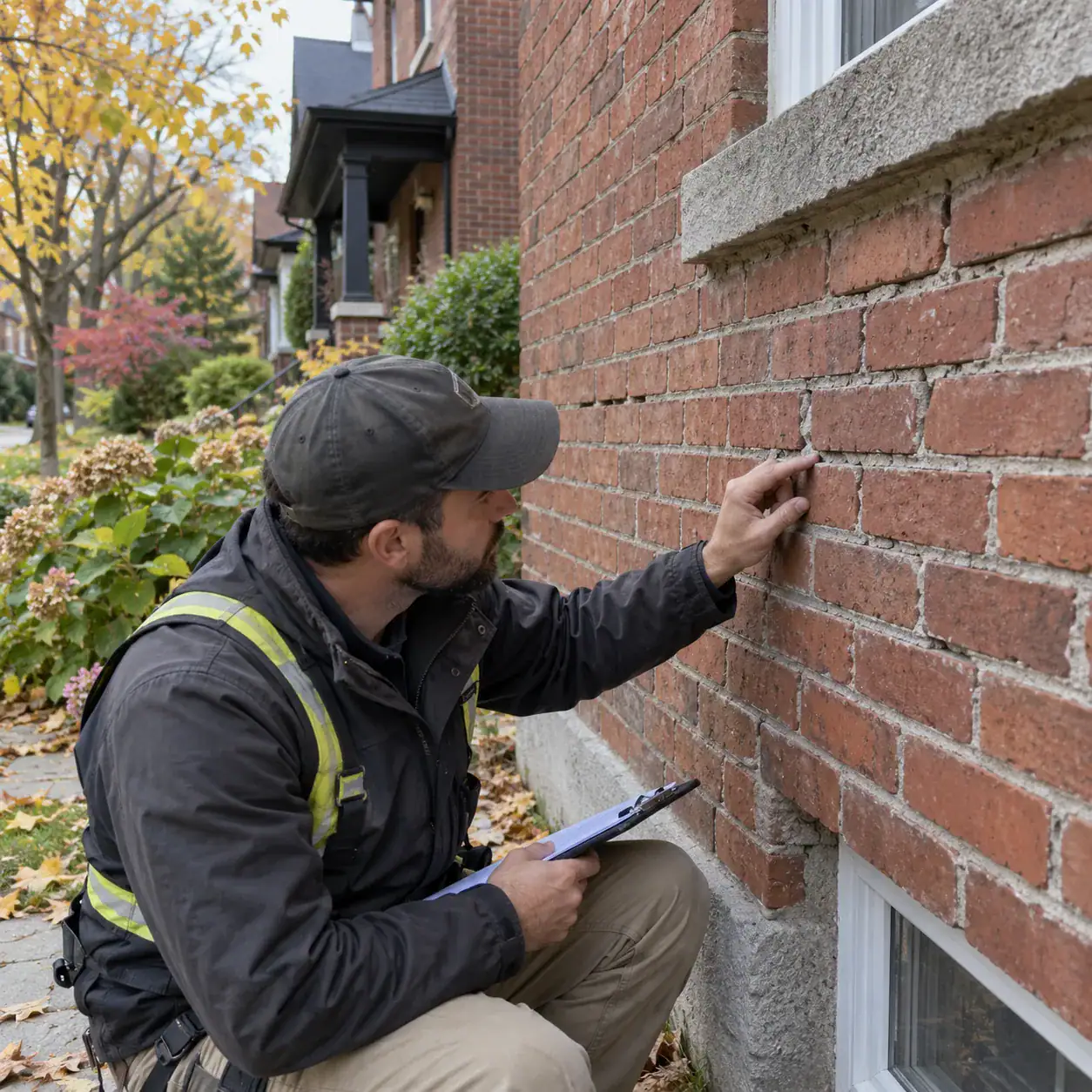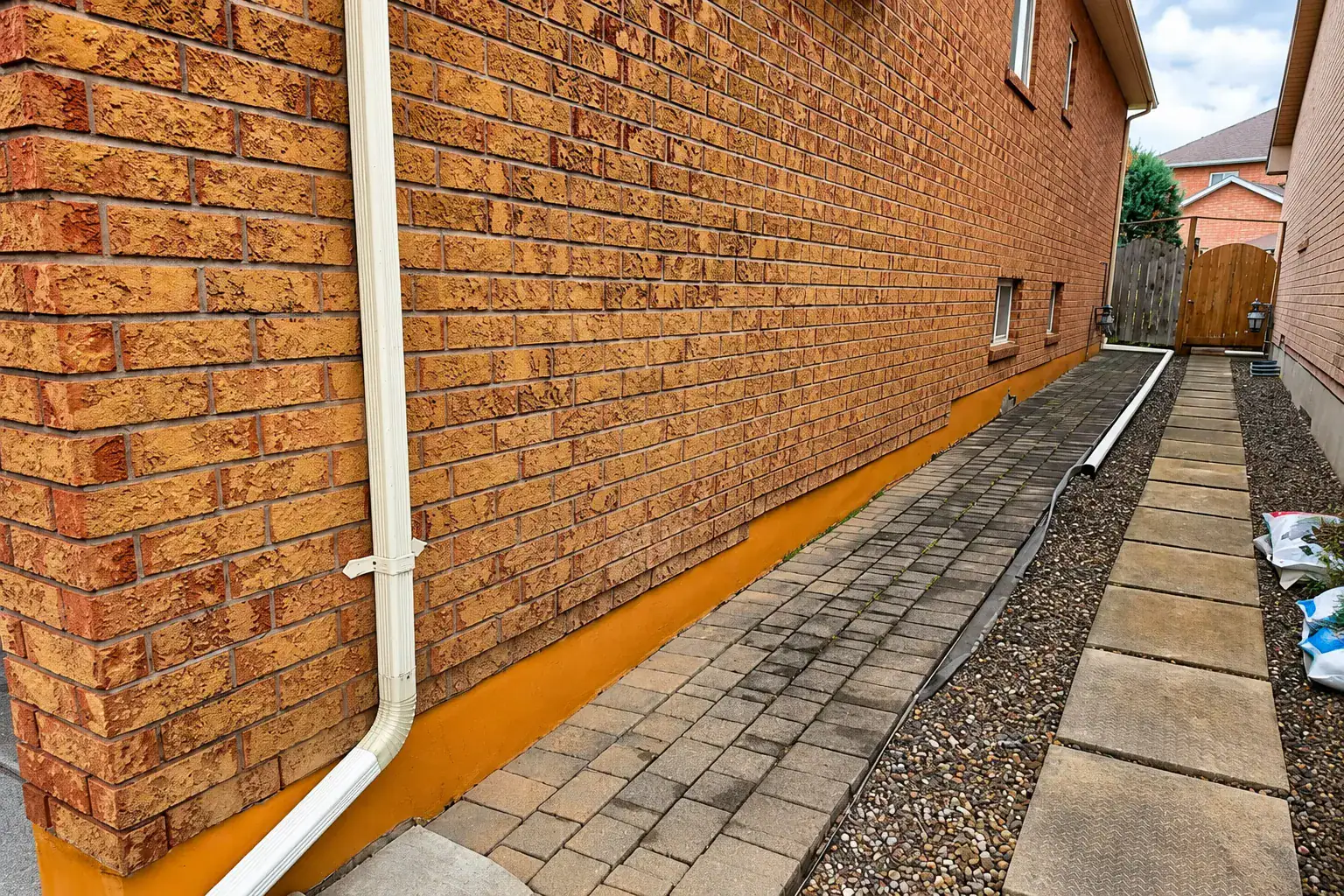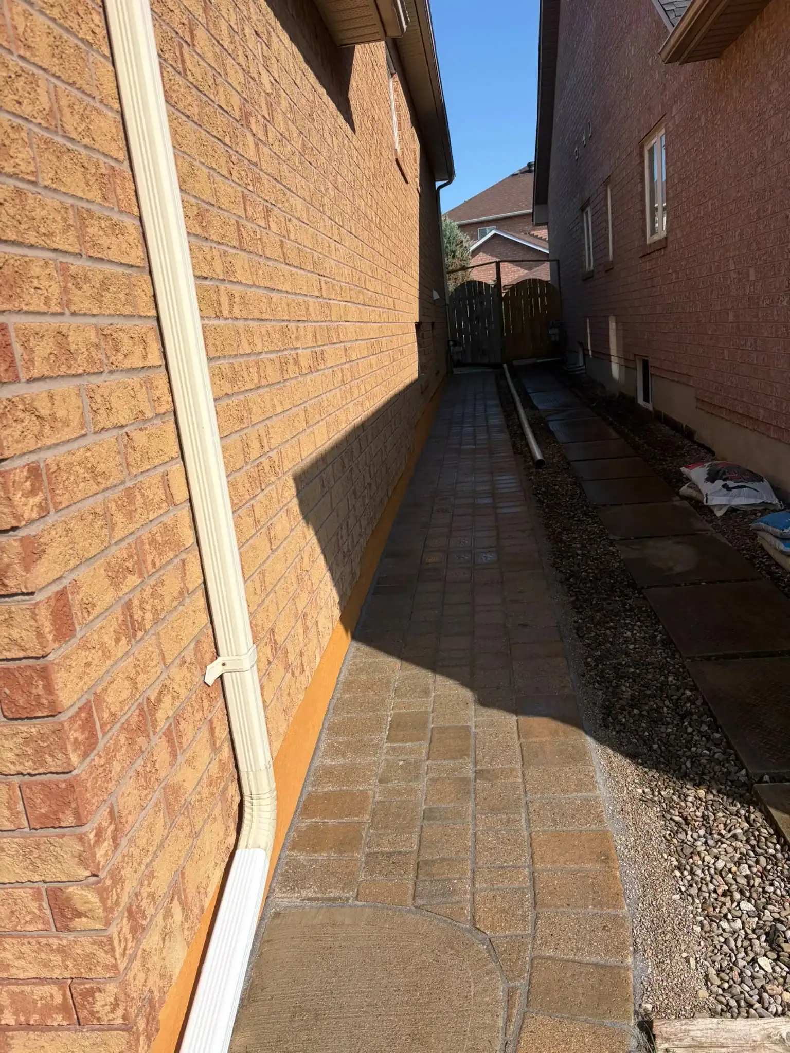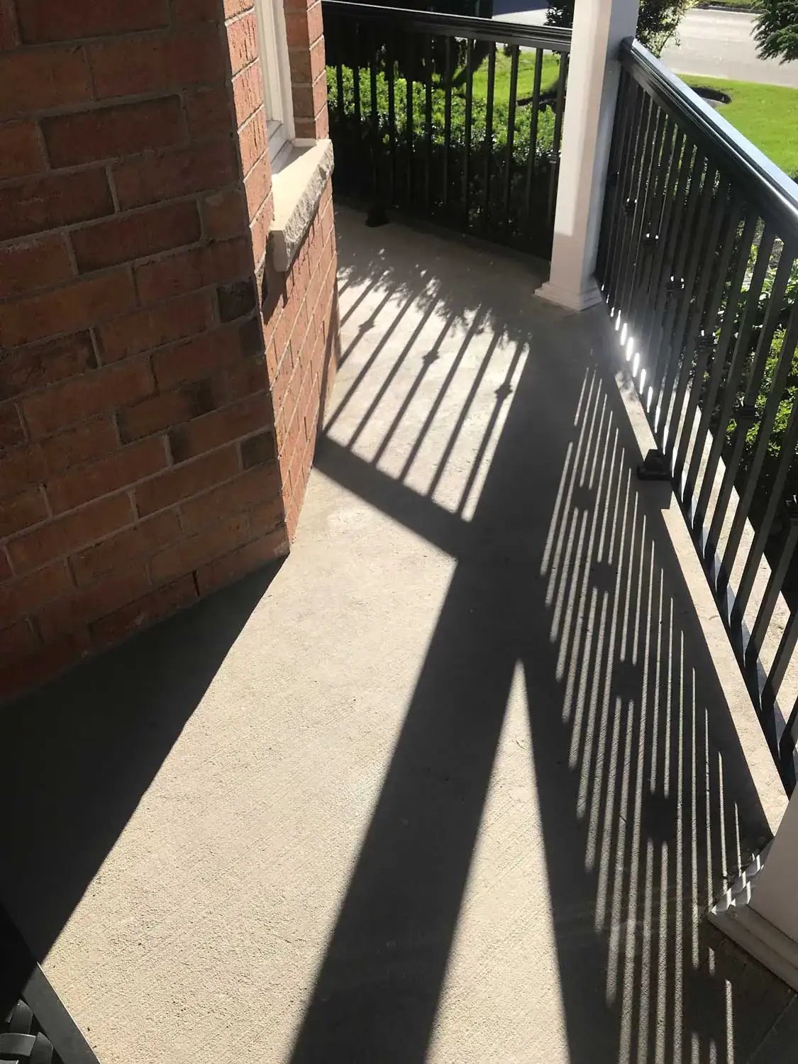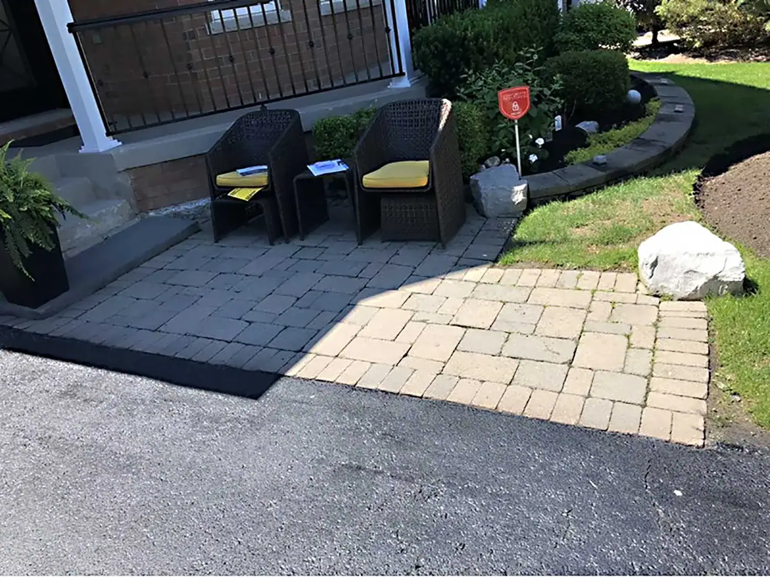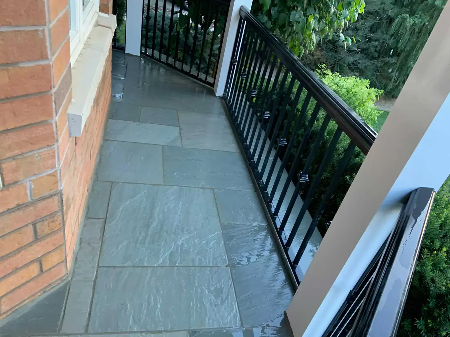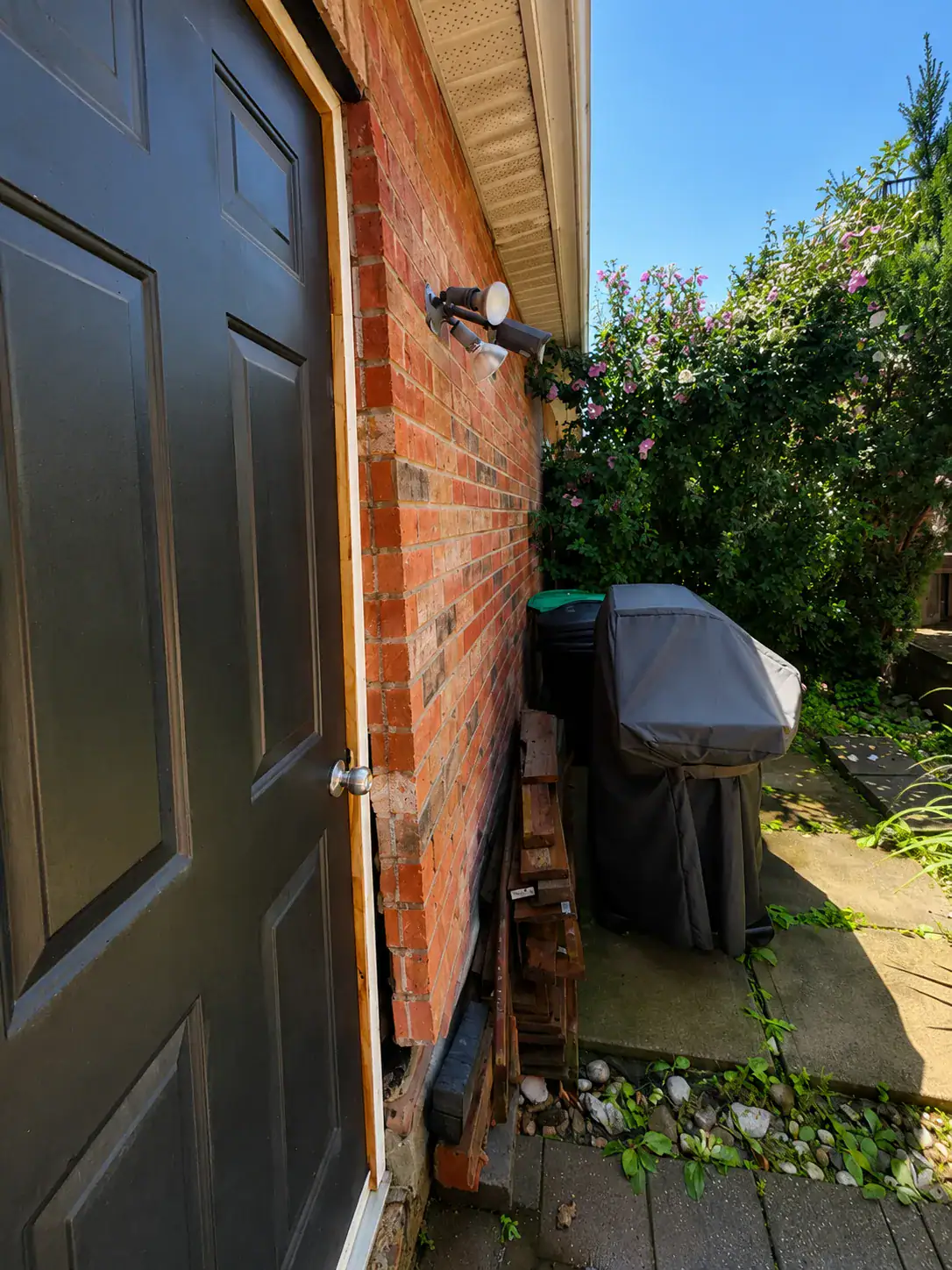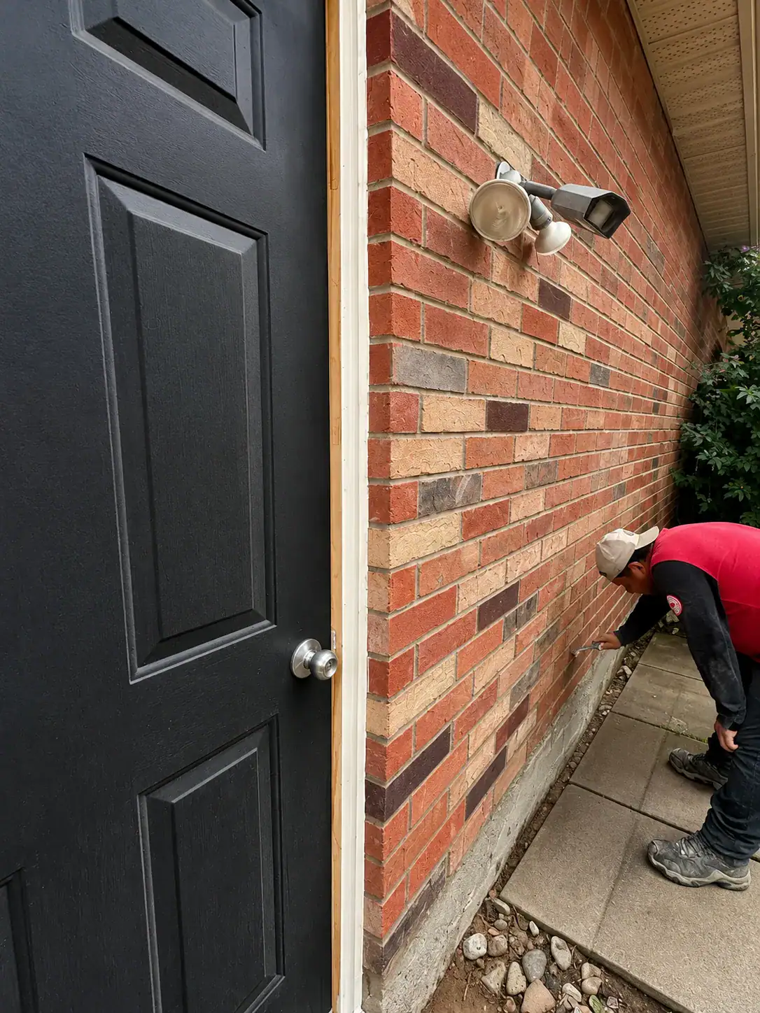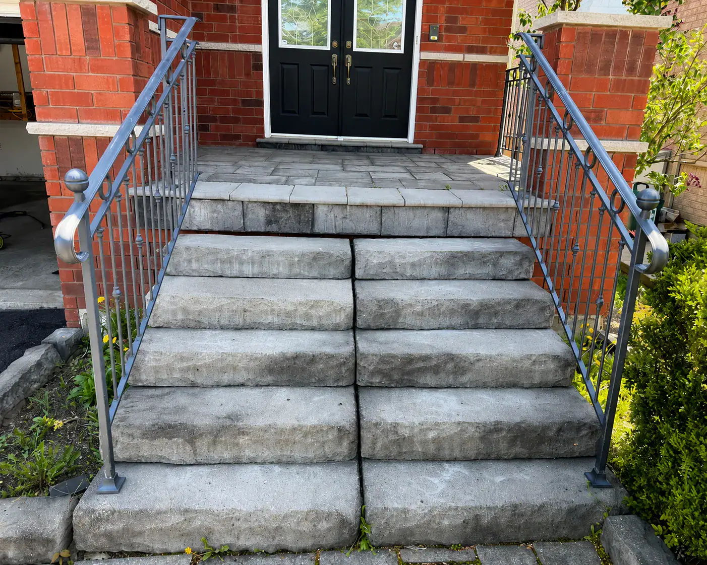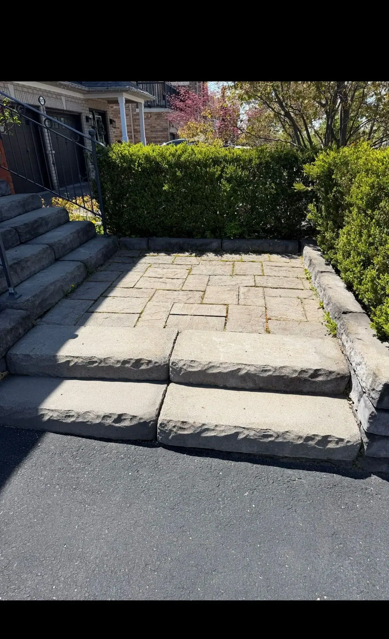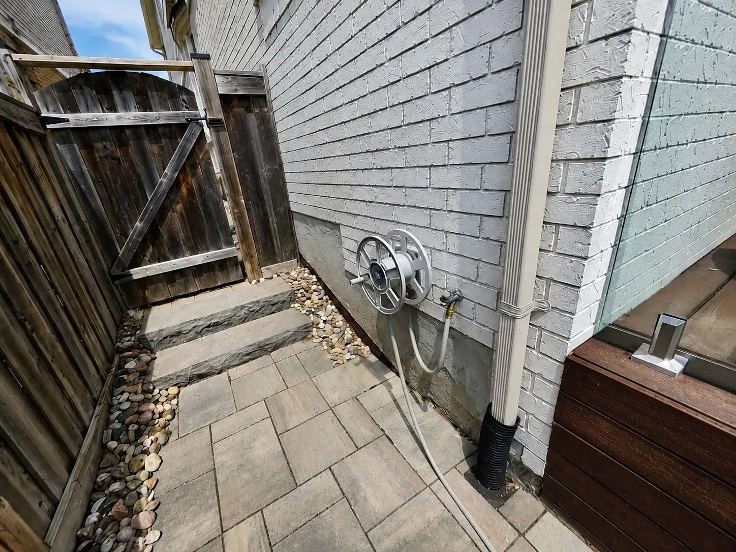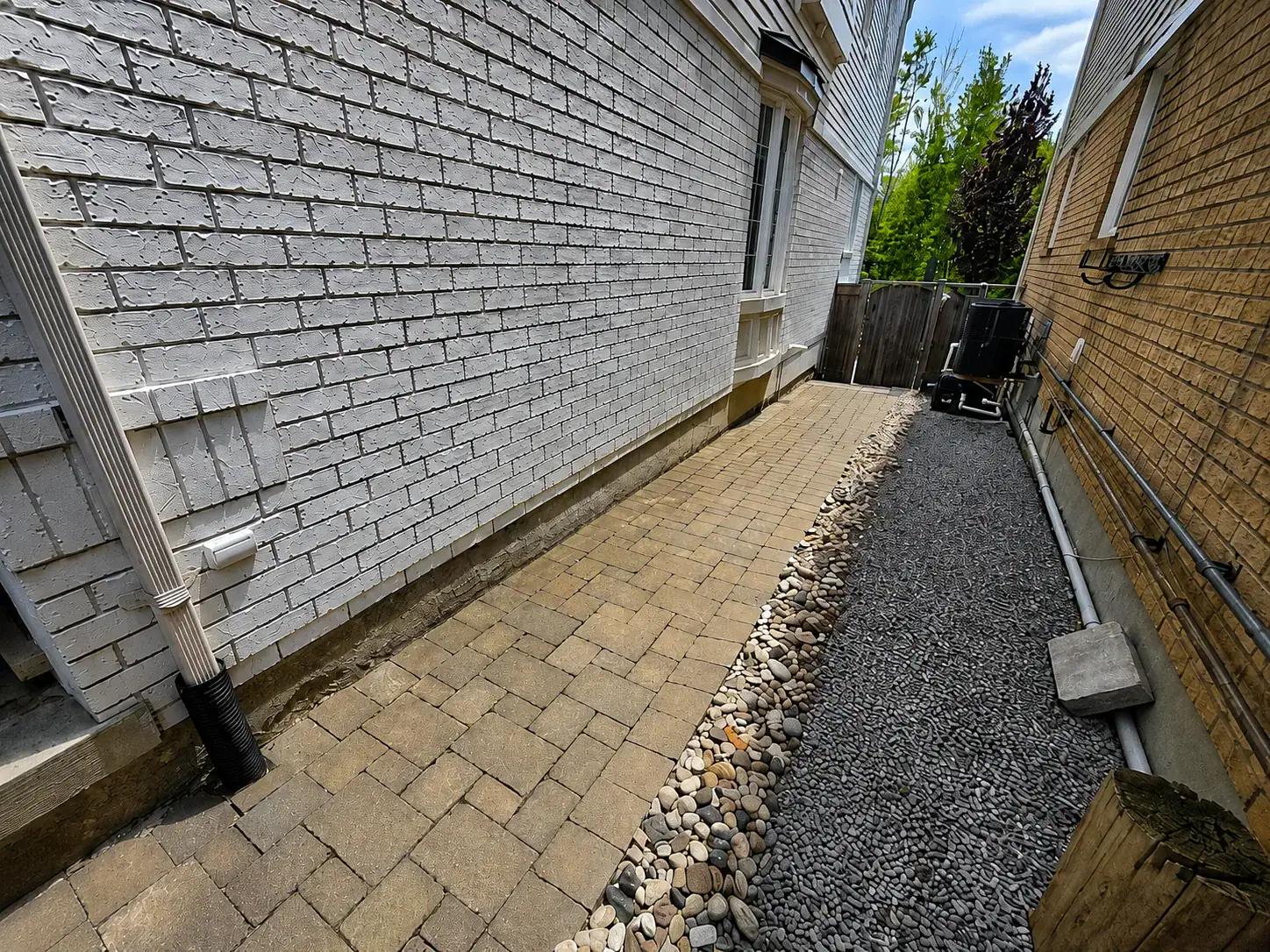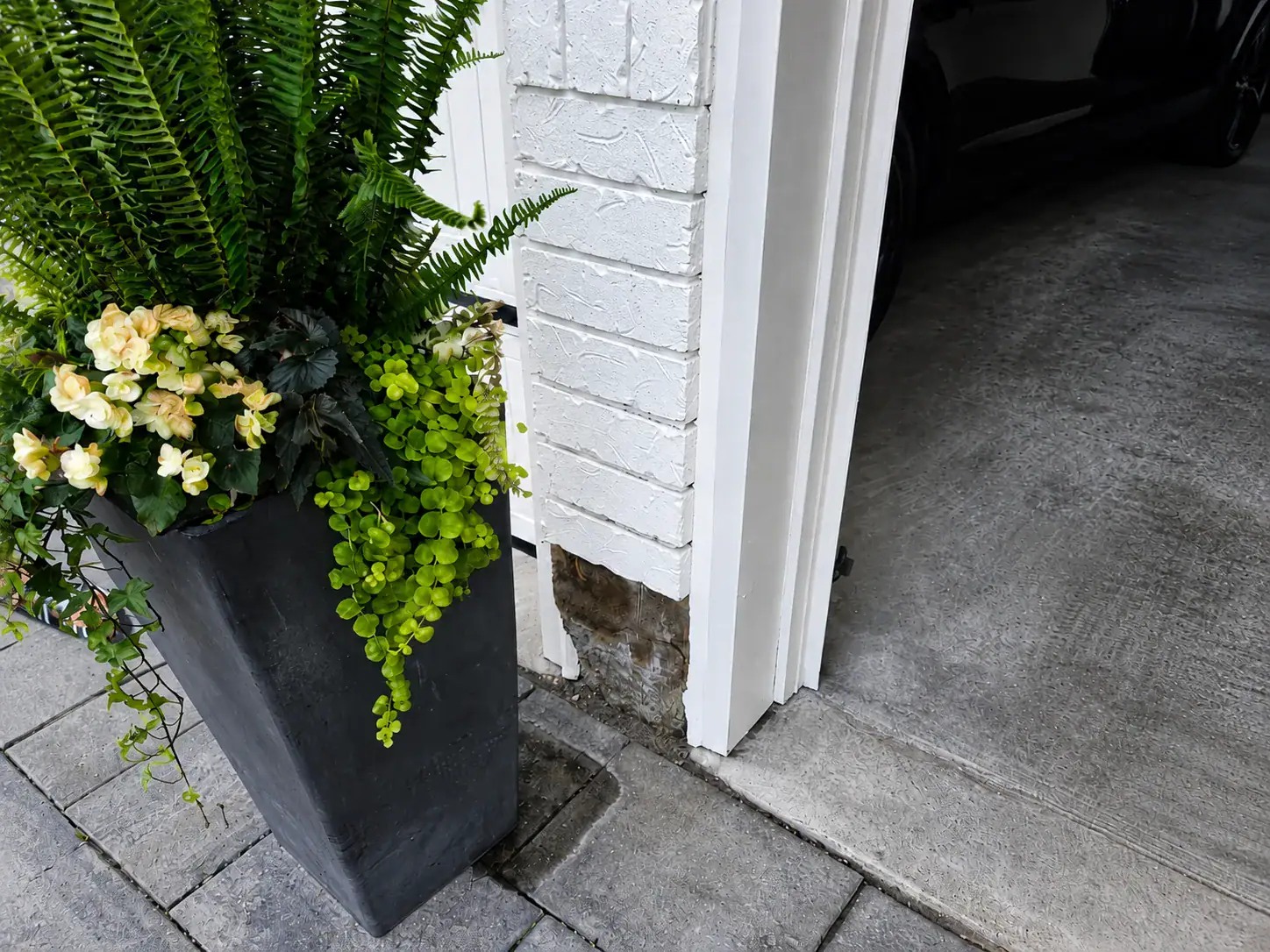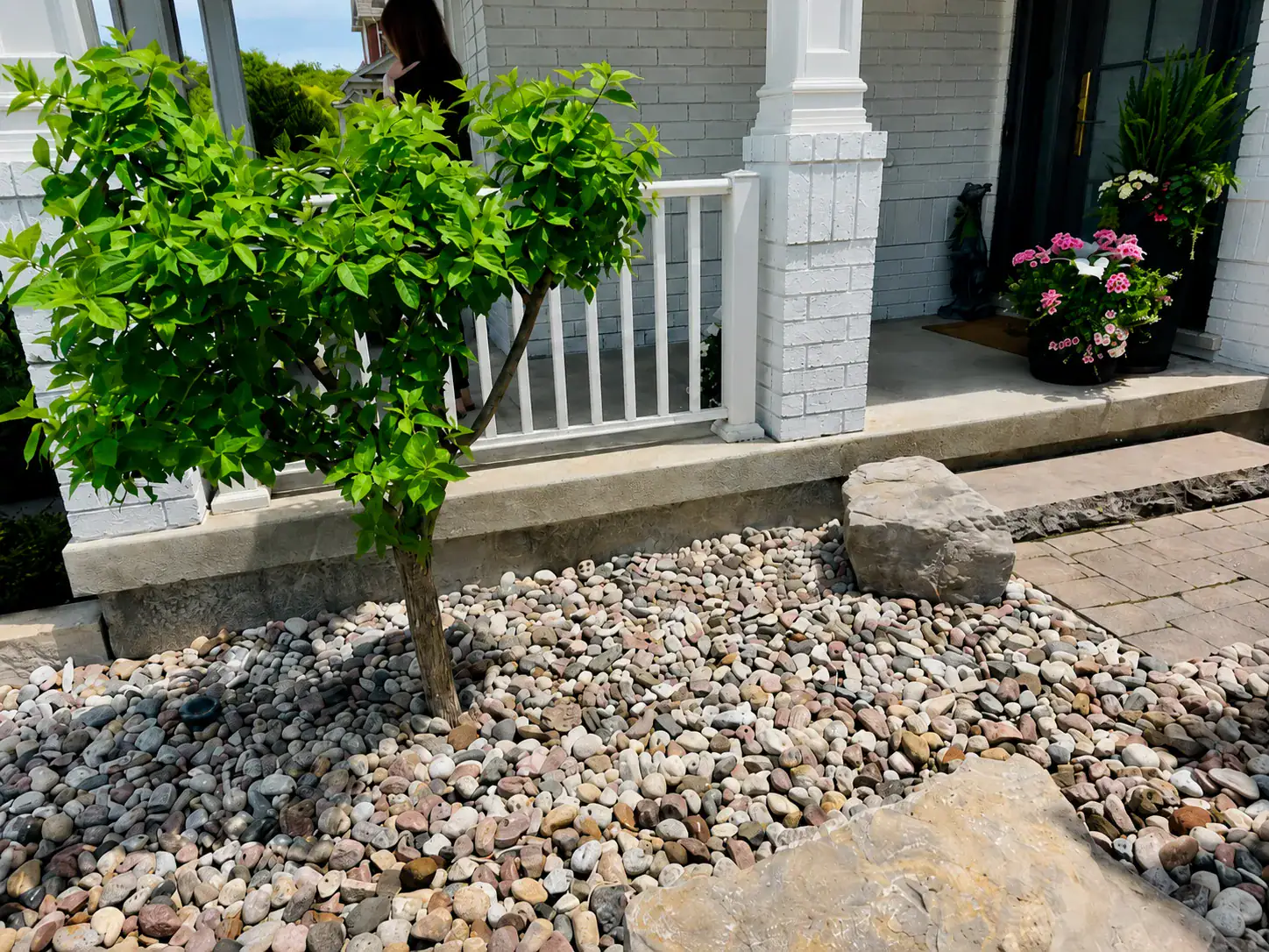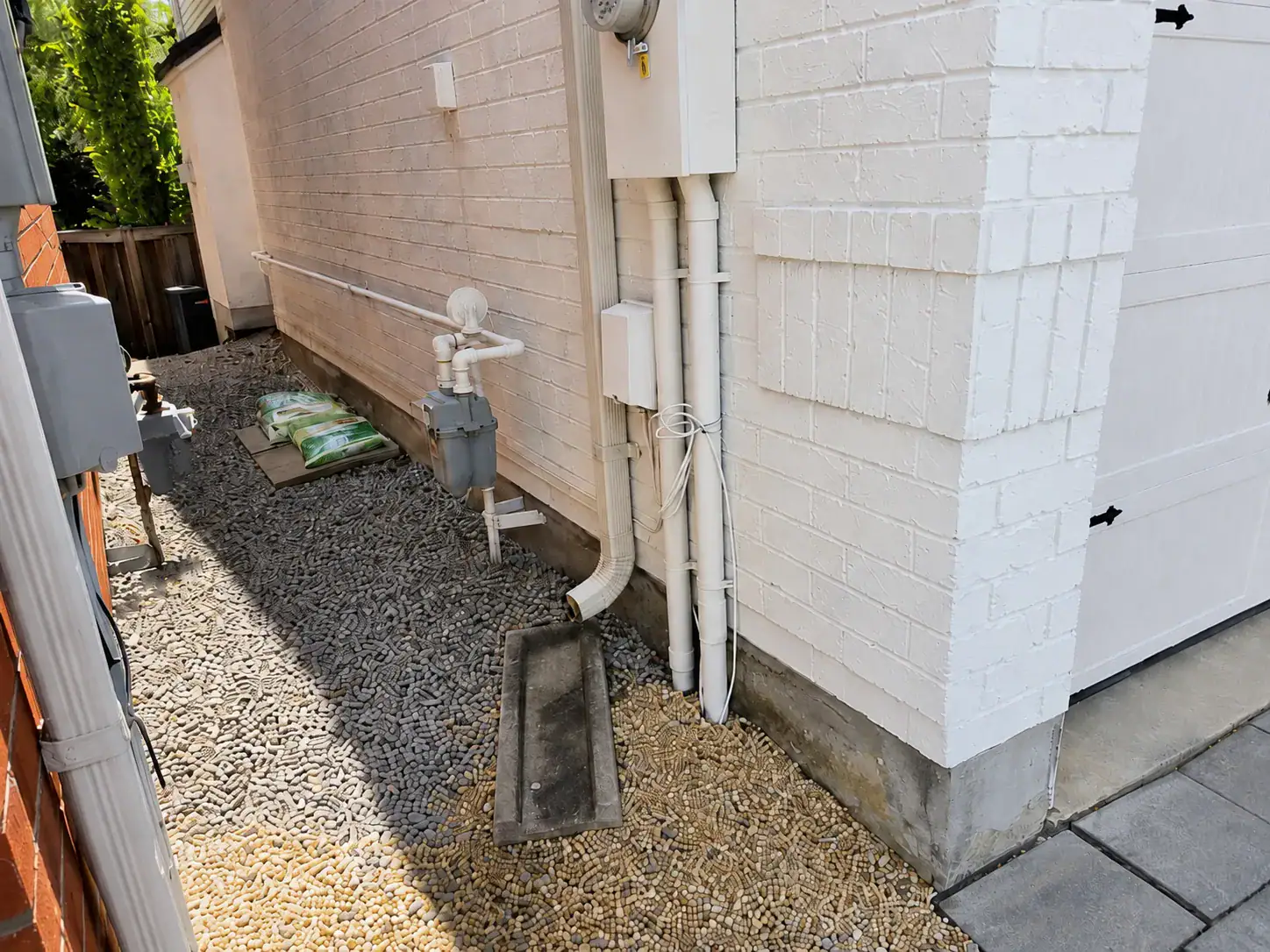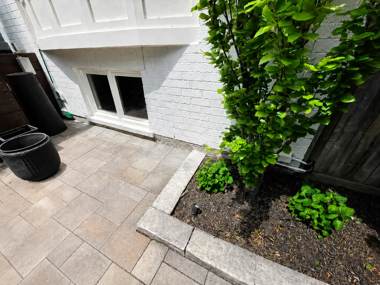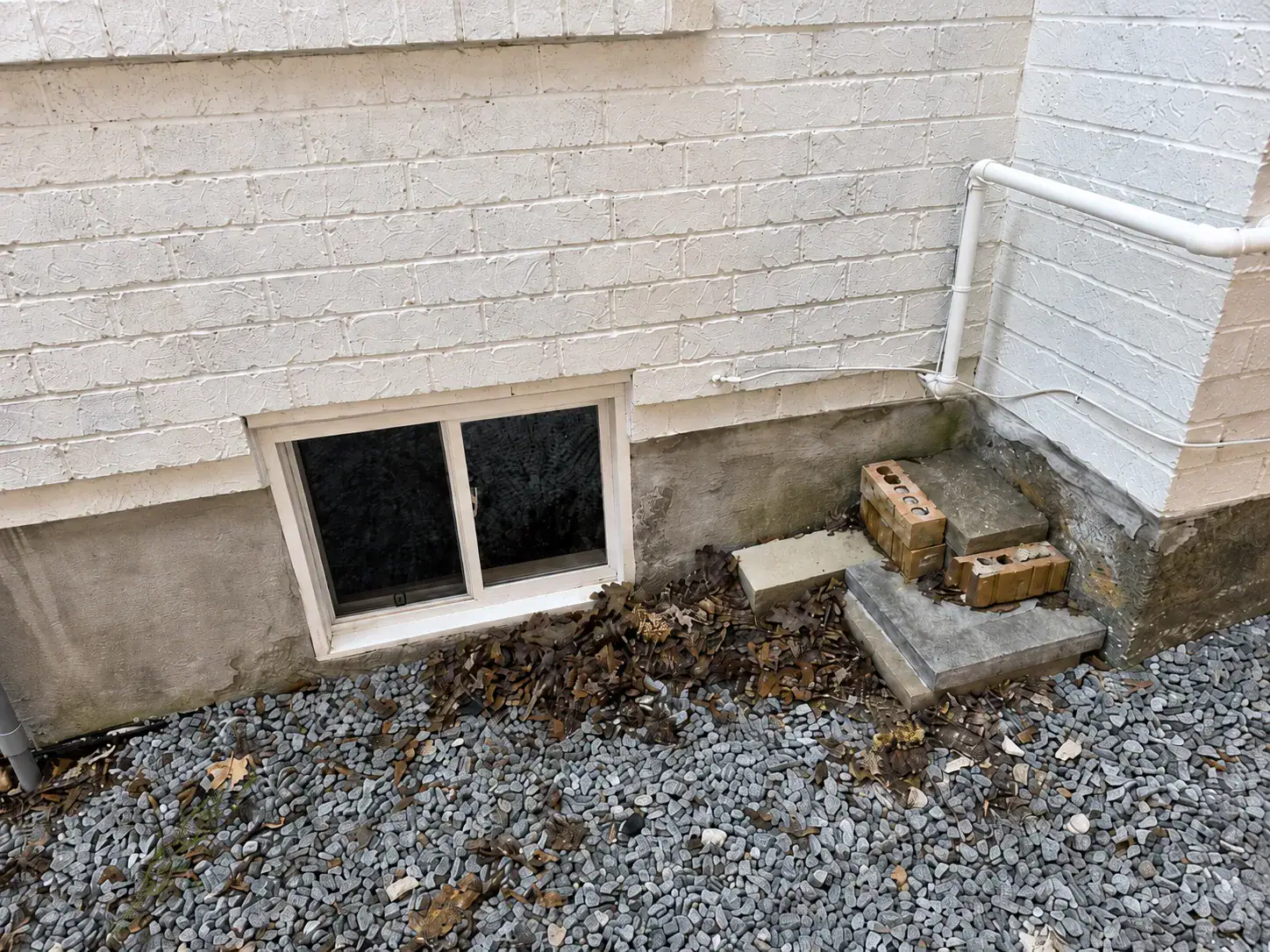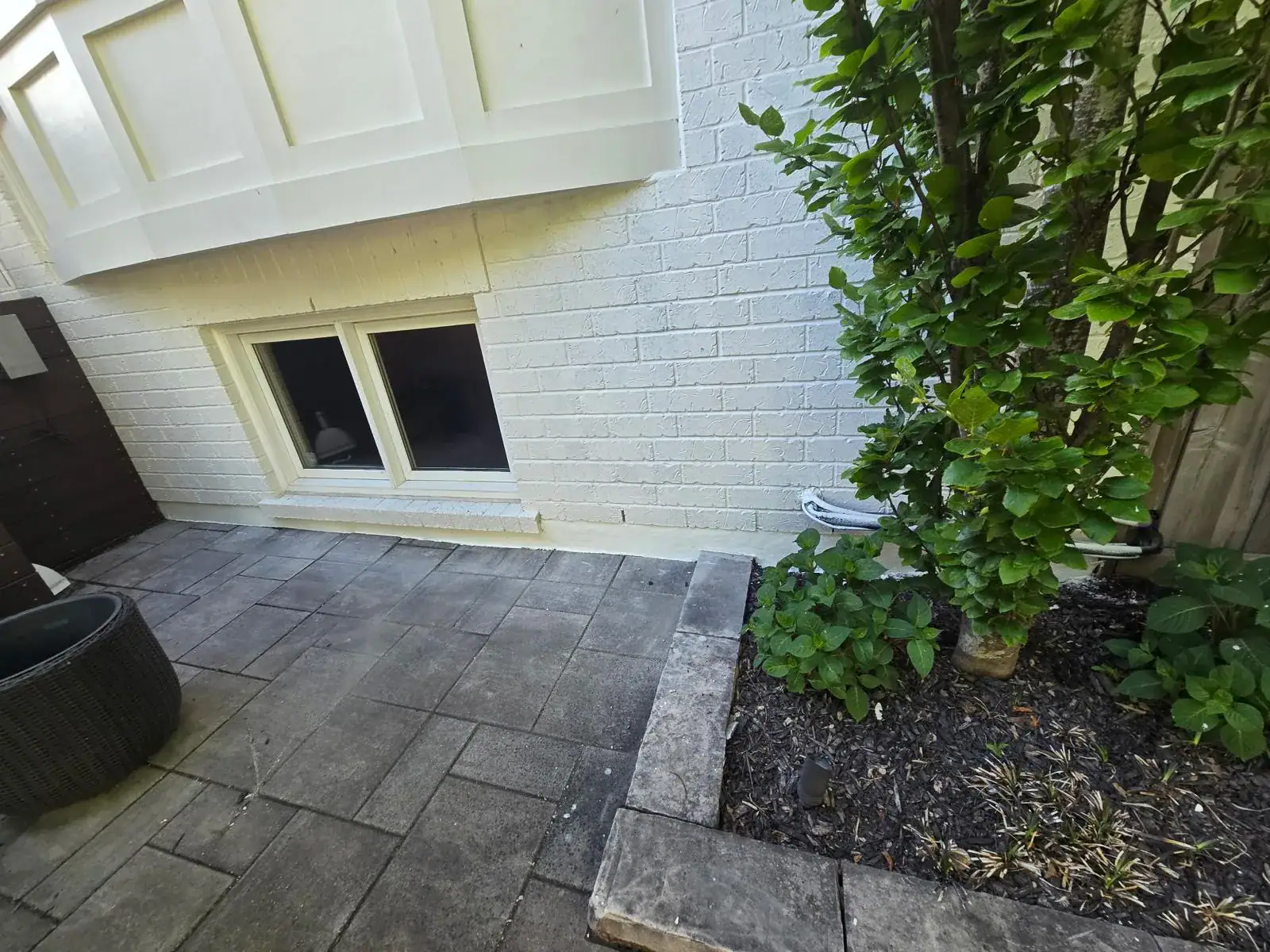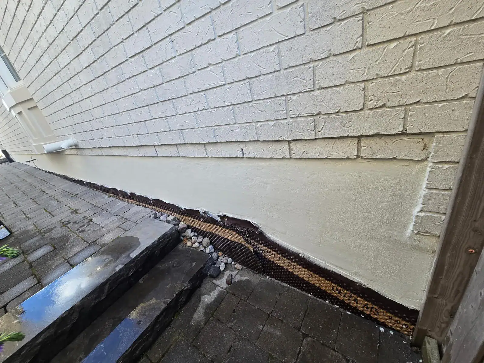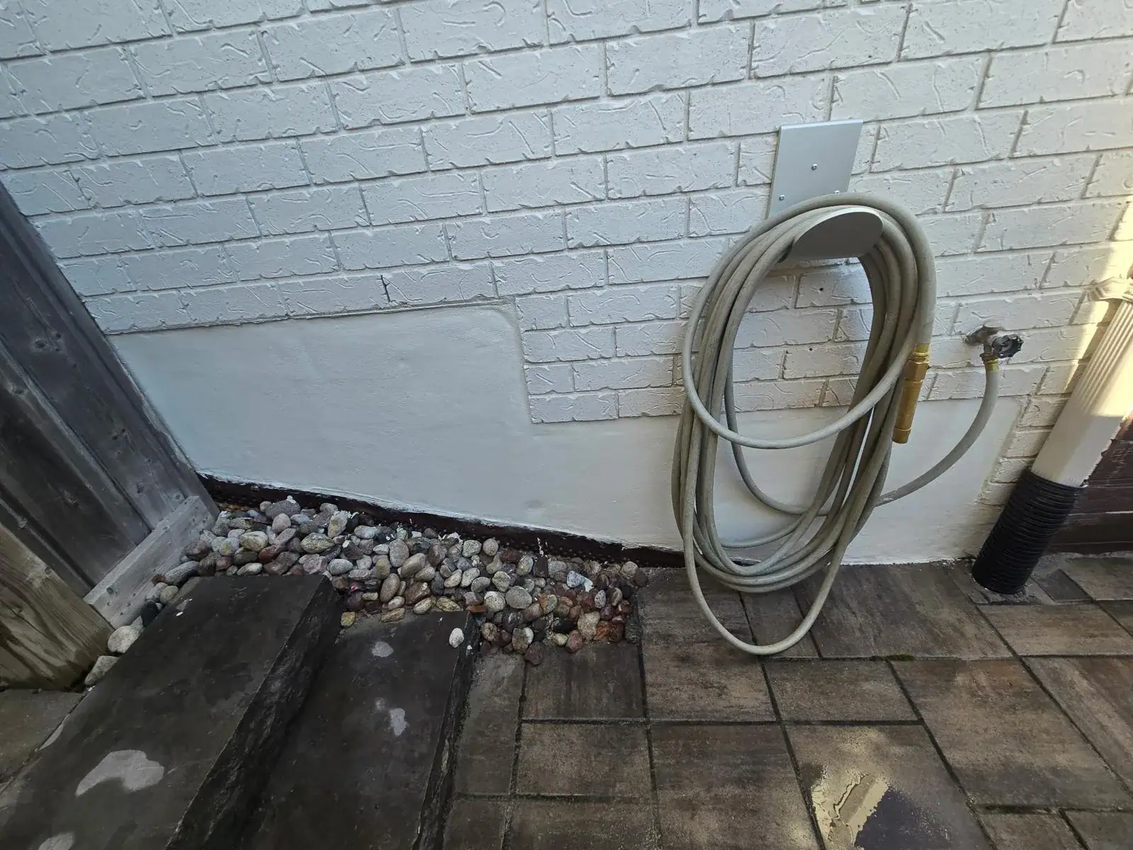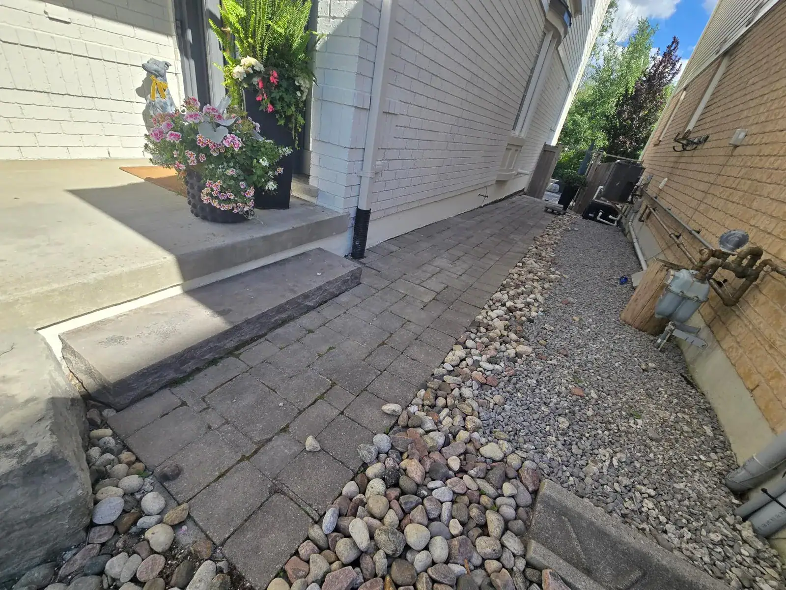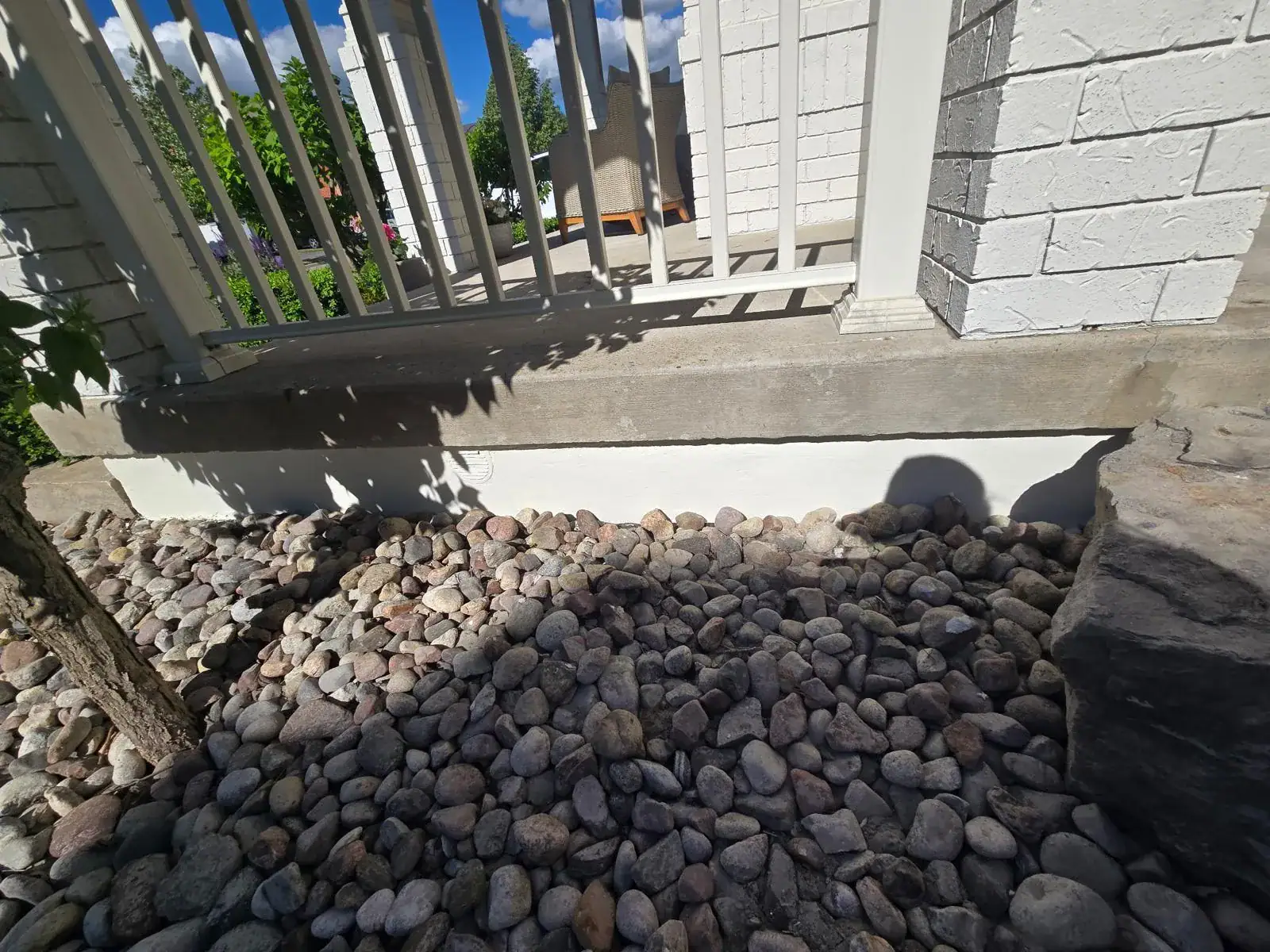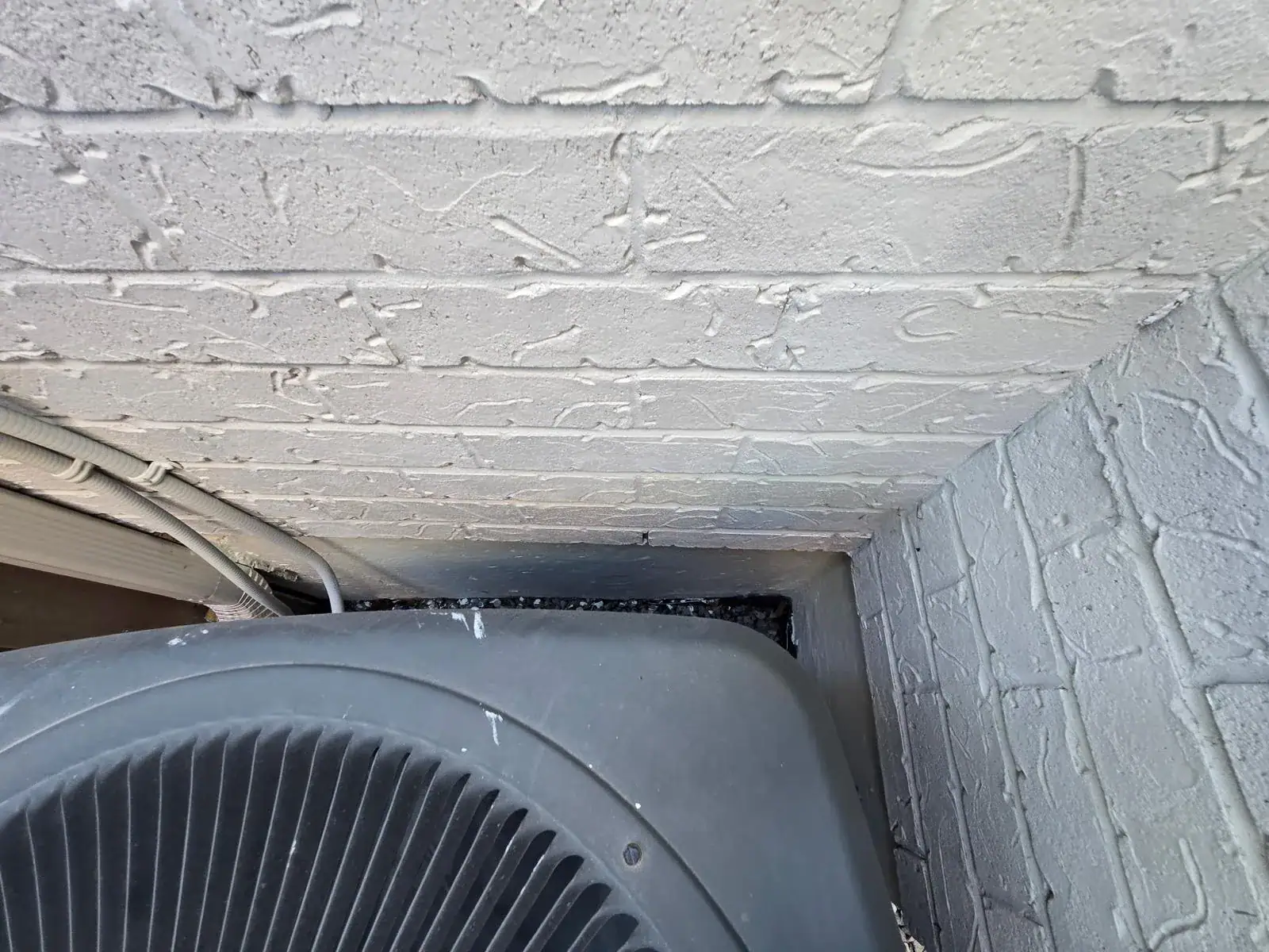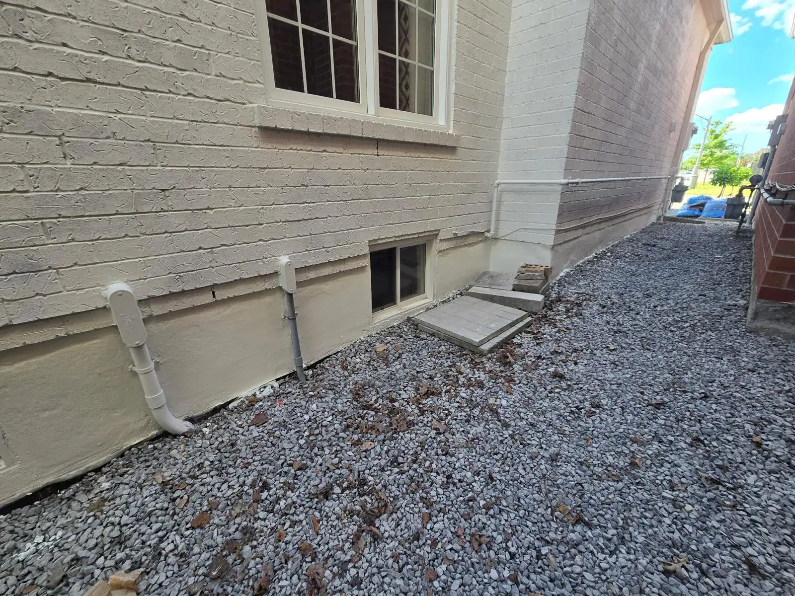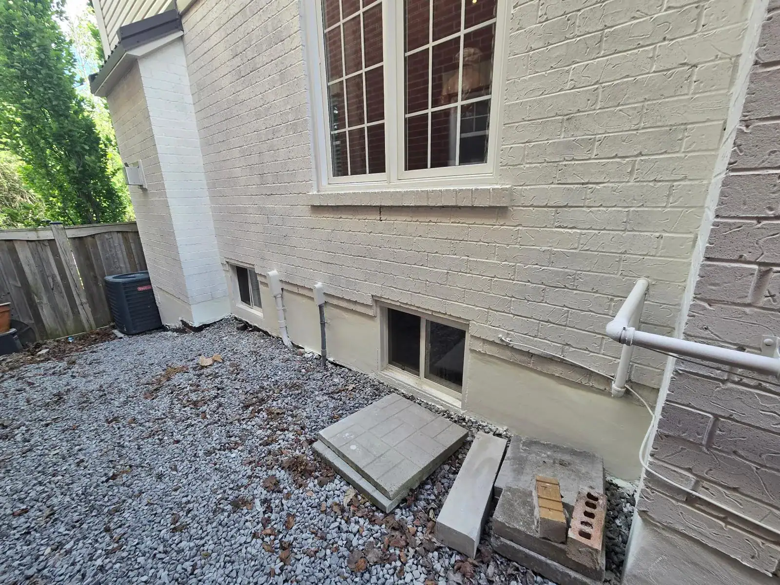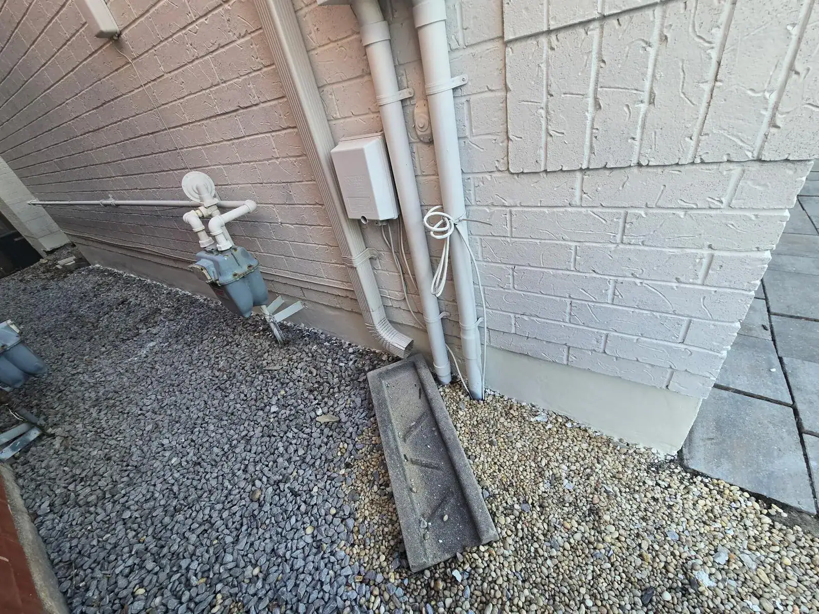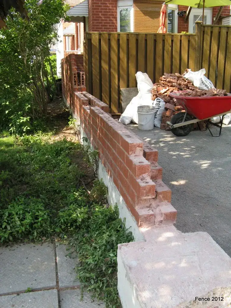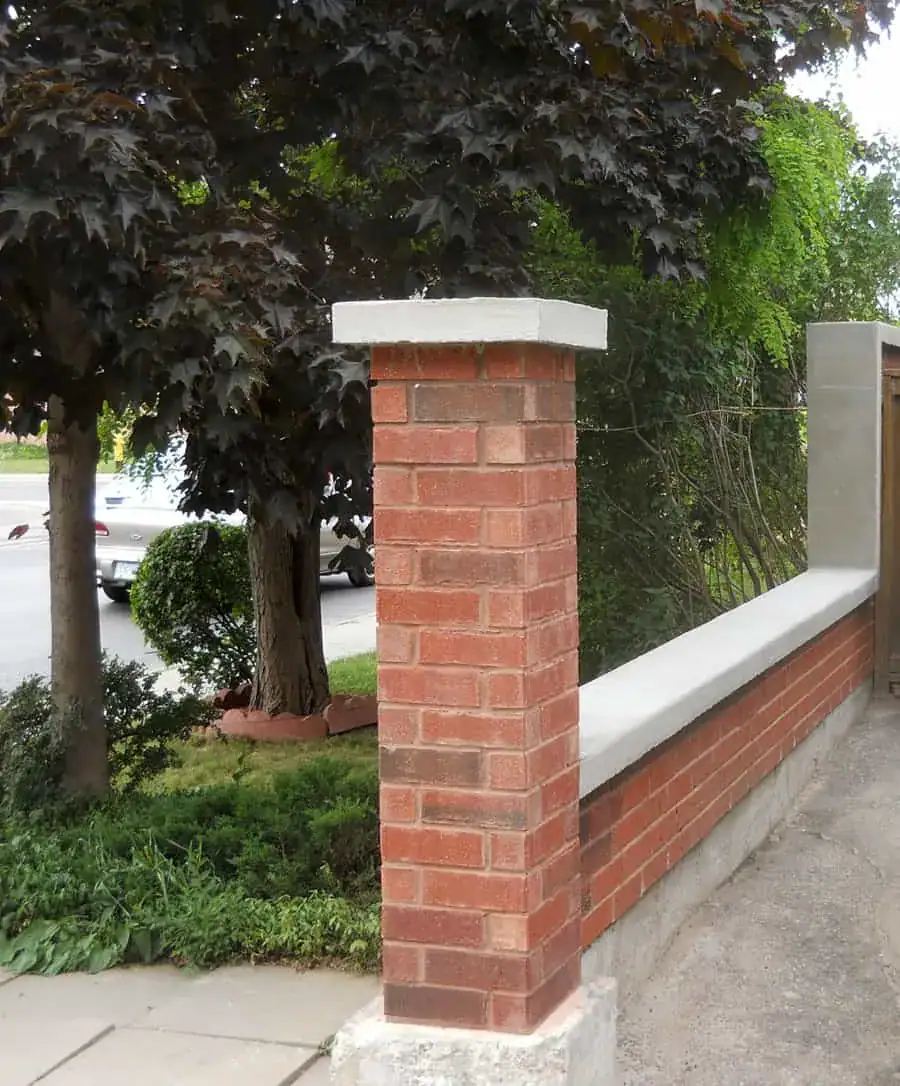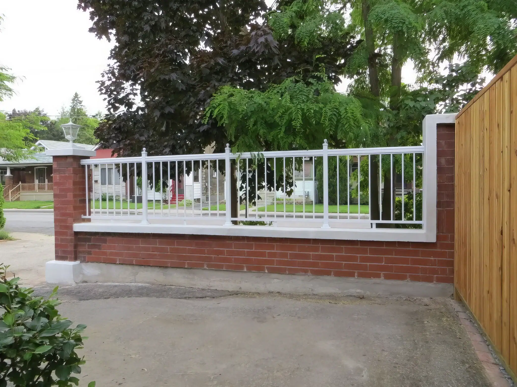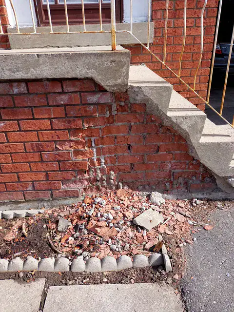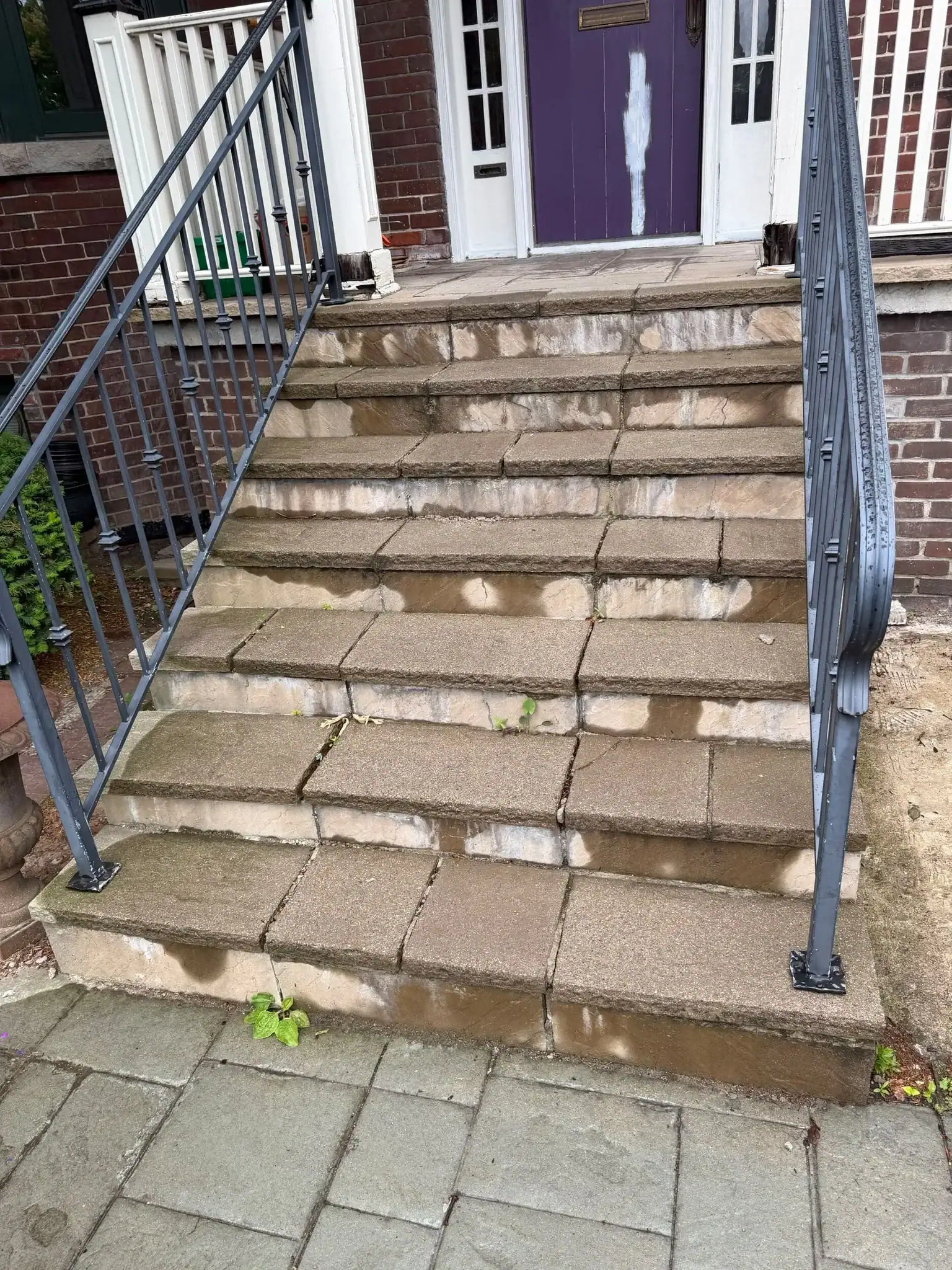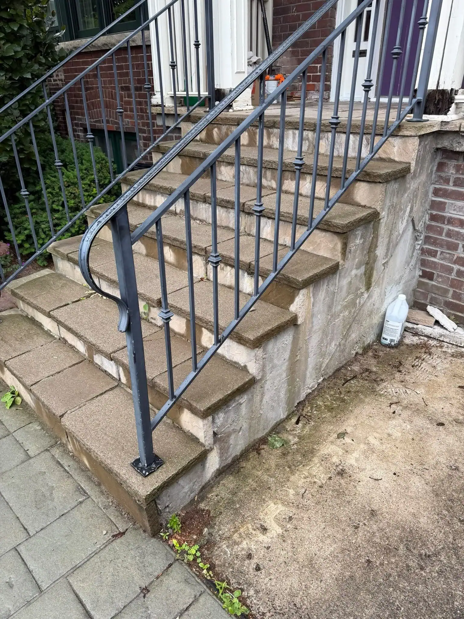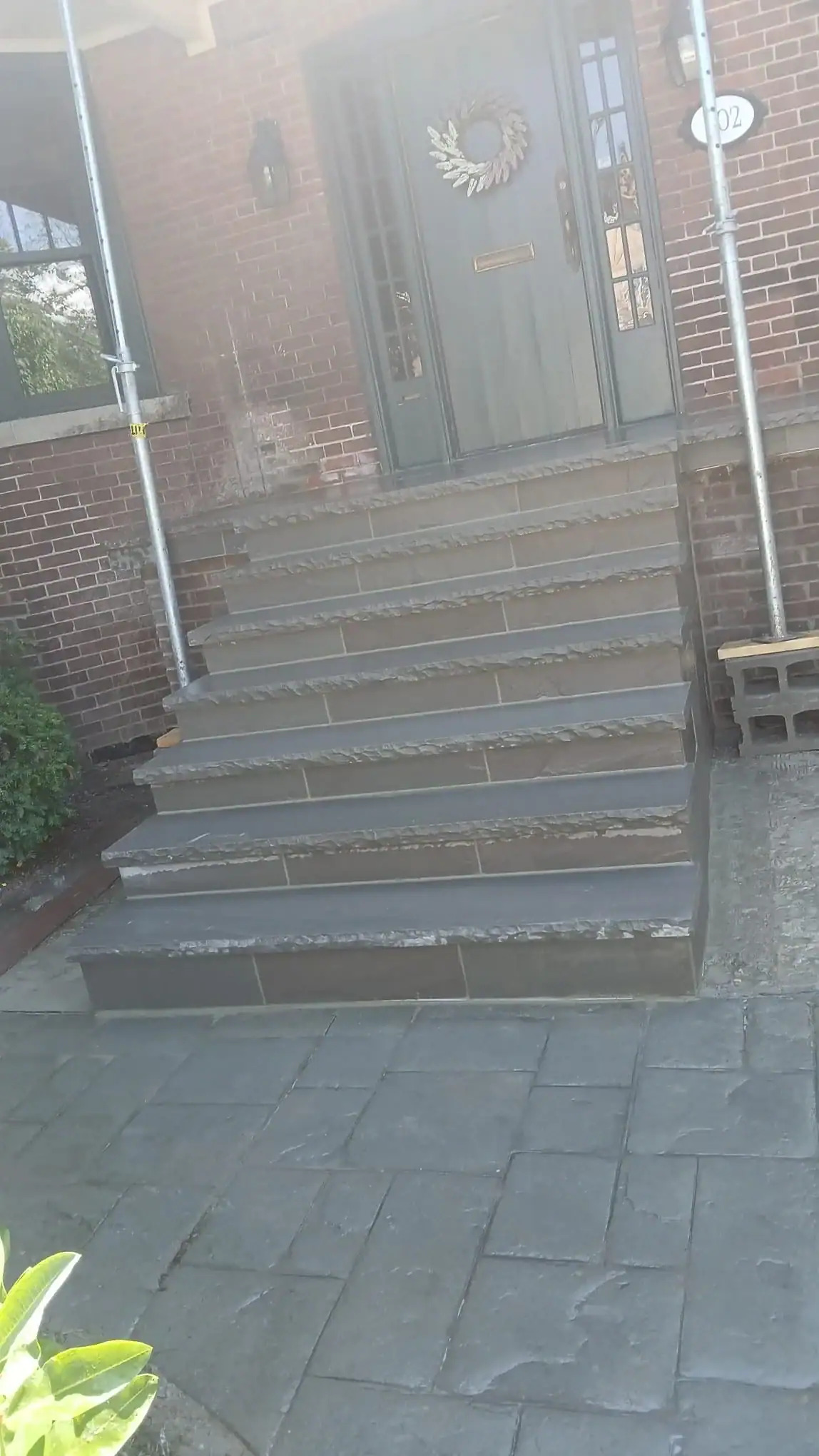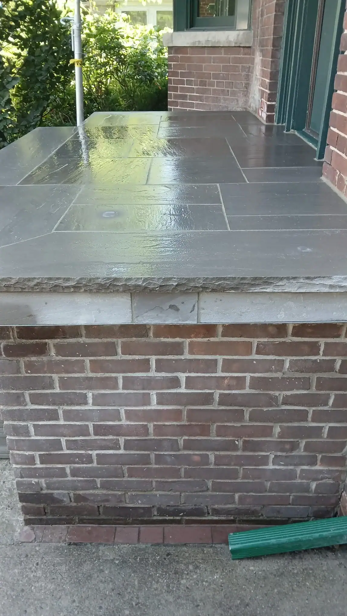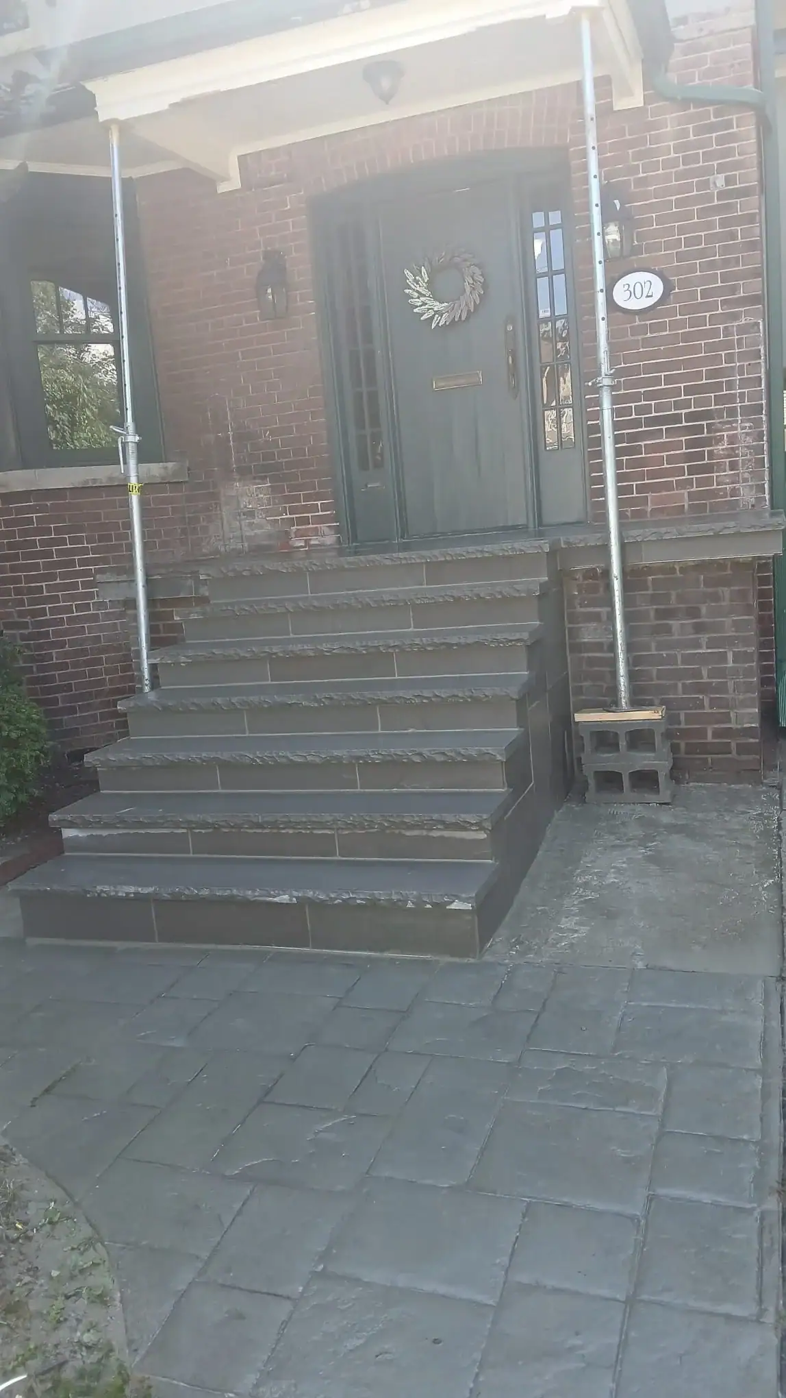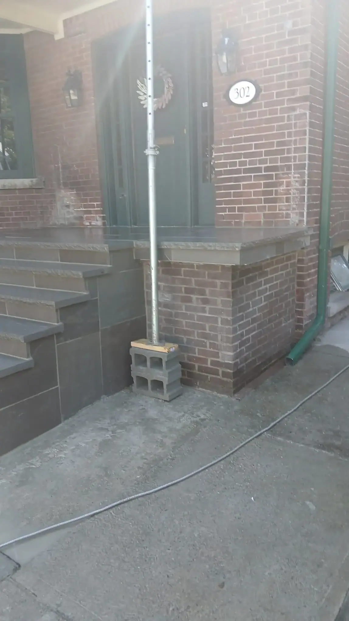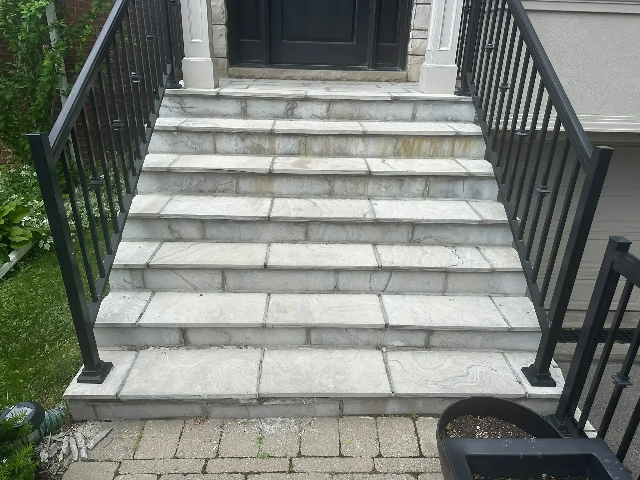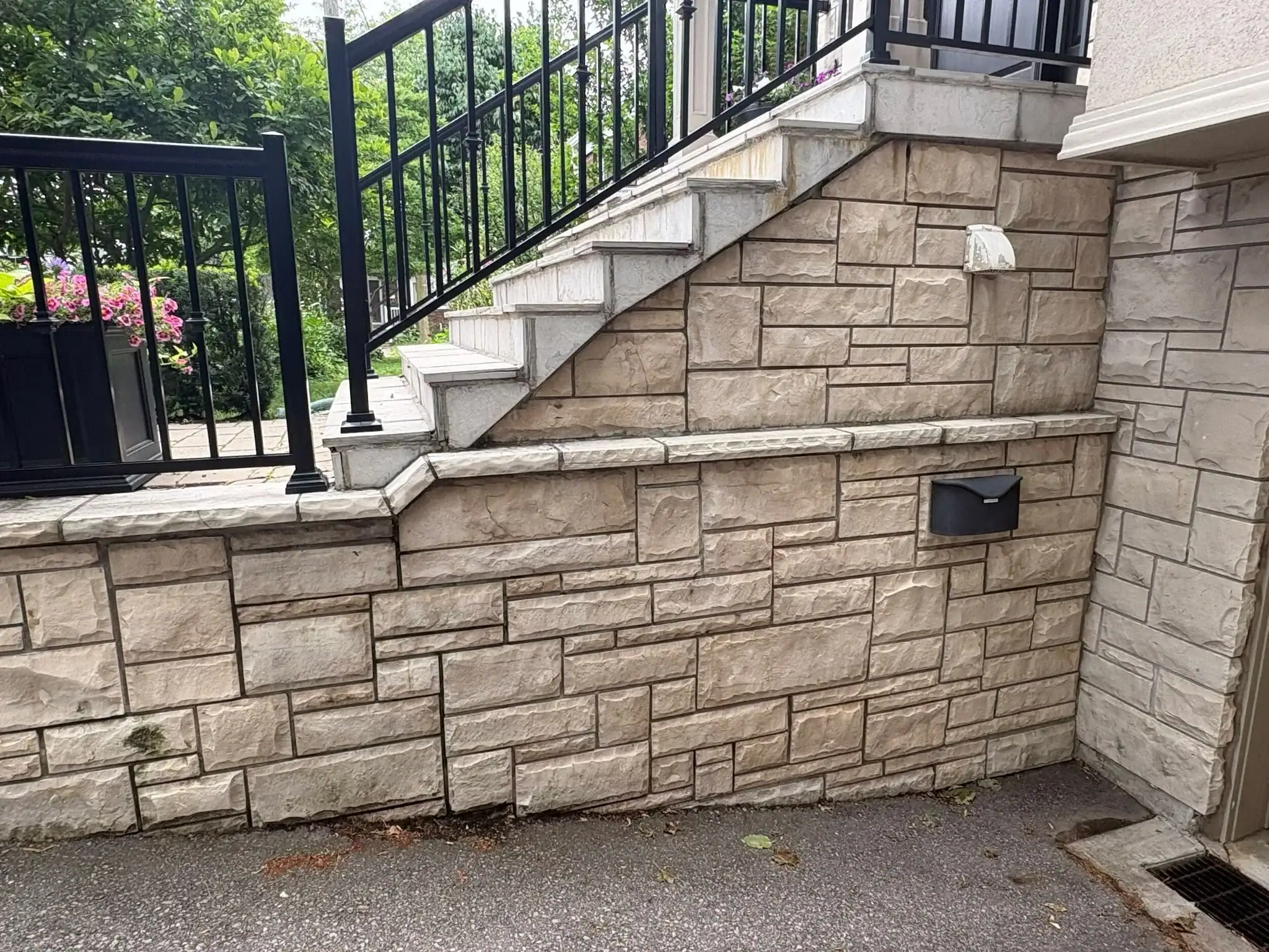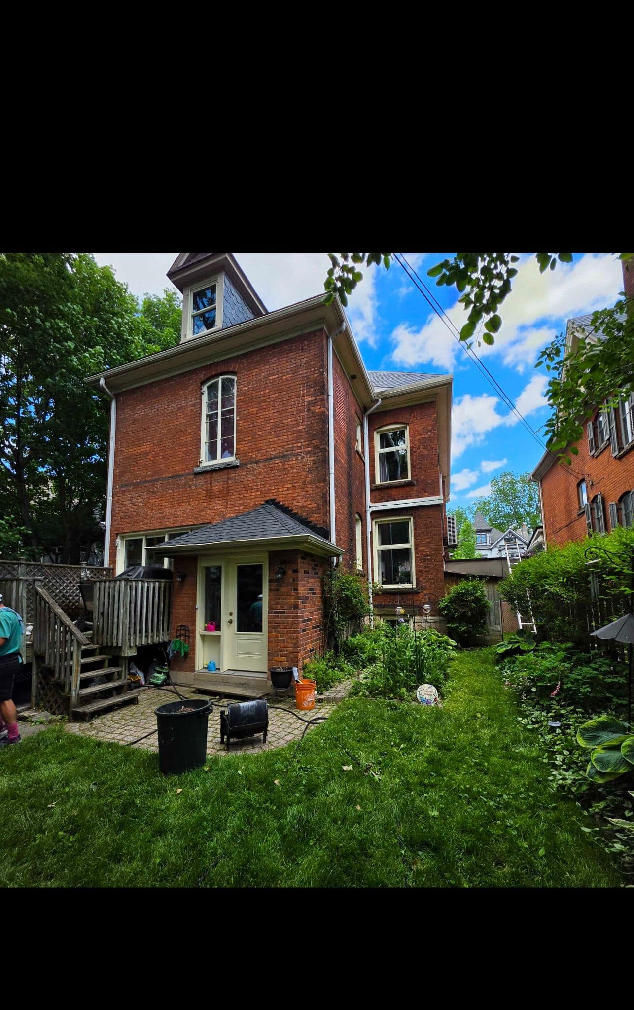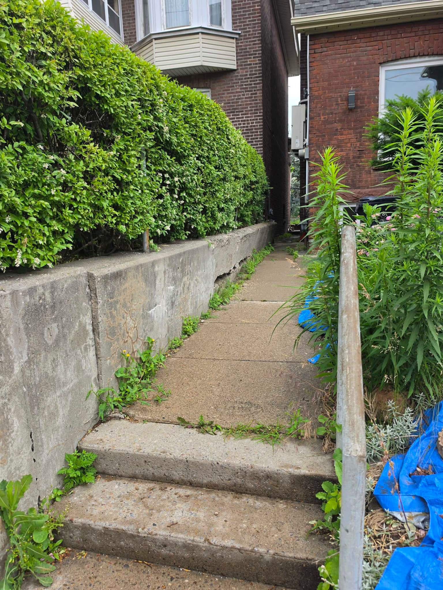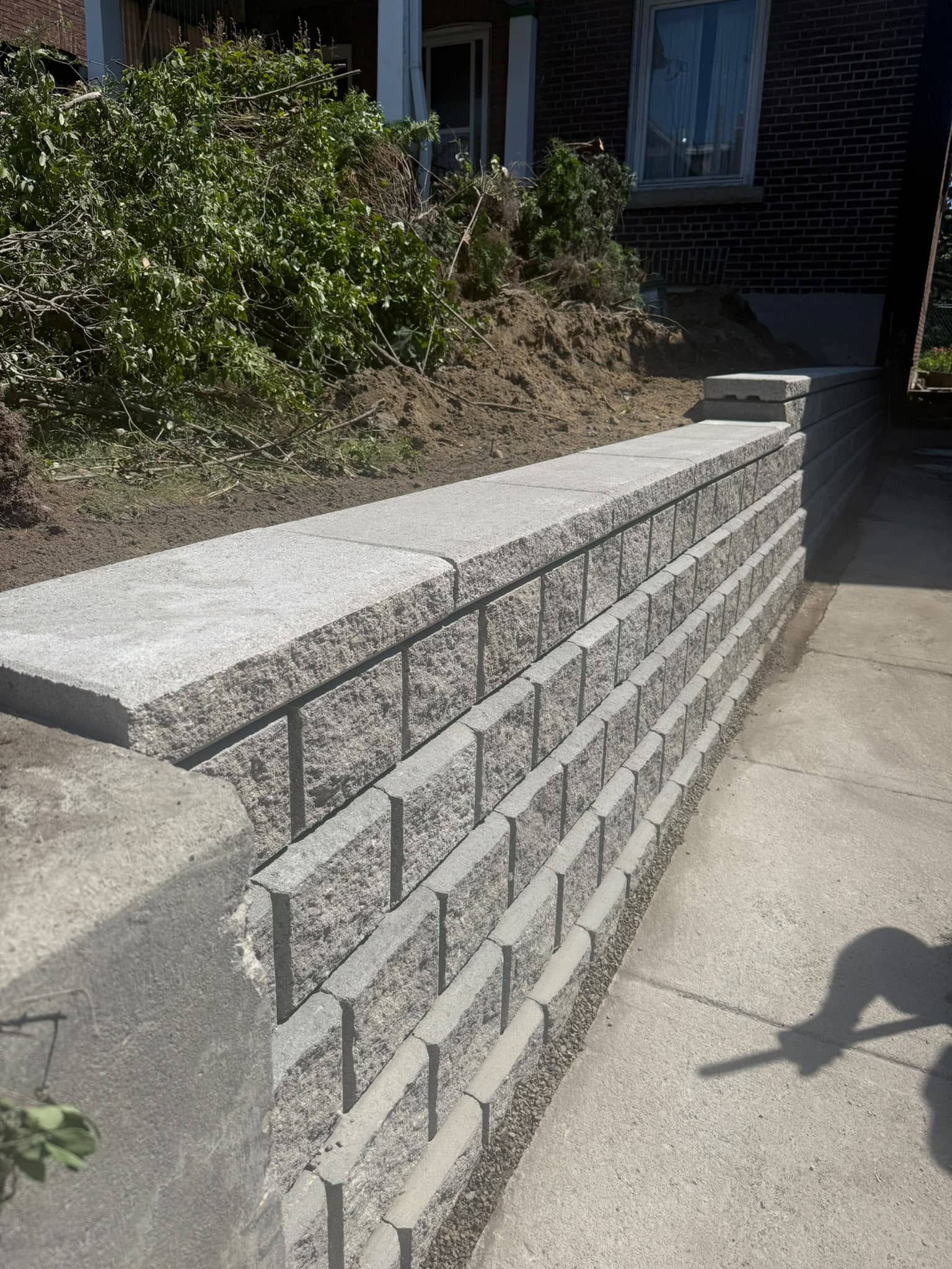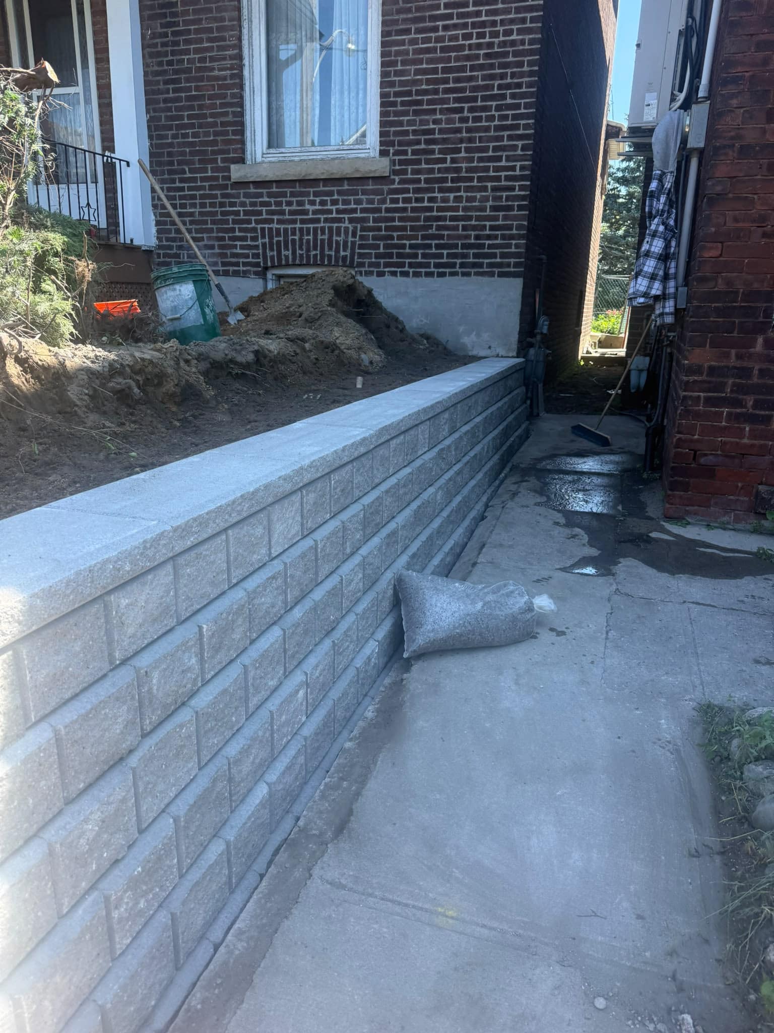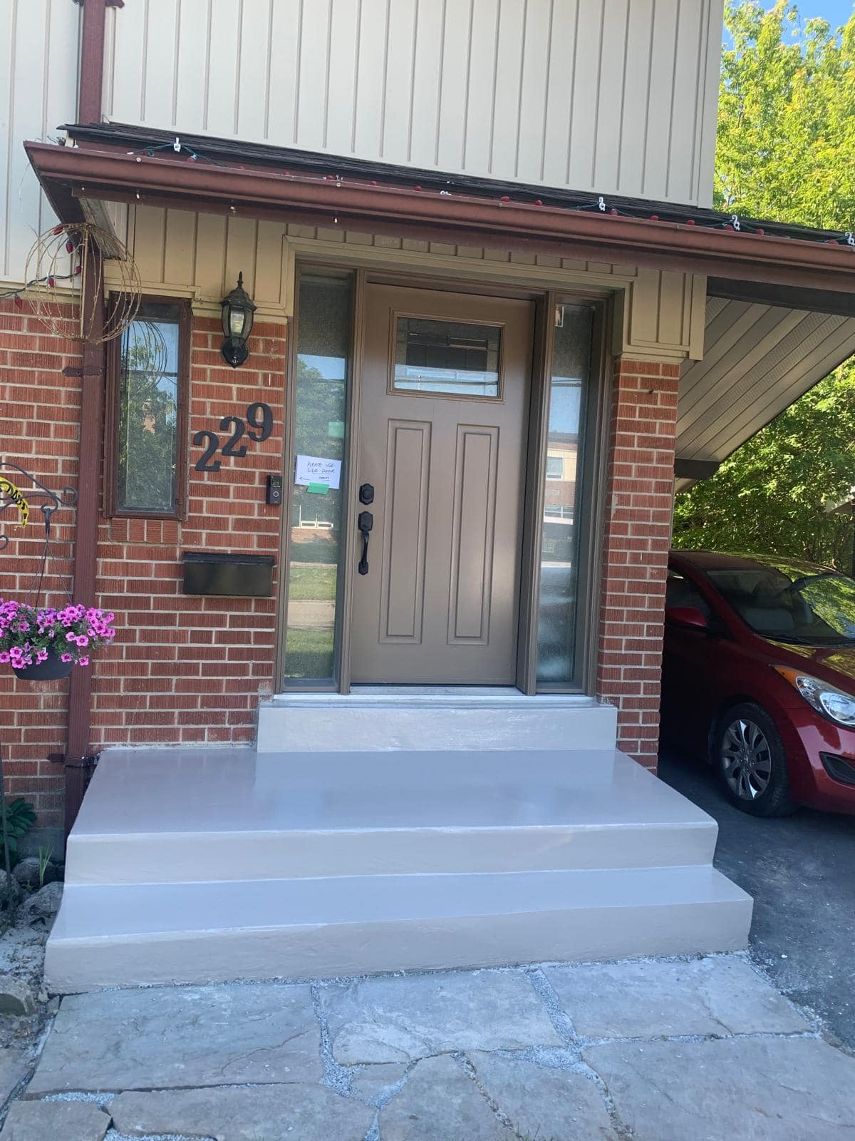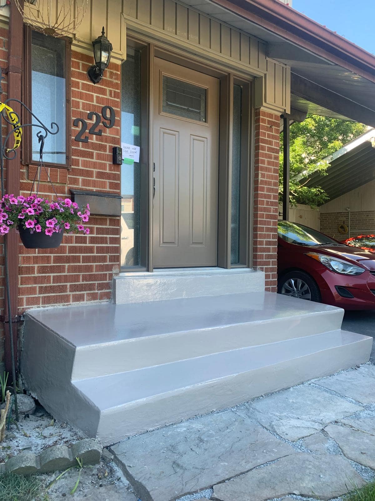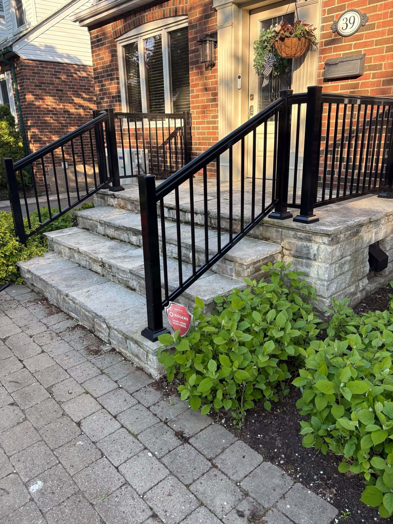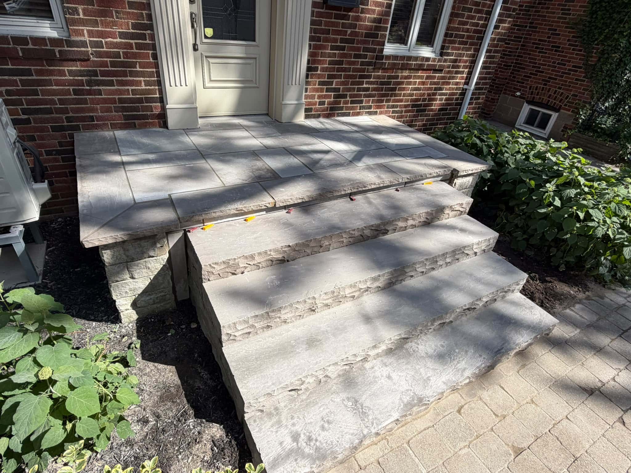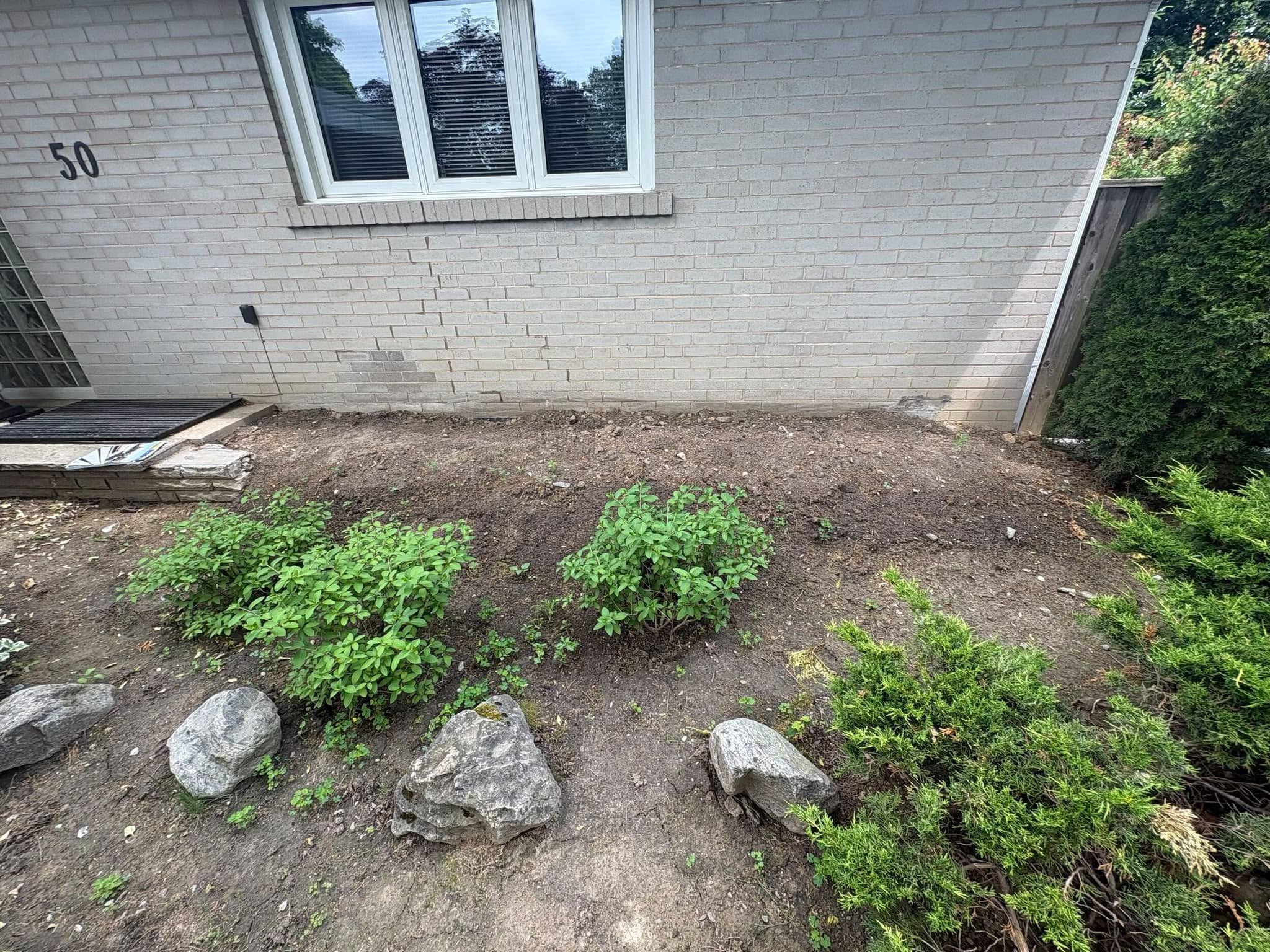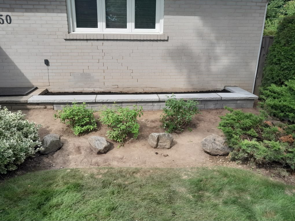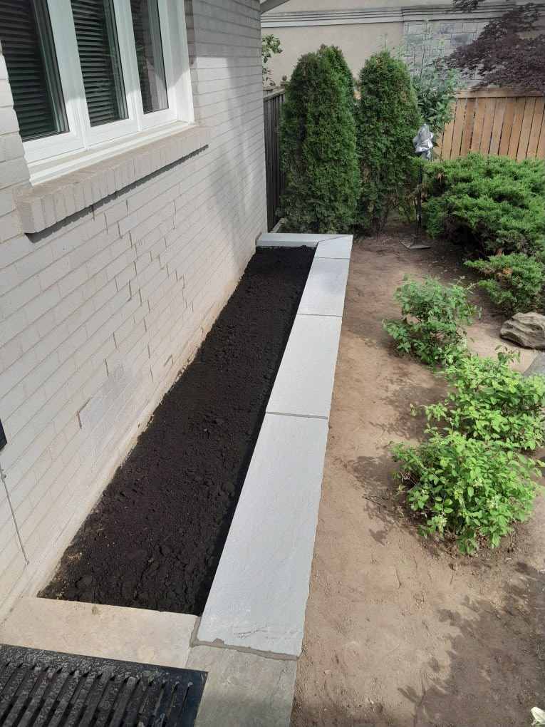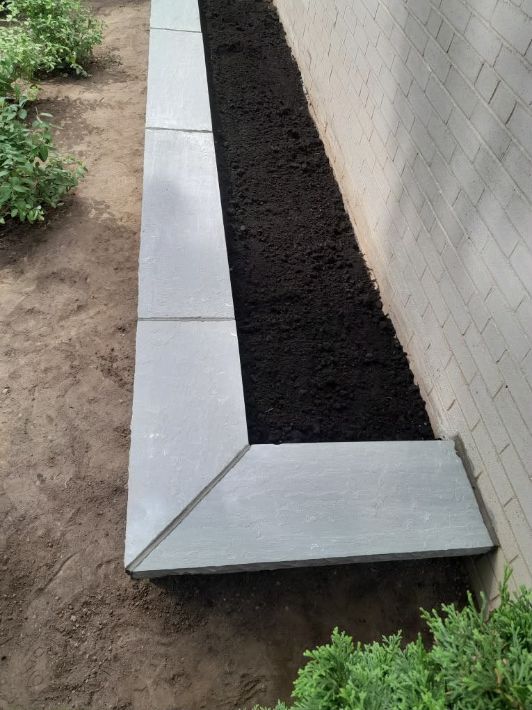

Choosing brick colours for your facade is one of the most important exterior design decisions a homeowner can make. Brick is not like paint, which can be changed easily every few years. It is a long-term material that affects curb appeal, resale impression, architectural character, and how well the home fits its street.
For Toronto and GTA homeowners, brick colour choices often need to work with the character of older neighbourhoods, existing masonry, roof colours, trim, stone accents, porch materials, interlocking walkways, and seasonal weather. A brick that looks warm and balanced on a sample board can look too bright, too flat, or too modern once it is installed across a whole wall.
This guide explains how to choose brick colours for your facade, what affects colour appearance, how mortar changes the final look, when matching matters more than contrast, and how to avoid choices that feel dated or disconnected from the home.
Start With the Permanent Features of the Home
The safest way to choose brick colours is to start with the parts of the home that won’t change. These fixed features include the roof, windows, doors, soffits, fascia, trim, stonework, porch, walkway, driveway, foundation, and neighbouring exterior materials.
Many homeowners choose brick based on a sample alone. That can lead to problems because brick colour only works in context. A warm red brick may look beautiful beside cream trim, but too busy beside a cool grey roof. A pale beige brick may look calm on its own, but it is washed out beside white siding. A charcoal brick may look modern, but it is too heavy on a narrow facade with little natural light.
Before choosing, stand across the street and look at the whole house. Ask what colours are already there. Is the roof warm brown, black, grey, or red-toned? Are the windows white, black, beige, bronze, or wood-toned? Is there existing stone, concrete, stucco, or interlocking nearby? The brick should support these elements rather than fight them.
A&A Masonry’s blog on brick and stone colours that complement Toronto homes is a useful resource for comparing masonry colours with other exterior materials.
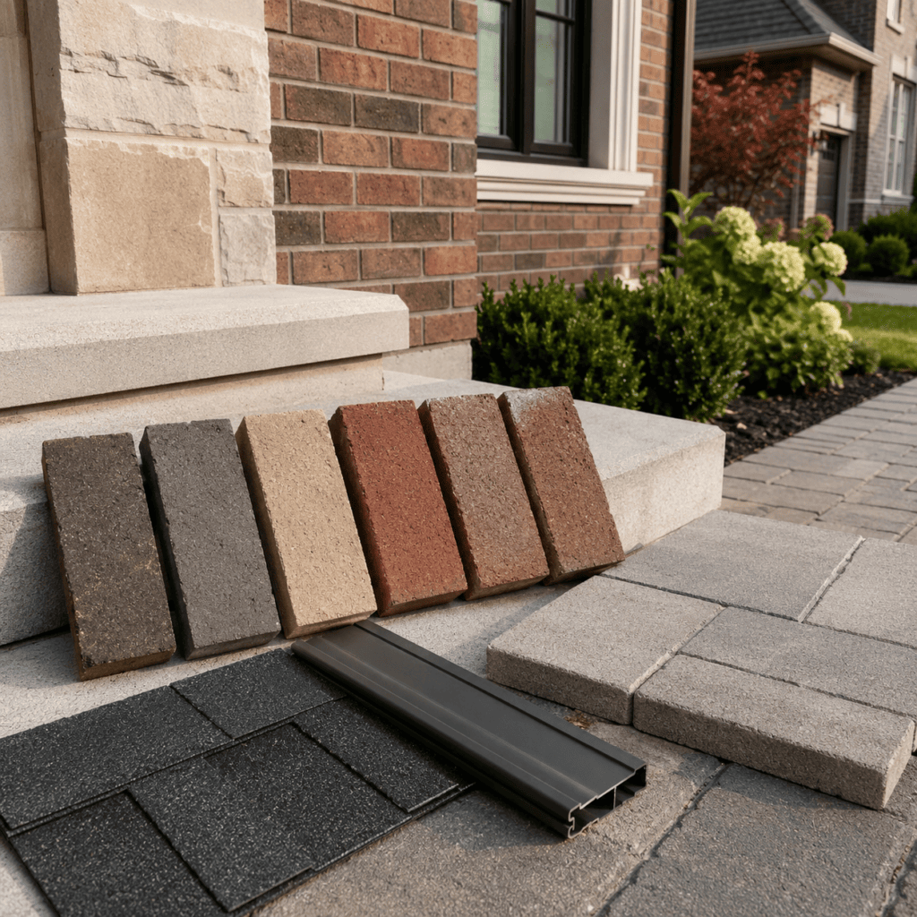
Why Brick Colour Looks Different Outside
Brick colour looks different outside because light, shade, moisture, weathering, and scale all change how the material appears. A small brick sample may look one way in a showroom and very different on a full facade in natural daylight.
Toronto homes often have mixed light conditions. A south-facing facade may look warmer and brighter in the sun. A north-facing wall may make the same brick look cooler and darker. Trees, neighbouring homes, porches, and overhangs can also change the appearance of brick throughout the day.
Moisture matters too. Brick can look deeper and darker after rain. Mortar can appear lighter when dry and darker when damp. In winter, snow can make red and dark brick look more intense, while grey or beige brick can appear flatter against the landscape.
The best approach is to view samples outside, at the actual home, at different times of day. Do not rely only on indoor lighting. If possible, place several brick samples beside the existing trim, roofline, walkway, and foundation to see how the colours work together.
Red Brick: Traditional, Warm, and Familiar
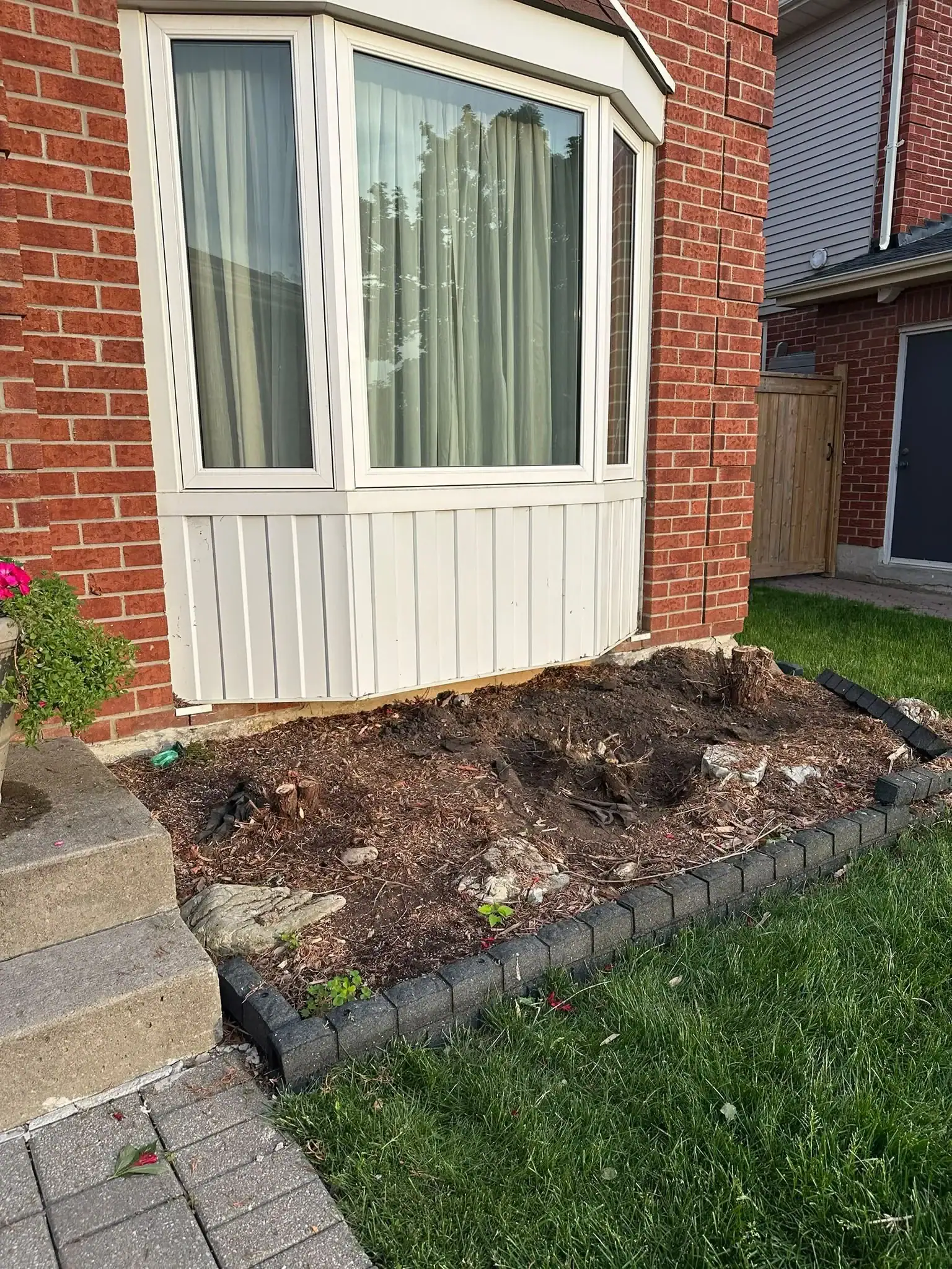
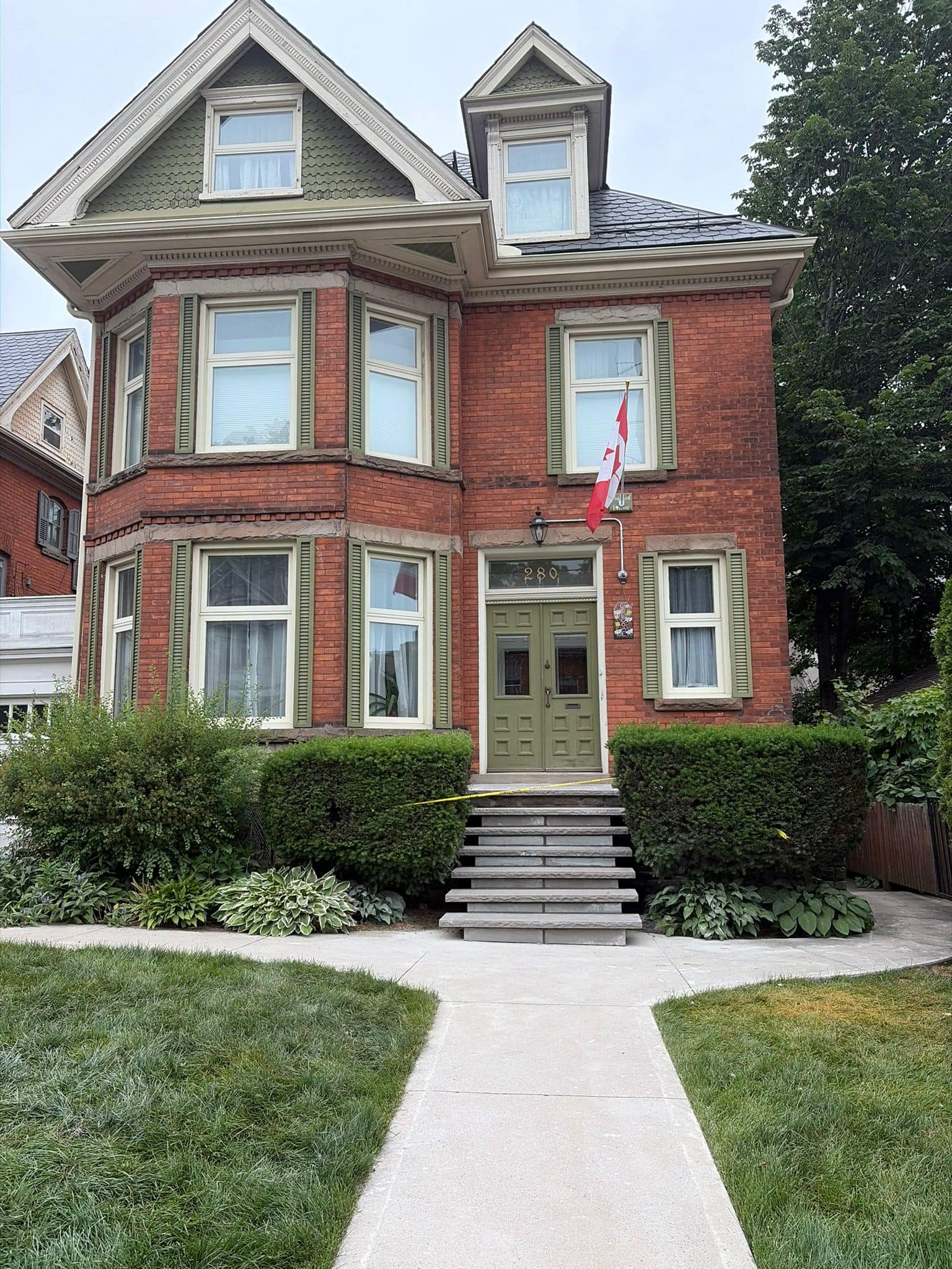
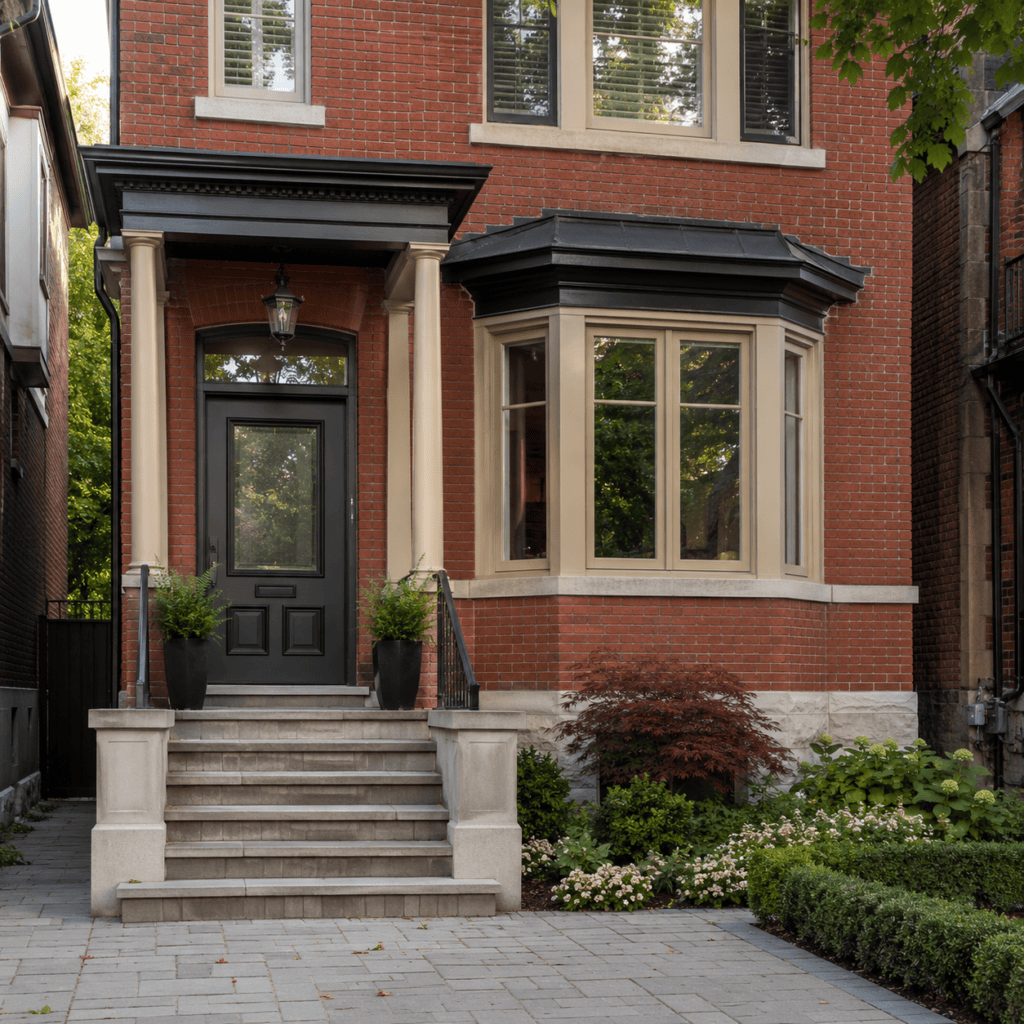
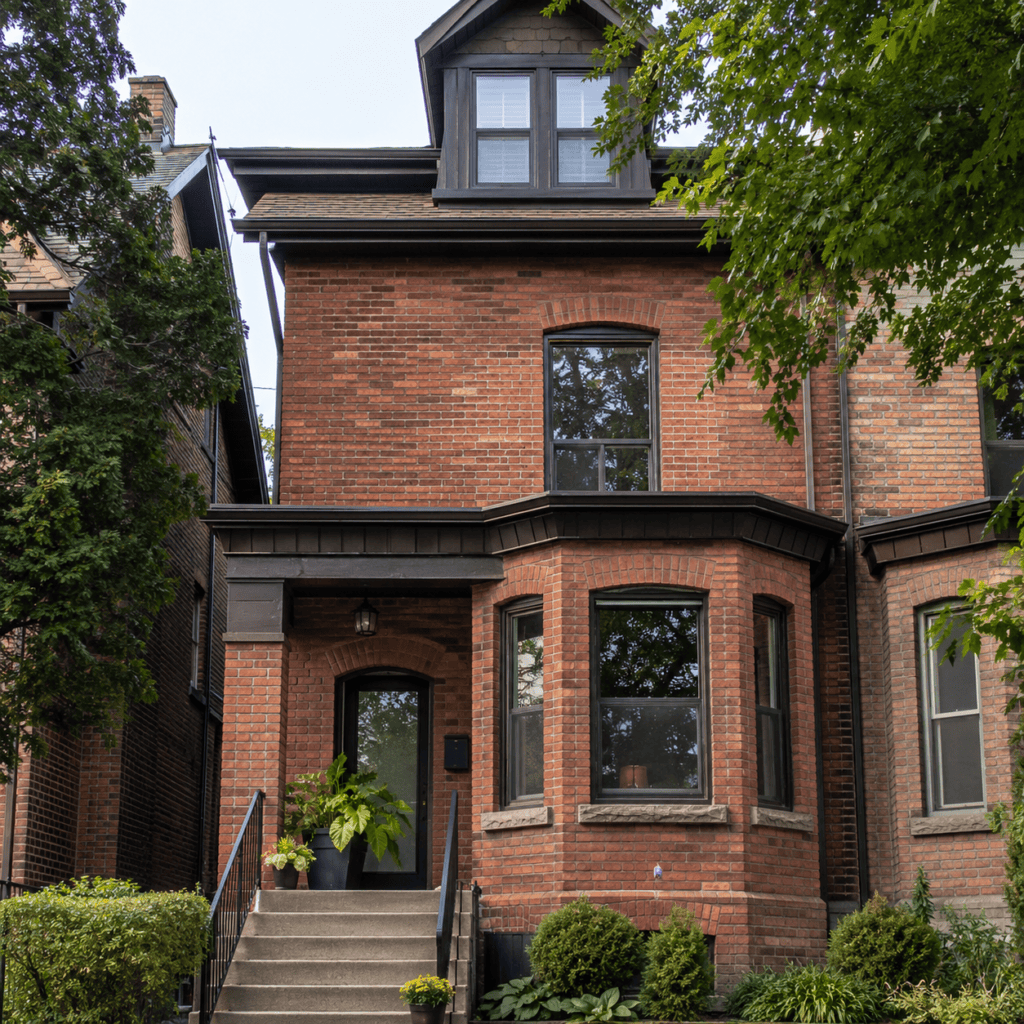
Red brick is a classic choice for Toronto homes because it feels warm, established, and familiar. Many older neighbourhoods in the city use red or red-brown brick, so this colour family often fits naturally into the surrounding streetscape.
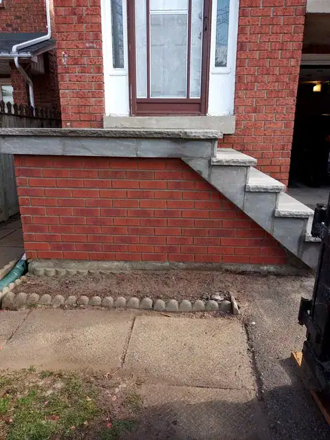
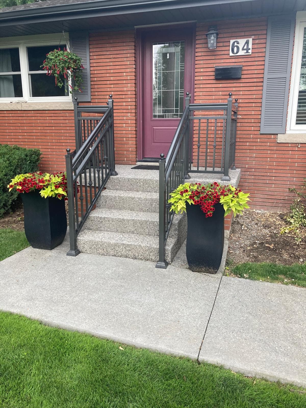
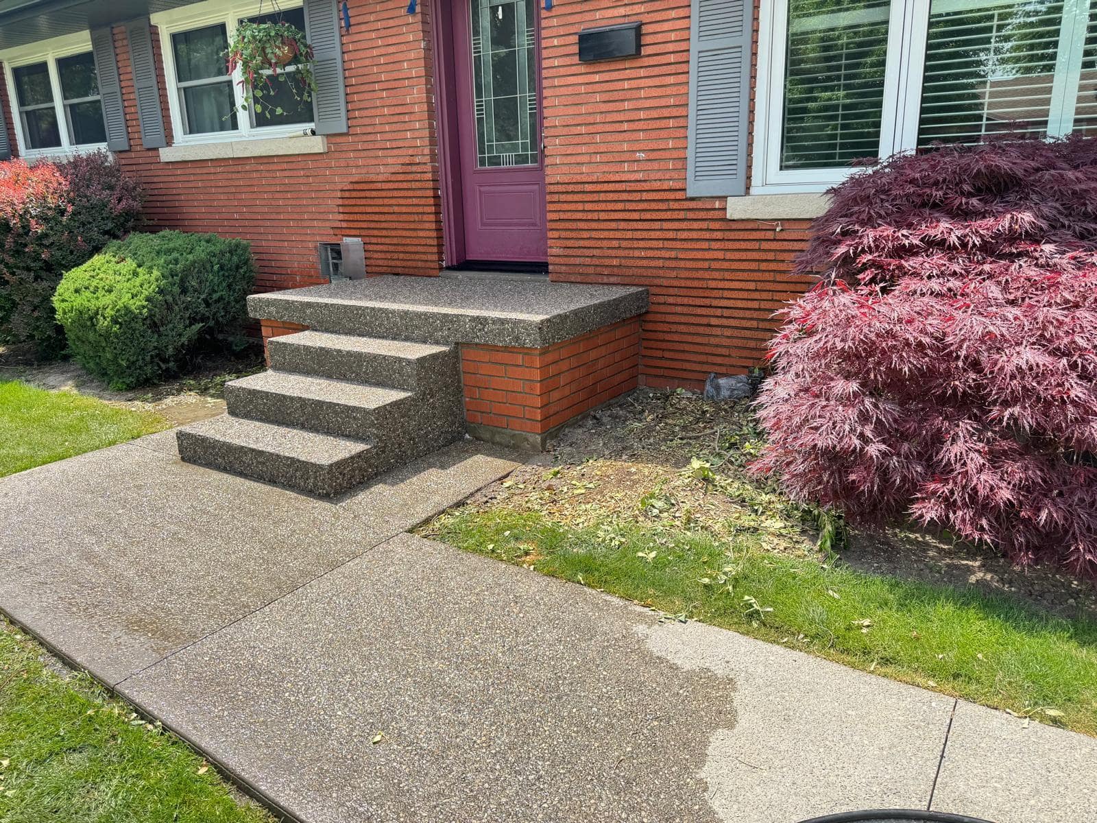
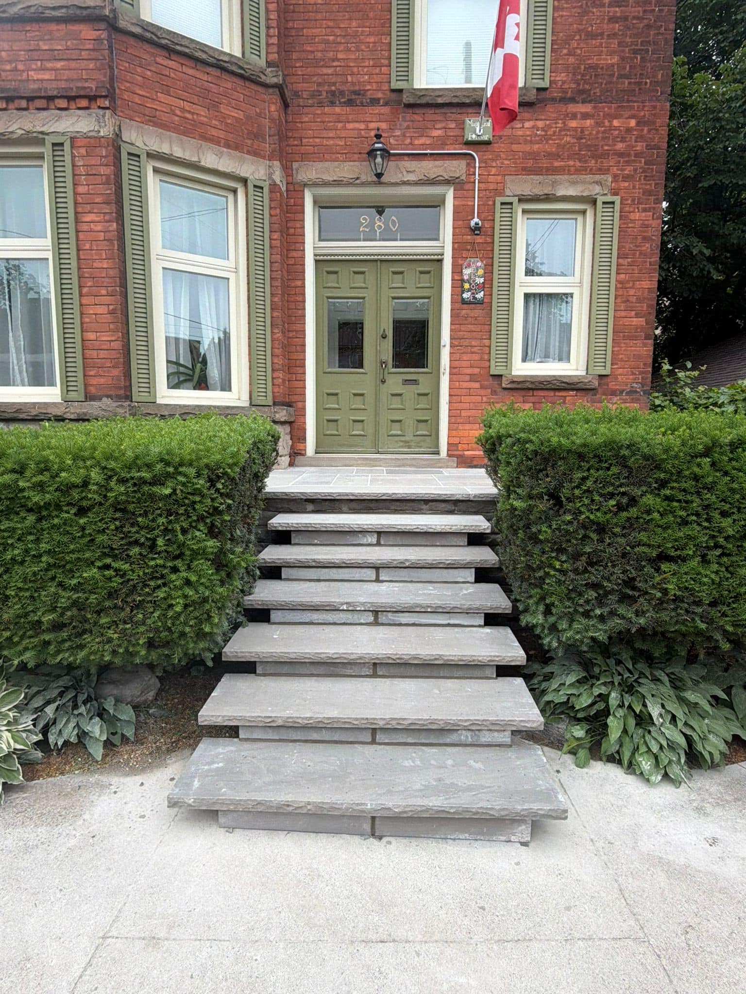
Red brick works well with black, cream, warm white, bronze, dark green, brown, and natural wood accents. It can suit Victorian, Edwardian, mid-century, and many traditional homes. Red brick can also pair well with stone steps, interlocking walkways, and darker roof colours.
The challenge is undertone. Some red bricks lean orange. Others lean brown, purple, or burgundy. A bright orange-red brick may feel too new beside older, weathered masonry. A dark red-brown brick may look rich and timeless, but it can make a shaded facade feel heavier.
Choose red brick for a warm, traditional look that suits many Toronto streets. Be careful if the home already has cool grey stone, blue-toned siding, or a very modern black-and-white design, since some red tones may clash.
Brown and Earth-Tone Brick: Warm and Grounded
Brown and earth-tone brick can make a facade feel warm, grounded, and natural. These colours often include tan, mocha, clay, rust, taupe, and brown-red blends. They can work well on homes with wood accents, bronze windows, warm stone, dark roofs, and natural landscaping.
Earth-tone brick is useful when a homeowner wants warmth without the stronger traditional look of red brick. It can also soften a home that has a large facade or heavy roofline. Brown brick tends to feel more relaxed and less formal than deep red or charcoal brick.
The risk is that some brown bricks may look dull if there is insufficient contrast. If the roof, trim, and landscaping are also brown, the home may feel flat. In that case, a lighter mortar, darker trim, or stone accent can help define the facade.
Choose brown or earth-tone brick if the home already has warm materials and you want a natural, settled appearance. Avoid choosing a muddy brown that disappears beside the roof or walkway.
Grey Brick: Modern, Calm, and Flexible
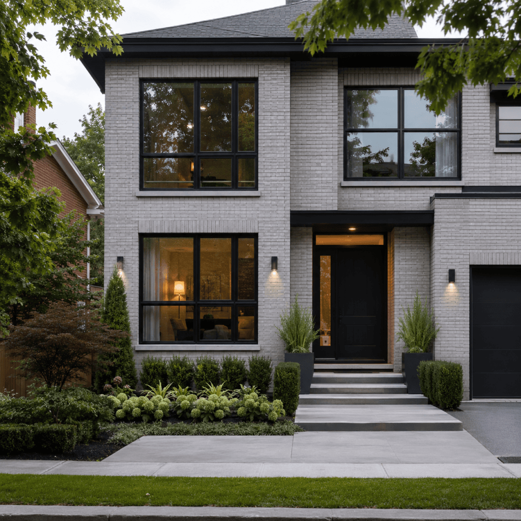
Grey brick can create a clean and modern look, especially when paired with black windows, white trim, light stone, or simple landscaping. It is popular for newer homes and exterior updates because it feels neutral and current.
Grey can also work on traditional homes, but it needs care. A soft, warm grey may blend well with older materials. A cool blue-grey may feel too sharp beside red brick, beige stone, or warm wood. The undertone matters more than many homeowners realize.
Light grey brick can make a facade feel brighter, while dark grey can make it feel more dramatic. Charcoal brick can look elegant, but it may absorb more heat and make a small facade feel heavy if used on too large a surface area. In shaded Toronto lots, dark grey can also lose detail unless the mortar and trim provide enough contrast.
Choose grey brick for a cleaner, more contemporary appearance. Test the sample carefully beside the roof, windows, and neighbouring masonry so the final look does not feel cold or disconnected.
White, Cream, and Light Brick: Bright but Higher Maintenance
White, cream, and light brick can make a facade feel bright, clean, and spacious. These colours can work well for modern homes, transitional designs, and properties where the homeowner wants a lighter exterior.
Light brick can be especially useful on small or shaded properties because it reflects more light and can make the facade feel less heavy. It pairs well with black windows, natural wood doors, soft grey roofs, and simple landscaping.
The tradeoff is maintenance visibility. Light brick may show dirt, algae, staining, efflorescence, and splashback more easily than darker brick. Toronto homes near busy roads, shaded side yards, or heavy landscaping may need more attention to keep light masonry looking clean.
Choose a light brick if the design supports a bright, clean exterior and you are comfortable with the maintenance. Avoid very stark white if the home has warm, older materials, unless the contrast is intentional and well-balanced.
Mixed Brick Blends: Natural Variation and Depth
Mixed brick blends can add depth by combining related tones on a single facade. A blend may include red, brown, tan, charcoal, cream, or grey variations. This can make the wall feel more natural and less flat.
Blends are useful because real brickwork rarely looks like one perfectly uniform colour. Older Toronto brick often shows variation due to manufacturing, weathering, repair history, and age. A thoughtful blend can help new masonry feel more established.
The risk is visual busyness. A strong multi-colour blend can overwhelm a small facade or compete with detailed windows, stonework, or landscaping. If the home already has many exterior materials, a quieter brick blend may work better.
Choose a mixed blend for texture and depth. Keep the rest of the exterior simpler so the facade does not feel crowded.
Mortar Colour Can Change the Whole Facade
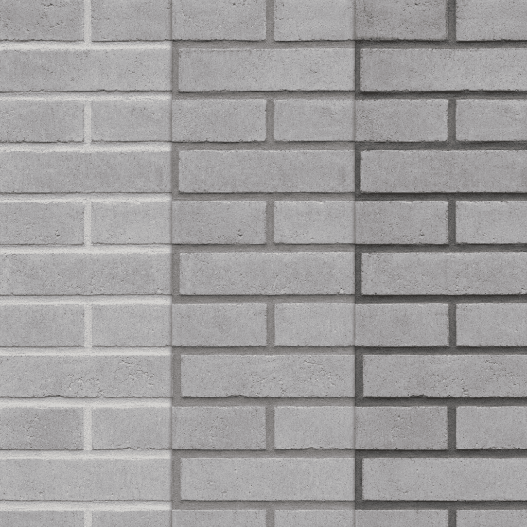
Mortar colour can dramatically change how the brick looks. Many homeowners focus on brick colour and forget that mortar can make up a large part of the visible wall. The same brick can look traditional, modern, soft, or high-contrast depending on the mortar.
Light mortar makes individual bricks stand out and can brighten the facade. Dark mortar creates a stronger, more modern look and can make the wall feel more uniform. Mortar that closely matches the brick creates a softer, blended appearance.
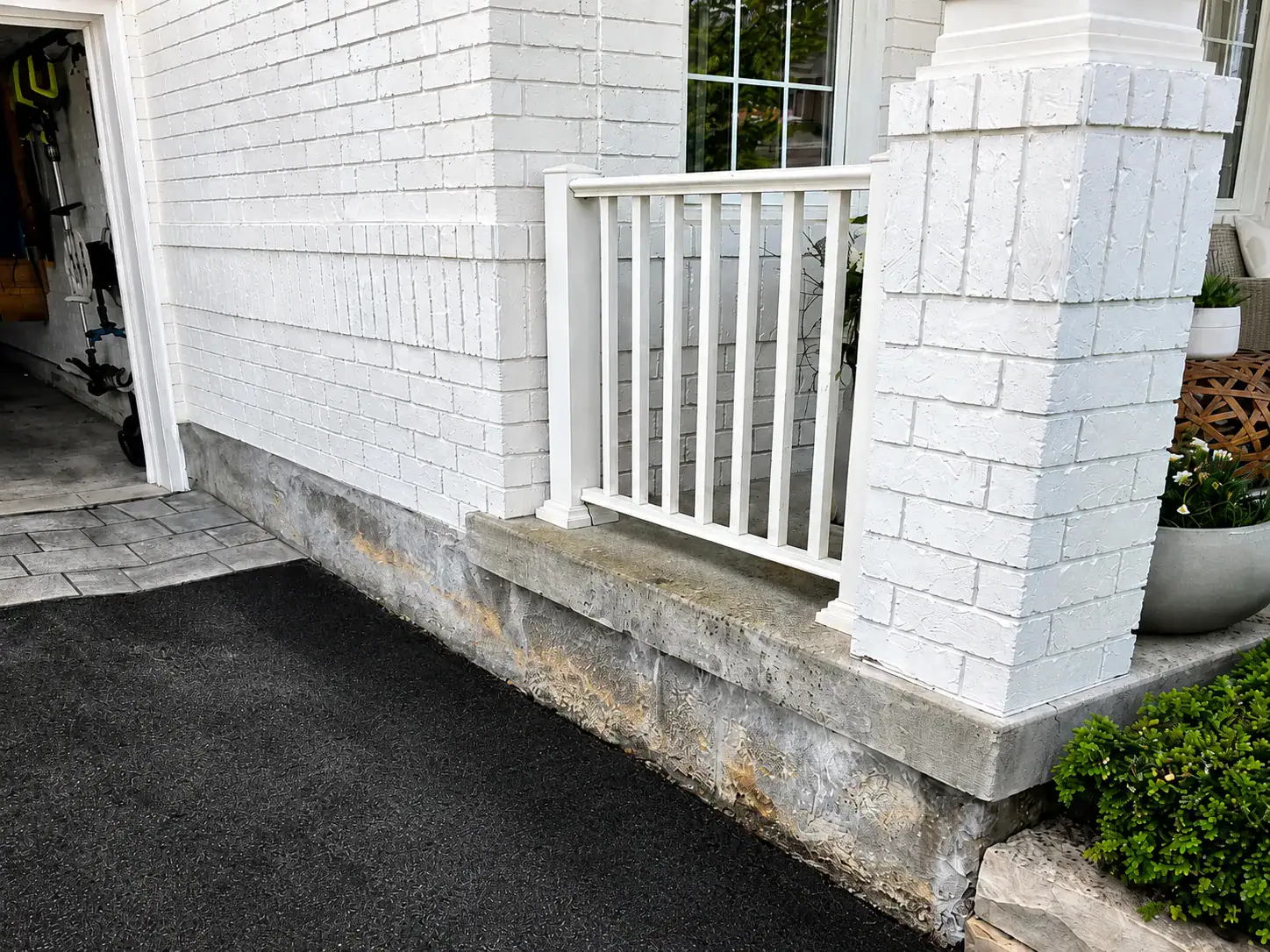
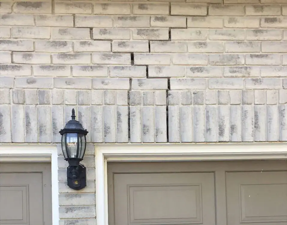
On older Toronto homes, mortar matching is especially important during repair. If the replacement mortar is too light, too dark, too smooth, or too hard, the repair can stand out even if the brick is a good match. Mortar type also matters for durability, not only appearance.
If existing mortar joints are cracked or deteriorated, A&A Masonry’s tuckpointing services in Toronto page explains why proper mortar repair helps protect brickwork from water and weather damage.
Matching Existing Brick vs Choosing a New Colour
Matching existing brick is usually best when the project involves repair, replacement, or a visible addition to an older facade. Choosing a new colour makes more sense when the project is a full reclad, a major redesign, a new wall, or an intentionally contrasting feature.
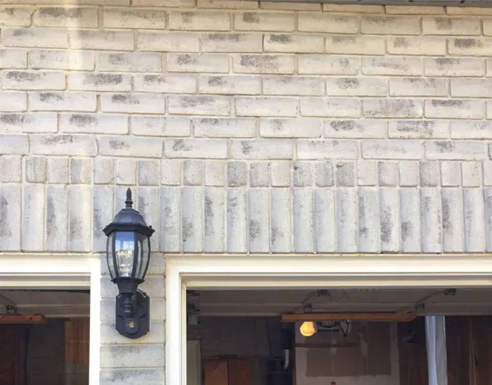
For repair work, close matching is important. A few mismatched bricks on a front wall, chimney, porch column, or window area can draw attention. Matching means more than colour. Brick size, texture, age, absorption, surface finish, and mortar joint style all matter.
For larger redesigns, homeowners have more freedom. A new facade colour can update the whole home, but it should still complement the roof, windows, neighbouring materials, and the property’s style. A colour that looks trendy today may feel dated later if it ignores the home’s architecture.
If brick units are damaged and need replacement, A&A Masonry’s brick replacement Toronto page explains why matching brick and surrounding masonry is important for a natural-looking repair.
Brick Colours for Older Toronto Homes
Older Toronto homes often look best when brick colours respect the property’s original character. This does not mean every repair must look old or every update must exactly copy the past. It means the colour choice should feel believable beside the home’s age, proportions, trim, roof, and surrounding streetscape.
Many older homes use red, red-brown, buff, yellow, or mixed clay tones. If the home has original brick, try to understand its colour before choosing a new material. Weathered brick may look darker or softer than it did when new. Cleaning a small area can sometimes reveal the original tone, but aggressive cleaning should be avoided because it can damage older brick.
For heritage properties or homes in heritage-sensitive areas, exterior changes may need extra care. The City of Toronto provides information on heritage permits, including guidance around exterior alterations and replacement materials. Homeowners should check requirements before changing visible heritage masonry.
Even when a home is not formally designated, choosing a brick colour that respects neighbourhood character can help the facade feel more natural and better connected to the street.
Brick Colours for Modern Facades
Modern facades often use simpler colour palettes and cleaner contrast. Grey, charcoal, cream, blackened tones, pale beige, and smooth red-brown brick can all work depending on the design. The key is restraint.
A modern exterior may pair brick with metal, glass, wood, stucco, or large-format stone. If too many colours are used, the facade can feel busy. A simple palette often looks stronger. For example, charcoal brick with black windows and warm wood can feel modern and balanced. Cream brick with black trim can feel bright and crisp. Soft grey brick with natural stone can feel calm and understated.
Modern does not always mean dark. In Toronto, darker facades can look sharp but may feel heavy on narrow lots or shaded streets. Lighter brick can help keep a modern home from feeling too severe.
Choose modern brick colours by thinking about proportion. A bold colour may work well as an accent, but it feels too strong across the entire facade.
How Brick Colour Works With Stone, Concrete, and Interlocking
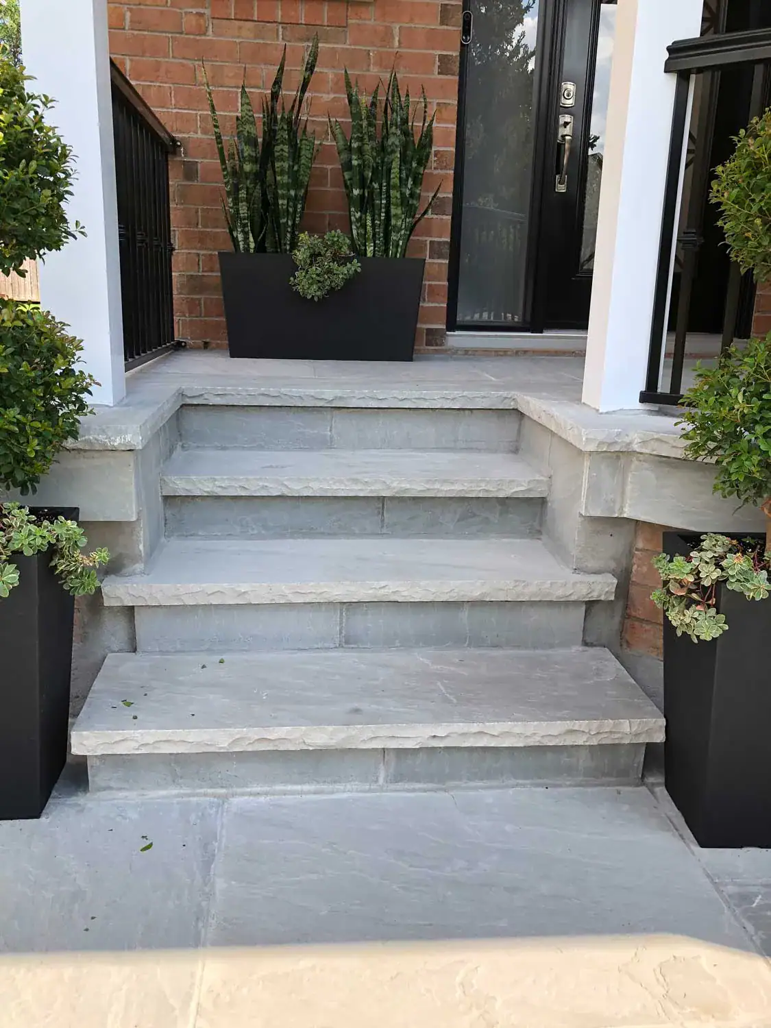
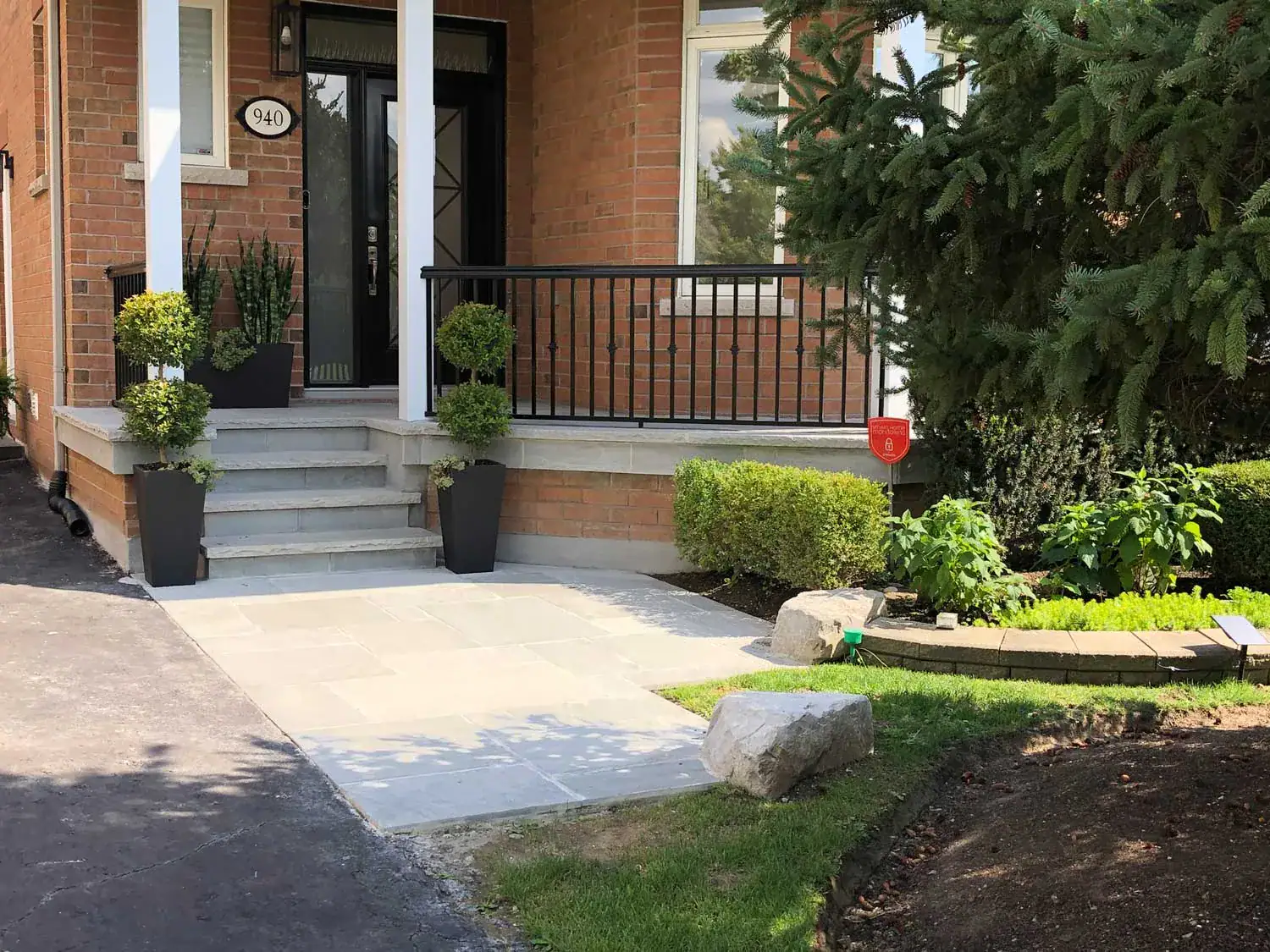
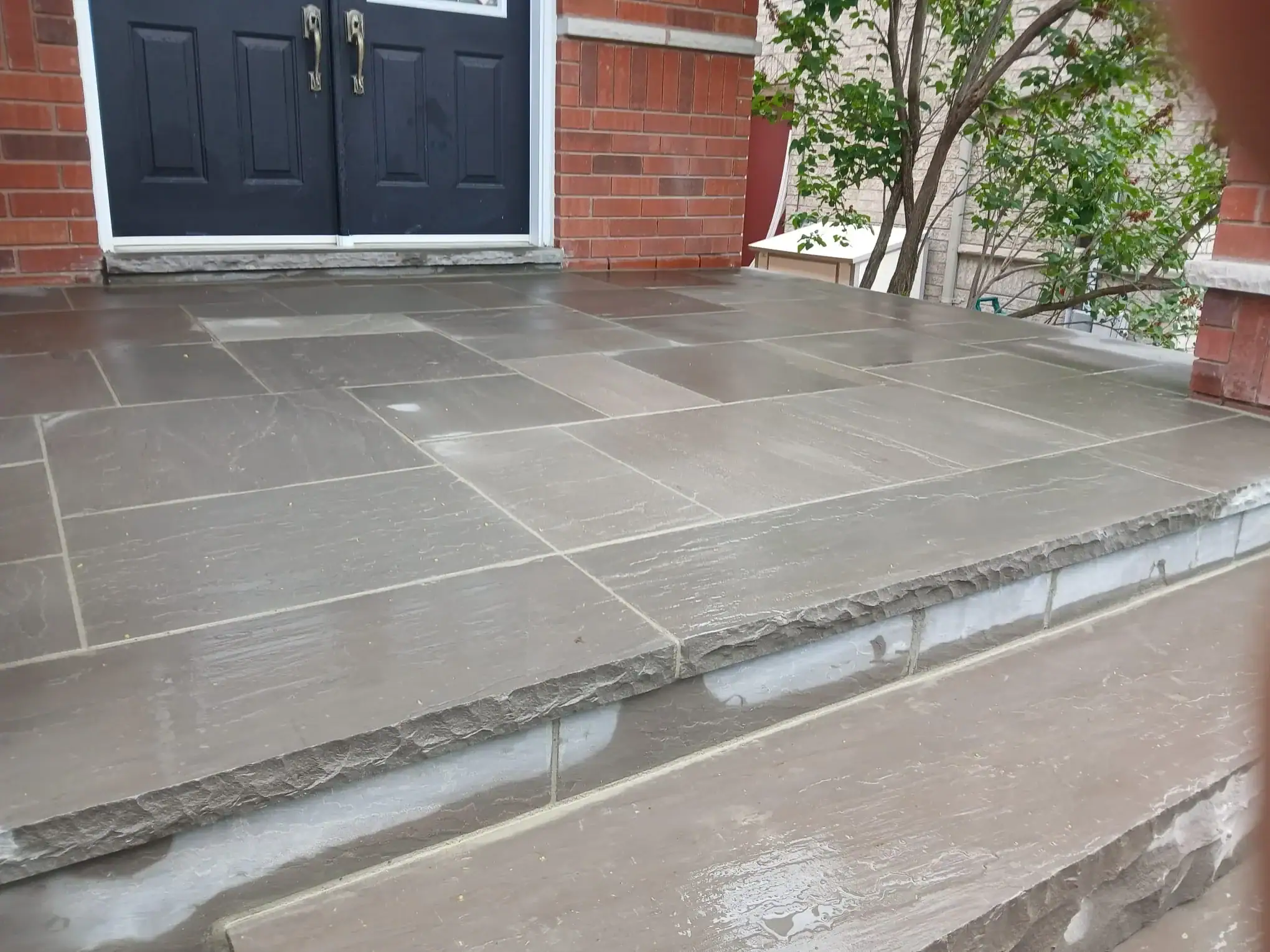
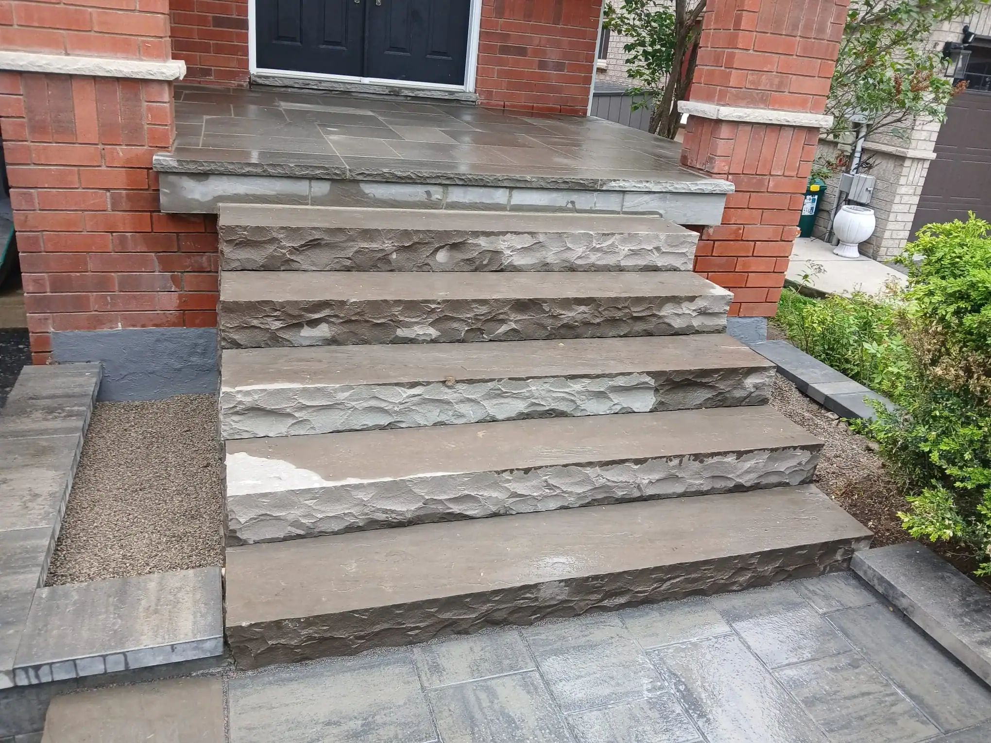
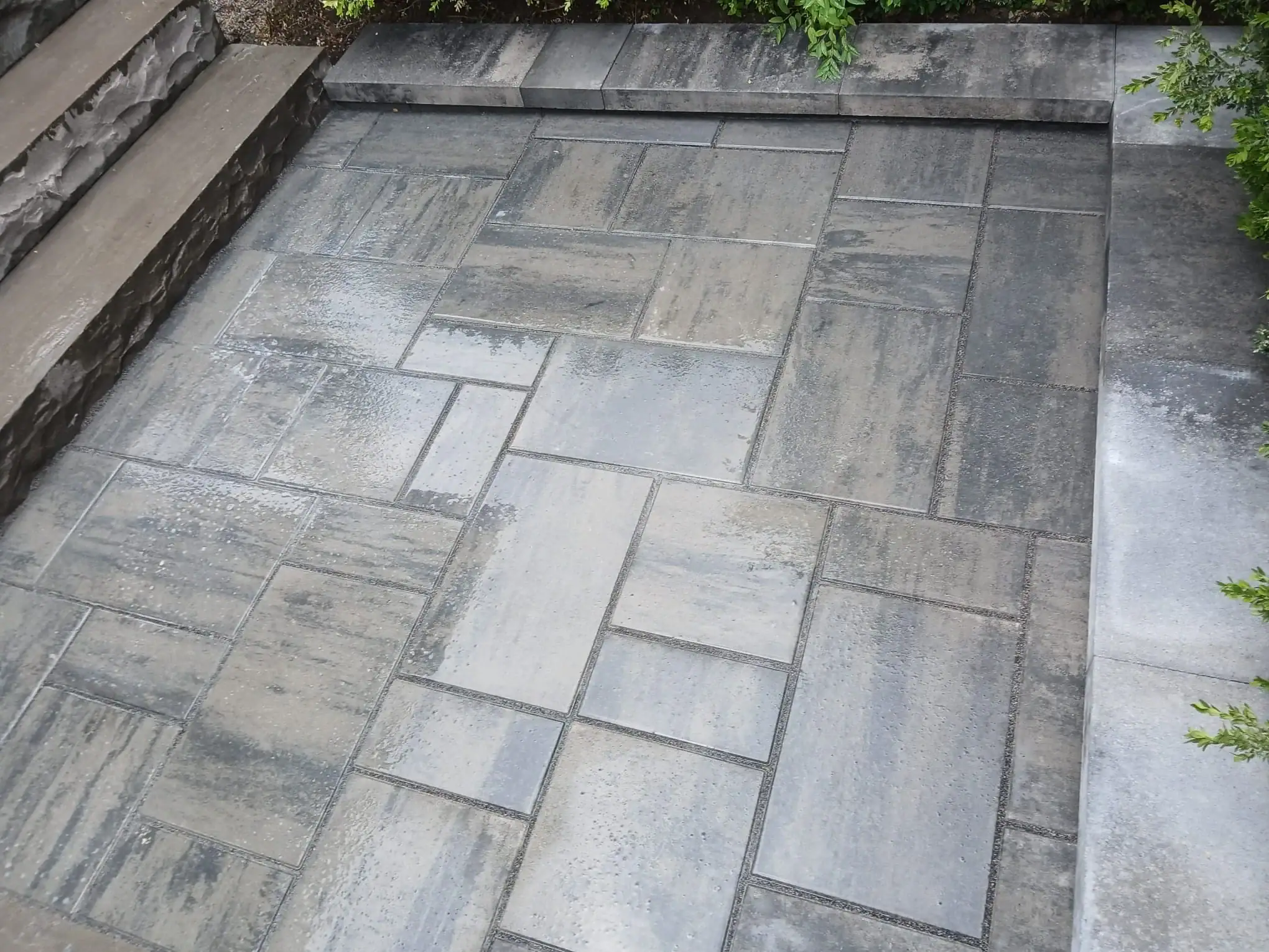
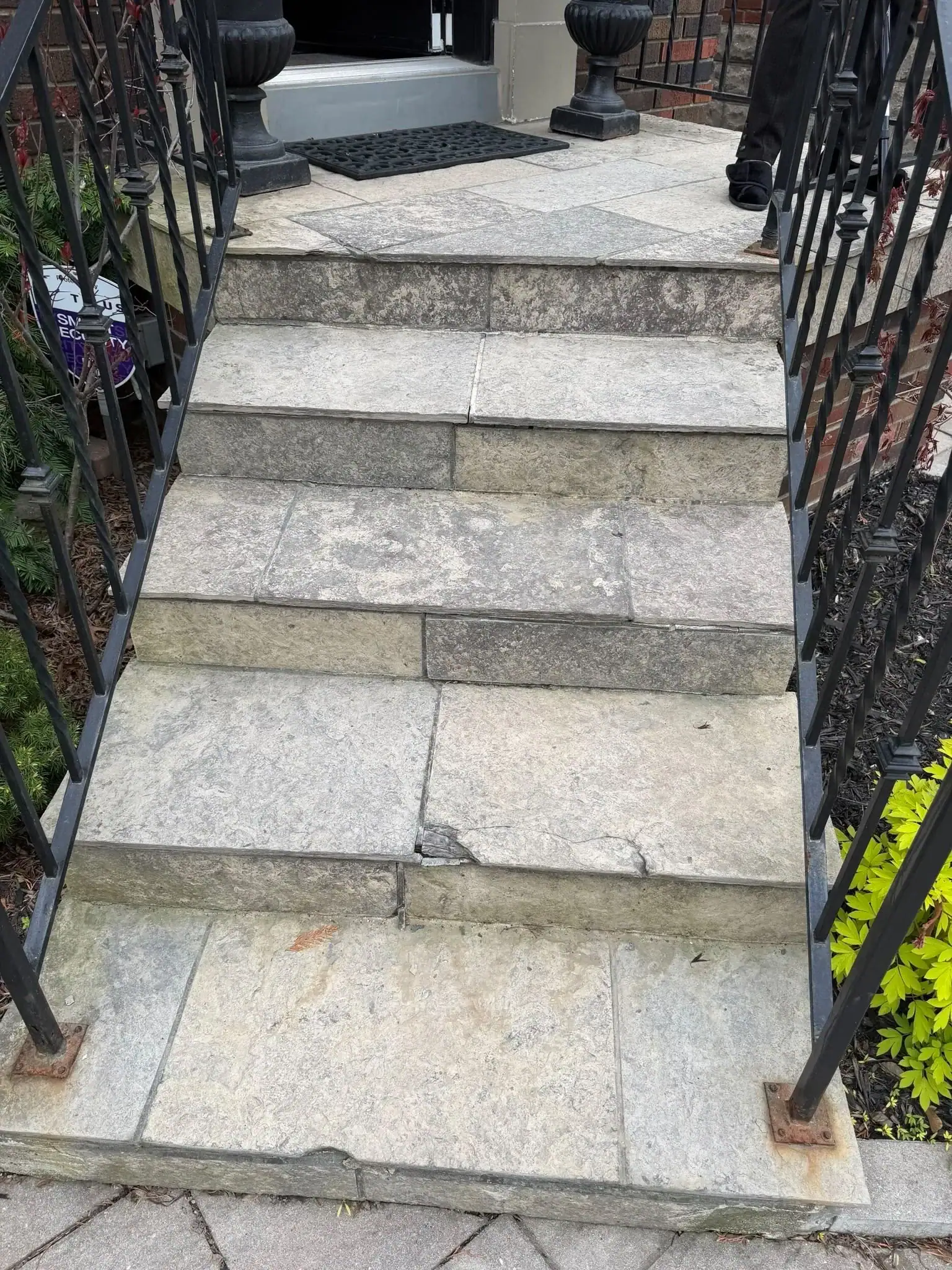
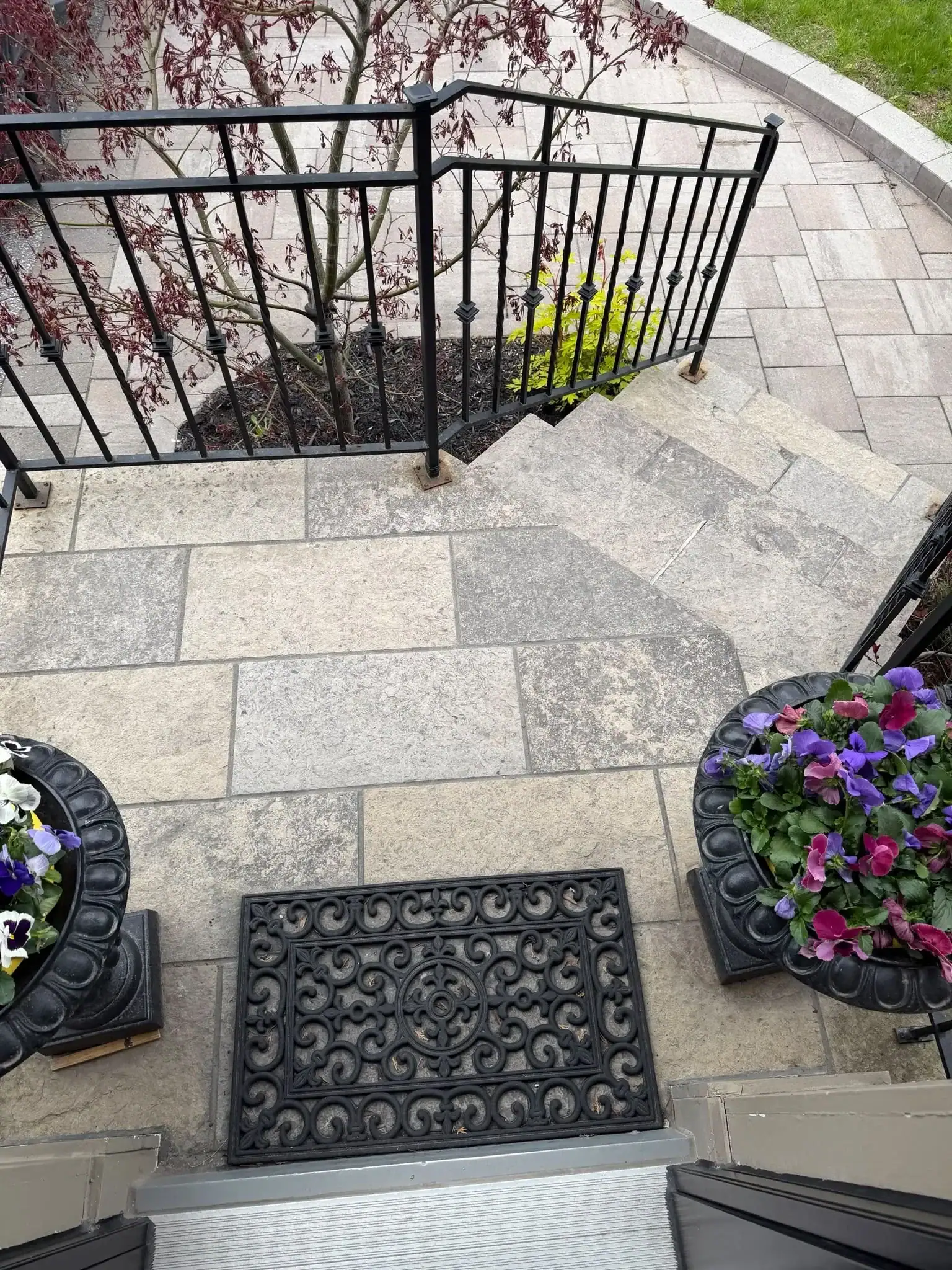
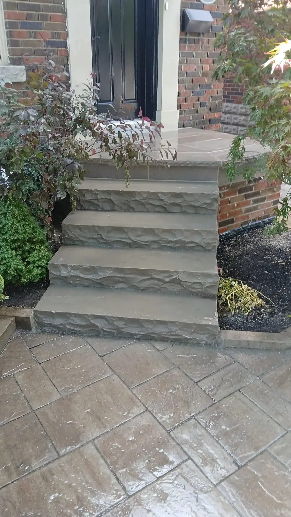
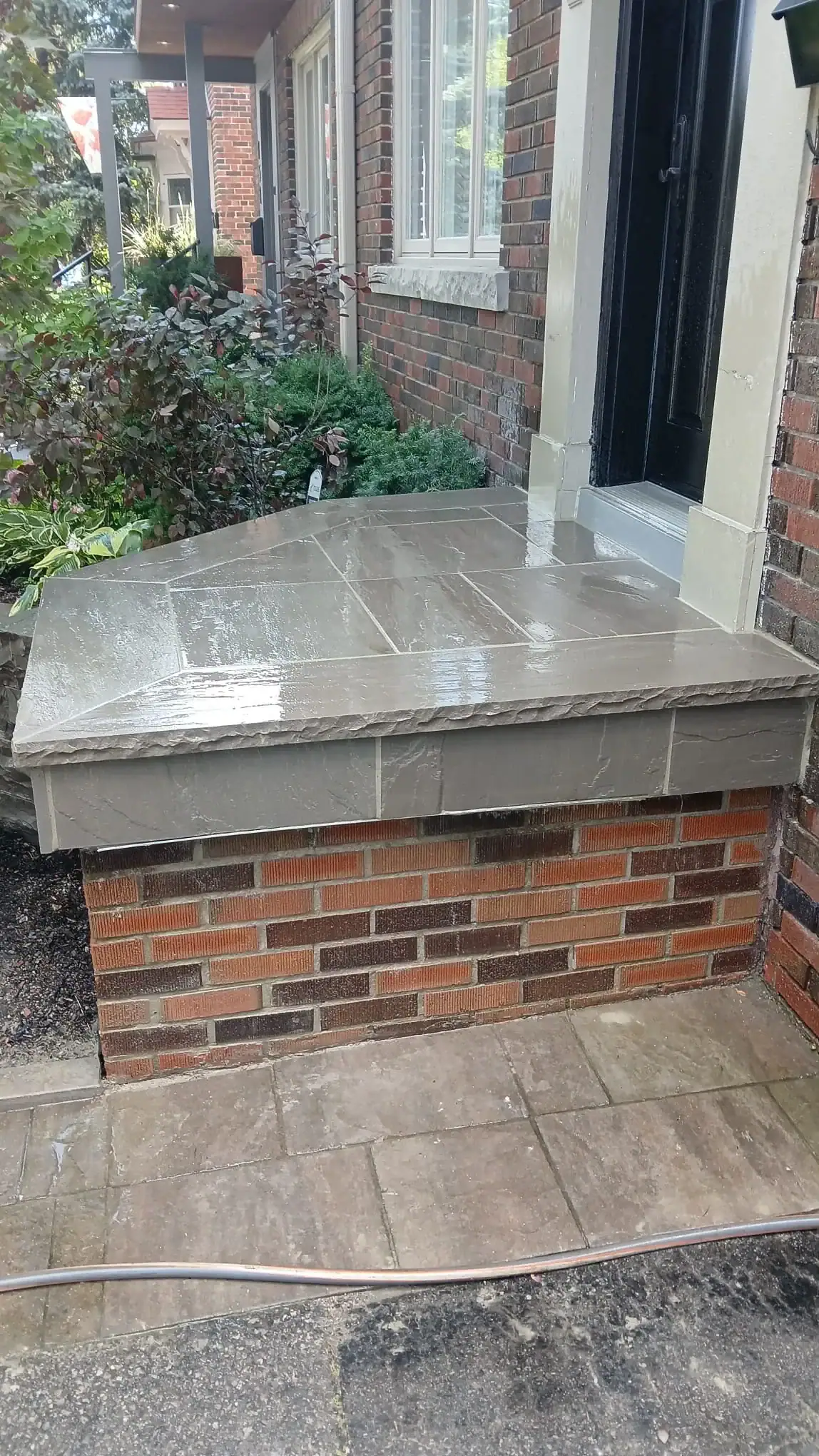
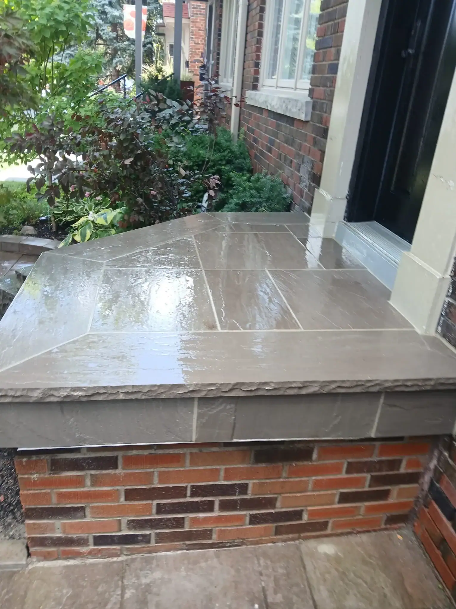
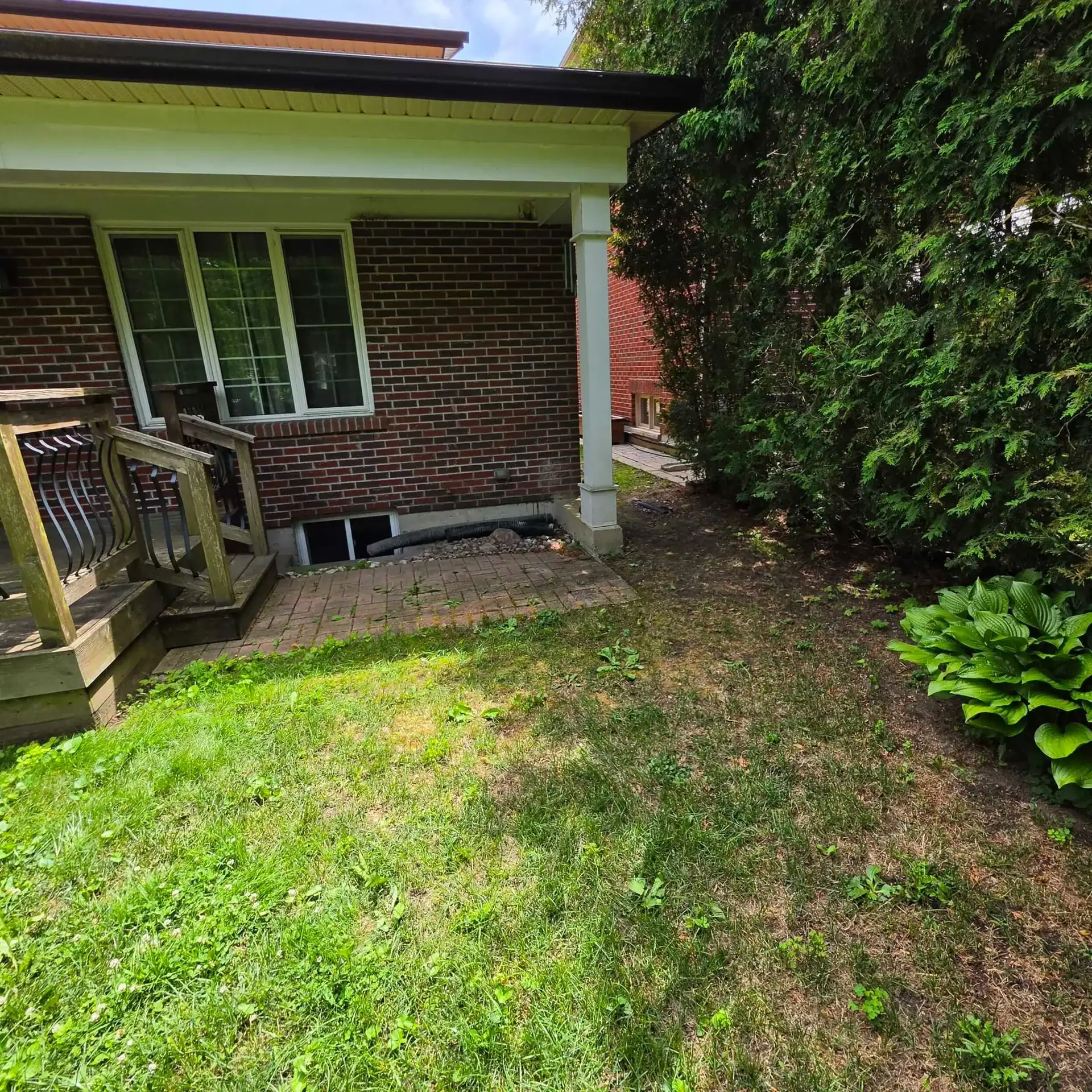
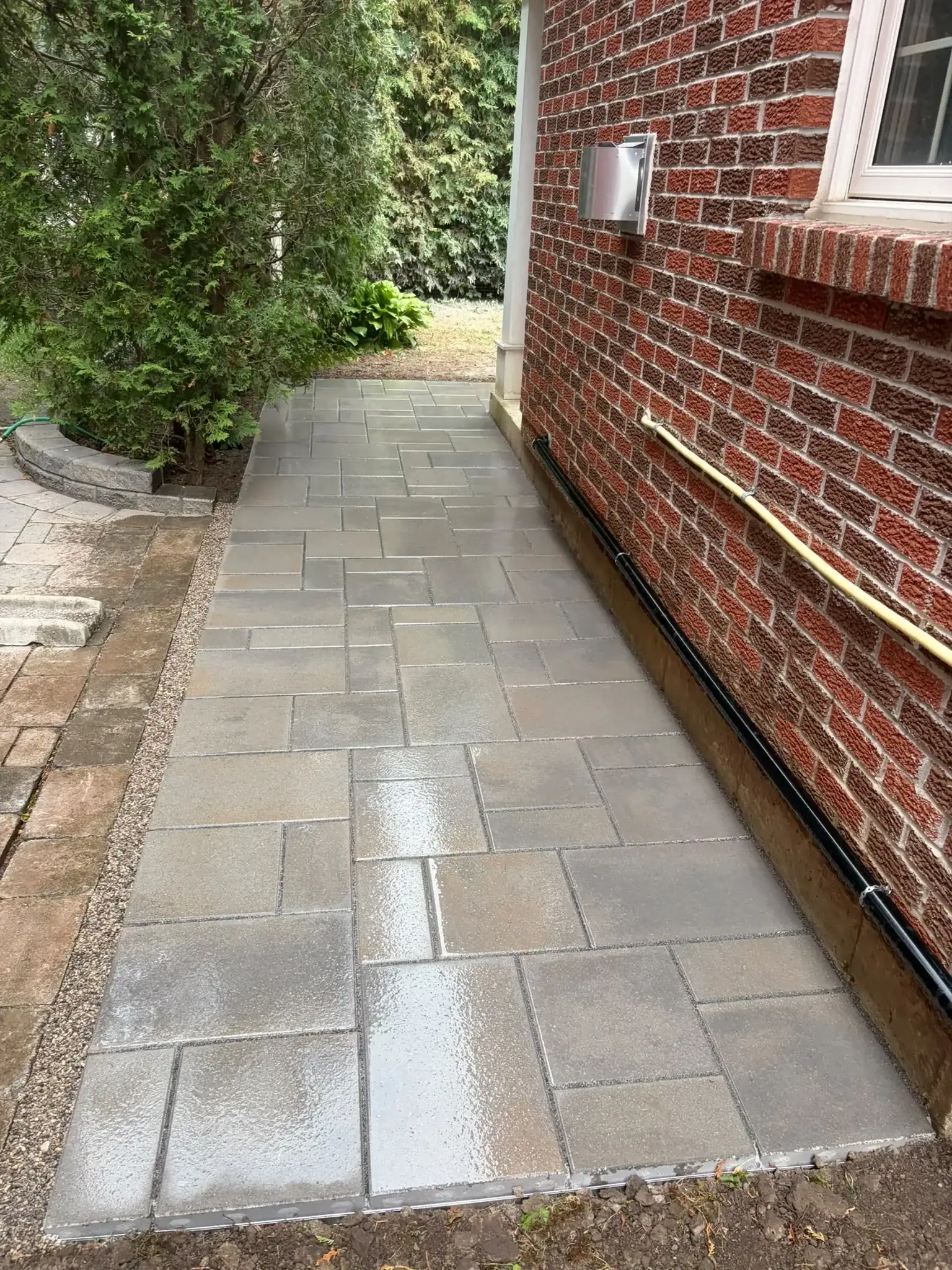
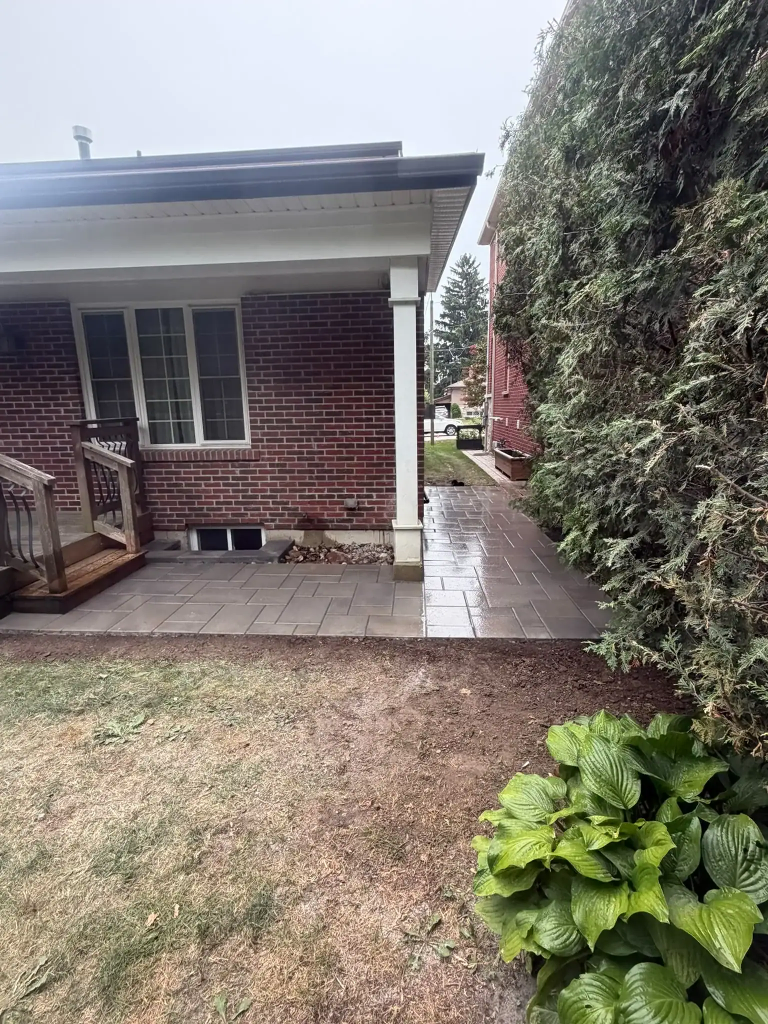
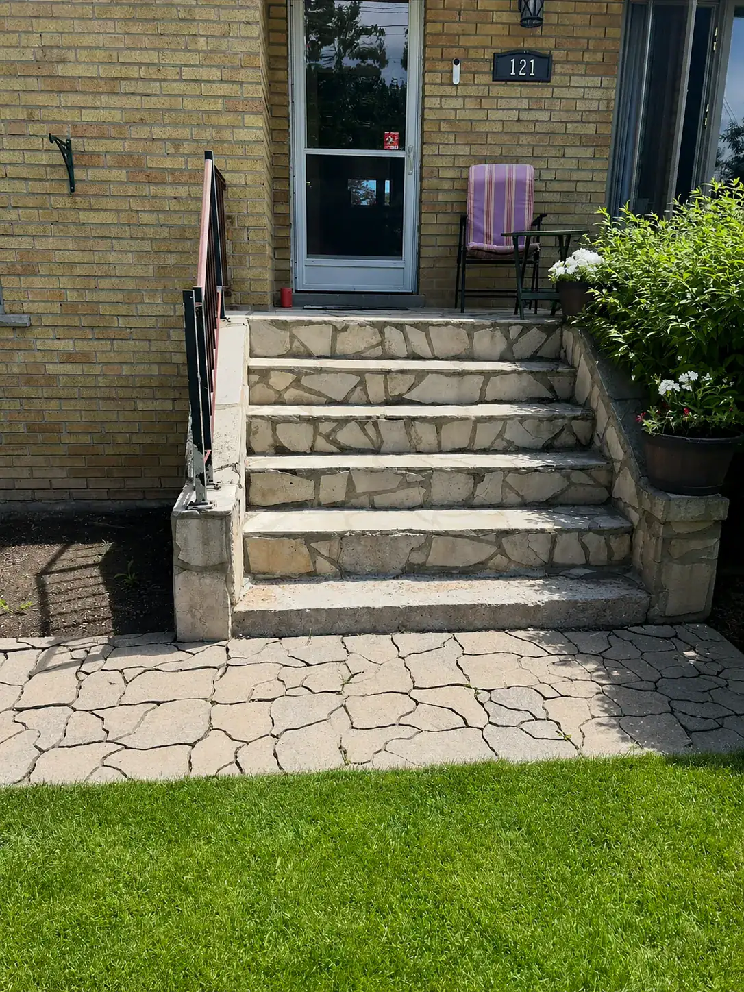
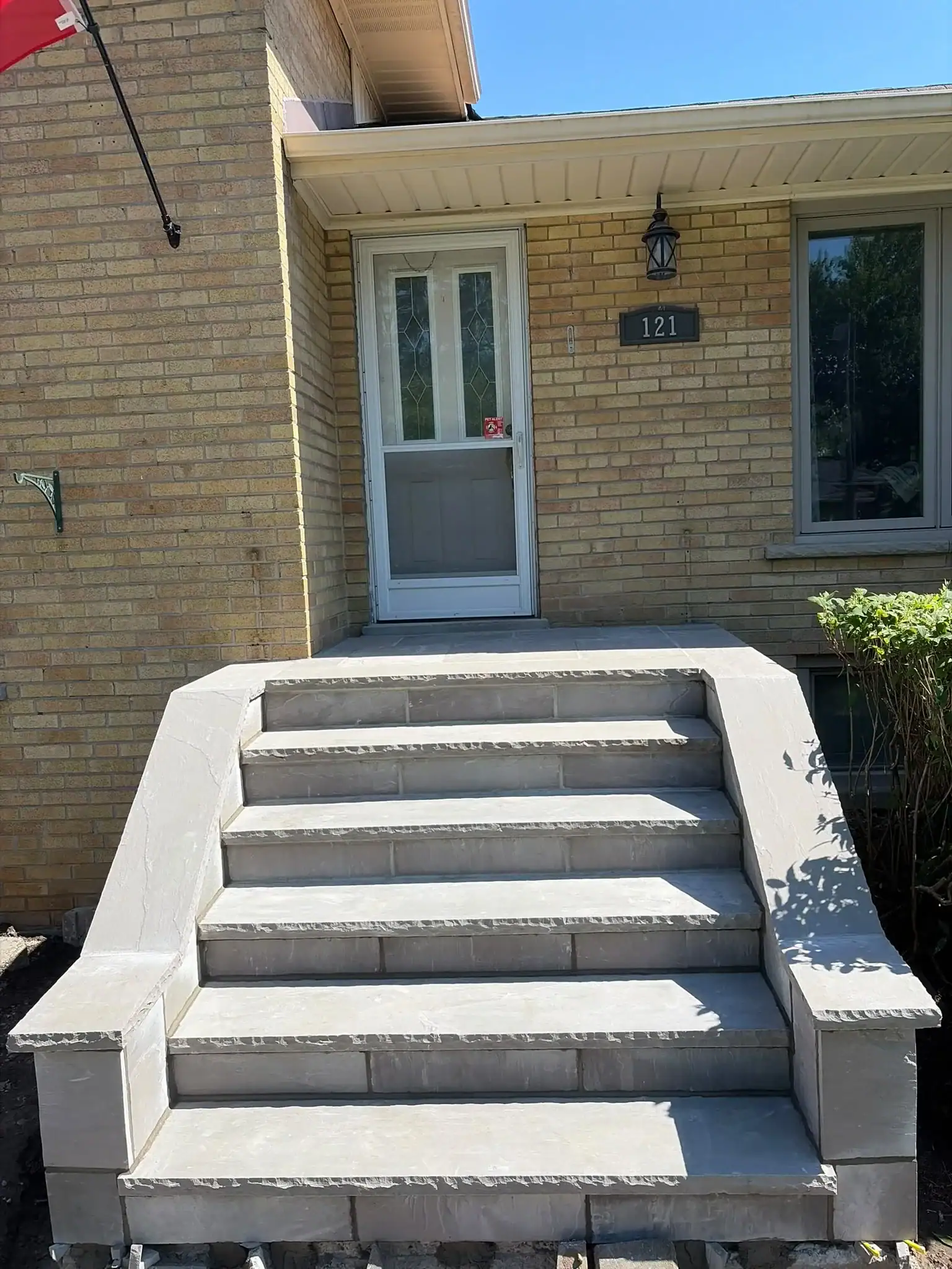
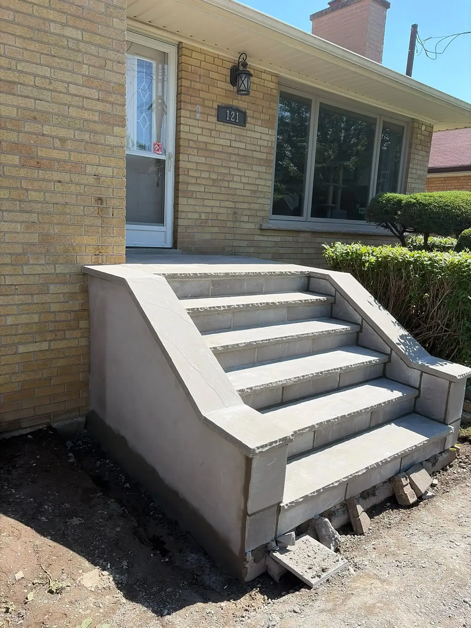
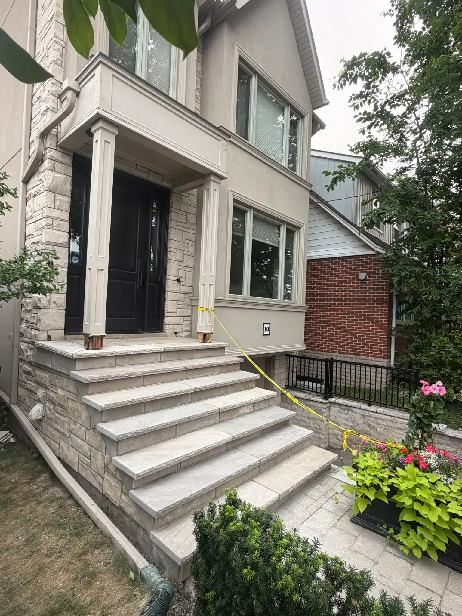
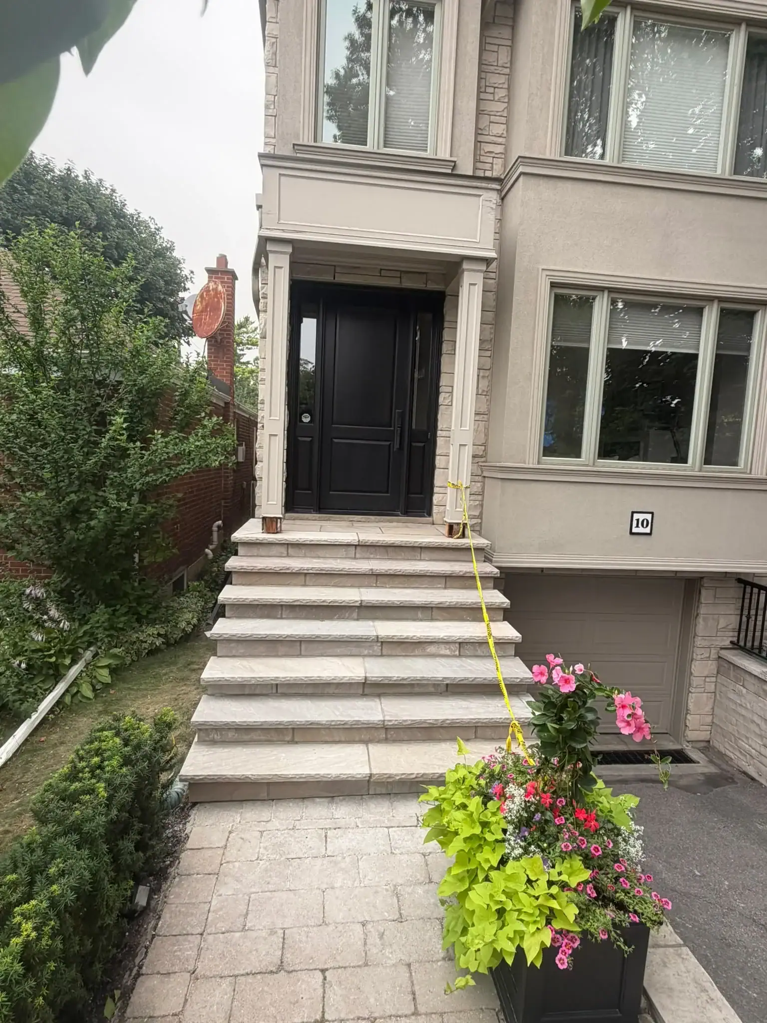
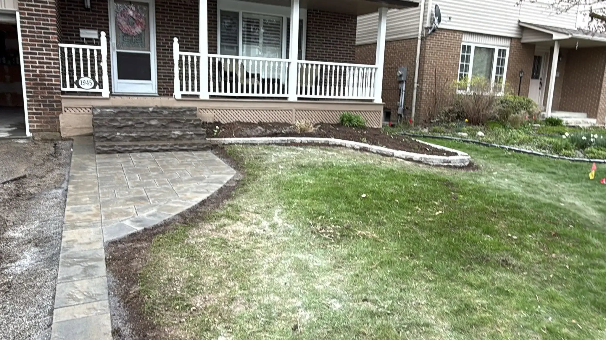
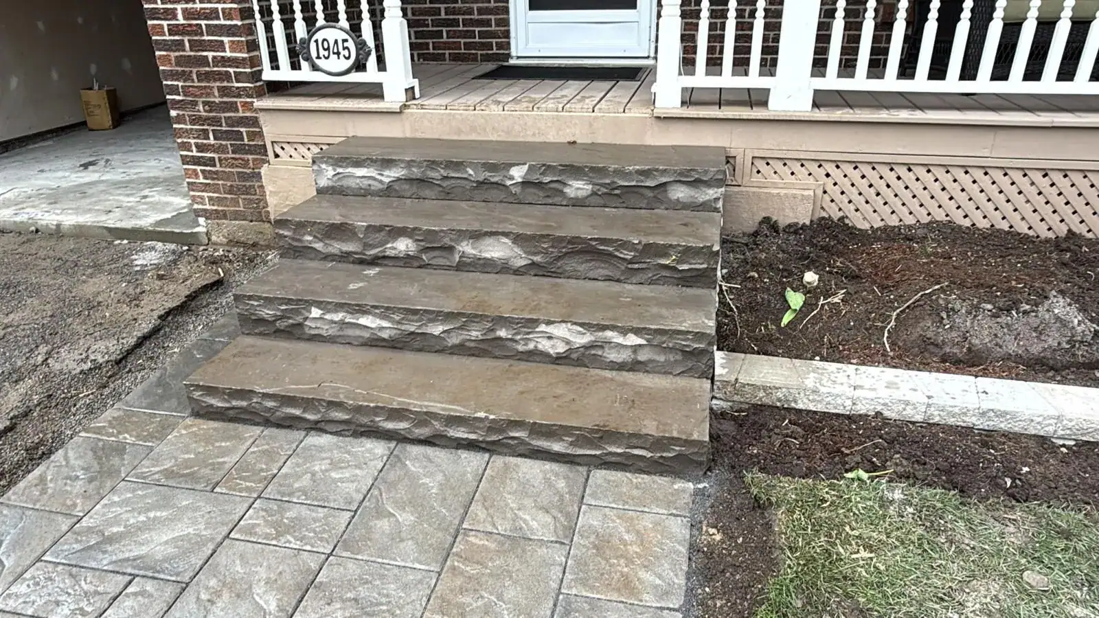
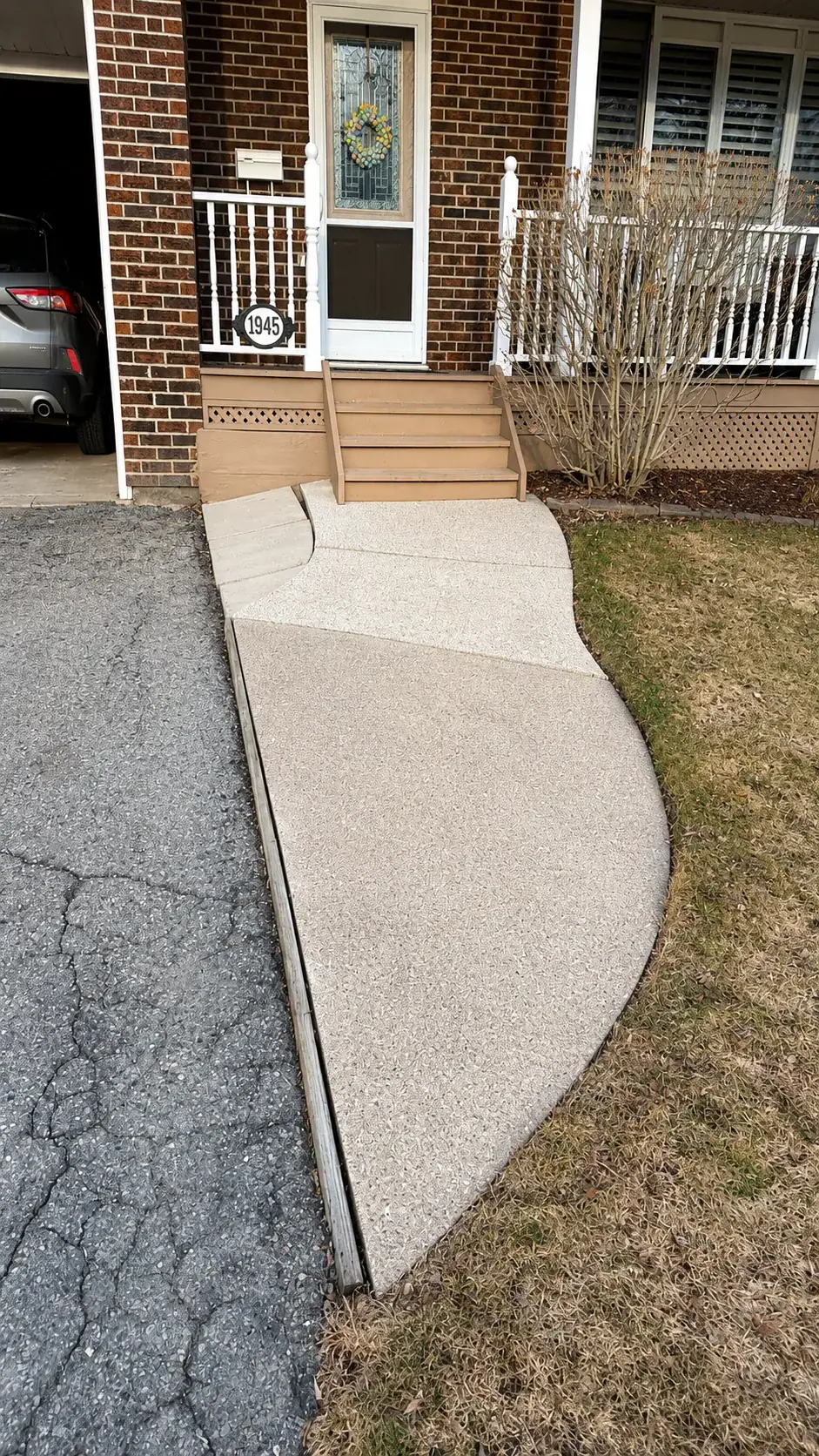
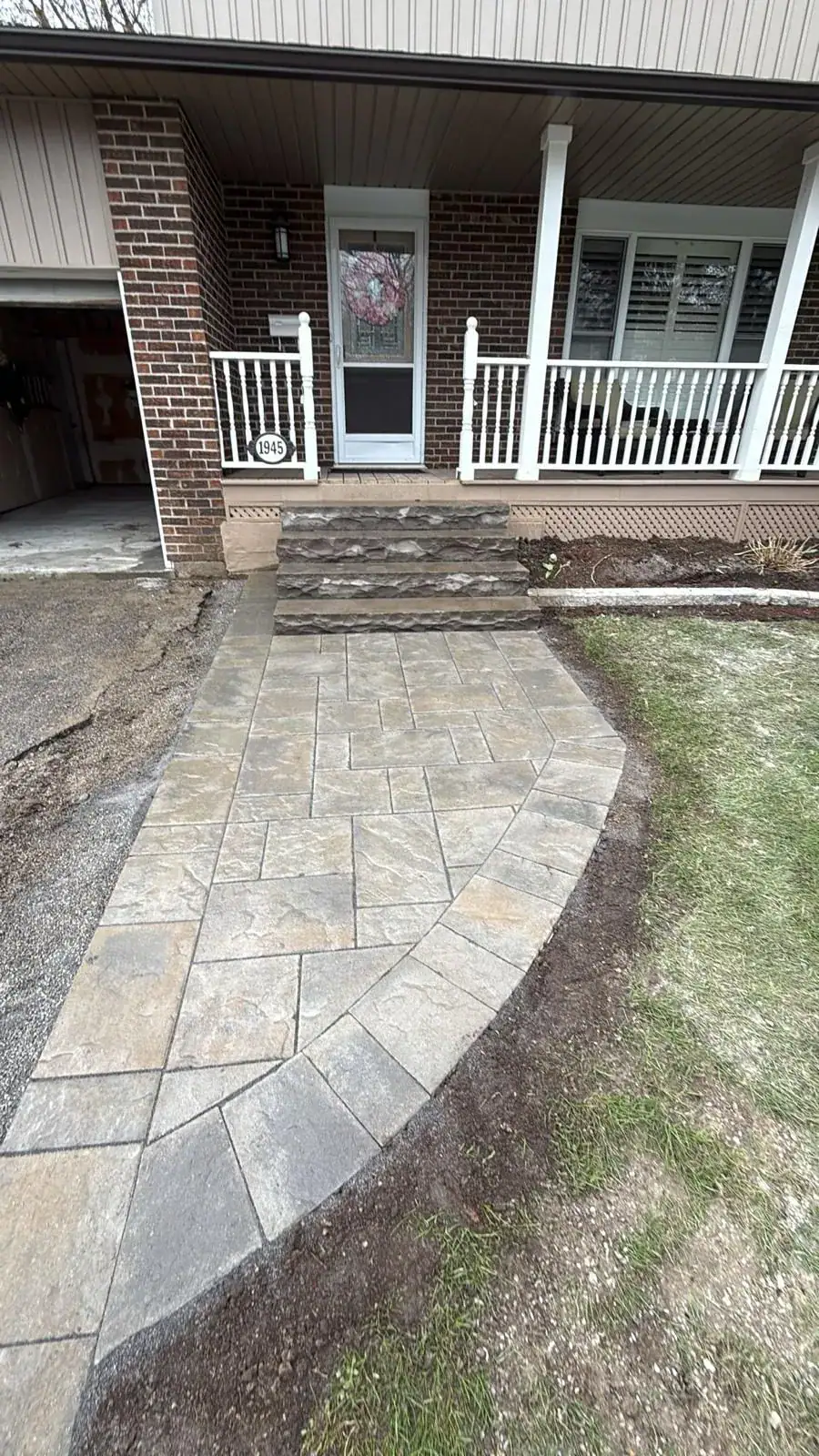
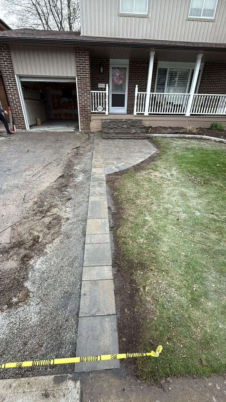
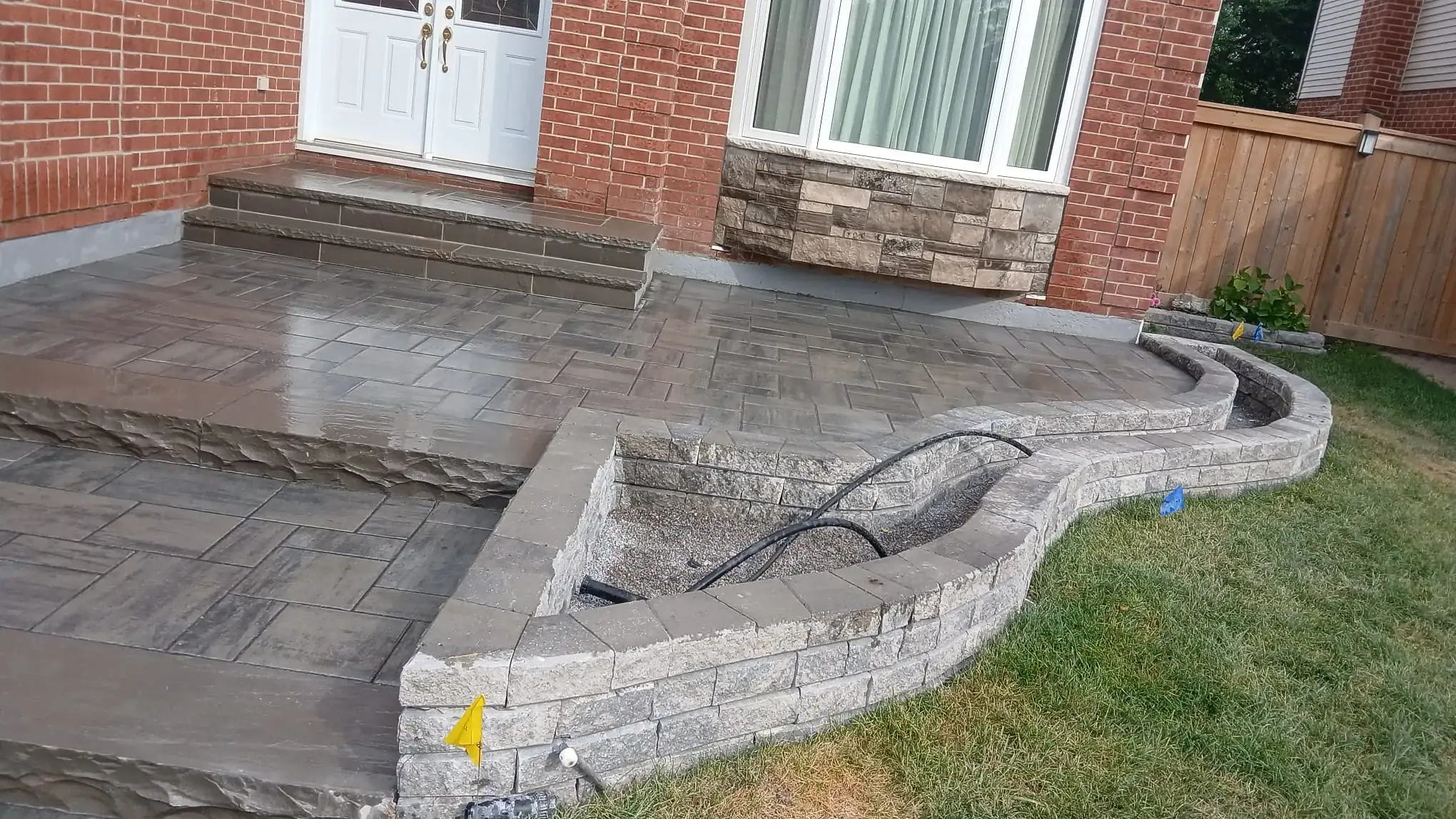
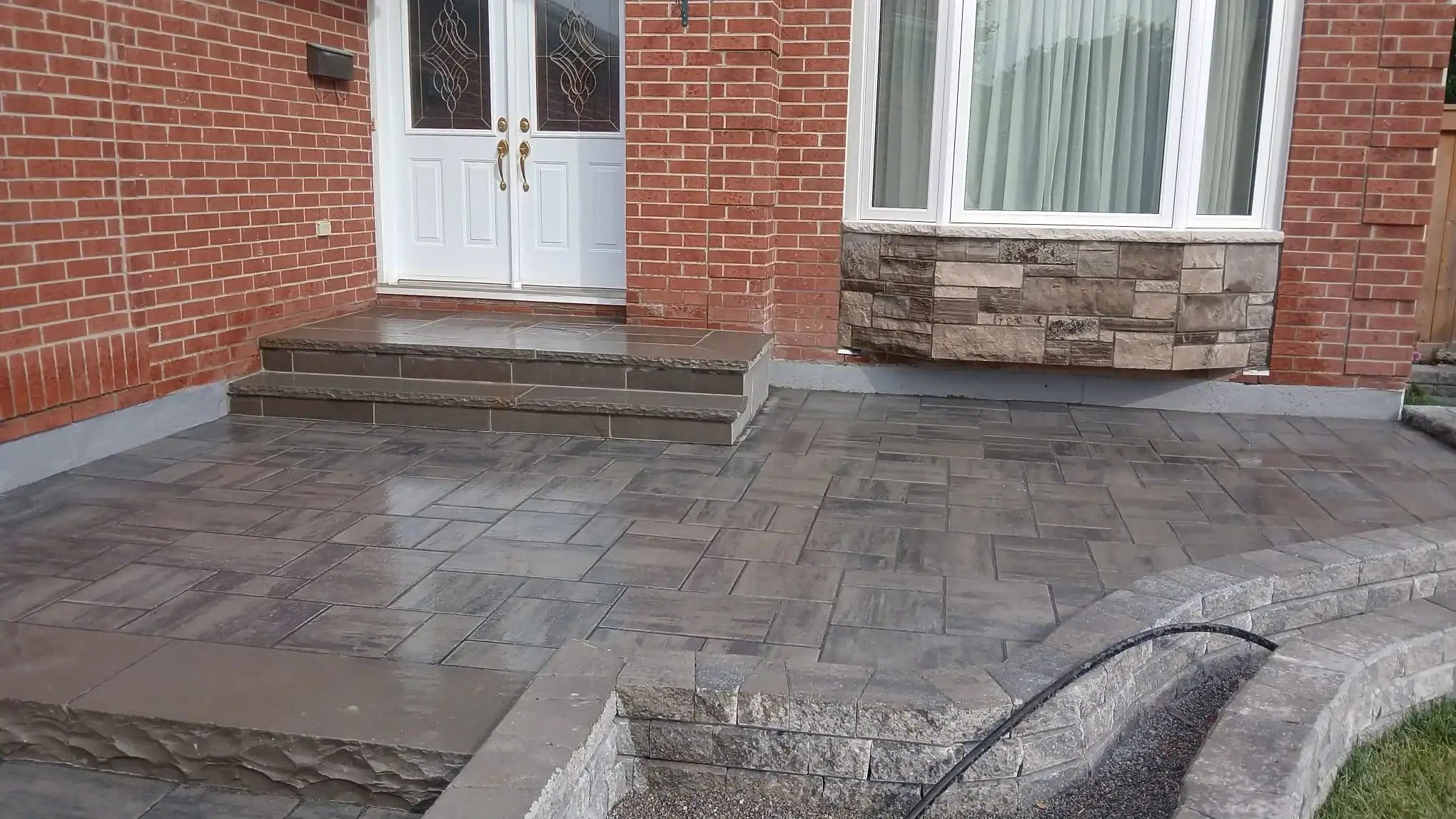
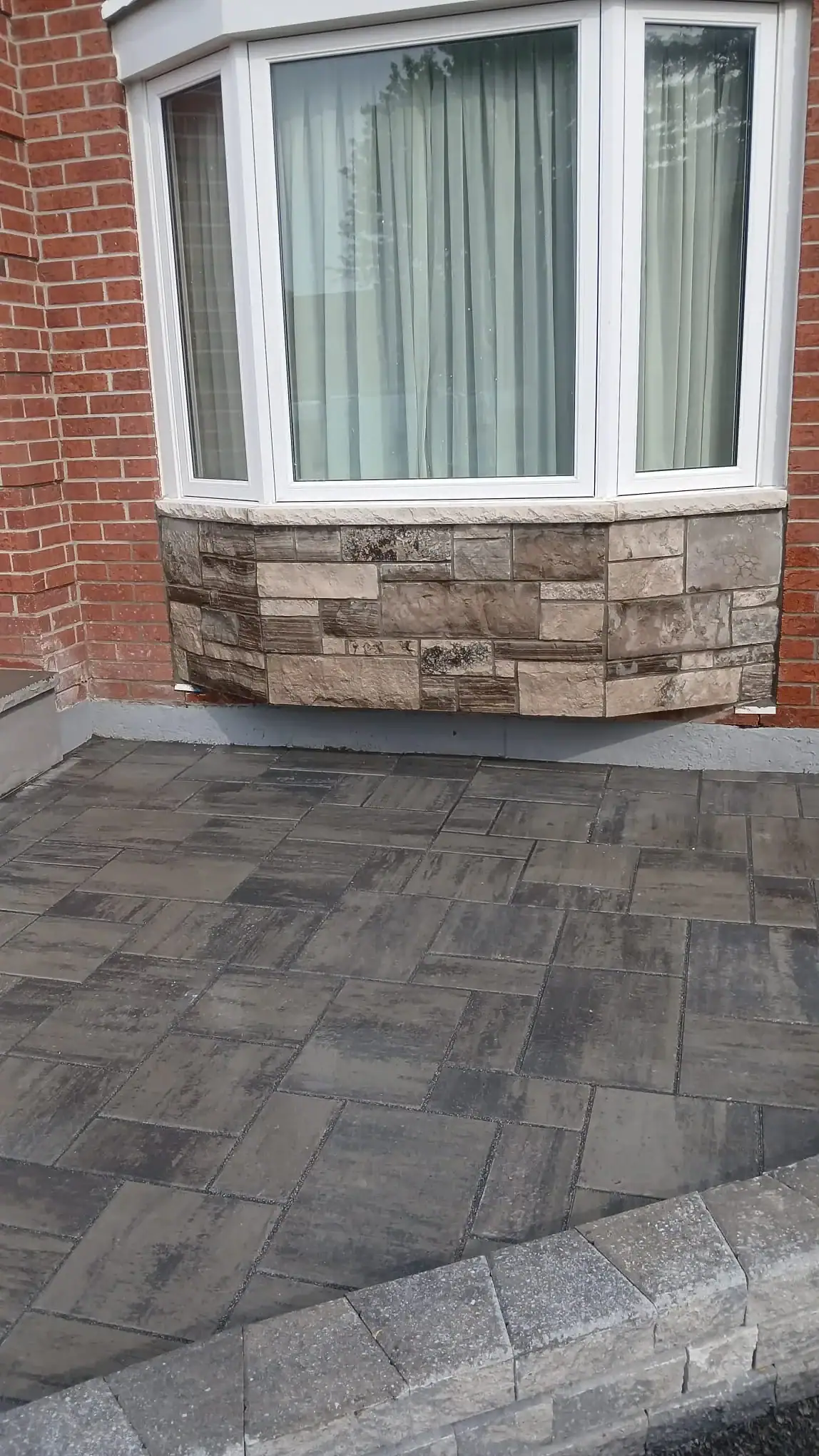
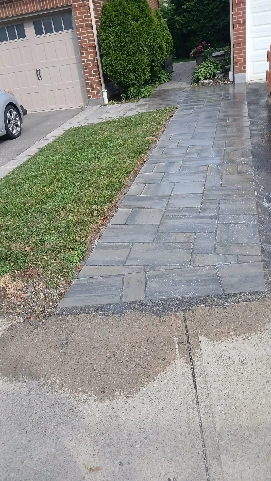
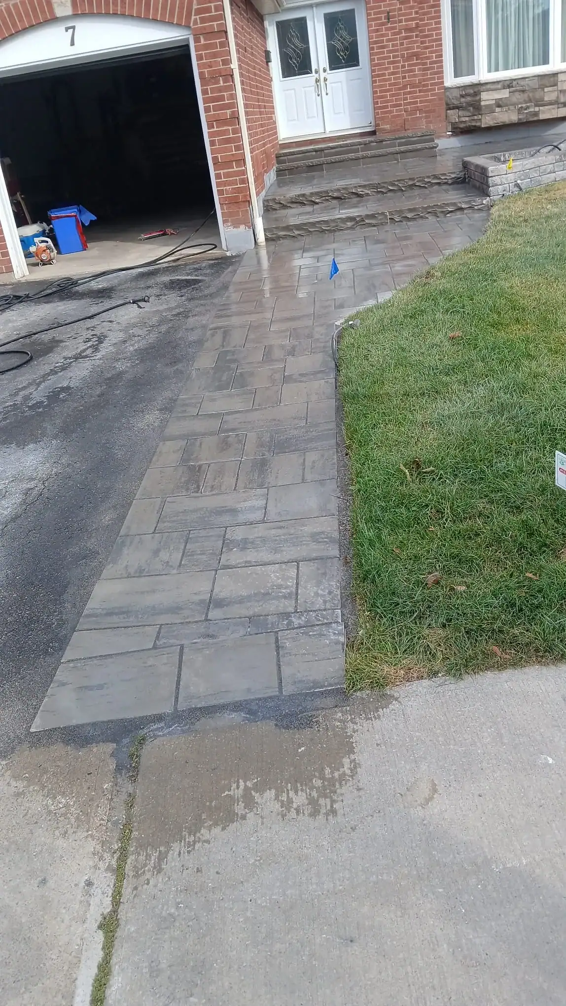
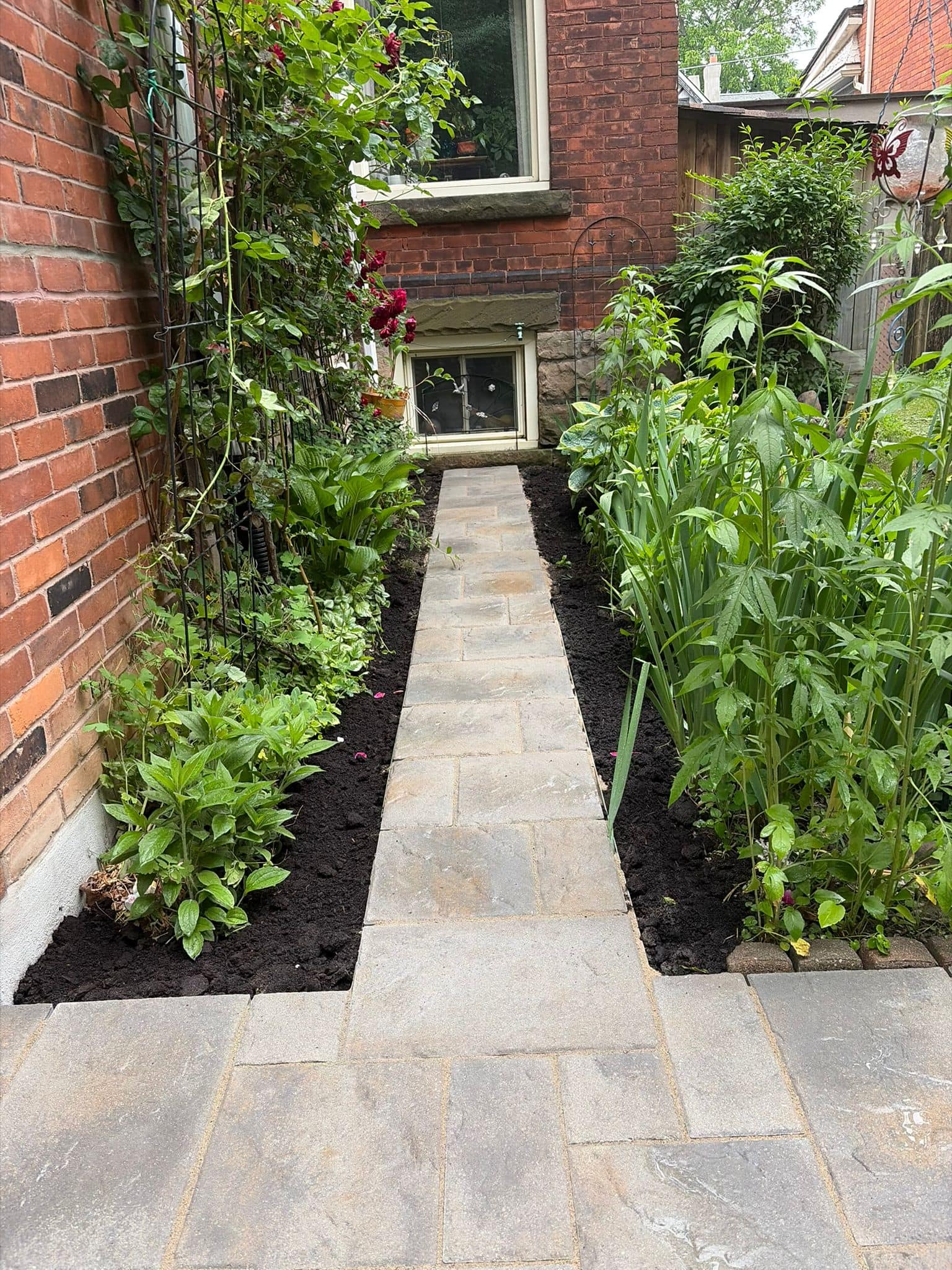
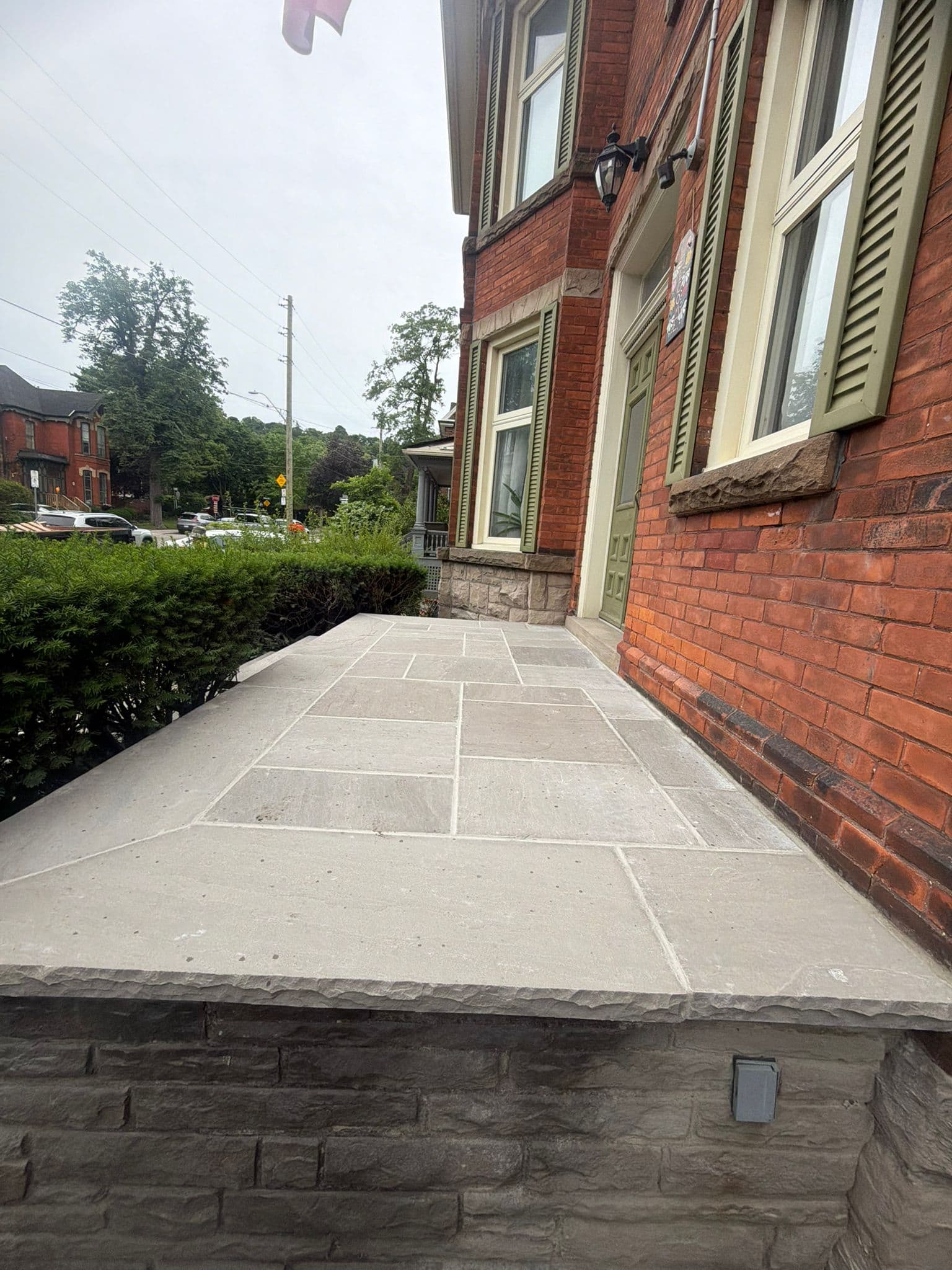
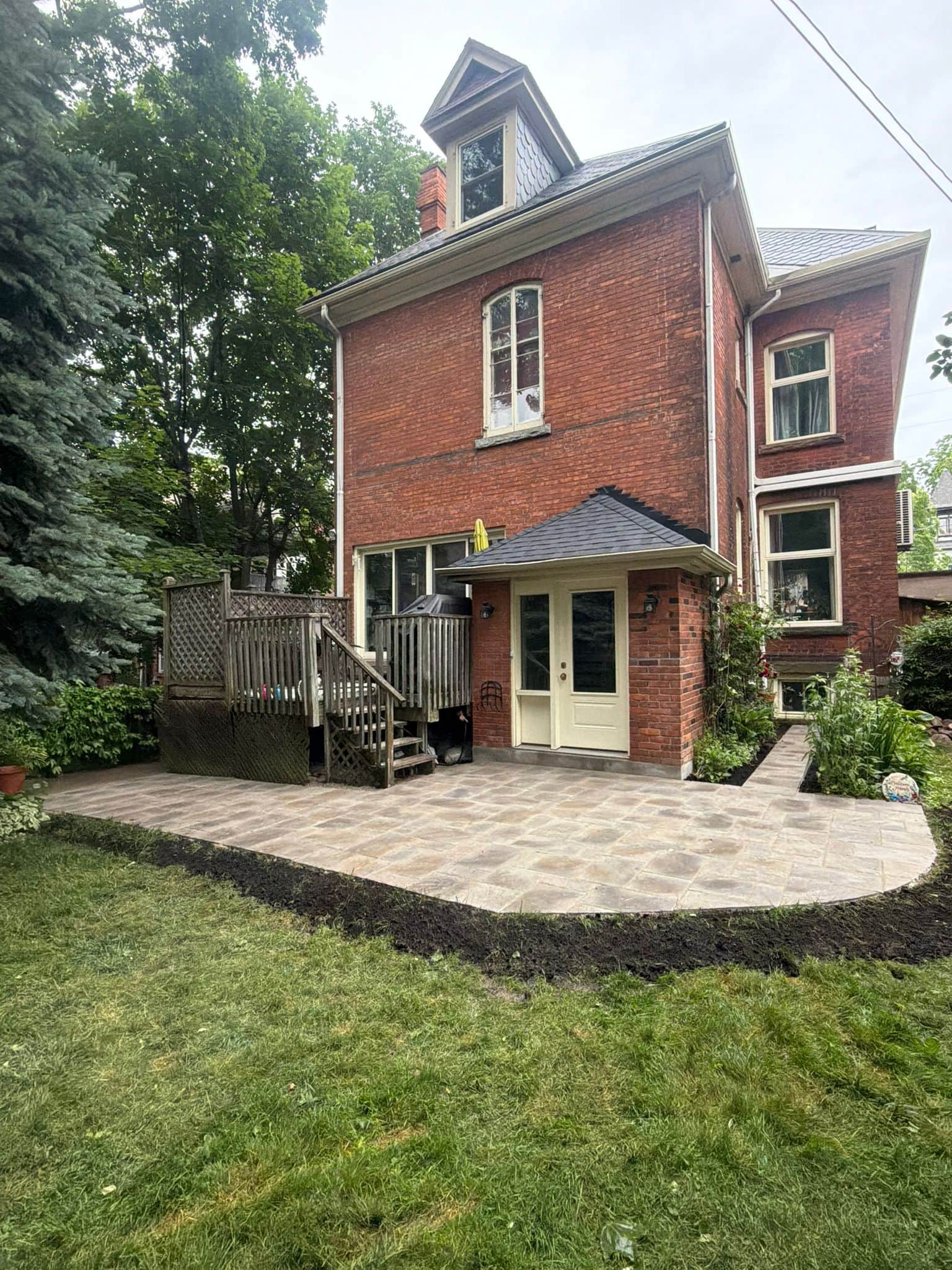
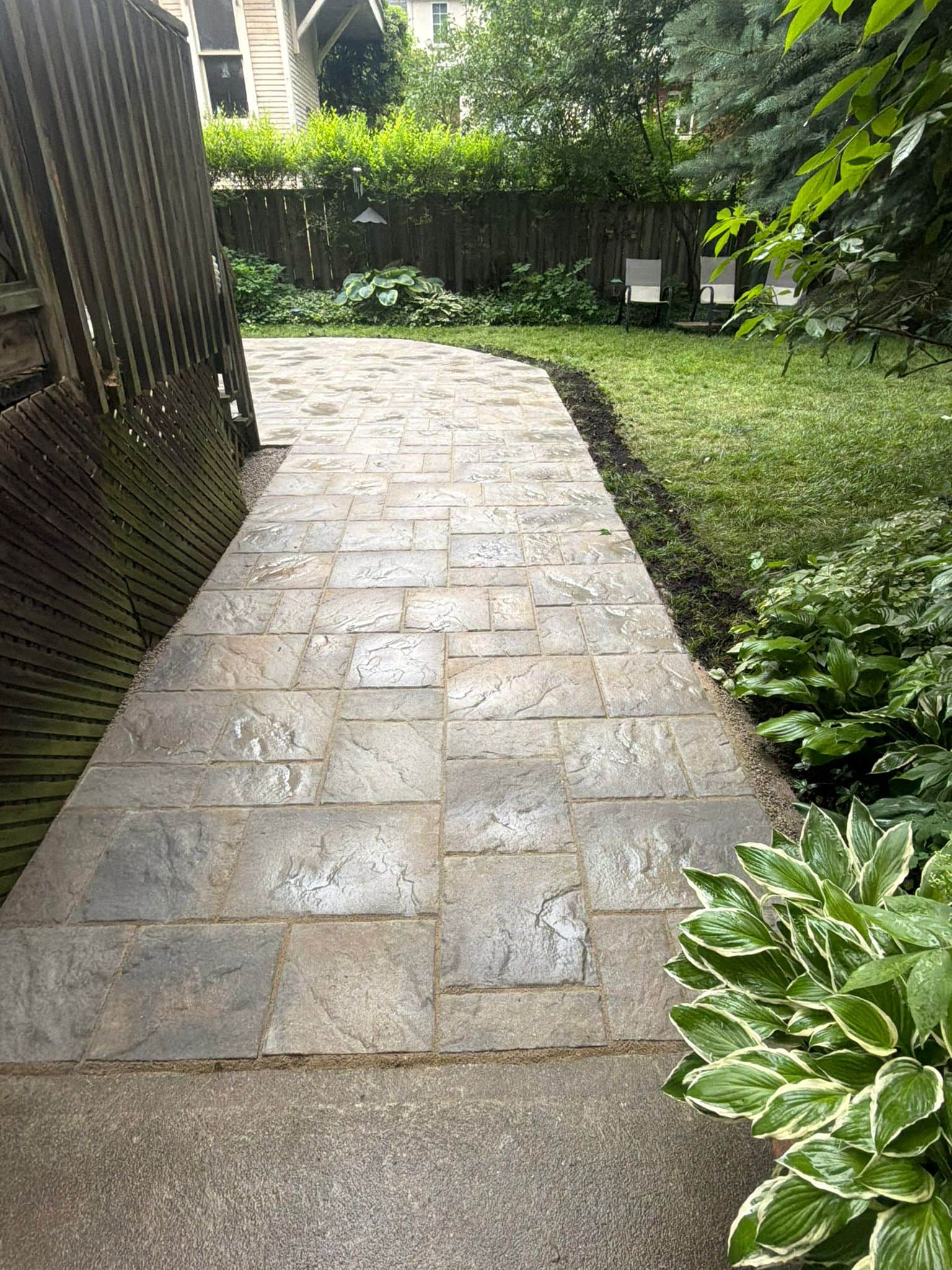
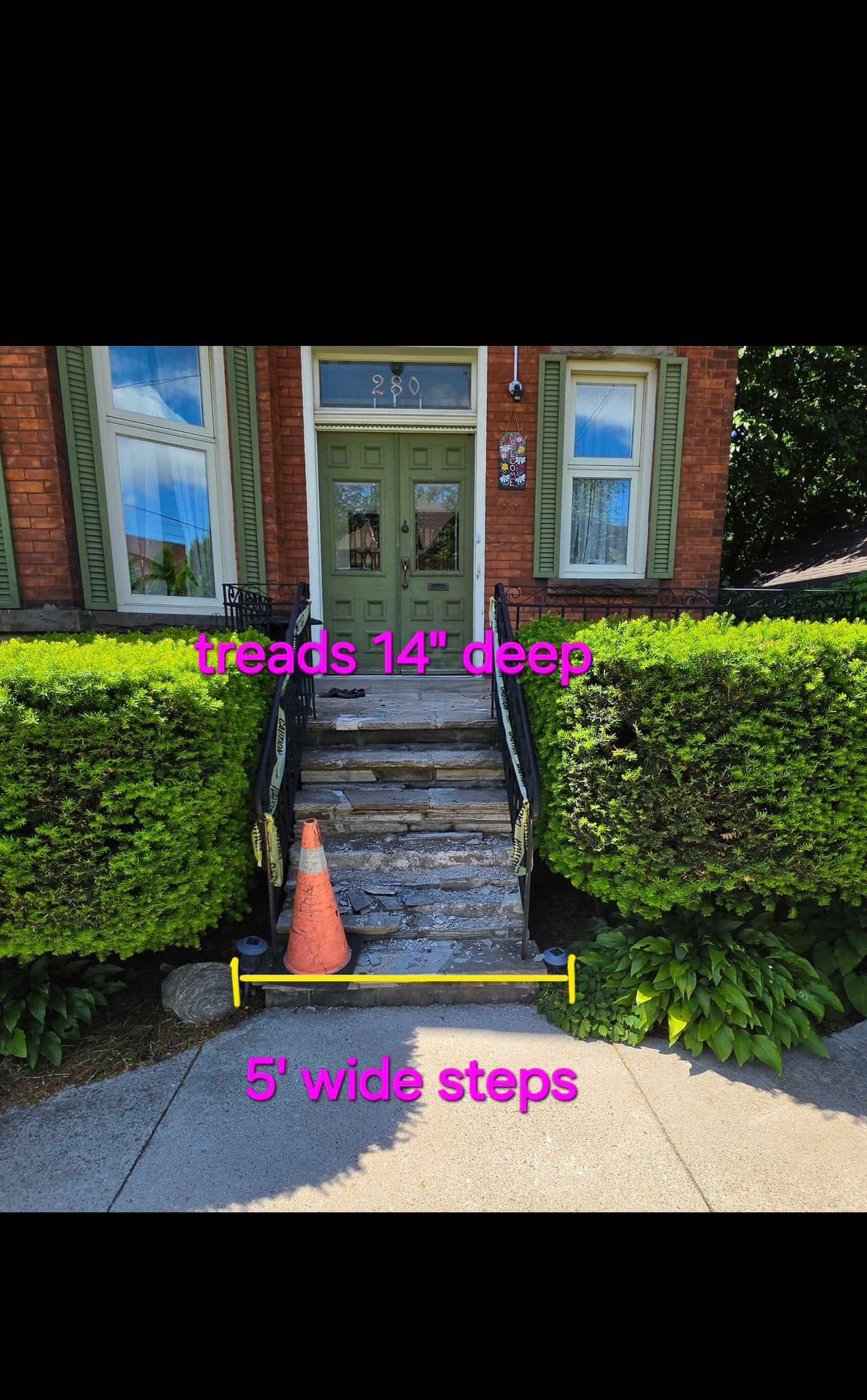
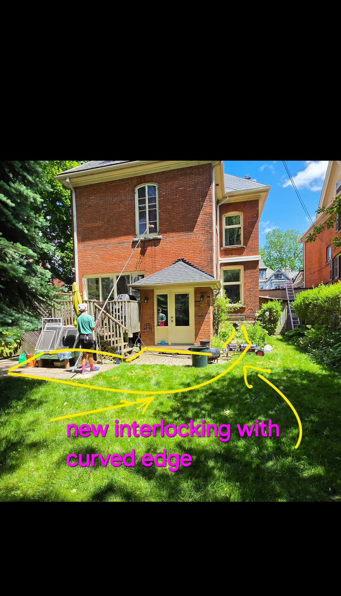
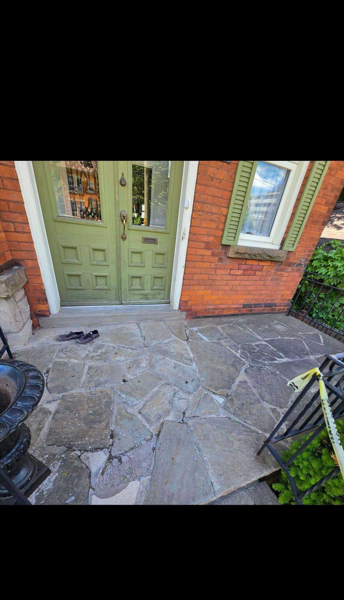
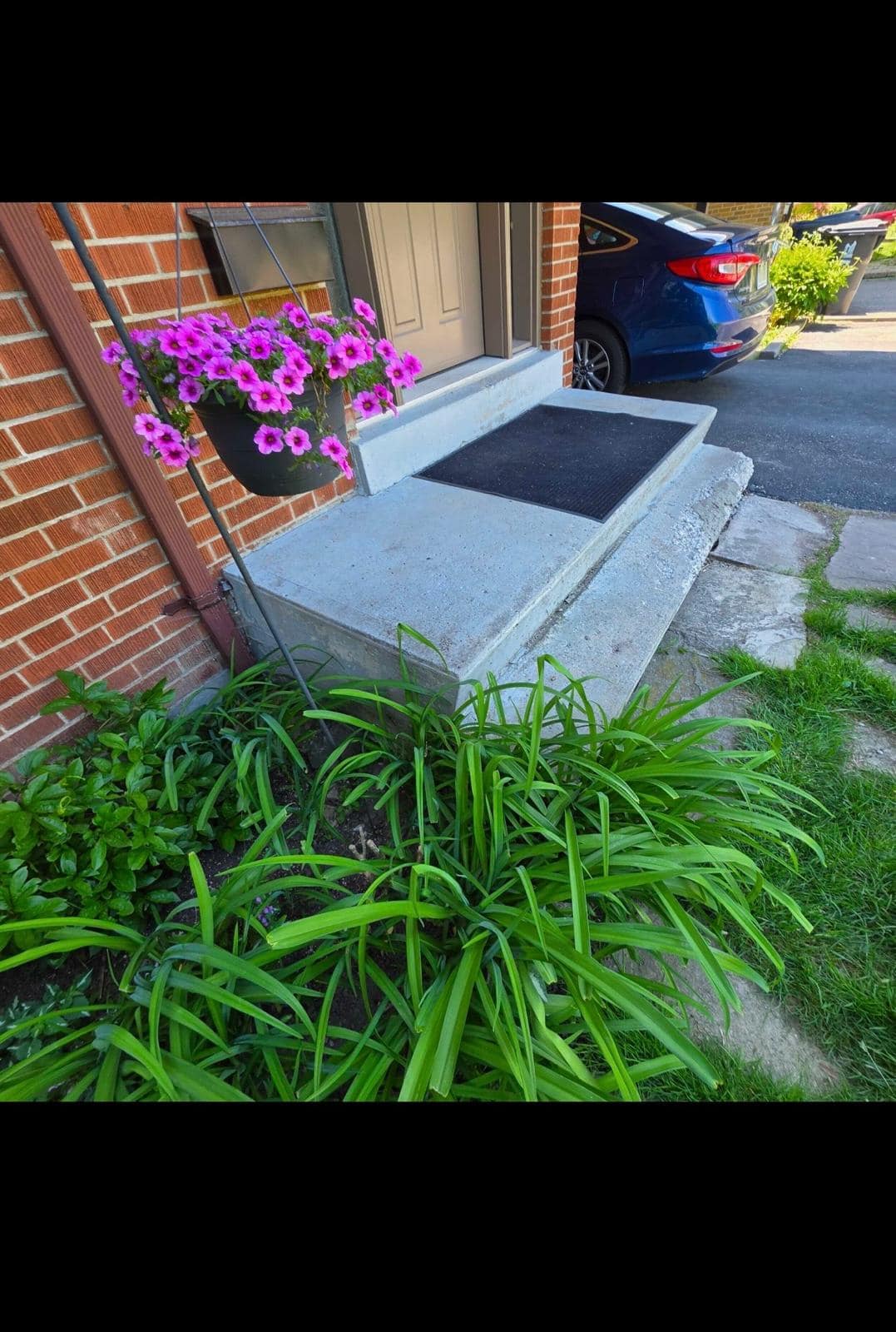
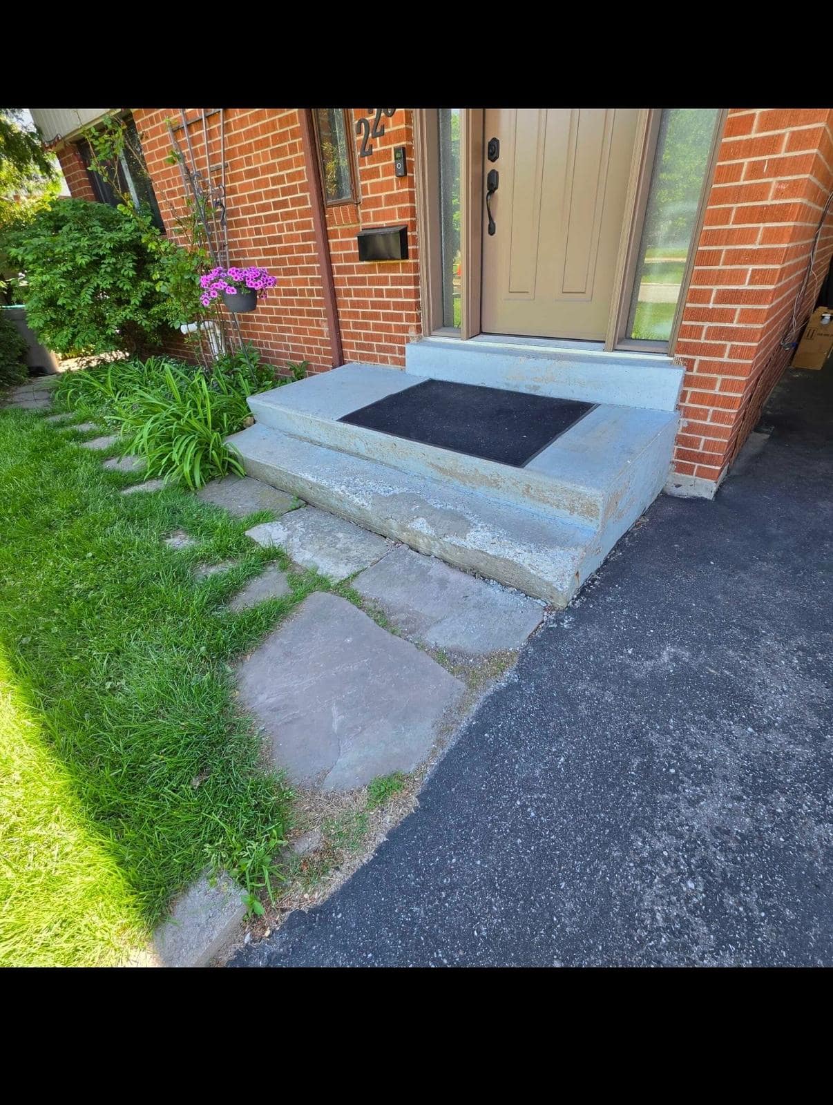
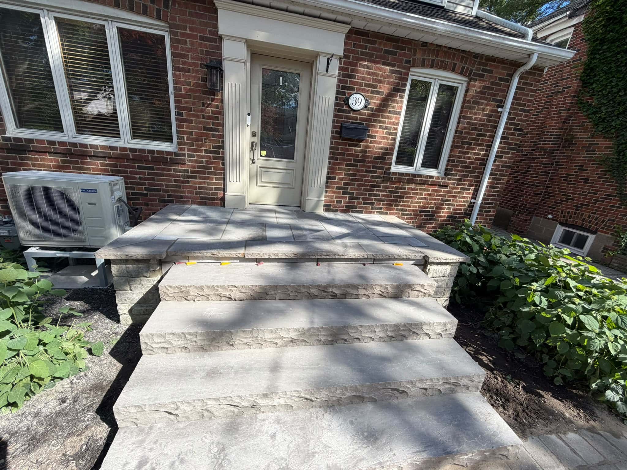
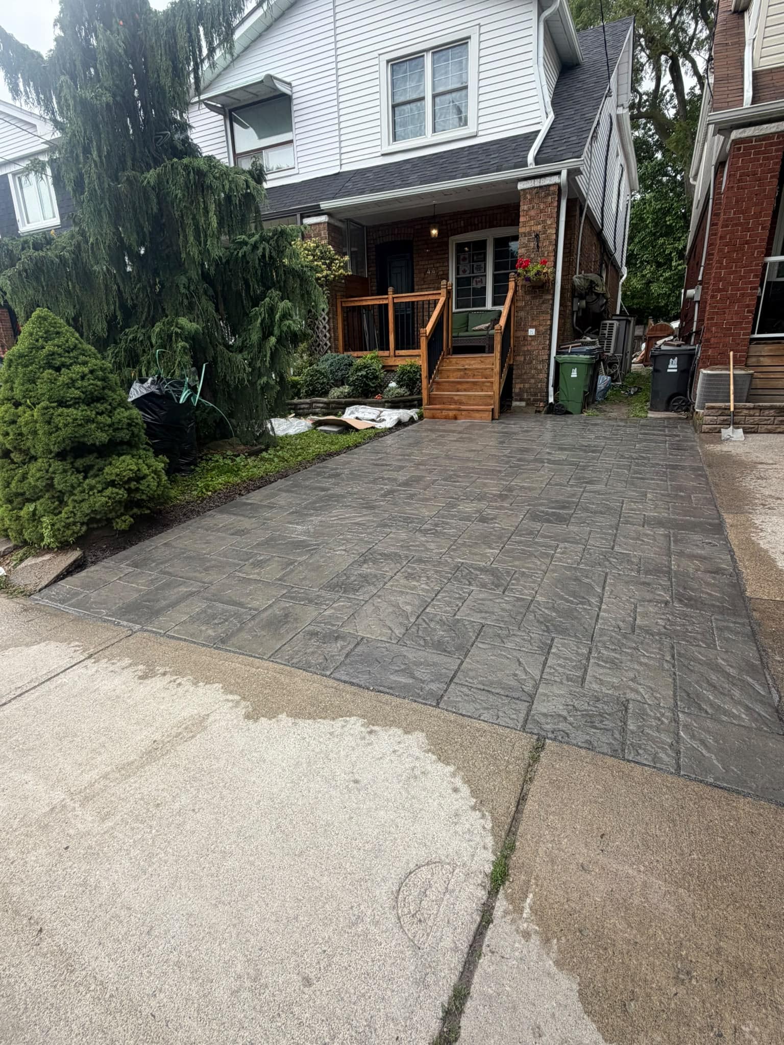
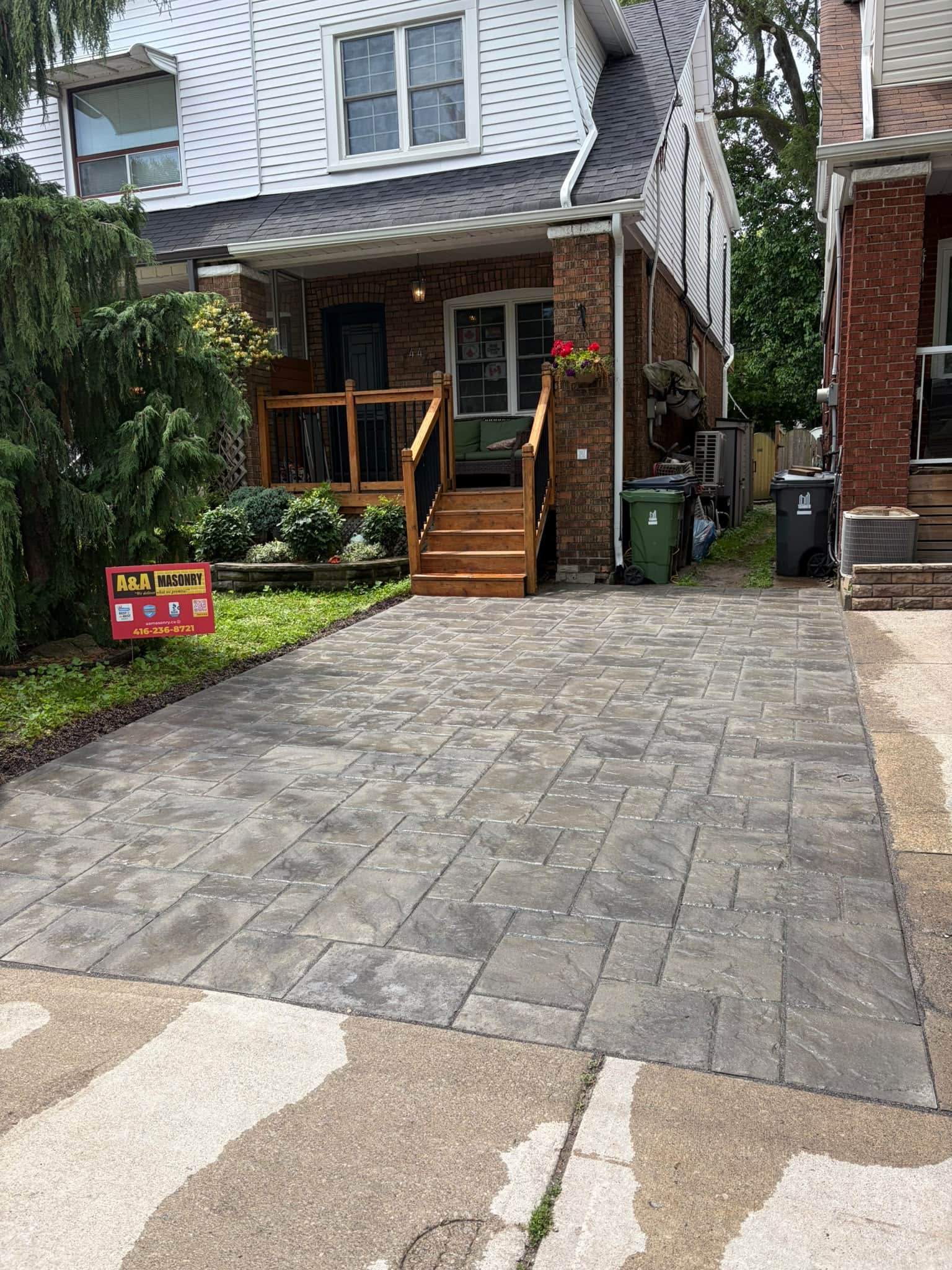
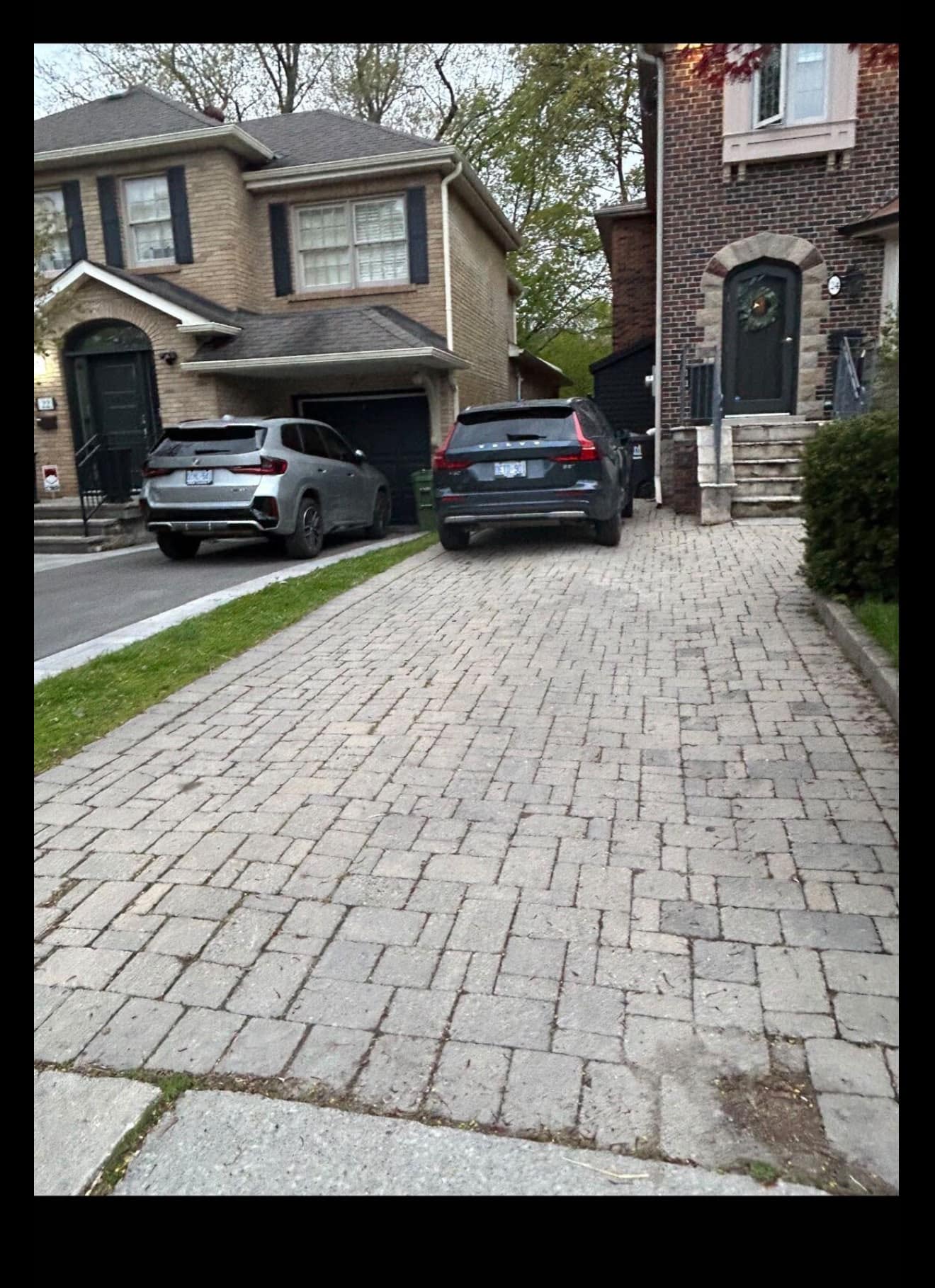
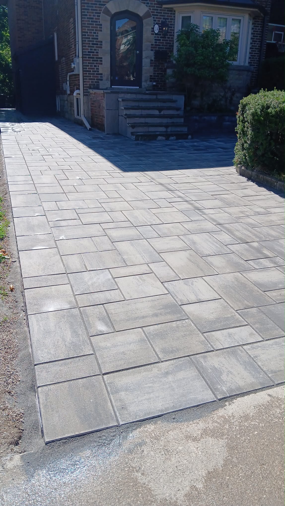
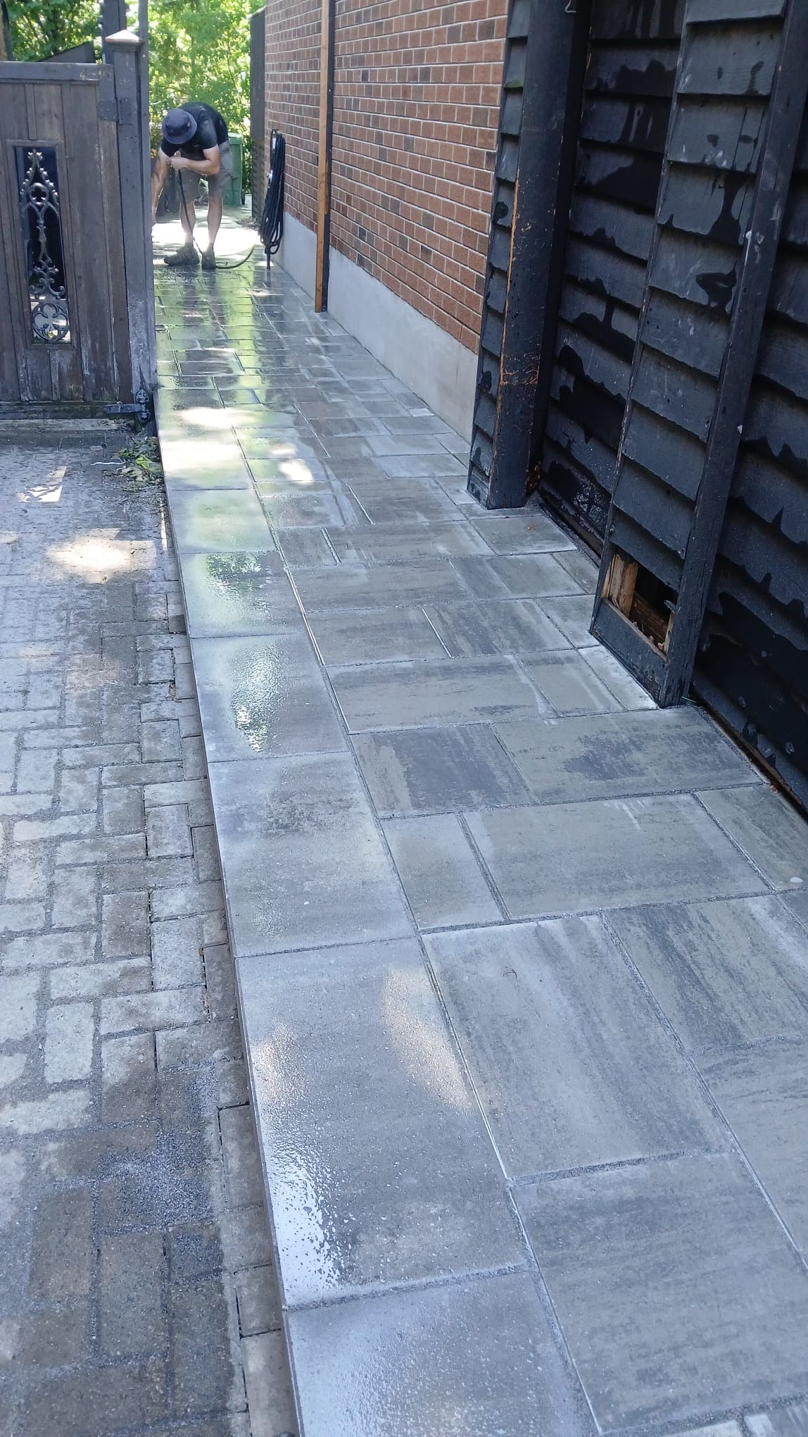
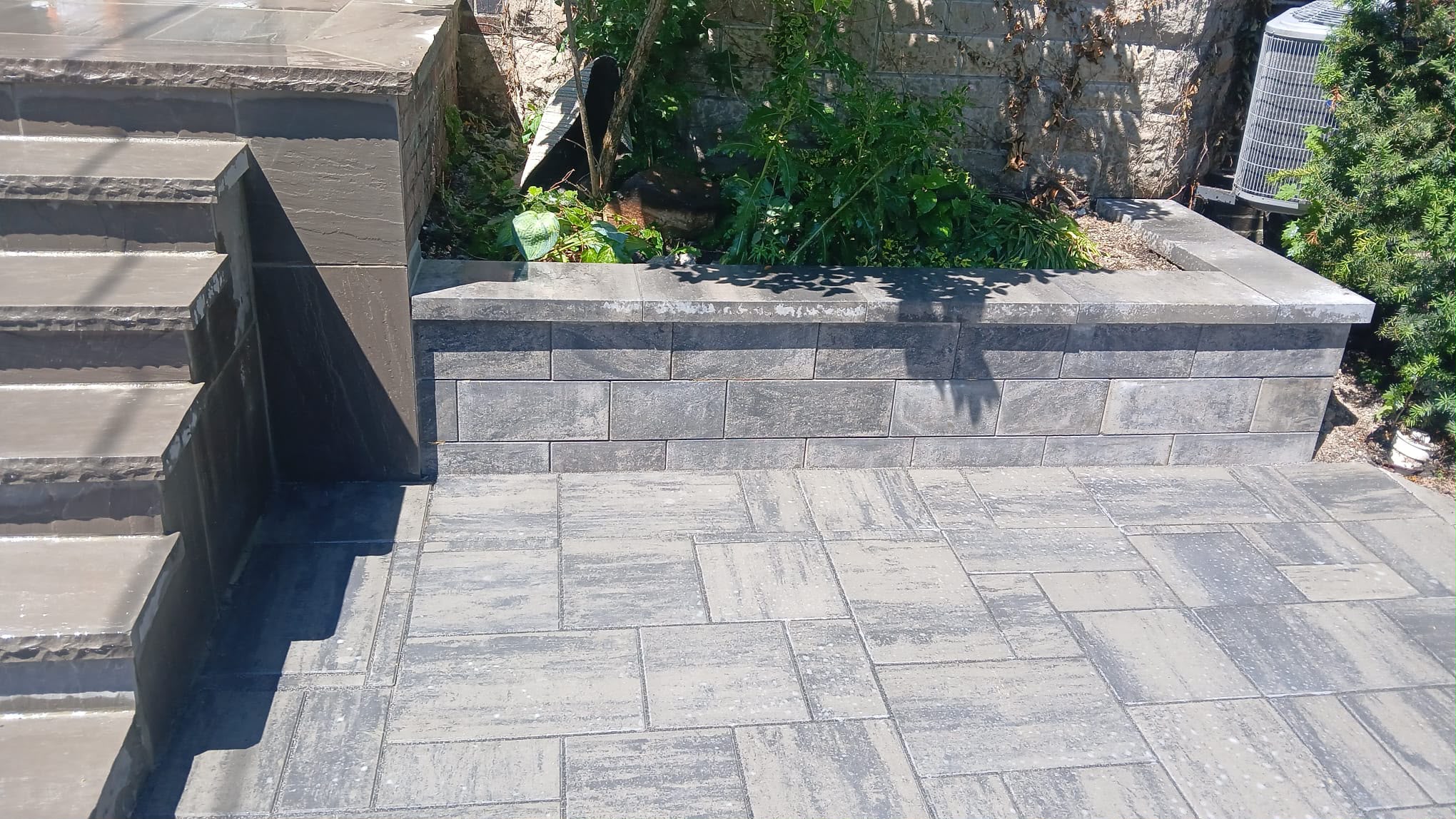
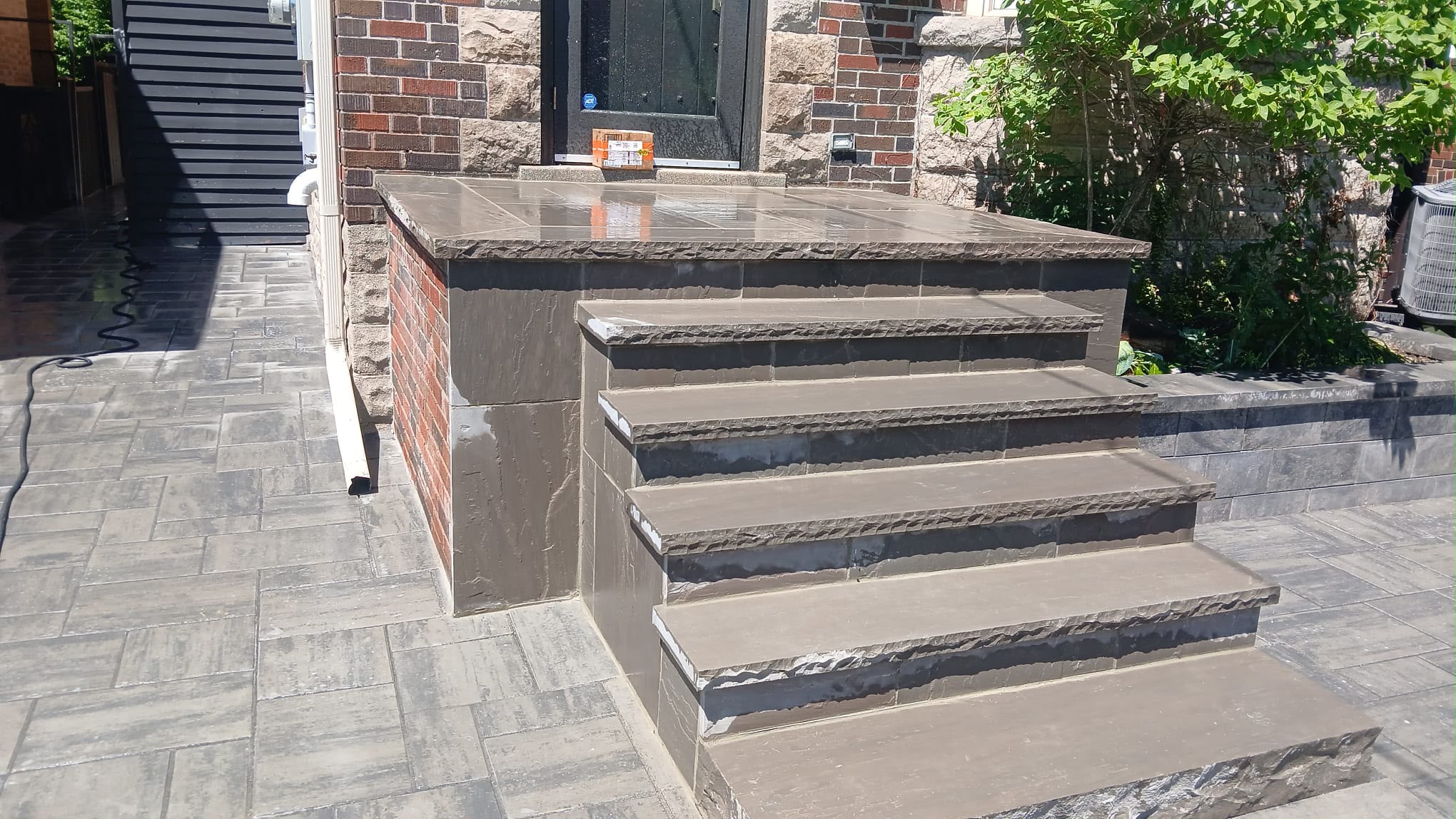
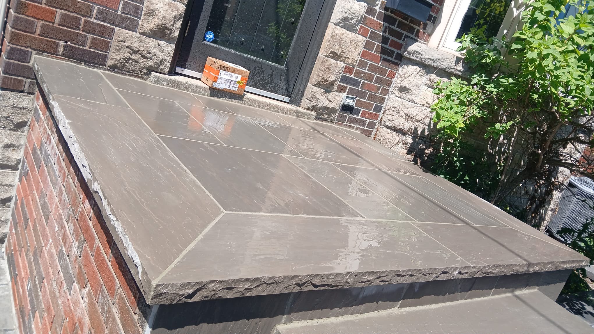
The brick colour should match the other masonry around the property. Stone steps, concrete porches, interlocking walkways, retaining walls, garden borders, and driveway pavers all influence how the facade looks.
If the home has warm red brick, cool grey pavers may create a strong contrast. That can work if it is intentional, but it can also feel disconnected. If the home uses beige or buff brick, warm grey stone, or taupe, interlocking may feel more natural. If the facade is charcoal or cool grey, warmer stone accents can soften the look.
Do not choose brick colour in isolation from the ground plane. The walkway and steps lead the eye to the facade. If those materials clash, the entrance may feel unfinished. A balanced exterior usually connects vertical masonry and horizontal hardscaping through shared undertones, contrast, or border details.
If stone is part of the design, A&A Masonry’s stone masonry Toronto page can help homeowners compare how brick and stone can work together in exterior features.
Sunlight, Shade, and Street View
Sunlight and shade should influence brick colour choice because the facade is viewed outdoors, not under showroom lights. A brick that looks perfect in direct sun may look dull in shade. A dark brick may look rich on a bright street but heavy under deep porch shadows.
North-facing facades often need extra care because they receive less direct sun. Cooler brick colours may look colder in these conditions. South-facing facades can accommodate greater depth and variety because sunlight brings out texture. Tree-covered lots may make dark brick feel even darker.
Street view matters too. A colour that looks good from two feet away may not read well from across the road. Step back and look at the facade from the sidewalk or street. This is how neighbours, buyers, and visitors will usually see it.
If you plan to use exterior lighting, remember that lighting can change how the brick colour appears at night. A&A Masonry’s blog on masonry lighting ideas for outdoor spaces explains how light can highlight brick texture, colour, and wall details.
Common Mistakes When Choosing Brick Colours
Common brick colour mistakes usually happen when homeowners choose too quickly, rely on small samples, ignore undertones, or forget the rest of the exterior.
- Choosing from indoor samples only: Brick should be viewed outside in natural light.
- Ignoring mortar colour: Mortar can change the entire look of the wall.
- Forgetting the roof: Roof colour strongly influences whether the brick looks warm, cool, heavy, or balanced.
- Using too many materials: Brick, stone, siding, stucco, metal, and pavers can feel busy if they do not share a clear palette.
- Choosing trendy colours too aggressively: Very bold colours may date faster than balanced tones.
- Not matching repairs carefully: Small mismatches can stand out on front facades and chimneys.
- Ignoring neighbourhood context: A facade can look awkward if it clashes strongly with surrounding homes.
- Covering up damage instead of repairing it: Colour updates should not hide cracked brickwork, failed mortar joints, or water damage.
These mistakes are avoidable when the colour decision is made with the whole property in mind.
When Permits or Heritage Rules May Matter
Permits or heritage rules may matter when changing a facade that affects exterior cladding, structural work, openings, additions, or a designated heritage property. A simple brick repair is different from a major facade alteration or recladding project.
The City of Toronto provides guidance on building permits, and Ontario’s official Building Code page is the preferred provincial reference for building requirements. If the work changes the exterior wall system, structure, openings, or major building features, homeowners should check which requirements apply before starting.
For heritage properties, visible exterior changes can be more sensitive. Always confirm requirements before changing brick colour, replacing historic brick, or altering original masonry details.
What Homeowners Should Check Before Choosing Brick Colour
Homeowners should check the entire facade, the existing masonry condition, and the surrounding materials before choosing a brick colour. This prevents a colour choice from becoming a repair or design problem later.
- Look at fixed colours: Roof, windows, trim, doors, porch, stone, walkway, and driveway.
- Check undertones: Decide whether existing materials are warm, cool, neutral, red, brown, grey, or beige.
- View samples outside: Check morning, afternoon, cloudy, and wet conditions if possible.
- Compare mortar options: Test how light, medium, dark, or matched mortar changes the wall.
- Consider scale: A small sample may look different when repeated across the full facade.
- Check nearby homes: The facade should feel personal yet connected to the street.
- Inspect for damage: Repair cracks, spalling, and failed mortar joints before focusing solely on colour.
- Think long term: Choose a colour you can live with through changing trends and seasons.
If the existing facade has cracked, stained, or weather-damaged masonry, A&A Masonry’s brick repair Toronto page can help explain when repair should come before design updates.

Quick Brick Colour Decision Guide
A simple brick colour guide can help narrow the decision.
- Choose red brick for a traditional Toronto look with warmth and long-term familiarity.
- Choose red-brown or earth tones for warmth and a softer, more grounded look.
- Choose grey brick if the home has modern details, black windows, cool stone, or a cleaner design direction.
- Choose cream or light brick if you want a brighter facade and are comfortable with more visible maintenance.
- Choose mixed blends for depth, texture, and a more natural masonry appearance.
- Choose close matching for repairs, additions, chimneys, porch columns, and visible front-wall work.
- Choose contrast carefully when the design is intentional and the rest of the exterior stays simple.
The best brick colour is not always the boldest or newest option. It is the one that makes the home look balanced, well-cared-for, and true to its architecture.
When Professional Help Makes More Sense
Professional help makes more sense when the project involves visible repair, brick replacement, older masonry, heritage-sensitive areas, major facade changes, or multiple exterior materials. Brick colour decisions are not only design choices. They also affect matching, repair quality, water performance, and long-term appearance.
A mason can help assess whether the existing brick should be repaired, matched, replaced, cleaned, repointed, or combined with new masonry. They can also help identify whether mortar colour, brick texture, and joint style will affect the final look.
For broader exterior planning, A&A Masonry’s masonry services in Toronto page outlines related services, including brick repair, brick replacement, tuckpointing, stone masonry, chimney repair, concrete repair, waterproofing, and exterior restoration.
Final Thoughts on Choosing Brick Colours for Your Facade
Choosing brick colours for your facade is about more than picking a favourite shade. The right colour should work with the roof, trim, windows, stone, steps, walkway, neighbouring homes, sunlight, and the property’s architectural character.
For Toronto and GTA homeowners, brick colour also needs to hold up visually through changing seasons. Rain can darken masonry. Snow can increase contrast. Shade can cool the appearance. Older neighbourhoods may call for more careful matching and a colour palette that respects the home’s original character.
Before deciding, view samples outside, compare mortar choices, check fixed exterior materials, and first repair existing masonry damage. A good brick colour should make the facade feel balanced, natural, and built to last, not just a momentary update.